GradientElevatedButton
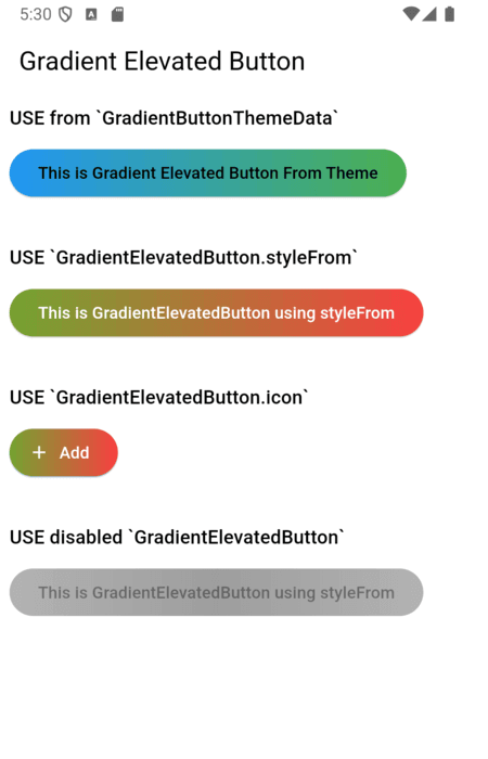
A customizable elevated button with gradient support for your Flutter applications. This package allows you to create buttons with gradient backgrounds, custom foreground colors, and various other customizable properties using the GradientElevatedButton widget.
Features
Gradient Background: Easily apply gradients to your button backgrounds.Customizable Style: Customize text color, shape, padding, and more.Integration with Theme: Use GradientButtonThemeExtension (via ThemeExtension) to apply a consistent style across your app. (Old: GradientButtonThemeData is deprecated)
Demo
Usage
1. Theming with ThemeExtension (Recommended)
The recommended way to theme all gradient buttons is to use GradientButtonThemeExtension with ThemeData.extensions:
MaterialApp (
theme: ThemeData (
extensions: <ThemeExtension <dynamic >>[
GradientButtonThemeExtension (
style: GradientElevatedButton .styleFrom (
backgroundGradient: const LinearGradient (
colors: [Colors .blue, Colors .green],
begin: Alignment .centerLeft,
end: Alignment .centerRight,
),
foregroundColor: Colors .black,
),
),
],
),
home: ...,
)
Then use GradientElevatedButton as usual:
GradientElevatedButton (
onPressed: () {},
child: Text ('Themed Gradient Button' ),
)
2. [DEPRECATED] Using GradientButtonThemeData
GradientButtonThemeData is deprecated and will be removed in a future release. Migrate to ThemeExtension as shown above.
GradientButtonThemeData (
data: GradientElevatedButton .styleFrom (
backgroundGradient: const LinearGradient (
colors: [Colors .blue, Colors .green],
begin: Alignment .centerLeft,
end: Alignment .centerRight,
),
foregroundColor: Colors .black,
),
child: MaterialApp (
),
)
3. Using GradientElevatedButton.styleFrom
Alternatively, you can style the GradientElevatedButton directly using GradientElevatedButton.styleFrom to define the button's gradient, shape, and other properties:
Widget gradientWidget = GradientElevatedButton (
onPressed: () {
},
style: GradientElevatedButton .styleFrom (
gradient: const LinearGradient (colors: [
Color .fromARGB (255 , 166 , 206 , 57 ),
Color .fromARGB (255 , 0 , 175 , 173 ),
],
disabledGradient: const LinearGradient (colors: [
Colors .grey.withAlpha (200 ),
Colors .grey,
Colors .grey.withAlpha (200 ),
],
begin: Alignment .topCenter,
end: Alignment .bottomCenter,
),
),
),
child: const Text ("This is Gradient Elevated Button" ),
);
Customization
You can fully customize the GradientElevatedButton using the following properties:
backgroundGradient : A LinearGradient (or other types) that defines the background gradient.foregroundColor : The color of the text and icon on the button.disabledBackgroundGradient : A LinearGradient (or other types) that defines the disabled background gradient.disabledForegroundColor : The color of the text and icon on the disabled button.padding : Padding inside the button.shape : Define the button’s shape with a ShapeBorder like RoundedRectangleBorder or StadiumBorder.elevation : Controls the button's elevation (default: 2).onPressed : The callback function that is called when the button is pressed.
Migration Guide
To migrate from GradientButtonThemeData to the new ThemeExtension approach:
Remove GradientButtonThemeData from your widget tree.
Add GradientButtonThemeExtension to your ThemeData.extensions.
Use GradientButtonThemeExtension.of(context) to access the style if needed.
All GradientElevatedButton widgets will now use the theme from the extension.
See the example and code comments for more details.
Example
click here for example
Issues and Feedback
Please file any issues or provide feedback by visiting the Issues and Feedback for this repository.
For suggestions or further feedback, feel free to send an email to chegz.dev@gmail.com , and we'd be happy to hear from you!
Contributors thanks