搜尋套件、儲存庫與 APP 分類

套件詳情v1.0.4

grouped_buttons

一個簡單的套件,讓分組複選框和單選按鈕變得更容易。

近 30 天下載
302
喜歡數
82
Pub 分數
30

安裝套件

flutter pub add grouped_buttons

套件介紹

根據套件公開資料產生的選型評估,僅供參考。

一個輕量級的 Flutter 套件,可簡化分組複選框和單選按鈕的建立與管理。它提供了一種乾淨、可重用的方式來處理多個選擇選項,具有一致的樣式和狀態管理。適用於表單或設定,使用者需要從預定義集合中選擇一個或多個項目。該套件透過抽象常見模式,減少冗餘程式碼,提升開發人員的生產力。

適用情境

  • 具有多個選項的表單輸入
  • 使用者偏好設定
  • 調查或測驗介面
  • 動態選項選擇
  • 簡化群組的狀態處理
  • 切換選項的統一使用者介面

主要特色

  • 輕鬆分組複選框和單選按鈕
  • 內建狀態管理
  • 可自訂外觀
  • 最小化樣板程式碼
  • 支援單選與多選
  • 乾淨、易讀的 API

適合對象

  • 使用選項組建構表單的開發者
  • 尋求一致切換元件的UI設計師
  • 需要簡單但可擴展的選擇組件的專案
  • 重視程式碼可維護性的團隊
  • Flutter 初學者學習表單處理

使用建議

  • 僅限複選框和單選按鈕類型
  • 無內建驗證
  • 不支援巢狀群組
  • 需要手動樣式設定以實現複雜設計
  • 不適用於超出選擇之外的進階表單邏輯

原始 README

以下為關聯原始碼儲存庫的 README 原文快照,最新內容請造訪原始碼儲存庫。

grouped_buttons

pub package

A set of Flutter widgets that makes grouping Checkboxes and Radio Buttons much easier!

Installing

Add the following to your pubspec.yaml file:

dependencies:
  grouped_buttons: ^1.0.4

Simple Usage

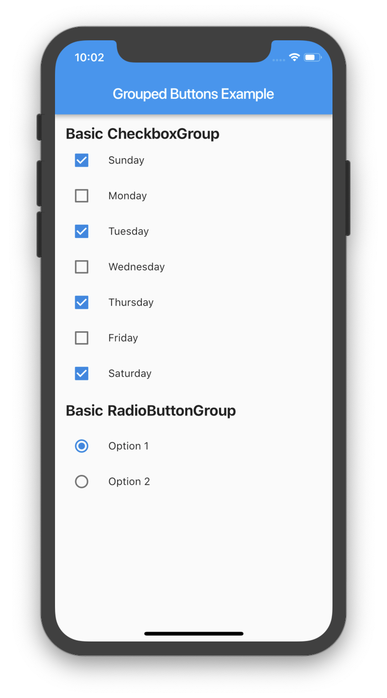
Creating a basic CheckboxGroup
CheckboxGroup(
  labels: <String>[
    "Sunday",
    "Monday",
    "Tuesday",
    "Wednesday",
    "Thursday",
    "Friday",
    "Saturday",
    "Sunday",
  ],
  onSelected: (List<String> checked) => print(checked.toString())
);
Creating a basic RadioButtonGroup
RadioButtonGroup(
  labels: <String>[
    "Option 1",
    "Option 2",
  ],
  onSelected: (String selected) => print(selected)
);
Screenshot
Basic Usage

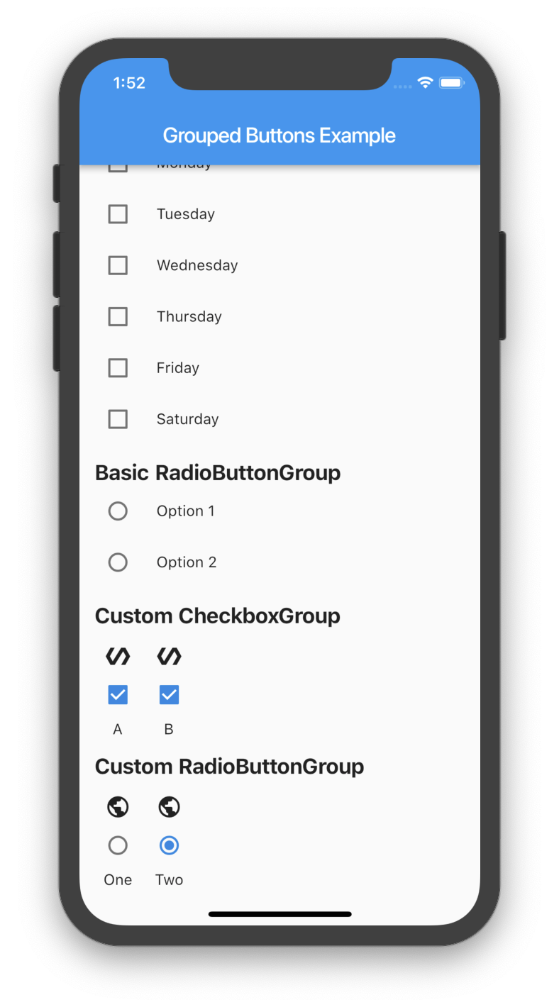
Custom Usage

There are several options that allow for more control.

Custom CheckboxGroup
Properties Description
activeColor The color to use when a Checkbox is checked.
checkColor The color to use for the check icon when a Checkbox is checked.
checked Specifies which boxes to be automatically checked. Every element must match a label. This is useful for clearing all selections (set it to []). If this is non-null, then the user must handle updating this list; otherwise, the state of the CheckboxGroup won't change.
disabled Specifies which boxes should be disabled. If this is non-null, no boxes will be disabled. The strings passed to this must match the labels.
itemBuilder Called when needed to build a CheckboxGroup element.
labels (required) A list of strings that describes each Checkbox. Each label must be distinct.
labelStyle The style to use for the labels.
margin Empty space surrounding the CheckboxGroup.
onChange Called when the value of the CheckboxGroup changes.
onSelected Called when the user makes a selection.
orientation Specifies the orientation to display elements. Either GroupedButtonsOrientation.HORIZONTAL or GroupedButtonsOrientation.VERTICAL.
padding Empty space in which to inset the CheckboxGroup.
tristate If true the checkbox's value can be true, false, or null.
List<String> _checked = ["A", "B"];

CheckboxGroup(
  orientation: GroupedButtonsOrientation.HORIZONTAL,
  margin: const EdgeInsets.only(left: 12.0),
  onSelected: (List selected) => setState((){
    _checked = selected;
  }),
  labels: <String>[
    "A",
    "B",
  ],
  checked: _checked,
  itemBuilder: (Checkbox cb, Text txt, int i){
    return Column(
      children: <Widget>[
        Icon(Icons.polymer),
        cb,
        txt,
      ],
    );
  },
);
Custom RadioButtonGroup
Properties Description
activeColor The color to use when a Radio button is checked.
disabled Specifies which buttons should be disabled. If this is non-null, no buttons will be disabled. The strings passed to this must match the labels.
itemBuilder Called when needed to build a RadioButtonGroup element.
labels (required) A list of strings that describes each Radio button. Each label must be distinct.
labelStyle The style to use for the labels.
margin Empty space surrounding the RadioButtonGroup.
onChange Called when the value of the RadioButtonGroup changes.
onSelected Called when the user makes a selection.
orientation Specifies the orientation to display elements. Either GroupedButtonsOrientation.HORIZONTAL or GroupedButtonsOrientation.VERTICAL.
padding Empty space in which to inset the RadioButtonGroup.
picked Specifies which Radio button to automatically pick. Every element must match a label. This is useful for clearing what is picked (set it to ""). If this is non-null, then the user must handle updating this; otherwise, the state of the RadioButtonGroup won't change.
String _picked = "Two";

RadioButtonGroup(
  orientation: GroupedButtonsOrientation.HORIZONTAL,
  margin: const EdgeInsets.only(left: 12.0),
  onSelected: (String selected) => setState((){
    _picked = selected;
  }),
  labels: <String>[
    "One",
    "Two",
  ],
  picked: _picked,
  itemBuilder: (Radio rb, Text txt, int i){
    return Column(
      children: <Widget>[
        Icon(Icons.public),
        rb,
        txt,
      ],
    );
  },
);
Screenshot
Basic Usage

所屬分類

原始碼儲存庫

使用此套件的專案

暫無相關資料。