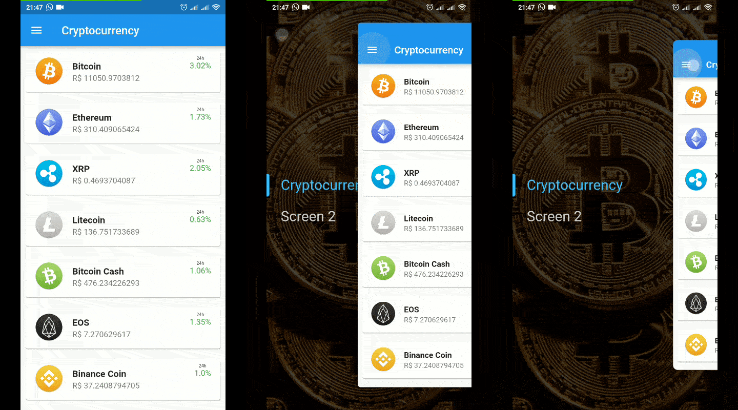
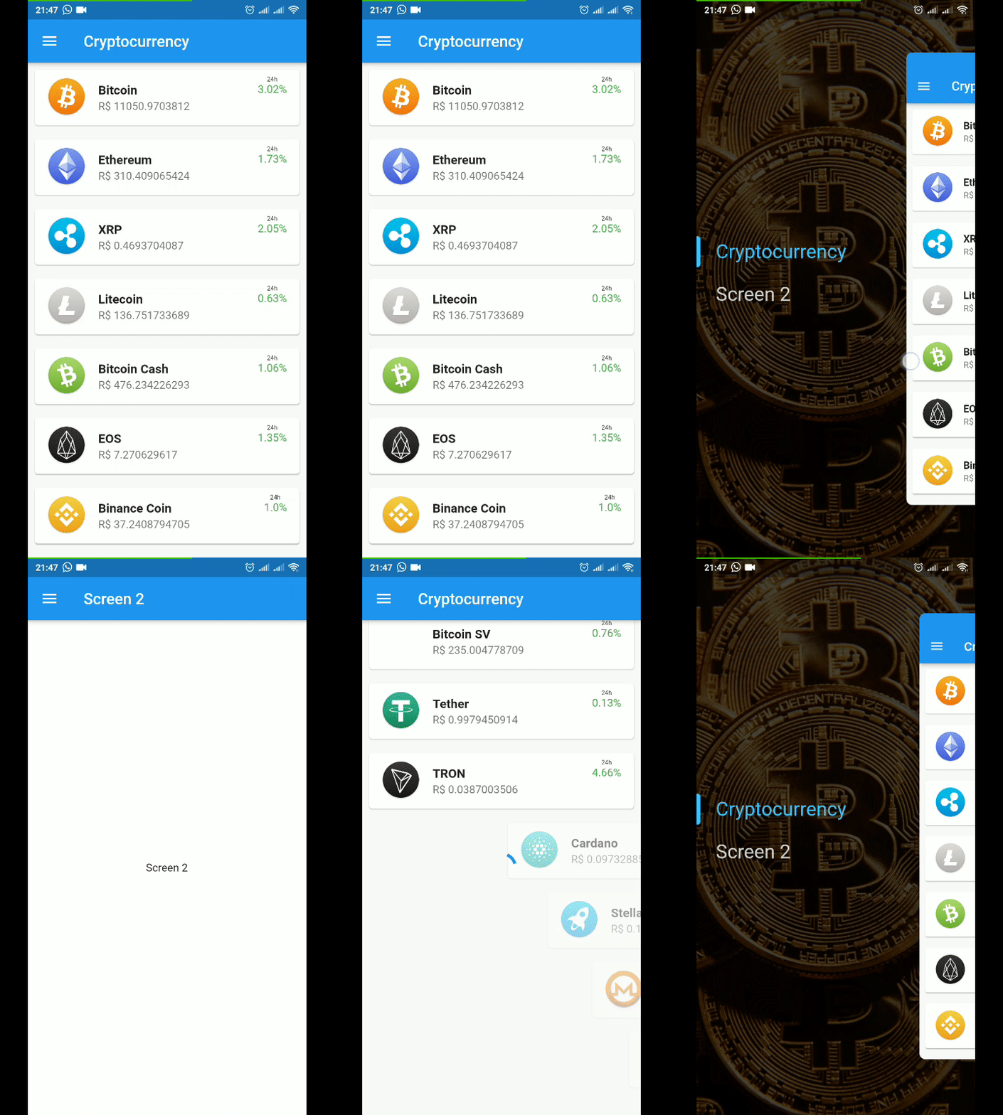
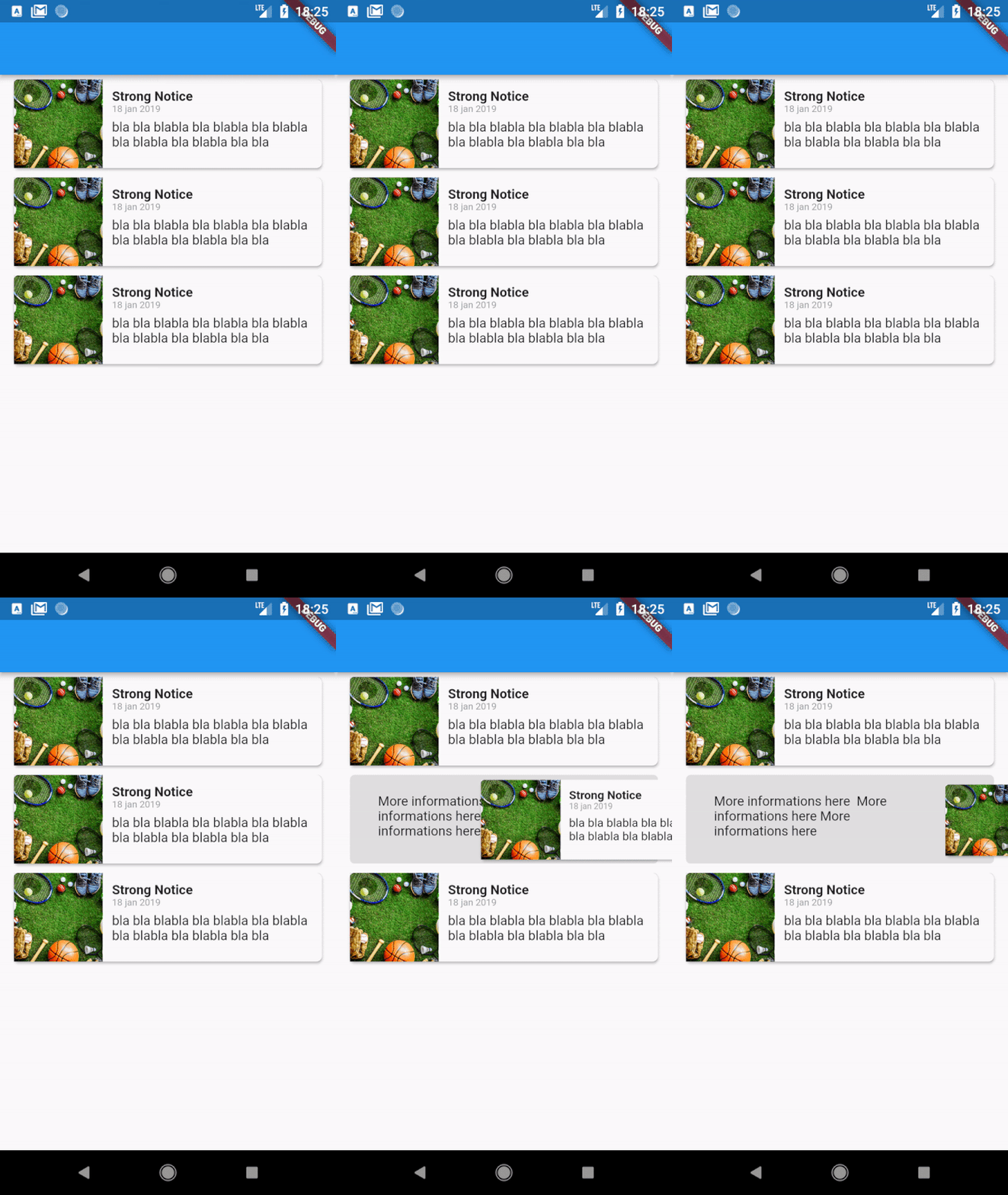
Hidden Drawer Menu
Hidden Drawer Menu is a library for adding a beautiful drawer mode menu feature with perspective animation.
You can use a pre-defined menu or make a fully customized menu.
Download APK Example
Use with default menu
import 'package:hidden_drawer_menu/model/hidden_drawer_menu.dart' ;
void main () => runApp (MyApp ());
class MyApp extends StatelessWidget @override
Widget build (BuildContext context) {
return MaterialApp (
theme: ThemeData (
primarySwatch: Colors .blue,
),
home: MyHomePage (),
);
}
}
class MyHomePage extends StatefulWidget MyHomePage ({Key key}) : super (key: key);
@override
_MyHomePageState createState () => _MyHomePageState ();
}
class _MyHomePageState extends State <MyHomePage > List <ScreenHiddenDrawer > itens = new List ();
@override
void initState () {
itens.add (new ScreenHiddenDrawer (
new ItemHiddenMenu (
name: "Screen 1" ,
baseStyle: TextStyle ( color: Colors .white.withOpacity (0.8 ), fontSize: 28.0 ),
colorLineSelected: Colors .teal,
),
FirstSreen ()));
itens.add (new ScreenHiddenDrawer (
new ItemHiddenMenu (
name: "Screen 2" ,
baseStyle: TextStyle ( color: Colors .white.withOpacity (0.8 ), fontSize: 28.0 ),
colorLineSelected: Colors .orange,
),
SecondSreen ()));
super .initState ();
}
@override
Widget build (BuildContext context) {
return HiddenDrawerMenu (
backgroundColorMenu: Colors .blueGrey,
backgroundColorAppBar: Colors .cyan,
screens: itens,
);
}
}
Use with full customization menu
import 'package:hidden_drawer_menu/model/hidden_drawer_menu.dart' ;
void main () => runApp (MyApp ());
class MyApp extends StatelessWidget @override
Widget build (BuildContext context) {
return MaterialApp (
theme: ThemeData (
primarySwatch: Colors .blue,
),
home: SimpleHiddenDrawer (
menu: Menu (),
screenSelectedBuilder: (position,controller) {
Widget screenCurrent;
switch (position){
case 0 : screenCurrent = Screen1 (); break ;
case 1 : screenCurrent = Screen2 (); break ;
case 2 : screenCurrent = Screen3 (); break ;
}
return Scaffold (
backgroundColor: backgroundColorContent,
appBar: AppBar (
leading: IconButton (
icon: Icon (Icons .menu),
onPressed: () {
controller.toggle ();
}),
),
body: screenCurrent,
);
},
),
);
}
}
class Menu extends StatefulWidget @override
_SecondSreenState createState () => _MenuState ();
}
class _MenuState extends State <SecondSreen > SimpleHiddenDrawerController controller;
@override
void didChangeDependencies () {
controller = SimpleHiddenDrawerController .of (context);
super .didChangeDependencies ();
}
@override
Widget build (BuildContext context) {
return Container (
width: double .maxFinite,
height: double .maxFinite,
color: Colors .cyan,
padding: const EdgeInsets .all (8.0 ),
child: Center (
child: Column (
mainAxisSize: MainAxisSize .min,
children: <Widget >[
RaisedButton (
onPressed: () {
controller.setSelectedMenuPosition (0 );
},
child: Text ("Menu 1" ),
),
RaisedButton (
onPressed: () {
controller.setSelectedMenuPosition (1 );
},
child: Text ("Menu 2" ),
)
],
),
),
);
}
}
Actions
This actions is only accessible by the children of HiddenDrawerMenu or SimpleHiddenDrawer.
Select item menu
SimpleHiddenDrawerController .of (context).setSelectedMenuPosition (0 );
Toggle menu (if opened will close, if closed will open)
SimpleHiddenDrawerController .of (context).toggle ();
Open
SimpleHiddenDrawerController .of (context).open ();
Close
SimpleHiddenDrawerController .of (context).close ();
Listen selected position
final controller = SimpleHiddenDrawerController .of (context);
controller.addListener ((){
print (controller.position);
});
Listen to menu status (closed,opening,open,closing)
final controller = SimpleHiddenDrawerController .of (context);
controller.addListener ((){
print (controller.state);
});
If you want to use only the widget responsible for the animation, it is now available as AnimatedDrawerContent
AnimatedDrawerController controller = AnimatedDrawerController (
vsync: this ,
animationCurve:Curves .decelerate,
duration:const Duration (milliseconds: 350 ,
);
return AnimatedDrawerContent (
controller: controller,
whithPaddingTop: false ,
whithShadow: false ,
isDraggable: true ,
child: Screen (),
);
You can control actions by controller such as:
controller.toggle ()
controller.open ()
controller.close ()
controller.move (percent)
Available settings
Menu
change BackgroundColor
set DecorationImage backgroud
enable Shadow above itens
Itens Menu
change colorText when selected
change colorText when unselected
change color lineleft selected
AppBar
change menu icon
change elavation
change BackgroundColor
set AutoTittleName
set actions
set widget in tittleAppBar
Content
change BackgroundColor
enable dragable
change curve animation