搜尋套件、儲存庫與 APP 分類

套件詳情v0.0.12

holdable_button

一個 Flutter 插件,可讓使用者建立具有按住手勢的按鈕,在按住時觸發按鈕周圍的載入動畫。

AndroidiOSWebmacOSWindowsLinux
近 30 天下載
84
喜歡數
30
Pub 分數
140

安裝套件

flutter pub add holdable_button

套件介紹

根據套件公開資料產生的選型評估,僅供參考。

HoldableButton 是一個 Flutter 套件,讓開發者能夠實現具有按住手勢的按鈕。當按鈕被按住並持續按壓時,按鈕周圍會觸發載入動畫,提供長時間互動的視覺反饋。它支援 Android、iOS、Web、macOS、Windows 和 Linux 多個平台,非常適合需要觸覺反饋的互動式 UI。此外,該套件輕量且易於整合,能提升表單、確認或需要刻意輸入操作的使用者體驗。

適用情境

  • 表單提交並確認
  • 需要刻意輸入的操作觸發
  • 長時間操作期間的加載狀態
  • 帶有反饋的互動式UI元素
  • 遊戲化應用互動

主要特色

  • 手勢檢測
  • 圓形載入動畫
  • 跨平台支援
  • 簡單整合
  • 可自訂的持續時間和外觀
  • 內建反饋機制

適合對象

  • 開發互動式表單的開發者
  • 需要確認手勢的應用
  • 以使用者體驗為導向的行動與網頁應用
  • 遊戲化應用
  • 快速原型互動流程

使用建議

  • 可能需要額外的樣式設定以實現自訂設計
  • 對低階裝置的效能影響
  • 僅限單按鈕按住行為
  • 不適合用於快速點擊的工作流程
  • 需要仔細配置時間以獲得最佳使用者體驗

原始 README

以下為關聯原始碼儲存庫的 README 原文快照,最新內容請造訪原始碼儲存庫。

Holdable Button Flutter Plugin

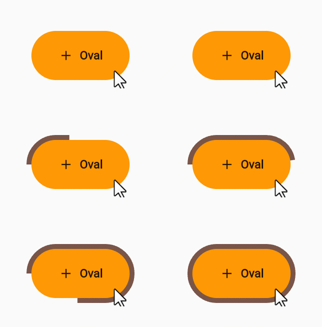
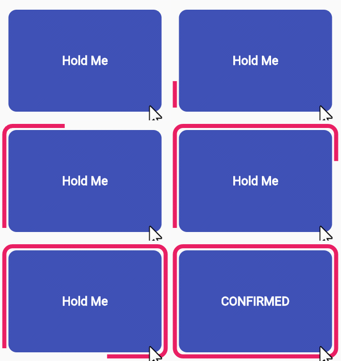
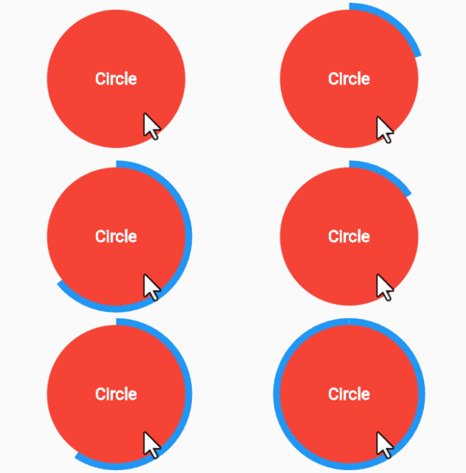
Holdable Button is a Flutter plugin that allows you to create interactive buttons with a unique animation. It enables users to hold a button, displaying a loading animation along its border, and then triggering a callback once the animation completes.

Demo 🎥

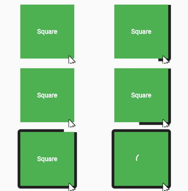
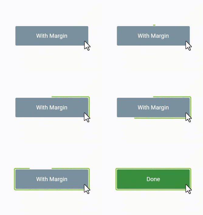
edge loading type:

voice oval

rectangle square

filling loading type:

long circle

Benefits 🚀

  • Interactive Animation: Engage users with a button that responds to long presses, offering an interactive and visually appealing experience.

  • Customizable: Tailor the button to match your app's design by adjusting parameters such as button color, loading color, border radius, child widget, animation duration, and start position.

  • User Engagement: Encourage users to interact with your app by introducing a novel way to trigger actions.

How to Use 🛠️

  1. Add the Holdable Button plugin to your pubspec.yaml file:

    dependencies:
      holdable_button: any
    
  2. Install the plugin by running:

    flutter pub get
    
  3. Import the package in your Dart code:

    import 'package:holdable_button/holdable_button.dart';
    
  4. Implement the HoldableButton widget:

    HoldableButton(
      loadingType: LoadingType.edgeLoading,
      width: 300,
      height: 200,
      buttonColor: Colors.blue,
      loadingColor: Colors.white,
      radius: 15.0,
      child: Text('Hold Me'),
      duration: 5,
      startPoint: 0.25,
      hasVibrate: true,
      onConfirm: () {
        // Callback when animation completes
      },
    )
    

Customization ⚙️

The HoldableButton widget supports the following parameters:

  • loadingType: the loading type: edgeLoading or fillingLoading.
  • buttonColor: The color of the button.
  • loadingColor: The color of the loading animation.
  • radius: The border radius of the button.
  • child: The widget inside the button.
  • duration: The duration of the animation in seconds.
  • startPoint: Start position in edgeLoading type.
  • hasVibrate: Enable Vibration after loading complete.
  • onConfirm: Callback when the animation completes.

Feel free to experiment with these parameters to achieve the desired look and behavior.

Contributing 🤝

Contributions are welcome! Please feel free to submit issues or pull requests.

所屬分類

依賴

依賴清單 2 項

  • plugin_platform_interface^2.1.7
  • web^1.0.0

原始碼儲存庫

使用此套件的專案

暫無相關資料。