搜尋套件、儲存庫與 APP 分類

info_popup 封面
套件詳情v4.3.2

info_popup

在您選擇的組件上向使用者顯示一些資訊的簡單方式。

AndroidiOSWebmacOSWindowsLinux
近 30 天下載
4.6萬
喜歡數
165
Pub 分數
150

安裝套件

flutter pub add info_popup

套件介紹

根據套件公開資料產生的選型評估,僅供參考。

InfoPopup 是一個輕量級的 Flutter 套件,讓開發者能輕鬆地在任何組件上顯示資訊彈窗,設定簡單。它提供一種乾淨且可自訂的方式,向使用者展示上下文資訊,透過在 UI 元素上直接提供提示或引導來提升使用者體驗。此套件支援 Android、iOS、Web、macOS、Windows 與 Linux 多個平台,確保在不同裝置上行為一致。透過單一指令即可輕鬆整合,非常適合加入微妙但有效率的使用者回饋機制。

適用情境

  • 在按鈕上顯示工具提示
  • 提供上下文相關的幫助
  • 增強表單欄位指引
  • 改進入職體驗
  • 新增互動式提示
  • 顯示狀態說明

主要特色

  • 簡單的單行整合
  • 可自定義彈出內容
  • 跨平台相容性
  • 支援各種小工具目標
  • 可設定定位
  • 輕便且快速

適合對象

  • 尋求快速反饋工具的UI/UX設計師
  • 開發教育類應用的開發者
  • 專注於可存取性的團隊
  • 需要直覺式使用者引導的應用程式
  • 開發週期緊張的專案

使用建議

  • 僅限基本彈出樣式
  • 無內建動畫自訂
  • 最適合小段文字內容
  • 可能需要手動調整位置
  • 不適合複雜的模態互動

原始 README

以下為關聯原始碼儲存庫的 README 原文快照,最新內容請造訪原始碼儲存庫。

Introduction

The info_popup package allows you to easily show a simple, customizable popup on your wrapped widget. The highlight feature, which can be activated at will, helps draw the user's attention to the desired location.

You can test it now on the Info Popup preview page. Note that the website experience may be different.

Features

  • Display a customizable popup on your wrapped widget
  • Activate the highlight feature to draw the user's attention to the desired location
  • Fully customize the content of the popup
  • Add margins to the popup from any side

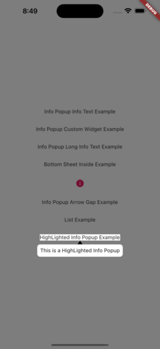
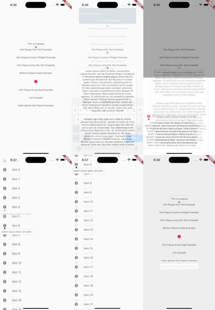
MainPresentation HighlightExample

Getting Started

To use this package, add info_popup as a dependency in your pubspec.yaml file.

dependencies:
  info_popup: ^3.0.0

Alternatively, you can add it to your project by running the following commands in your terminal:

with Dart:

$ dart pub add info_popup

with Flutter:

$ flutter pub add info_popup

Usage

To show a popup, wrap the widget that you want to display the popup on with the InfoPopupWidget widget. All you have to do is wrap it in the widget you want to show information with the InfoPopupWidget widget. With the InfoPopupController, you can customize it as you wish, and turn it on and off.

import 'package:info_popup/info_popup.dart';
	InfoPopupWidget(
		contentTitle: 'Info Popup Details',
		child: Icon(
			Icons.info,
			color: Colors.pink,
		),
	),

Example

This is a normal info text displayed using the InfoPopupWidget widget with several optional parameters.

              InfoPopupWidget(
                contentTitle: 'Info Popup Details',
                arrowTheme: InfoPopupArrowTheme(
                  color: Colors.pink,
                  arrowDirection: ArrowDirection.up,
                ),
                contentTheme: InfoPopupContentTheme(
                  infoContainerBackgroundColor: Colors.black,
                  infoTextStyle: TextStyle(color: Colors.white),
                  contentPadding: const EdgeInsets.all(8),
                  contentBorderRadius: BorderRadius.all(Radius.circular(10)),
                  infoTextAlign: TextAlign.center,
                ),
                dismissTriggerBehavior: PopupDismissTriggerBehavior.onTapArea,
                areaBackgroundColor: Colors.transparent,
                indicatorOffset: Offset.zero,
                contentOffset: Offset.zero,
                onControllerCreated: (controller) {
                  print('Info Popup Controller Created');
                },
                onAreaPressed: (InfoPopupController controller) {
                  print('Area Pressed');
                },
                infoPopupDismissed: () {
                  print('Info Popup Dismissed');
                },
                onLayoutMounted: (Size size) {
                  print('Info Popup Layout Mounted');
                },
                child: Icon(
                  Icons.info,
                  color: Colors.pink,
                ),
              ),

"This is a custom popup example created using the InfoPopupWidget widget.

Custom Popup Widget
              InfoPopupWidget(
                customContent: Container(
                  decoration: BoxDecoration(
                    color: Colors.blueGrey,
                    borderRadius: BorderRadius.circular(10),
                  ),
                  padding: const EdgeInsets.all(10),
                  child: Column(
                    children: const <Widget>[
                      TextField(
                        decoration: InputDecoration(
                          hintText: 'Enter your name',
                          hintStyle: TextStyle(color: Colors.white),
                          enabledBorder: OutlineInputBorder(
                            borderSide: BorderSide(color: Colors.white),
                          ),
                        ),
                      ),
                      SizedBox(height: 10),
                      Center(
                        child: Text(
                          'Example of Info Popup inside a Bottom Sheet',
                          style: TextStyle(
                            color: Colors.white,
                          ),
                        ),
                      ),
                    ],
                  ),
                ),
                arrowTheme: const InfoPopupArrowTheme(
                  color: Colors.pink,
                  arrowDirection: ArrowDirection.up,
                ),
                dismissTriggerBehavior: PopupDismissTriggerBehavior.onTapArea,
                areaBackgroundColor: Colors.transparent,
                indicatorOffset: Offset.zero,
                contentOffset: Offset.zero,
                onControllerCreated: (controller) {
                  print('Info Popup Controller Created');
                },
                onAreaPressed: (InfoPopupController controller) {
                  print('Area Pressed');
                },
                infoPopupDismissed: () {
                  print('Info Popup Dismissed');
                },
                onLayoutMounted: (Size size) {
                  print('Info Popup Layout Mounted');
                },
                child: Icon(
                  Icons.info,
                  color: Colors.pink,
                ),
              ),

Conclusion

The info_popup package provides a simple and effective way to show a customizable popup on your wrapped widget. With the highlight feature, you can draw the user's attention to the desired location.

License

This project is licensed under the MIT License - see the LICENSE file for details.

所屬分類

原始碼儲存庫

使用此套件的專案

暫無相關資料。