搜尋套件、儲存庫與 APP 分類

input_slider 封面
套件詳情v0.3.1

input_slider

一個可自訂的輸入框,用於同步滑塊和文字欄位。

AndroidiOSWebmacOSWindowsLinux
近 30 天下載
435
喜歡數
25
Pub 分數
150

安裝套件

flutter pub add input_slider

套件介紹

根據套件公開資料產生的選型評估,僅供參考。

input_slider 套件提供了一個同步輸入元件,將滑塊與文字欄連結起來,確保使用者與任一元件互動時兩者保持同步。此套件高度可自訂,讓開發者能調整外觀、範圍、步幅與格式化。適用於需要精確數值輸入並具備視覺反饋的表單,支援所有主要平台,包含行動裝置、網頁與桌面端。該套件簡化了直覺式數字輸入的建立,無需手動同步邏輯。

適用情境

  • 需要精確數值的表單輸入
  • 帶有視覺滑塊的互動設定
  • UI 元素之間的同步數值輸入
  • 可自定義的儀表板輸入欄位
  • 應用程式中的即時值調整
  • 跨平台數值輸入組件

主要特色

  • Slider 與 TextField 之間的雙向同步
  • 可自訂的範圍和步長值
  • 支援小數與整數輸入
  • 平台無關設計
  • 可擴充的樣式選項
  • 內建驗證和格式化

適合對象

  • 開發互動式表單的開發者
  • 需要響應式數值輸入的設計人員
  • 需要一致使用者輸入處理的應用程式
  • 跨平台 Flutter 應用程式
  • 具備即時反饋的 UI 元件

使用建議

  • 需要仔細處理小數精確度
  • 可能需要額外的驗證來處理邊緣情況
  • 不適合非數值資料類型
  • 僅限數值輸入使用案例
  • 頻繁更新可能帶來的效能影響
  • 依賴外部相依性以實現完整功能

原始 README

以下為關聯原始碼儲存庫的 README 原文快照,最新內容請造訪原始碼儲存庫。

Pub

input_slider

While Sliders offer a quick and visual way to change a value, it can be hard to achieve precise inputs with them. Additionally, some users really dislike Sliders, and especially on small devices they can get quite fiddly. One way to use the advantages of having a Slider while minimizing the drawbacks is to add an additional alternativ (text) input field.

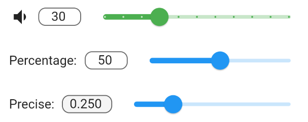
This packages InputSlider combines a TextField with a Slider and synchronizes both of them. They share the same minimum and maximum values and changes made to one also changes the other. Optionally, you can also specify a leading widget, such as a label Text or Icon.

grafik

Usage

InputSlider(
  onChange: (value) => print("change: $value"),
  min: 0.0,
  max: 100.0,
  decimalPlaces: 0,
  value: 50.0,
  leading: Text("Percentage:"),
)

Input Slider Forms

You can group multiple InputSlider together using an InputSliderForm. By specifying leadingWeight and sliderWeight it is possible to align them together. They can be also styled together or individually.

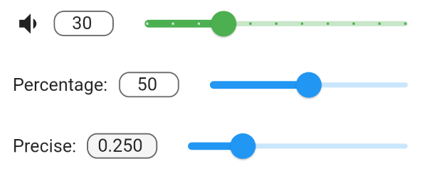
InputSliderForm(
    leadingWeight: 1,
    sliderWeight: 20,
    activeSliderColor: Colors.red,
    inactiveSliderColor: Colors.green[100],
    filled: true,
    vertical: true,
    children: [
      InputSlider(
        onChange: (value) {
          print("Setting 1 changed");
        },
        min: 0.0,
        max: 10.0,
        decimalPlaces: 0,
        defaultValue: 5.0,
        leading: Text("Setting 1:"),
      ),
      InputSlider(
        onChange: (value) {
          print("Setting 2 changed");
        },
        min: 0.0,
        max: 1.0,
        decimalPlaces: 3,
        defaultValue: 0.32,
      ),
)

Sliders can be rotated by 90 degrees by setting vertical=true. This can be done to individual InputSliders or to InputSliderForms.

photo_2021-07-10_13-54-59

所屬分類

原始碼儲存庫

使用此套件的專案

暫無相關資料。