搜尋套件、儲存庫與 APP 分類

list_tile_switch 封面
套件詳情v1.0.0

list_tile_switch

一個簡單卻優雅的組件結合了 Material ListTile 與自訂及原生的 Material 和 Cupertino 開關實作。

AndroidiOSWebmacOSWindowsLinux
近 30 天下載
458
喜歡數
75
Pub 分數
150

安裝套件

flutter pub add list_tile_switch

套件介紹

根據套件公開資料產生的選型評估,僅供參考。

一個 Flutter 套件,可無縫整合 Material Design ListTile 與可自訂的原生風格開關,支援 Material 和 Cupertino 風格。它提供一種簡潔優雅的解決方案,用於建立具有一致跨平台外觀的可切換清單項目。此組件設計旨在透過輕量級且易於使用的功能,提升使用者體驗,兼具功能性與美學吸引力。非常適合在設定或偏好設定畫面中頻繁使用開關的場景。

適用情境

  • 設定介面
  • 首選項面板
  • 可切換的列表項目
  • 使用者設定檔設定
  • 表單控件

主要特色

  • 可自訂的 Material 和 Cupertino 開關
  • 無縫 ListTile 集成
  • 跨平台一致性
  • 輕量且高效
  • 容易實現
  • 樣式彈性

適合對象

  • 開發設定螢幕的開發者
  • 尋求原生樣式的切換開關的設計人員
  • 需要跨平台切換元件的應用程式
  • 強調介面潤飾的專案

使用建議

  • 需要 Flutter 3.0+
  • 僅限開關特定功能
  • 除了標準轉換外,沒有內建動畫
  • 複雜佈局可能需要額外的樣式

原始 README

以下為關聯原始碼儲存庫的 README 原文快照,最新內容請造訪原始碼儲存庫。

ListTileSwitch

Build Status Codemagic build status Coverage Status

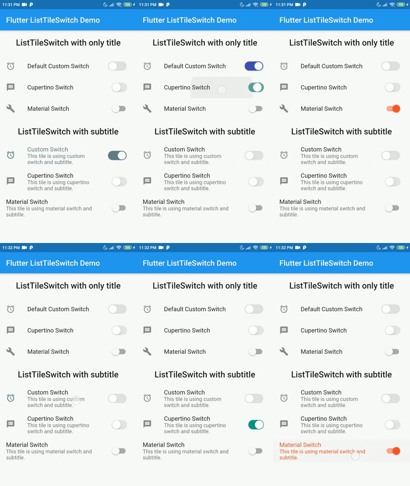
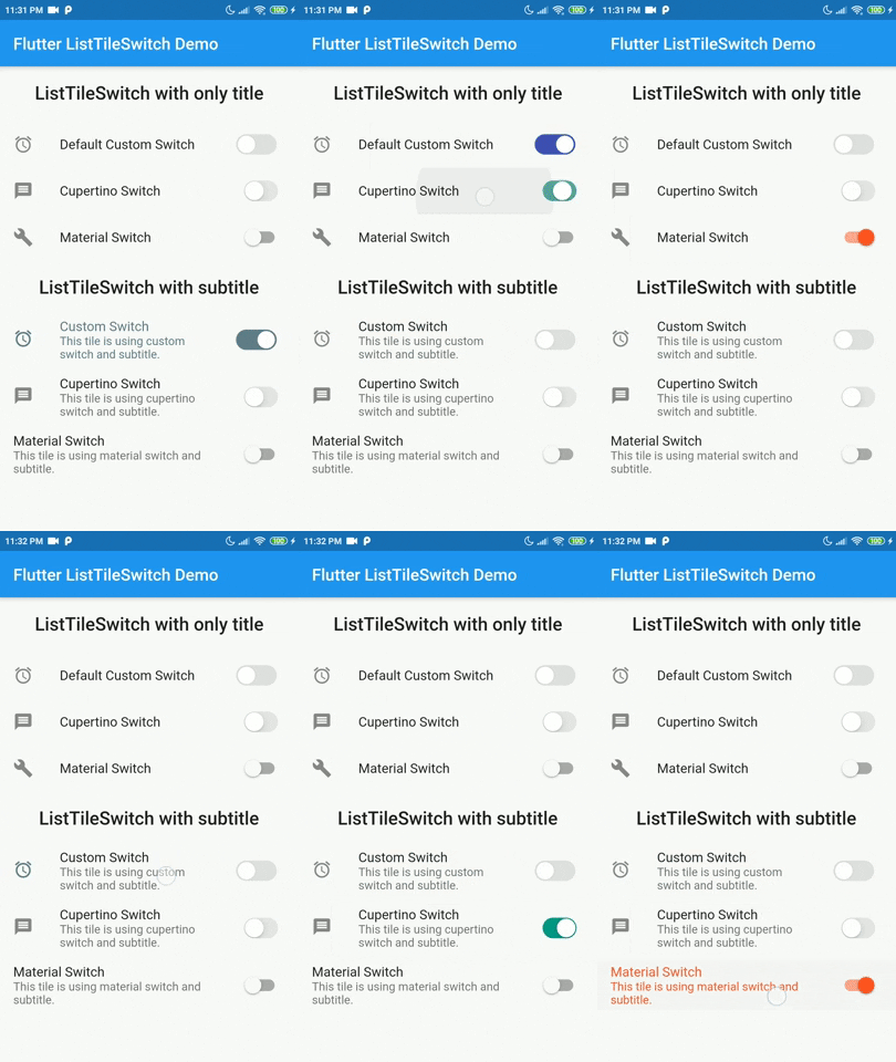
ListTileSwitch is a simple widget that combines ListTile with a switch. Offering 3 types of switch widgets:

  1. Switch: Material Switch from Material library on Flutter SDK.
  2. CupertinoSwitch: CupertinoSwitch from Cupertino library on Flutter SDK.
  3. A custom switch.

Demo

Tested on Android and Web but not iOS. Theoritacially it should work on iOS devices too, since this package contains nothing but pure Dart and Flutter components.

Installation

Add dependency for package on your pubspec.yaml:

dependencies:
    list_tile_switch: <latest>

Usage

Use it as a regular ListTile widget with a bonus: the trailing widget is a switch. Covering all aspects of the ListTile and adding more with a custom switch.

Parameter Definition
double switchScale Adjusting the scale of the switch widget.
Color switchActiveColor The color of the switch when the switch is active.
bool toggleSelectedOnValueChange Deciding whether to color the ListTile when switch value is true, the selected color will be the switchActiveColor.
Color switchInactiveColor Color when the switch is inactive.
SwitchType switchType Indicating the type of switch to be displayed.
bool value Current state of the switch value.
onChanged(bool) Toggle callback for the widget.
Widget leading, Widget title, Widget subtitle, Widget isThreeLine, EdgeInsetsGeometry contentPadding, VoidCallback onLongPress, VisualDensity visualDesnsity, bool dense, bool enabled, FocusNode focusNode, bool autoFocus, bool selected, Color focusColor, Color hoverColor, MouseCursor mouseCursor Referring to the original implementation of ListTile from Flutter SDK, all of the values are mapped directly to the ListTile widget internally.

Example

import 'package:flutter/material.dart';  
import 'package:list_tile_switch/list_tile_switch.dart';  
  
void main() {  
  runApp(MyApp());  
}  
  
class MyApp extends StatelessWidget {  
  @override  
  Widget build(BuildContext context) {  
  return MaterialApp(  
  title: 'Flutter ListTileSwitch Demo',  
  debugShowCheckedModeBanner: false,  
  theme: ThemeData(  
  primarySwatch: Colors.blue,  
  visualDensity: VisualDensity.adaptivePlatformDensity,  
 ),  home: ListTileSwitchExample(title: 'Flutter ListTileSwitch Demo'),  
 ); }}  
  
class ListTileSwitchExample extends StatefulWidget {  
  ListTileSwitchExample({Key key, this.title}) : super(key: key);  
  final String title;  
  @override  
  _ListTileSwitchExampleState createState() => _ListTileSwitchExampleState();  
}  
  
class _ListTileSwitchExampleState extends State<ListTileSwitchExample> {  
  bool _value = false;  
  @override  
  Widget build(BuildContext context) {  
    return Scaffold(  
	  appBar: AppBar(  
		title: Text(widget.title),  
	  ),
	  body: ListTileSwitch(  
	    value: _value,  
		leading: Icon(Icons.access_alarms),  
		onChanged: (value) {  
		  setState(() {  
			_value = value;  
		  });
		},
		visualDensity: VisualDensity.comfortable,
		switchType: SwitchType.cupertino,
		switchActiveColor: Colors.indigo,  
		title: Text('Default Custom Switch'),  
	 ),
   );
}}

Todo

The list of additional features that are considered to be implemented in the future.

  • [ ] Creating more tests
  • [ ] Add interactivity to custom switch widget
  • [ ] Make custom switch more configurable
    • [ ] Configurable thumb shape
    • [ ] Configurable track shape
    • [ ] Scaling animation on value change

Contribution

Contributions are accepted via pull requests. For more information about how to contribute to this package, please check the contribution guide.

License

This project is licensed under the MIT license, additional knowledge about the license can be found here.

所屬分類

原始碼儲存庫

使用此套件的專案

暫無相關資料。