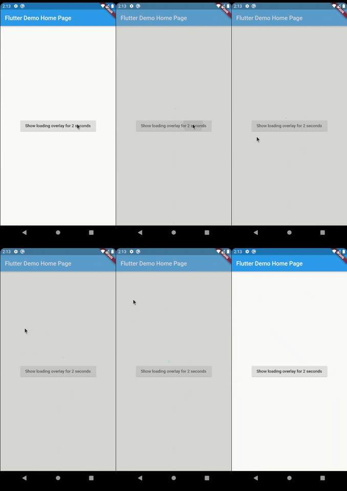
LoaderOverlay 是一個 Flutter 套件,可簡化異步操作期間的螢幕管理。它會顯示一個載入覆蓋層,以防止使用者在執行 API 呼叫或資料處理等任務時進行互動。此覆蓋層可輕鬆切換開啟與關閉,確保在任務完成前阻擋輸入,從而提供流暢的使用者體驗。支援所有主要平台,包括 Android、iOS、Web、macOS、Windows 和 Linux。非常適合在載入狀態下改善使用者體驗,而無需複雜的自訂實作。
適用情境
在非同步操作期間阻止UI
防止加載期間意外點擊
在表單中顯示加載指示器
管理長時間執行的後台任務
提升應用程式的回應速度
簡化載入狀態處理
主要特色
簡單覆蓋啟用
自動UI阻塞
跨平台支援
輕鬆整合非同步任務
可自訂的載入外觀
非侵入式設計
適合對象
尋求快速加載覆蓋層的開發者
頻繁異步操作的應用程式
需要清晰加載反饋的 UI
注重使用者體驗一致性的團隊
專案需要最少的樣板程式碼
使用建議
可能需要手動關閉覆蓋層
有限的自定選項
頻繁切換可能帶來的效能影響
不適合複雜的加載動畫
依賴於正確的非同步任務協調
原始 README
以下為關聯原始碼儲存庫的 README 原文快照,最新內容請造訪原始碼儲存庫。
Introduction
Have you ever found yourself in the situation of doing some async processing your screen and wanting
to prevent the user from interacting with the screen while the application is loading? If so, this
package was made just for you.
Basic Usage
The most simple usage is just wrap the widget that you want an overlay on LoaderOverlay. Default
loader will be shown.
This simple step will already configure the loader overlay for use.
After that configuration you can just call:
context.loaderOverlay.show();
This will show the overlay with the default loading indicator. The default loading configured is to
just show a centered CircularProgressIndicator
To hide the overlay (after the async processing, for example), just call:
context.loaderOverlay.hide();
You can check if overlay is visible:
final isVisible = context.loaderOverlay.visible;
*Note: You will always need the context to show or hide the loader overlay
Basic Usage on Navigation
To use this package with named routes you can just wrap your MaterialApp with GlobalLoaderOverlay.
This widget has all the features of LoaderOverlay but it is provided for all the routes of the app.
Your overlay loader widget can be any widget you want. For example you can import the
package flutter_spinkit and customise your widget like this.
To do that just pass your widget to overlayWidget and set useDefaultLoading to false.
Another customisation you can do is configure the color and opacity of the overlay.
The default opacity is grey with 0.4 opacity, but you can change it with
the overlayColor: Colors.yellow.withValues(alpha: 0.8).
If you pass widget to context.loaderOverlay.show, then defaultLoader and widgetOverlay will be
ignored;
Progress
If you want to show some progress while the loader overlay is visible, you can do it with the
context.loaderOverlay.show(progress: 'Doing progress #0',) for an initial progress, and with
context.loaderOverlay.progress('Doing progress #1'); every time the progress need to change.
Both this methods pass the progress to the current widgetBuilder on every call.
You can also remove by complete the overlayColor (set to transparent), set the useDefaultLoading to false,
and use a fully personalized overlayWidgetBuilder to make your own 100% customizable overlay.
By default, the overlay does not animate in or out. You can enable animations by passing the
appropriate parameters to LoaderOverlay. Internally, an AnimatedSwitcher is used to manage
animations, so the parameters are passed directly to the AnimatedSwitcher. By specifying
a duration and reverseDuration, the overlay will animate in and out using a fade (the default
transition used by AnimatedSwitcher). You can also pass curves, a transition builder and a layout
builder for further customisation.