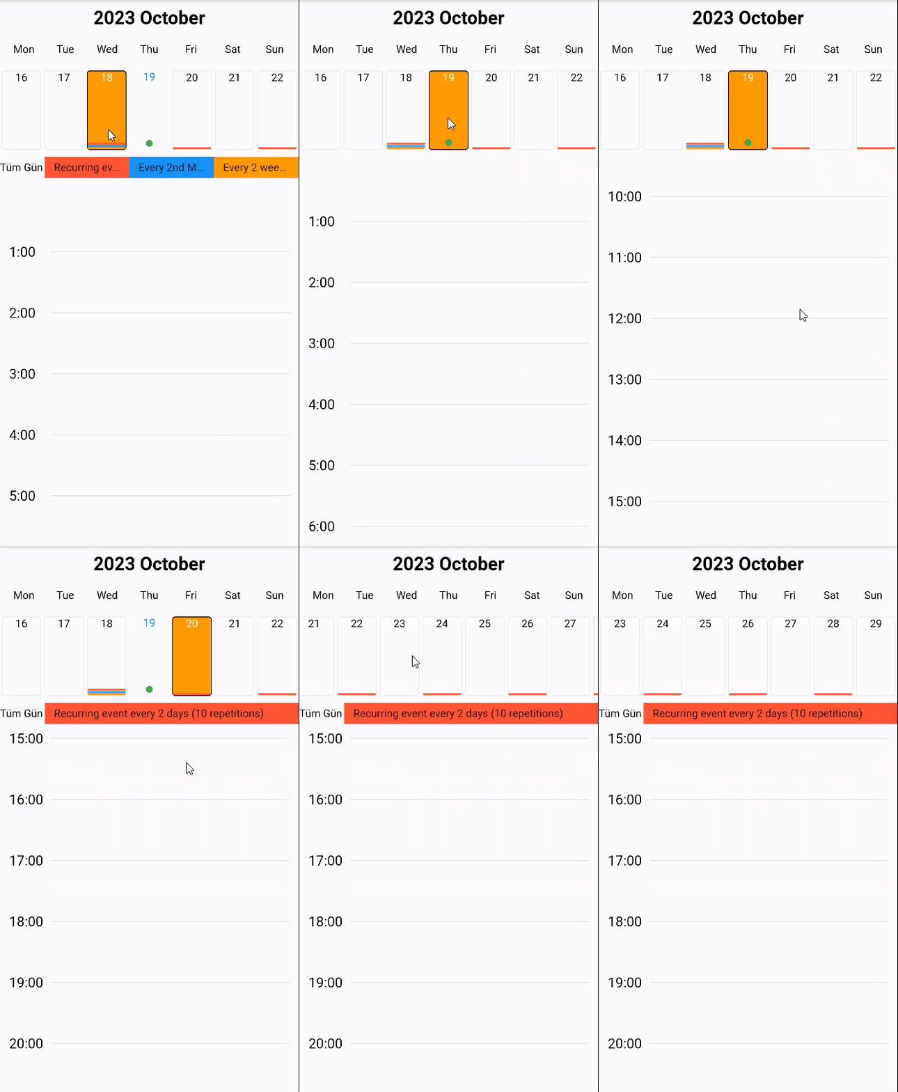
-
String? title - The title you want to appear at the top of the calendar.
-
String? locale - It determines in which locale the calendar will work.
-
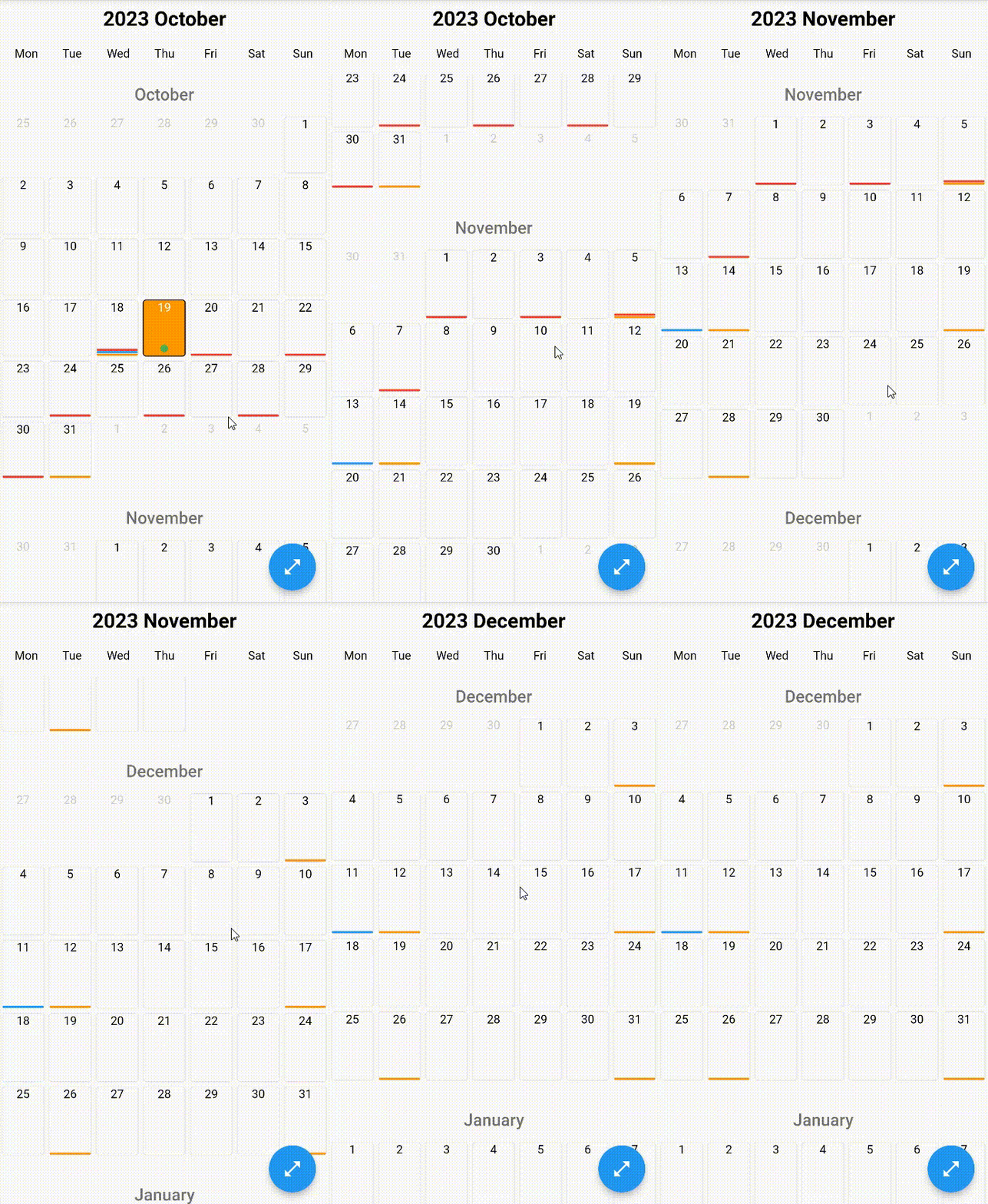
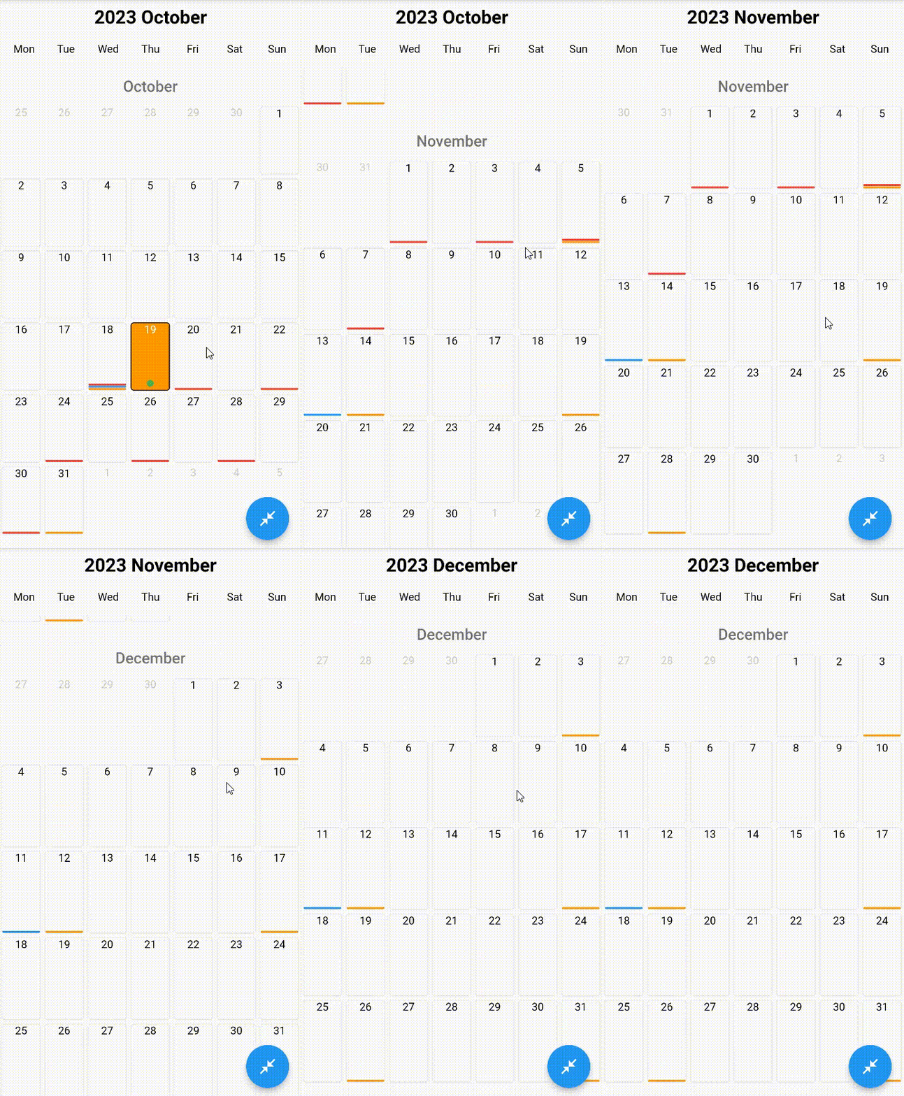
bool showAllDays - Whether the calendar will show all days
-
bool disableOffDays - Turns off all dates of the calendar
-
bool disableWeekendsDays - Whether to show the bar showing the days of the week above the calendar
-
List<int>? disableWeekDays - It determines which days of the week to disable
-
DateTime? disableBefore - The calendar closes before the specified date.
-
DateTime? disableAfter - The calendar closes after the specified date.
-
List<DateTime>? disabledDates - Specifies which types the calendar will turn off.
-
EdgeInsetsGeometry itemSpace - Space inside the cells of the calendar
-
Duration animationDuration - Animation Duration
-
Color enabledColor - The color that the active days of the calendar will have
-
Color disabledColor - The color that the inactive days of the calendar will have
-
Color selectedColor - The color that the selected days of the calendar will have
-
Color primaryColor - The main theme color of your calendar
-
Color gridBorderColor - Determines the grid border color on the calendar
-
BorderRadiusGeometry borderRadius - If non-null, the corners of this box are rounded.
-
Color weekDaysBarBorderColor - Determines the border color of the WeekDaysBar.
-
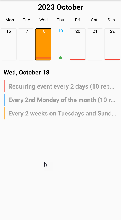
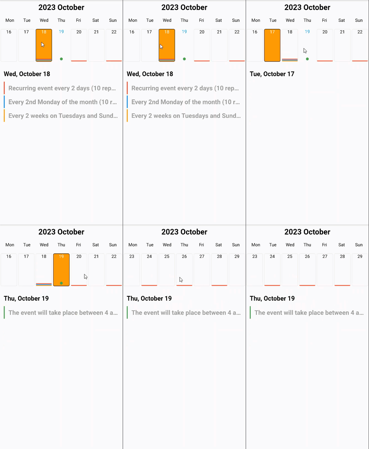
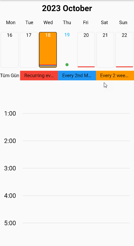
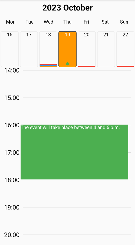
MobkitCalendarViewType mobkitCalendarViewType - Determines what appearance the calendar will have.
- (Enum) monthly
Monthly view
- (Enum) weekly
Weekly view
- (Enum) daily
Daily view
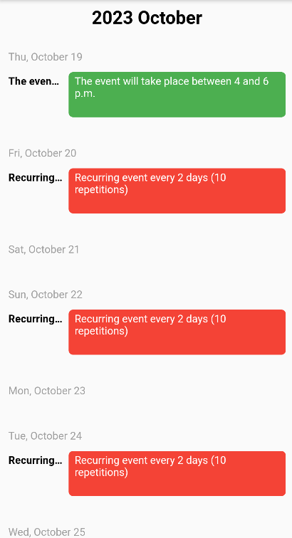
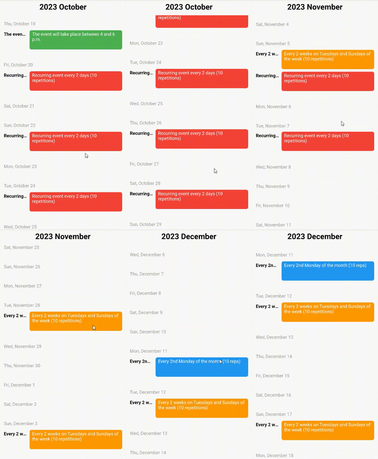
- (Enum) agenda
Agenda view
-
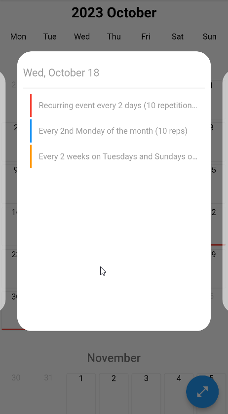
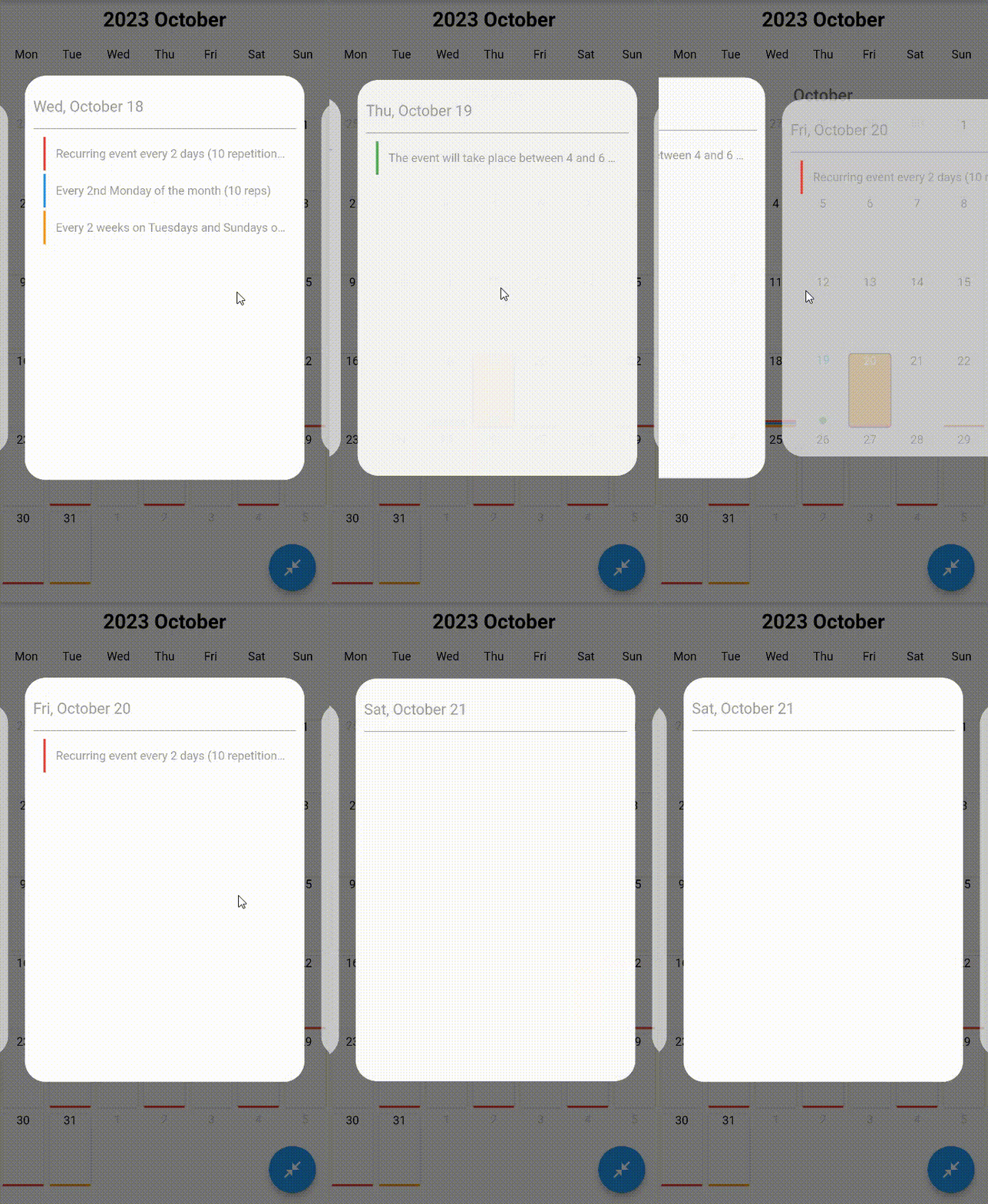
bool popupEnable - Determines whether a popup will open when the event is clicked.
-
CalendarPopupConfigModel calendarPopupConfigModel - It allows you to customize the Popup that will open when the event is clicked.
- (double) popupHeight
Popup height
- (double) popupWidth
Popup width
- (BoxDecoration) popUpBoxDecoration
Popup decoration
- (bool) popUpOpacity
Popup Opacity
- (int) animateDuration
Popup animation duration
- (double) popupSpace
Popup space
- (double) verticalPadding
Padding to be applied to the popups that appear on the sides.
- (double) viewportFraction
Determines the spreading rate of the opened carousel relative to the screen.
-
double viewportFraction - It represents the proportion of how much space the first month on the screen will take up.
-
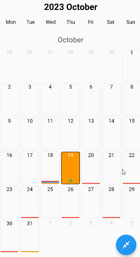
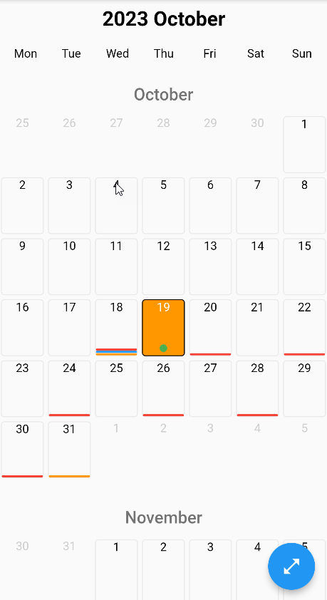
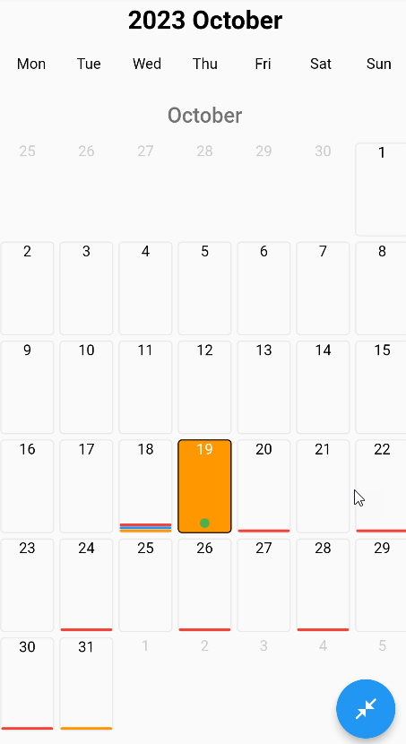
bool? showEventOffDay - Determines whether events will be shown on double when the view is closed.
-
bool? monthBetweenPadding - It represents Padding to be applied between two months.
-
double? agendaDayBetweenPadding - Specifies the gap to be applied between days in the Agenda view.
-
bool? showEventLineMaxCountText - It determines the appearance of the number of events that cannot be shown in the event line marked in the calendar box.
-
bool? showEventPointMaxCountText - It determines the appearance of the number of events that cannot be shown in the event point marked in the calendar box.
-
double? weeklyTopWidgetSize - Determines the size of the widget above in the weekly view.
-
double? dailyTopWidgetSize - Determines the size of the widget above in the daily view.
-
CalendarCellConfigModel cellConfig - It allows you to customize the box where the dates are written.
- (CalendarCellStyle) selectedStyle
- (CalendarCellStyle) enabledStyle
- (CalendarCellStyle) disabledStyle
- (CalendarCellStyle) currentStyle
- (CalendarCellStyle) weekendStyle
- (CalendarCellStyle) cellConfig
It allows you to give different styles to the box where dates with different statuses are written.
- (double) eventPointRadius
It determines the radius of the events shown with a round dot.
- (double) spaceBetweenEventLines
It provides the space between the events specified by the line.
- (double) spaceBetweenEventLineToPoint
It determines the gap between the events specified with a line and the events specified with a circle dot.
- (double) spaceBetweenEventPoints
It determines the spacing between the events specified with a circle dot.
- (double) eventLineHeight
Determines the line heights of events specified with lines.
- (BorderRadius) eventLineRadius
It determines the radius around the edges of the events specified with lines.
- (int) maxEventPointCount
It determines the maximum number of events specified with a circle dot to be shown.
- (int) maxEventLineCount
It determines the maximum number of events specified with lines to be displayed.
-
CalendarTopBarConfigModel topBarConfig - It allows you to customize the widgets drawn at the top of the calendar and located in the top bar.
- (bool?) isVisibleMonthBar
Determines whether the month information section appears in the Top Bar section.
- (bool?) isVisibleYearBar
Determines whether the year information section appears in the Top Bar section.
- (bool?) isVisibleWeekDaysBar
Determines whether the weekdays information section appears in the Top Bar section.
- (bool?) isVisibleHeaderWidget
Determines the appearance of the header widget in the Top Bar section
- (bool?) isVisibleTitleWidget
Determines the appearance of the title widget in the Top Bar section
- (TextStyle) monthDaysStyle
It determines the spelling styles of the days of the month in the ball bar.
- (TextStyle) weekDaysStyle
It determines the spelling styles of the days of the week in the ball bar.
-
DailyItemsConfigModel dailyItemsConfigModel - It allows you to customize the widgets drawn at the top of the calendar and located in the top bar.
- (String?) allDayText
It determines what is written in the status section of all-day events.
- (TextStyle?) allDayTextStyle
It determines the style of the text in the status section of all-day events.
- (TextStyle?) hourTextStyle
It determines the style in the section where the time of events is specified in the daily view.
- (EdgeInsets?) allDayMargin
It determines Margin between the events that are all day in daily appearance.
- (FrameStyle?) allDayFrameStyle
- (FrameStyle?) itemFrameStyle
- (FrameStyle) frameStyle
It allows you to customize all day events in the daily view.
- (TextStyle?) textStyle
It determines the text style of the entire day or special items in the daily view.
- (EdgeInsets?) padding
It determines the space between all day or special items in the daily view.
- (Border?) border
It determines the border around the entire day or special items in the daily view.
- (BorderRadius?) borderRadius
It determines the border radius around the edges of the entire day or special items in the daily view.
- (Color?) color
It determines the colors of the whole day or special items in the daily view.
- (Alignment?) alignment
Determines the alignment of the entire day or special items in the daily view.
- (TextAlign?) textAlign
Determines the text alignment of the entire day or special items in the daily view.
- (double) space
Determines the space between items in the daily view.
-
AgendaViewConfigModel agendaViewConfigModel - Allows you to customize the agenda view.
- (DateTime?) startDate
It determines the starting date in the range from which data will be captured in the agenda view.
- (DateTime?) endDate
It determines the ending date in the range from which data will be captured in the agenda view.
- (String?) dateFormatPattern
Determines the writing format of dates in the agenda view.
- (TextStyle?) titleTextStyle
It determines the writing style in the title section of events in the agenda view.
- (TextStyle?) detailTextStyle
It determines the writing style in the detail section of events in the agenda view.
- (TextStyle?) dateTextStyle
It determines the writing style in the date section of events in the agenda view.
-
TextStyle enableStyle - The textstyle that the active days of the calendar will have
-
TextStyle monthDaysStyle - The textstyle that the days of the month will have in the calendar.
-
TextStyle weekDaysStyle - The textstyle that the days of the week will have in the calendar
-
TextStyle disabledStyle - The textstyle that the inactive days of the calendar will have
-
TextStyle currentStyle - The textstyle that today's date will have
-
TextStyle selectedStyle - The textstyle that the selected days in the calendar will have.