搜尋套件、儲存庫與 APP 分類

neon_circular_timer 封面
套件詳情v0.0.8

neon_circular_timer

一個幫助您快速建立計時器的套件,擁有美觀的使用者介面,高度可自訂,您可以變更計時器的顏色、粗細以及時鐘文字樣式。

AndroidiOSWebmacOSWindowsLinux
近 30 天下載
308
喜歡數
69
Pub 分數
140

安裝套件

flutter pub add neon_circular_timer

套件介紹

根據套件公開資料產生的選型評估,僅供參考。

NeonCircularTimer 是一個 Flutter 套件,旨在以最少的努力創建視覺上吸引人的圓形計時器。它提供了一個簡潔、可自定義的介面,允許使用者調整計時器顯示的顏色、線條粗細和文字樣式。適用於倒數計時、健身應用程式或任何需要動態時間指示器的應用程式,支援所有主要平台,包括 Android、iOS、Web、macOS、Windows 和 Linux。該套件透過流暢的動畫和現代霓虹燈風格的美學提升了使用者體驗。

適用情境

  • 健身追蹤
  • 學習時段計時器
  • 遊戲倒數計時
  • 事件提醒
  • 互動式應用介面

主要特色

  • 高度可自訂的外觀
  • 流暢的動畫過渡
  • 支援多個平台
  • 可調整的描邊寬度與顏色
  • 可自訂的文字樣式
  • 霓虹風格視覺效果

適合對象

  • 開發倒數計時功能的開發者
  • 注重設計的應用程式
  • 跨平台計時器實作
  • 需要吸引人使用者介面元素的應用程式
  • 注重美學的專案

使用建議

  • 在低階設備上可能需要效能調校
  • 自定義選項可能會增加複雜性
  • 僅限圓形計時器設計
  • 不適用於非倒數時間顯示
  • 依賴外部動畫程式庫以實現進階效果

原始 README

以下為關聯原始碼儲存庫的 README 原文快照,最新內容請造訪原始碼儲存庫。

neon_circular_timer

Make a timer application with a fancy neon effect and beautiful UI

v0.0.3 and above now the timer has also a neumorphic border

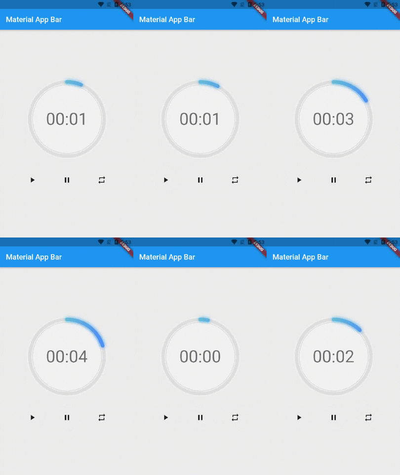
Preview of example

example preview

Usage

Use neumorphicEffect to show or hide the neumorphic border

Use isTimerTextShown to show or hide the text

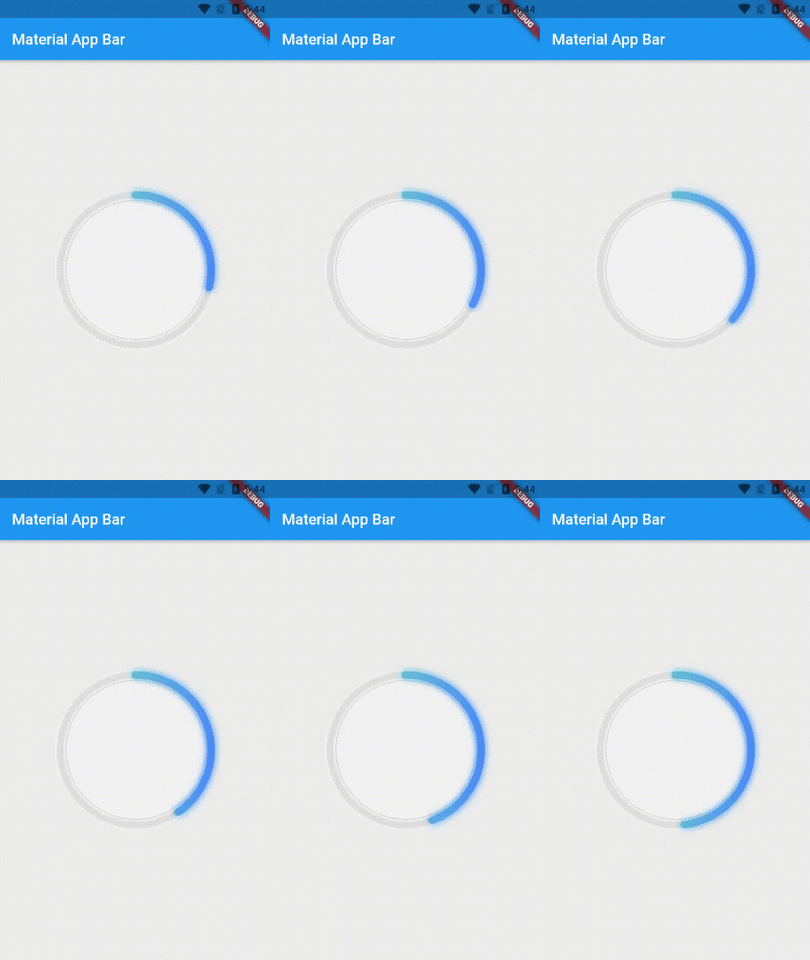
With neumorphicEffect is true and isTimerTextShown is false


  NeonCircularTimer(
                width: 200,
                    duration: 20,
                    controller : your_controller
                    isTimerTextShown: false,
                    neumorphicEffect: true,
                    innerFillGradient: LinearGradient(colors: [
                      Colors.greenAccent.shade200,
                      Colors.blueAccent.shade400
                    ]),
                    neonGradient: LinearGradient(colors: [
                      Colors.greenAccent.shade200,
                      Colors.blueAccent.shade400
                    ]),
                   ),

neum no text

with neumorphicEffect is false and isTimerTextShown is false
  NeonCircularTimer(
                width: 200,
                    duration: 20,
                    controller : your_controller
                    isTimerTextShown: false,
                    neumorphicEffect: false,
                    innerFillGradient: LinearGradient(colors: [
                      Colors.greenAccent.shade200,
                      Colors.blueAccent.shade400
                    ]),
                    neonGradient: LinearGradient(colors: [
                      Colors.greenAccent.shade200,
                      Colors.blueAccent.shade400
                    ]),
                   ),

no txt nor neum

Parameters

Name Type Default Value Description
key Key null Key for Countdown Timer.
neon double 4.0 The itensity of the neon
duration int required Countdown duration in Seconds.
initialDuration int 0 Countdown initial elapsed Duration in Seconds.
controller CountDownController required Controls (i.e Start, Pause, Resume, Restart) the Countdown Timer.
width double required Width of the rectangle that surrounds the circle ( Diameter of the Countdown Timer).
neonColor Color Colors.white54 neon Color for Countdown Widget.
neonGradient Gradient null neon Gradient for Countdown Widget. Note that neonColor will not be effective if gradient is provided.
neumorphicEffect bool true show neumorphic border
innerFillColor Color Colors.black12 Filling Color for Countdown Widget.
innerFillGradient Gradient null Filling Gradient for Countdown Widget. Note that fillColor will not be effective if gradient is provided.
outerStrokeColor Color Colors.white border Color for Countdown Widget.
backgroundColor Color Colors.white54 must be provided if you choose to use neumorphic effect .
outerStrokeGradient Gradient null border Gradient for Countdown Widget. Note that backgroundColor will not be effective if gradient is provided.
strokeWidth double 10.0 Border Thickness of the Countdown Ring.
strokeCap StrokeCap StrokeCap.round Begin and end contours with a flat edge and no extension.
textStyle TextStyle Theme.of(context).textTheme.headline3 Text Style for Countdown Text.
textFormat String TextFormat.MM_SS Format for the Countdown Text.
isReverse bool false Handles Countdown Timer (true for Reverse Countdown (max to 0), false for Forward Countdown (0 to max)).
isReverseAnimation bool false Handles Animation Direction (true for Reverse Animation, false for Forward Animation).
isTimerTextShown bool true Handles visibility of the Countdown Text.
autoStart bool true Handles the timer start.
onStart VoidCallback null This Callback will execute when the Countdown Starts.
onComplete VoidCallback null This Callback will execute when the Countdown Ends.

About the Controller

to get the time in seconds use :

controller.getCurrentTimeInSeconds();

to get the time formated into the selected TextFormat use:

controller.getTime();

to control the timer use :

controller.restart(); // to reset the timer
controller.start(); // to start the timer from 0
controller.pause(); // to pause the timer
controller.resume(); // to continue from the value where the timer stopped

所屬分類

原始碼儲存庫

使用此套件的專案

暫無相關資料。