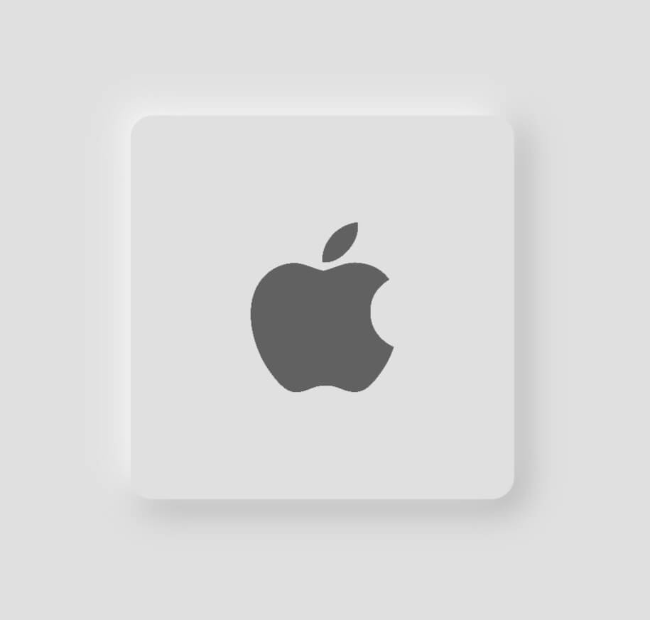
Neumorphic Button
This package lets you create Neumorphic Button with a number of customizable features that can be used throughout your Flutter app.You can create a minimal visual design style that uses monochromatic colors, subtle shadows and low contrasts to showcase buttons and cards, creating a really soft look.
Installation
Add the latest version of package to your pubspec.yaml
dependencies:
neumorphic_button: ^0.0 .1 +2
Import the package and use it in your Flutter App.
import 'package:neumorphic_button/neumorphic_button.dart' ;
Features
There are a number of properties that you can specify for your neumorphic button :
height
width
border-radius
box-shape
shadow-color
spread-radius
blur-radius
onTap function
Example
Light mode neumorphic button
class HomeScreen extends StatelessWidget const HomeScreen ({Key ? key}) : super (key: key);
@override
Widget build (BuildContext context) {
Size size = MediaQuery .of (context).size;
return Scaffold (
backgroundColor: Colors .grey.shade300,
body: Center (
child: NeumorphicButton (
onTap: () {},
child: Image .asset (
'assets/apple.png' ,
height: 80 ,
color: Colors .grey[700 ],
),
BorderRadius : 12 ,
bottomRightShadowBlurRadius: 15 ,
bottomRightShadowSpreadRadius: 1 ,
borderWidth: 5 ,
backgroundColor: Colors .grey.shade300,
topLeftShadowBlurRadius: 15 ,
topLeftShadowSpreadRadius: 1 ,
topLeftShadowColor: Colors .white,
bottomRightShadowColor: Colors .grey.shade500,
height: size.width * 0.5 ,
width: size.width * 0.5 ,
padding: EdgeInsets .all (50 ),
bottomRightOffset: Offset (4 , 4 ),
topLeftOffset: Offset (-4 , -4 ),
)),
);
}
}
Dark mode neumorphic button
class HomeScreen extends StatelessWidget const HomeScreen ({Key ? key}) : super (key: key);
@override
Widget build (BuildContext context) {
Size size = MediaQuery .of (context).size;
return Scaffold (
backgroundColor: Colors .grey.shade900,
body: Center (
child: NeumorphicButton (
onTap: () {},
child: Image .asset (
'assets/apple.png' ,
height: 80 ,
color: Colors .grey[700 ],
),
BorderRadius : 12 ,
bottomRightShadowBlurRadius: 15 ,
bottomRightShadowSpreadRadius: 1 ,
borderWidth: 5 ,
backgroundColor: Colors .grey.shade900,
topLeftShadowBlurRadius: 15 ,
topLeftShadowSpreadRadius: 1 ,
topLeftShadowColor: Colors .grey.shade800,
bottomRightShadowColor: Colors .black,
height: size.width * 0.5 ,
width: size.width * 0.5 ,
padding: EdgeInsets .all (50 ),
bottomRightOffset: Offset (5 , 5 ),
topLeftOffset: Offset (-5 , -5 ),
)),
);
}
}