搜尋套件、儲存庫與 APP 分類

number_paginator 封面
套件詳情v1.1.2

number_paginator

一個用於在頁面之間切換的 Flutter 分頁器小部件。

AndroidiOSWebmacOSWindowsLinux
近 30 天下載
1.2萬
喜歡數
108
Pub 分數
160

安裝套件

flutter pub add number_paginator

套件介紹

根據套件公開資料產生的選型評估,僅供參考。

一個 Flutter 小部件,提供簡單且可自訂的分頁器,用於透過數字按鈕在頁面之間導航。專為清潔直覺的列表檢視或分頁內容中的頁面導航而設計,支援多種平台,包括行動裝置、Web 和桌面。此小部件允許使用者直接跳轉至特定頁面並提供視覺反饋,進而提升資料密集型應用的易用性。它能輕鬆整合至現有的 Flutter 專案中,設定簡單。

適用情境

  • 在列表中瀏覽大型數據集
  • 在儀表板中實現頁面控制項
  • 增強資料表格中的使用者體驗
  • 支援圖像畫廊中的分頁
  • 建立響應式網頁和行動介面

主要特色

  • 編號頁面按鈕
  • 可自定樣式
  • 跨平台相容性
  • 與 ListView 的簡單整合
  • 內建的可存取性支援
  • 平滑過渡動畫

適合對象

  • 開發分頁 UI 的開發者
  • 內容載入量大的應用
  • 需要直覺導航的專案
  • 重視平台一致性的團隊
  • 尋求輕量級分頁解決方案的使用者

使用建議

  • 可能需要自定義邏輯來處理動態資料
  • 未針對頁數極多的情況進行優化
  • 有限的內建錯誤處理
  • 無自動頁面加載機制
  • 依賴外部狀態管理進行資料更新

原始 README

以下為關聯原始碼儲存庫的 README 原文快照,最新內容請造訪原始碼儲存庫。

Number Paginator

pub.dev analysis demo

A Flutter paginator widget for switching between page numbers.

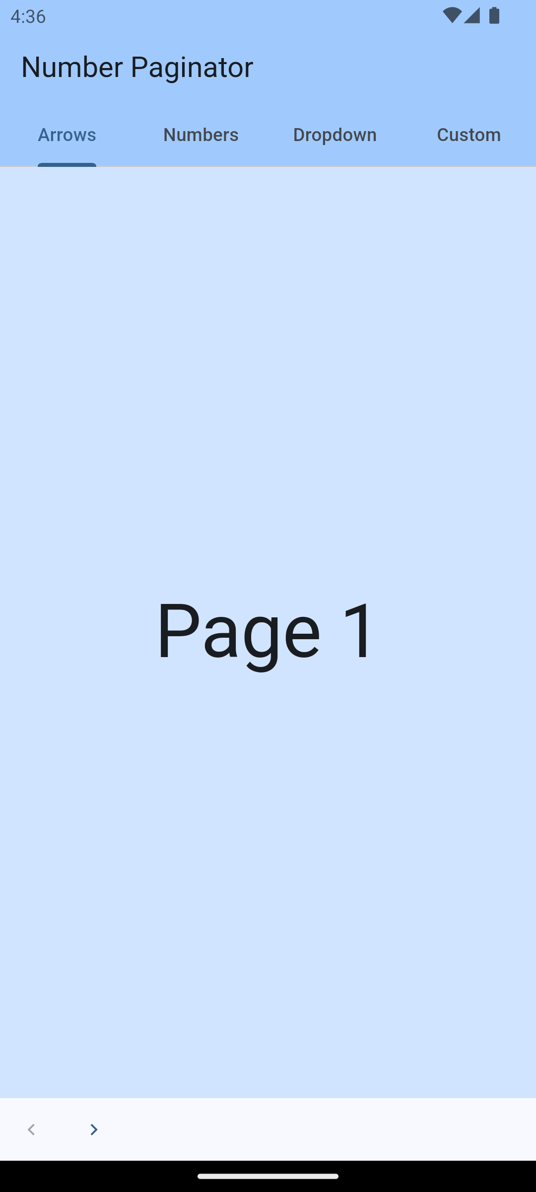
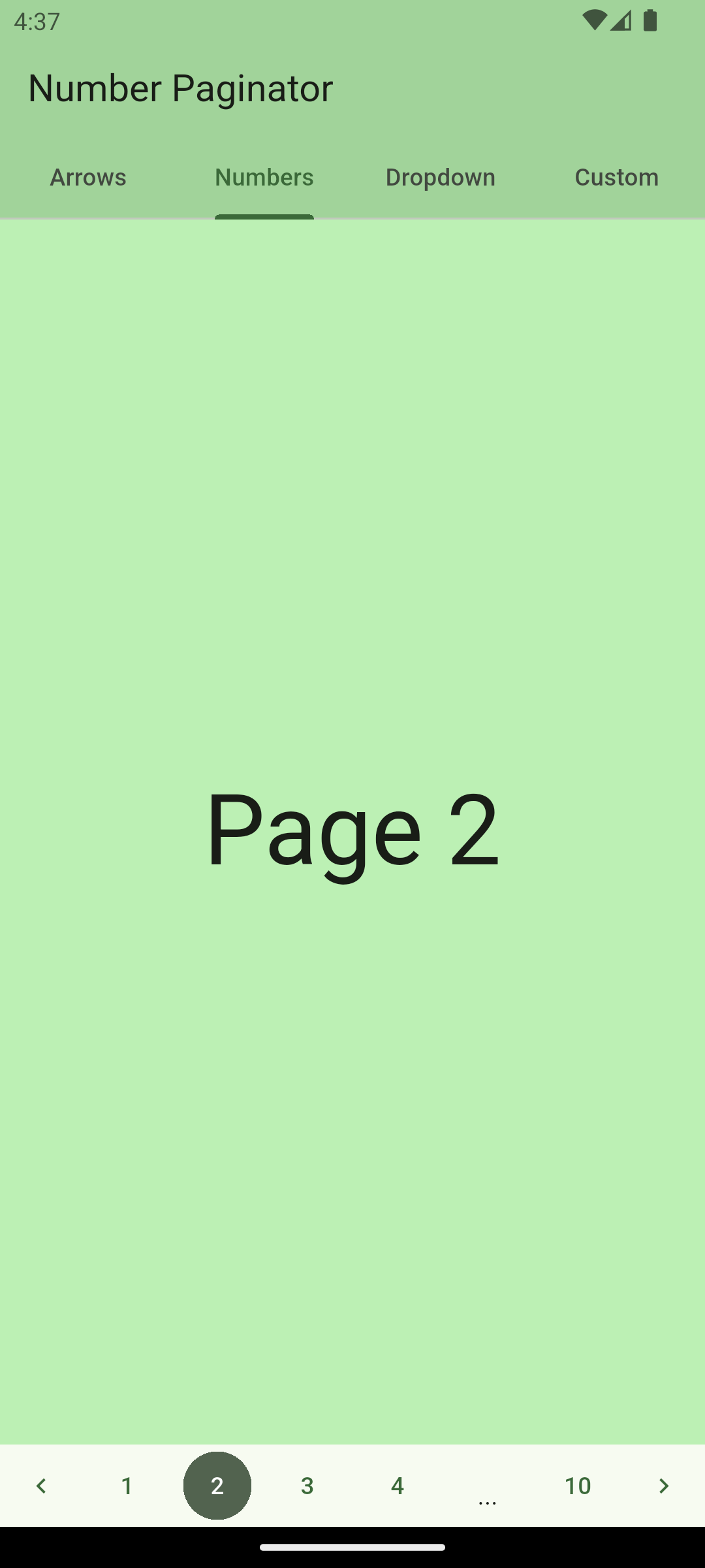
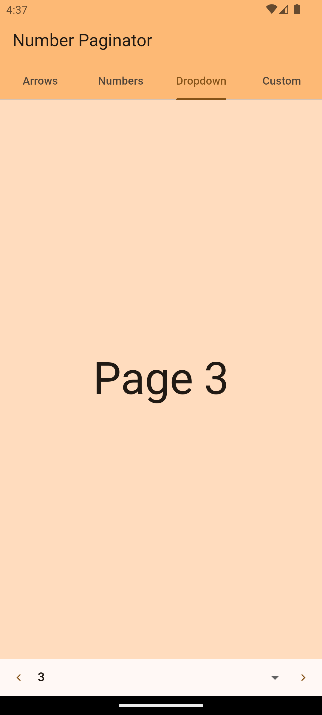
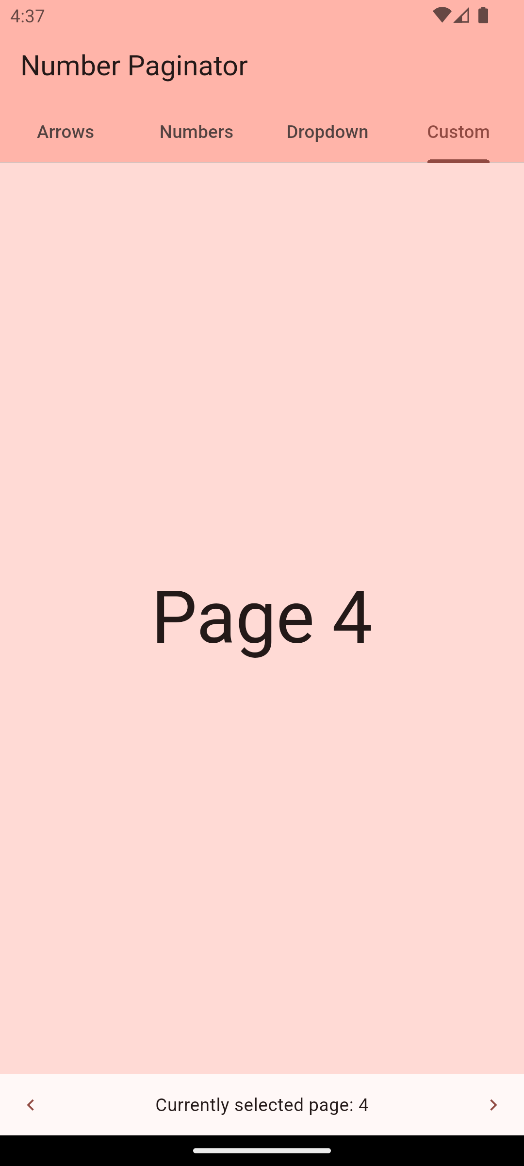
screenshot1 screenshot2 screenshot3 screenshot3 → Check web demo

Getting Started

The number_paginator package allows you to implement pagination with page numbers very easily. If you have content that is split up into several pages, number_paginator can be used to let the user switch between these page numbers. The package automatically handles the case where page numbers don't fit on one screen and replaces some of them with three dots.

Usage - Version 1.0.0 or newer

NumberPaginator only requires the number of pages (numberPages) to be set. All the rest is handled by the widget automatically. Normally, one also wants to react to page changes using the onPageChange callback. By default, NumberPaginator displays just page numbers, without arrow buttons for "previous" or "next" (unlike in the versions previous to 1.0.0).

NumberPaginator(
  numberPages: 10,
  onPageChange: (int index) {
    // handle page change...
  },
)

simple usage screenshot

With arrow buttons

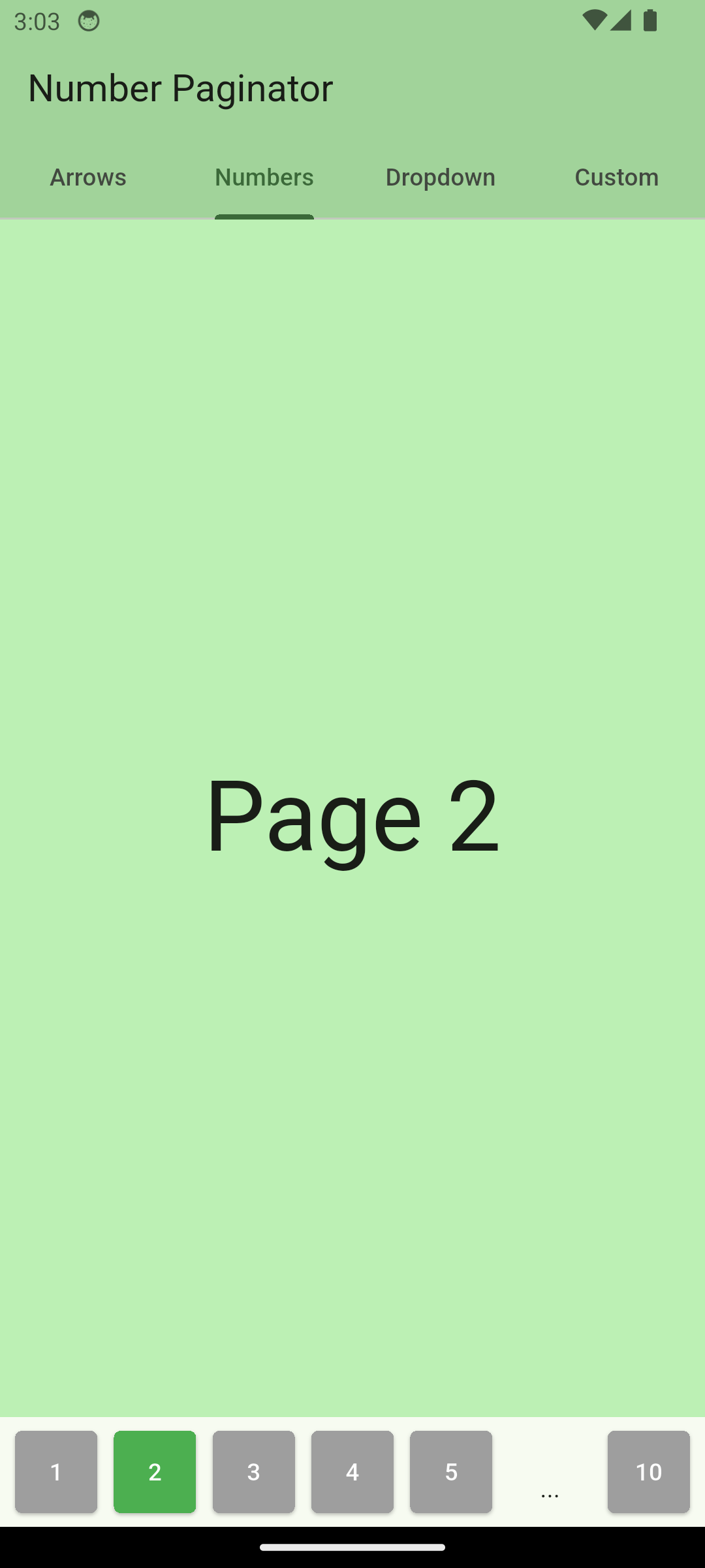
From version 1.0.0 on, the back/next buttons are not shown by default. You can manually add PrevButton and NextButton widgets, which come included with the package. This gives more freedom compared to the versions before 1.0.0, and lets you customize the layout as you need.

NumberPaginator(
  numberPages: 10,
  onPageChange: (int index) {
    // handle page change...
  },
  child: const SizedBox(
    height: 48,
    child: Row(
      children: [
        PrevButton(),
        Expanded(
          child: NumberContent(),
        ),
        NextButton(),
      ],
    ),
  ),
)
With Controller

NumerPaginatorController allows you to control the NumberPaginator from the outside, e.g. with an external button anywhere in your app.

// instantiate the controller in your state
final NumberPaginatorController _controller = NumberPaginatorController();

...
/// use it within NumberPaginator
NumberPaginator(
  controller: _controller,
  // by default, the paginator shows numbers as center content
  numberPages: 10,
  onPageChange: (int index) {
    // handle page change...
  },
)
...
// Use the controller, e.g. within a button, to trigger a page change
floatingActionButton: FloatingActionButton(
  onPressed: () => _controller.next(),
  child: const Icon(Icons.navigate_next),
)

Be aware that the page indices are zero-based! I.e. using _controller.navigateToPage(0); will navigate to page "1".

Customize

NumberPaginator version 1.0.0 and later provides more flexibility when it comes to customization.

Button look and feel
// define variables in your widget state
final int _numPages = 10;
final NumberPaginatorController _controller = NumberPaginatorController();

// use in the build method
NumberPaginator(
  controller: _controller,
  numberPages: _numPages,
  onPageChange: (int index) {
    setState(() {
      _currentPage = index;
    });
  },
  child: SizedBox(
    height: 64,
    child: Padding(
      padding: const EdgeInsets.all(4.0),
      child: NumberContent(
        buttonBuilder: (context, index, isSelected) => _CustomButton(
          onTap: () => _controller.navigateToPage(index),
          text: '${index + 1}',
          isSelected: isSelected,
        ),
      ),
    ),
  ),
)

// define any custom button widget that you like
class _CustomButton extends StatelessWidget {
  final VoidCallback onTap;
  final String text;
  final bool isSelected;

  const _CustomButton({
    required this.onTap,
    required this.text,
    this.isSelected = false,
  });

  @override
  Widget build(BuildContext context) {
    return AspectRatio(
      aspectRatio: 1,
      child: Padding(
        padding: const EdgeInsets.all(4.0),
        child: ElevatedButton(
          child: Text(text),
          onPressed: onTap,
          style: ElevatedButton.styleFrom(
            backgroundColor: isSelected ? Colors.blue : Colors.grey,
            foregroundColor: Colors.white,
            shape: RoundedRectangleBorder(borderRadius: BorderRadius.circular(4.0)),
            padding: EdgeInsets.zero,
          ),
        ),
      ),
    );
  }
}

custom buttons

Content variations

NumberPaginator allows for customization of how a user can navigate between pages. It provides three different modes and an additional possibility of complete customization o the content using a builder.

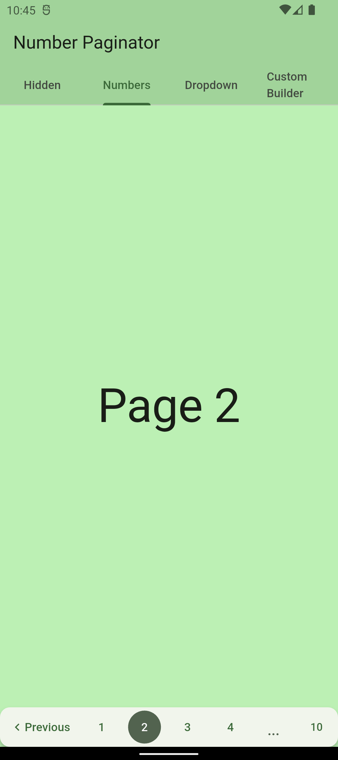
Numbers (default)

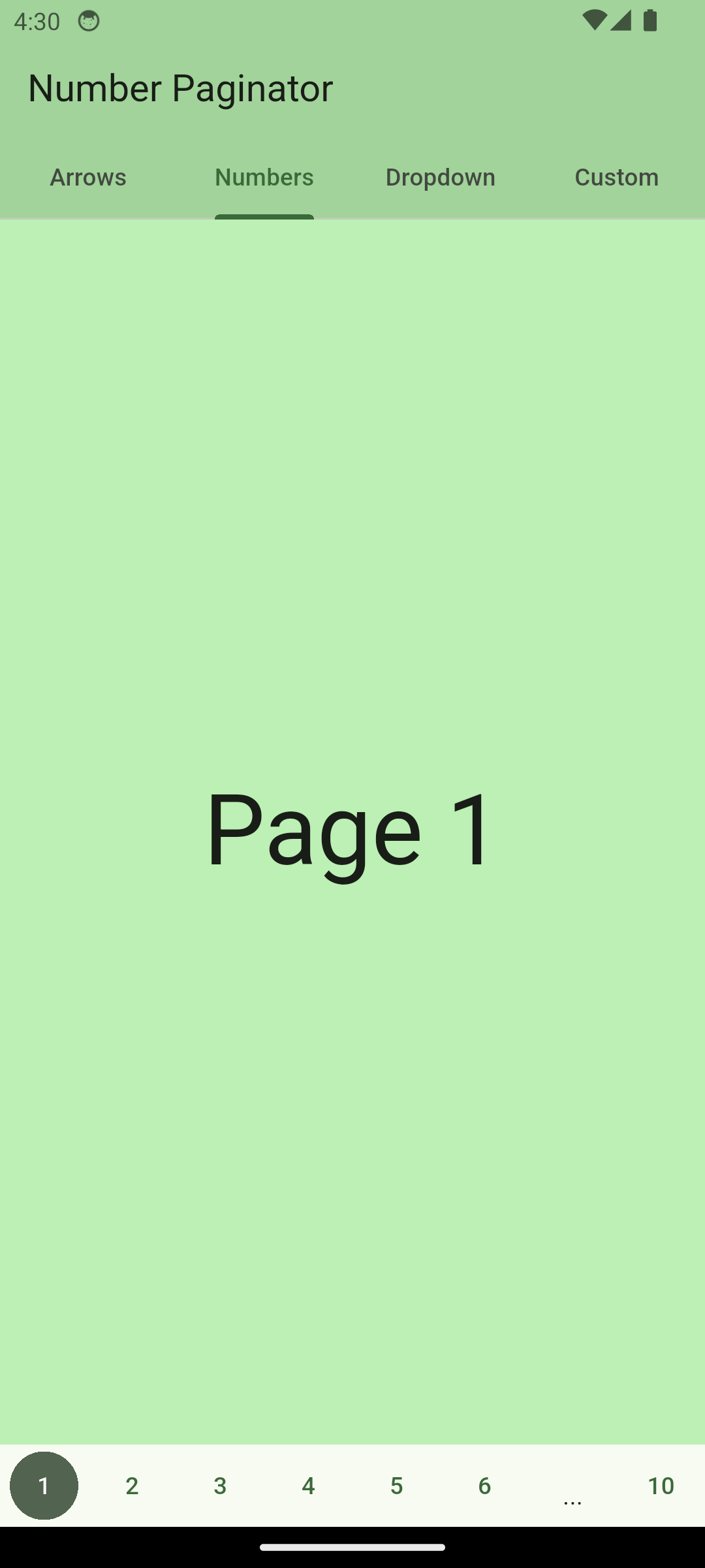
The paginator shows numbers for switching to any page number that is visible. If the pages don't fit on the screen, some of them are replaced with three dots.

NumberPaginator(
  ...
  child: const SizedBox(
    height: 48,
    child: Row(
      children: [
        PrevButton(),
        Expanded(
          child: NumberContent(),
        ),
        NextButton(),
      ],
    ),
  ),
)

screenshot with page numbers

Scrollable Numbers

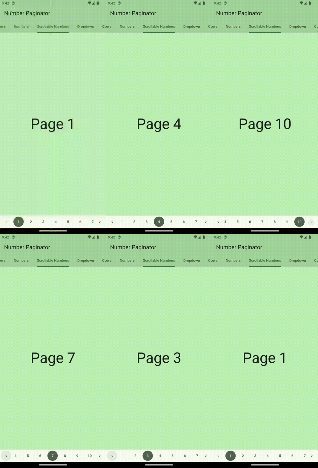
The page numbers can also be made scrollable. Just use ScrollableNumberContent for that.

NumberPaginator(
  ...
  child: const SizedBox(
    height: 48,
    child: Row(
      children: [
        PrevButton(),
        Flexible(child: ScrollableNumberContent()),
        NextButton(),
      ],
    ),
  ),
)

gif with scrollable page numbers

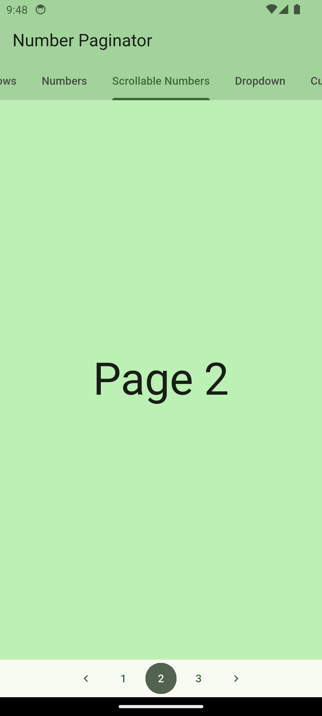
If you want the buttons to be centered, you can set shrinkWrap: true for ScrollableNumberContent like so:

ScrollableNumberContent(shrinkWrap: true)

centered scrollable page numbers

Dropdown

The paginator shows a dropdown (material widget) for choosing which page to show, along with the prev/next buttons.

NumberPaginator(
  ...
  child: const SizedBox(
    height: 48,
    child: Row(
      children: [
        PrevButton(),
        Expanded(
          child: DropDownContent(),
        ),
        NextButton(),
      ],
    ),
  ),
)

screenshot with dropdown

CustomContent (for passing any content)

Using the builder property, you can pass any content that you want that should be displayed as a central part of the paginator. For example, you can pass a custom text:

NumberPaginator(
  ...
  child: SizedBox(
    height: 48.0,
    child: Row(
      children: [
        const PrevButton(),
        Expanded(
          child: CustomContent(
            builder: (context, currentPage) => Center(
              child: Text("Currently selected page: ${currentPage + 1}"),
            ),
          ),
        ),
        const NextButton(),
      ],
    ),
  ),
)

screenshot with usage of builder

Complete example

A complete example of a simple page widget with number pagination.

import 'package:flutter/material.dart';
import 'package:number_paginator/number_paginator.dart';

class NumbersPage extends StatefulWidget {
  const NumbersPage({Key? key}) : super(key: key);

  @override
  _NumbersPageState createState() => _NumbersPageState();
}

class _NumbersPageState extends State<NumbersPage> {
  final int _numPages = 10;
  int _currentPage = 0;

  @override
  Widget build(BuildContext context) {
    var pages = List.generate(
      _numPages,
      (index) => Center(
        child: Text(
          "Page ${index + 1}",
          style: Theme.of(context).textTheme.displayLarge,
        ),
      ),
    );

    return Scaffold(
      backgroundColor: Theme.of(context).colorScheme.primaryContainer,
      body: pages[_currentPage],
      bottomNavigationBar: Material(
        child: NumberPaginator(
          numberPages: _numPages,
          onPageChange: (int index) {
            setState(() {
              _currentPage = index;
            });
          },
          child: const SizedBox(
            height: 48,
            child: Row(
              children: [
                PrevButton(),
                Expanded(
                  child: NumberContent(),
                ),
                NextButton(),
              ],
            ),
          ),
        ),
      ),
    );
  }
}

Usage - Version 0.4.4 or older

Show usage instructions

NumberPaginator only requires the number of pages (numberPages) to be set. All the rest is handled by the widget automatically. Normally, one also wants to react to page changes using the onPageChange callback. By default, NumberPaginator displays page numbers as central content of the paginator.

NumberPaginator(
  numberPages: 10,
  onPageChange: (int index) {

    // handle page change...
  },
)
With Controller

NumerPaginatorController allows you to control the NumberPaginator from the outside, e.g. with an external button anywhere in your app.

// instantiate the controller in your state
final NumberPaginatorController _controller = NumberPaginatorController();

...
/// use it within NumberPaginator
NumberPaginator(
  controller: _controller,
  // by default, the paginator shows numbers as center content
  numberPages: _numPages,
  onPageChange: (int index) {
    setState(() {
      _currentPage = index;
    });
  },
)

...
// Use the controller, e.g. within a button, to trigger a page change
floatingActionButton: FloatingActionButton(
  onPressed: () => _controller.next(),
  child: const Icon(Icons.navigate_next),
)

Customize

NumberPaginator allows for several customizations.

Button look and feel
NumberPaginator(
  // by default, the paginator shows numbers as center content
  numberPages: 10,
  onPageChange: (int index) {
    setState(() {
      _currentPage = index; // _currentPage is a variable within State of StatefulWidget
    });
  },
  // initially selected index
  initialPage: 4,
  config: NumberPaginatorUIConfig(
    // default height is 48
    height: 64,
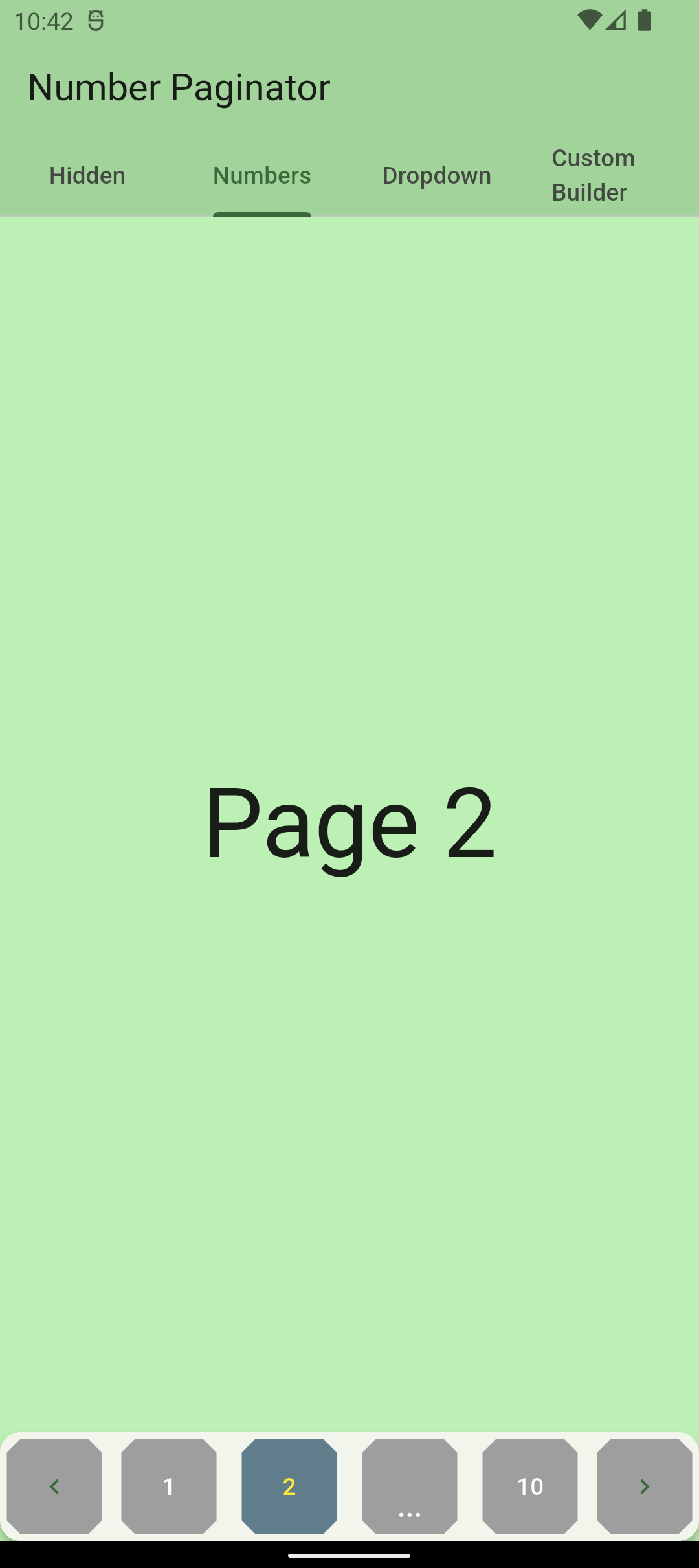
    buttonShape: BeveledRectangleBorder(
      borderRadius: BorderRadius.circular(8),
    ),
    buttonSelectedForegroundColor: Colors.yellow,
    buttonUnselectedForegroundColor: Colors.white,
    buttonUnselectedBackgroundColor: Colors.grey,
    buttonSelectedBackgroundColor: Colors.blueGrey,
  ),
)

custom buttons

Visibility/customisation of prev/next buttons
NumberPaginator(
  // by default, the paginator shows numbers as center content
  numberPages: 10,
  onPageChange: (int index) {
    setState(() {
      _currentPage = index; // _currentPage is a variable within State of StatefulWidget
    });
  },
  // show/hide the prev/next buttons
  showPrevButton: true,
  showNextButton: false,  // defaults to true
  // custom content of the prev/next buttons, maintains their behavior 
  nextButtonContent: Icon(Icons.arrow_right_alt),
  // custom prev/next buttons using builder (ignored if showPrevButton/showNextButton is false)
  prevButtonBuilder: (context) => TextButton(
    onPressed: _controller.currentPage > 0 ? () => _controller.prev() : null,  // _controller must be passed to NumberPaginator
    child: const Row(
      children: [
        Icon(Icons.chevron_left),
        Text("Previous"),
      ],
    ),
  ),
)

prev/next button customisation

Content variations

NumberPaginator allows for customization of how a user can navigate between pages. It provides three different modes and an additional possibility of complete customization o the content using a builder.

Hidden (only arrows are visible)

The user only sees arrows to switch to the previous/next page.

NumberPaginator(
  numberPages: _numPages,
  // shows only default arrows, no center content of paginator
  config:
      const NumberPaginatorUIConfig(mode: ContentDisplayMode.hidden),
  onPageChange: (int index) {
    setState(() {
      _currentPage = index;
    });
  },
)

screenshot for hidden

Numbers (default)

The paginator shows numbers for switching to any page number that is visible.

NumberPaginator(
  // by default, the paginator shows numbers as center content
  numberPages: _numPages,
  onPageChange: (int index) {
    setState(() {
      _currentPage = index;
    });
  },
)

screenshot with page numbers

Dropdown

The paginator shows a dropdown (material widget) for choosing which page to show, along with the prev/next buttons.

NumberPaginator(
  numberPages: _numPages,
  // shows a dropdown as the center paginator content
  config: const NumberPaginatorUIConfig(
      mode: ContentDisplayMode.dropdown),
  onPageChange: (int index) {
    setState(() {
      _currentPage = index;
    });
  },
)

screenshot with dropdown

Builder (for passing any content)

Using the contentBuilder property, you can pass any content that you want that should be displayed as a central part of the paginator. For example, you can pass a custom text:

NumberPaginator(
  numberPages: _numPages,
  contentBuilder: (index) => Expanded(
    child: Center(
      child: Text("Currently selected page: ${index + 1}"),
    ),
  ),
  onPageChange: (int index) {
    setState(() {
      _currentPage = index;
    });
  },
)

screenshot with usage of builder

Complete example

A complete example of a simple page widget with number pagination.

import 'package:flutter/material.dart';
import 'package:number_paginator/number_paginator.dart';

class NumbersPage extends StatefulWidget {
  const NumbersPage({Key? key}) : super(key: key);

  @override
  _NumbersPageState createState() => _NumbersPageState();
}

class _NumbersPageState extends State<NumbersPage> {
  final int _numPages = 10;
  int _currentPage = 0;

  @override
  Widget build(BuildContext context) {
    var pages = List.generate(
      _numPages,
      (index) => Center(
        child: Text(
          "Page ${index + 1}",
          style: Theme.of(context).textTheme.headline1,
        ),
      ),
    );

    return Scaffold(
      body: pages[_currentPage],
      // card for elevation
      bottomNavigationBar: Card(
        margin: EdgeInsets.zero,
        elevation: 4,
        child: NumberPaginator(
          // by default, the paginator shows numbers as center content
          numberPages: _numPages,
          onPageChange: (int index) {
            setState(() {
              _currentPage = index;
            });
          },
        ),
      ),
    );
  }
}

Coming soon...

  • Animations

Contribute

If you have any ideas for extending this package or have found a bug, please contribute!

  1. You'll need a GitHub account.
  2. Fork the number_paginator repository.
  3. Work on your feature/bug.
  4. Create a pull request.
  5. Star this project. ⭐
  6. Become a hero!! 🎉

所屬分類

原始碼儲存庫

使用此套件的專案