搜尋套件、儲存庫與 APP 分類

persistent_bottom_nav_bar_v2 封面
套件詳情v6.5.0

persistent_bottom_nav_bar_v2

一個高度可自訂的 Flutter 底部導覽列。內含 17 種預設樣式,也可使用您自訂的樣式。

AndroidiOSWebmacOSWindowsLinux
近 30 天下載
1.7萬
喜歡數
447
Pub 分數
160

安裝套件

flutter pub add persistent_bottom_nav_bar_v2

套件介紹

根據套件公開資料產生的選型評估,僅供參考。

一個高度可自訂的 Flutter 底部導航列,提供 17 種預設樣式並支援自訂設計。它確保跨螢幕的持續導航,即使在導航後也能維持選取標籤狀態。非常適合需要一致底部導航、豐富視覺選項與順暢過渡的應用程式。此套件相容於所有主要平台,包含 Android、iOS、Web、macOS、Windows 與 Linux。

適用情境

  • 行動應用程式導航
  • Web 應用程式導航
  • 跨平台應用
  • 持久的標籤頁選擇
  • 自定義UI樣式

主要特色

  • 17 種內建樣式
  • 自定樣式支援
  • 持久化標籤頁狀態
  • 流暢的動畫
  • 多平台相容性
  • 輕鬆整合

適合對象

  • 需要靈活底部導航的開發者
  • 具有複雜導航需求的應用程式
  • 注重設計的 Flutter 項目
  • 跨平台應用程式
  • 注重UI一致性的團隊

使用建議

  • 使用自定樣式可能會增加套件大小
  • 需要仔細處理狀態管理
  • 有限的文件用於高階自訂
  • 不太適合簡單的單螢幕應用
  • 大量動畫帶來的效能影響

原始 README

以下為關聯原始碼儲存庫的 README 原文快照,最新內容請造訪原始碼儲存庫。

Persistent Bottom Navigation Bar Version 2

Build Coverage Pub package version License GitHub Issues or Pull Requests GitHub Repo stars

A highly customizable bottom navigation bar for Flutter. It is shipped with 17 prebuilt styles you can choose from (see below), but can also be used with your very own style without sacrificing any features. View on pub.dev

NOTE: This package is a continuation of persistent_bottom_nav_bar.

🎉 Version 6.0.0 Released! 🎉

Version 6.0.0 includes new features like Animated Icons, further improvements, and bug fixes. 🚀

New Features
  • Scroll to Top: Added the ability to scroll to the top of the current tab with a double tap on the tab icon.
  • Animated Icons: Introduced support for animated icons in the navigation bar.
  • Change Number of Tabs at Runtime: Properly support dynamically hiding and showing tabs at runtime.
Breaking Changes

See the Changelog for breaking changes

[!NOTE] If you are migrating from Version 4.x.x to Version 5 read this MIGRATION GUIDE.

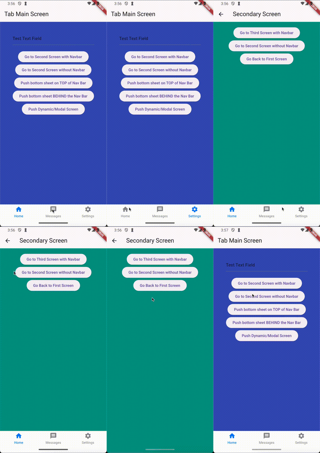
Preview

Features

  • New pages can be pushed with or without showing the navigation bar.
  • 17 prebuilt navigation bar styles ready to use.
  • Each style is fully customizable (see styling section)
  • Fully customizable navigation bars
  • Navigation Stack is not discarded when switching to another tab (can be turned off)
  • Option to hide the navigation bar once the user scrolls down
  • (Animated icons)
  • Handles hardware/software Android back button.
  • Supports go_router to make use of flutters Router API
  • Supports transparency and blur effects
Table of Contents

Styles

Style1 Style2 Style3
style1 style2 style3
Style4 Style5 Style6
style4 style5 style6
Style7 Style8 Style9
style7 style8 style9
Style10 Style11 Style12
style12 style11 style12
Style13 Style14 Style15
style13 style14 style15
Style16 Neumorphic
style16 neumorphic

Note: These do not include all style variations

Getting Started

1. Install the package

Run

dart pub add persistent_bottom_nav_bar_v2

or look at the install instructions.

2. Import the package
import 'package:persistent_bottom_nav_bar_v2/persistent_bottom_nav_bar_v2.dart';
3. Use the PersistentTabView

The PersistentTabView is your top level container that will hold both your navigation bar and all the pages (just like a Scaffold). Thats why it is not recommended, to wrap the PersistentTabView inside a Scaffold.body because it does all of that for you. So just create the config for each tab and insert the PersistentTabView like this and you are good to go:

import 'package:flutter/material.dart';
import 'package:persistent_bottom_nav_bar_v2/persistent_bottom_nav_bar_v2.dart';

void main() => runApp(PersistenBottomNavBarDemo());

class PersistenBottomNavBarDemo extends StatelessWidget {
  @override
  Widget build(BuildContext context) {
    return MaterialApp(
      title: 'Persistent Bottom Navigation Bar Demo',
      home: PersistentTabView(
        tabs: [
          PersistentTabConfig(
            screen: YourFirstScreen(),
            item: ItemConfig(
              icon: Icon(Icons.home),
              title: "Home",
            ),
          ),
          PersistentTabConfig(
            screen: YourSecondScreen(),
            item: ItemConfig(
              icon: Icon(Icons.message),
              title: "Messages",
            ),
          ),
          PersistentTabConfig(
            screen: YourThirdScreen(),
            item: ItemConfig(
              icon: Icon(Icons.settings),
              title: "Settings",
            ),
          ),
        ],
        navBarBuilder: (navBarConfig) => Style1BottomNavBar(
          navBarConfig: navBarConfig,
        ),
      ),
    );
  }
}

Styling

You can customize the Navigation Bar with all the parameters each style allows. Every style allows you to pass an instance of NavBarDecoration. This inherits from BoxDecoration and thus offers everything the BoxDecoration is capable of. Styles that include animations also allow you to adjust the timings and interpolation curves of the animation.

Using Different Styles

To use different styles, you can replace the Style1BottomNavBar widget with any other predefined style or your custom widget (see the list of available styles). Here is an example of how to use a different style:

PersistentTabView(
  tabs: ...,
  navBarBuilder: (navBarConfig) => Style2BottomNavBar(
    navBarConfig: navBarConfig,
  ),
),
Customizing with NavBarDecoration and ItemAnimation

You can customize the appearance of the navigation bar using NavBarDecoration. Here is an example:

PersistentTabView(
  tabs: ...,
  navBarBuilder: (navBarConfig) => Style2BottomNavBar(
    navBarConfig: navBarConfig,
    navBarDecoration: NavBarDecoration(
      color: Colors.blue,
      borderRadius: BorderRadius.circular(8),
      boxShadow: [
        BoxShadow(
          color: Colors.black26,
          blurRadius: 10,
        ),
      ],
    ),
    itemAnimationProperties: ItemAnimation(
      duration: const Duration(milliseconds: 400),
      curve: Curves.easeInOut,
    )
  ),
),

In this example, the navigation bar will have a blue background, rounded corners, and a shadow effect. You can customize other properties like padding, gradient, and more as needed. Additionally, the navigation bars item animation is adjusted to take 400ms and use an easeInOut curve.

Using a custom Navigation Bar

You can replace the StyleXBottomNavBar widget with your own custom widget. The navBarBuilder gives you a navBarConfig which contains core functionality to run the PersistentTabView. One example is the onItemSelected callback which needs to be called in your custom widget when an item is selected to trigger crucial behavior in the PersistentTabView. Here is an example of a custom navigation bar widget:

class CustomNavBar extends StatelessWidget {
  final NavBarConfig navBarConfig;

  // You are free to omit this, but in combination with `DecoratedNavBar` it might make your start easier
  final NavBarDecoration navBarDecoration;

  const CustomNavBar({
    super.key,
    required this.navBarConfig,
    this.navBarDecoration = const NavBarDecoration(),
  });

  Widget _buildItem(ItemConfig item, bool isSelected) {
    final title = item.title;
    return Column(
      mainAxisAlignment: MainAxisAlignment.center,
      children: [
        Expanded(
          child: IconTheme(
            data: IconThemeData(
              size: item.iconSize,
              color: isSelected
                      ? item.activeForegroundColor
                      : item.inactiveForegroundColor,
            ),
            child: isSelected ? item.icon : item.inactiveIcon,
          ),
        ),
        if (title != null)
          Padding(
            padding: const EdgeInsets.only(top: 15.0),
            child: Material(
              type: MaterialType.transparency,
              child: FittedBox(
                child: Text(
                  title,
                  style: item.textStyle.apply(
                    color: isSelected
                            ? item.activeForegroundColor
                            : item.inactiveForegroundColor,
                  ),
                ),
              ),
            ),
          ),
      ],
    );
  }

  @override
  Widget build(BuildContext context) {
    return DecoratedNavBar(
      decoration: navBarDecoration,
      height: kBottomNavigationBarHeight,
      child: Row(
        mainAxisAlignment: MainAxisAlignment.spaceAround,
        crossAxisAlignment: CrossAxisAlignment.center,
        children: [
          for (final (index, item) in navBarConfig.items.indexed)
            Expanded(
              child: InkWell(
                // This is the most important part. Without this, nothing would happen if you tap on an item.
                onTap: () => navBarConfig.onItemSelected(index),
                child: _buildItem(item, navBarConfig.selectedIndex == index),
              ),
            ),
        ],
      ),
    );
  }
}

In your PersistentTabView, you can use it just like the predefined style:

PersistentTabView(
  tabs: ...,
  navBarBuilder: (navBarConfig) => CustomNavBar(
    navBarConfig: navBarConfig,
  ),
),

The most important thing is that you call the navBarConfig.onItemSelected function with the index of the tapped item, otherwise the PersistentTabView will not react to anything.

You dont need to use either the DecoratedNavBar widget, nor the NavBarDecoration, it is just a helper for you. You can do whatever you want in that custom navigation bar widget, as long as you remember to invoke the onItemSelected callback.

Switching Tabs programmatically

Internally, the PersistentTabView uses a PersistentTabController. So you can pass a controller to the PersistentTabView to use it later for changing the tab programmatically:

PersistentTabController _controller = PersistentTabController(initialIndex: 0);

PersistentTabView(
  controller: _controller,
  ...
);

_controller.jumpToTab(2);

// Navigate to the previously selected Tab
_controller.jumpToPreviousTab();

AnimatedIcons

Flutter provides AnimatedIcons that have two representations and can smoothly animate between them. You can simply use the provided AnimatedIconWrapper and just replace your previous icon with an animated one. The PersistentTabView will handle all the animations for you automatically (i.e. the icon will animate whenever you enter or leave the respective tab).

Here is an example:

PersistentTabView(
  tabs:  [
    PersistentTabConfig(
      screen: const MainScreen(),
      item: ItemConfig(
        icon: AnimatedIconWrapper(icon: AnimatedIcons.home), // <- this also allows you to change animation timings. The animation itself will be triggered automatically
        title: "Home",
      ),
    ),
    ...
  ],
  navBarBuilder: (navBarConfig) => Style1BottomNavBar(
    navBarConfig: navBarConfig,
  ),
)

Custom transition animation when switching pages

When switching from one tab to another, the default behavior is a slide transition that slides the current page to the left or right and reveals the taget page by sliding it into the screen. You can customize this behavior by building your own animation, e.g. by fading out the current page and fading in the new one. To control the animation, you can pass a function to PersistentTabView.animatedTabBuilder. This function is a builder that builds the old page and the new page at the same time. That is why it gets the BuildContext as an argument, the index of the currently built tab, the progress of the animation, the new index, the old index and the actual page content as a child.

This is what the default animation builder looks like:

 final double yOffset = newIndex > index
     ? -animationValue
     : (newIndex < index
         ? animationValue
         : (index < oldIndex ? animationValue - 1 : 1 - animationValue));
 return FractionalTranslation(
   translation: Offset(yOffset, 0),
   child: child,
 );

Navigation

Each of your Tabs will get its own Navigator, so they dont interfere with each other. That means there will now be a difference between calling Navigator.of(context).push() (which will push a new screen inside the current tab) and Navigator.of(context, rootNavigator: true).push() (which will push a new screen above the whole PersistentTabView, ultimately hiding your navigation bar).

The package includes the following utility functions for navigation.

pushScreen(
  context,
  screen: MainScreen(),
  withNavBar: true, // or false
);
pushScreenWithNavBar(
  context,
  screen: MainScreen(),
);
pushScreenWithoutNavBar(
  context,
  screen: MainScreen(),
);
pushWithNavBar(
  context,
  MaterialPageRoute(builder: (context) => ...)
);
pushWithoutNavBar(
  context,
  MaterialPageRoute(builder: (context) => ...)
);
popAllScreensOfCurrentTab();

By default, each of the tabs navigators will inherit all the settings of the root navigator. So every configuration you do to the named routes (etc.) of the root navigator, will work just the same in each tab. If you want specific settings for each navigator (like additional routes, NavigatorObservers etc.), you can do so by passing a NavigatorConfig to the respective PersistentTabConfig.

The PersistentTabView has the ability to remember the navigation stack for each tab, so when you switch back to it you will see the exact same content when you left. This behavior can be toggled with the PersistentTabView.stateManagement parameter.

Router API

To utilize flutters Router API for navigation in combination with this package, go_router must be used. Follow the setup in the go_router documentation to get started with declarative routing. To integrate your Persistent Navigation Bar, you have to setup a StatefulShellRoute.indexedStack as one of your routes, which will contain the PersistentTabView. See the example for a full code example or the code snippet below:

  • use PersistentTabView.router instead of PersistentTabView
  • pass the navigationShell to the PersistentTabView.router (this will contain each tab view)
  • use PersistentRouterTabConfig instead of PersistentTabConfig (notice the missing screen argument because the screens are specified by the routes in each StatefulShellBranch)
StatefulShellRoute.indexedStack(
  builder: (context, state, navigationShell) =>
      PersistentTabView.router(
    tabs: [
      PersistentRouterTabConfig(
        item: ItemConfig(
          icon: const Icon(Icons.home),
          title: "Home",
        ),
      ),
      PersistentRouterTabConfig(
        item: ItemConfig(
          icon: const Icon(Icons.message),
          title: "Messages",
        ),
      ),
      PersistentRouterTabConfig(
        item: ItemConfig(
          icon: const Icon(Icons.settings),
          title: "Settings",
        ),
      ),
    ],
    navBarBuilder: (navBarConfig) => Style1BottomNavBar(
      navBarConfig: navBarConfig,
    ),
    navigationShell: navigationShell,
  ),
  branches: [
    // The route branch for the 1st Tab
    StatefulShellBranch(
      routes: <RouteBase>[
        GoRoute(
          path: "/home",
          builder: (context, state) => const MainScreen(
            useRouter: true,
          ),
          routes: [
            GoRoute(
              path: "detail",
              builder: (context, state) => const MainScreen2(
                useRouter: true,
              ),
            ),
          ],
        ),
      ],
    ),

    // The route branch for 2nd Tab
    StatefulShellBranch(
      routes: <RouteBase>[
        GoRoute(
          path: "/messages",
          builder: (context, state) => const MainScreen(
            useRouter: true,
          ),
        ),
      ],
    ),

    // The route branch for 3rd Tab
    StatefulShellBranch(
      routes: <RouteBase>[
        GoRoute(
          path: "/settings",
          builder: (context, state) => const MainScreen(
            useRouter: true,
          ),
        ),
      ],
    ),
  ],
),

Useful Tips

  • Try the interactive example project in the official git repo to get a better feeling for the package

  • Pop to any screen in the navigation stack for a given tab:

    Navigator.of(context).popUntil((route) {
        return route.settings.name == "ScreenToPopBackTo";
    });
    
  • Pop back to first screen in the navigation stack for a given tab:

    popAllScreensOfCurrentTab();
    
  • To push bottom sheet on top of the Navigation Bar, use showModalBottomScreen and set it's property useRootNavigator to true. See example project for an illustration.

  • If you need e.g. notification counters on the icons in the navBar, you can use the badges package like so: (see Issue 11)

    PersistentTabConfig(
        screen: ...,
        item: ItemConfig(
            icon: Badge(
                animationType: BadgeAnimationType.scale,
                badgeContent: UnreadIndicator(),
                child: const Icon(
                    Icons.chat_rounded,
                ),
            ),
            title: "Chat",
        ),
    ),
    

所屬分類

依賴

依賴清單 1 項

原始碼儲存庫

使用此套件的專案