搜尋套件、儲存庫與 APP 分類

pie_menu 封面
套件詳情v3.8.3

pie_menu

一個提供高度可自訂的圓形/徑向上下文選單的Flutter套件

AndroidiOSWebmacOSWindowsLinux
近 30 天下載
2110
喜歡數
247
Pub 分數
150

安裝套件

flutter pub add pie_menu

套件介紹

根據套件公開資料產生的選型評估,僅供參考。

Pie_menu 是一個 Flutter 套件,提供可自訂的圓形或徑向上下文選單,非常適合直覺且節省空間的使用者互動。它讓開發者能夠建立具有可配置切片、動畫和手勢的互動式餅狀選單。此套件支援 Android、iOS、Web、macOS、Windows 和 Linux 多個平台,確保跨裝置行為一致。透過豐富的顏色、尺寸和行為自訂選項,提升需要快速存取多個動作之應用程式的 UI 設計。

適用情境

  • 行動應用程式中的快速操作選擇
  • 創意工具中的直覺導航
  • 增強遊戲介面的使用者介面
  • 在生產力應用中優化工作流程
  • 在AR/VR應用中提供基於手勢的控制

主要特色

  • 高度可自訂的徑向佈局
  • 支援觸控、輕觸和拖曳手勢
  • 流暢的動畫和過渡
  • 跨平台相容性
  • 可設定的切片大小與間距
  • 可擴展的事件處理

適合對象

  • 開發手勢豐富介面的開發者
  • 尋求現代菜單替代方案的UI設計師
  • 需要緊湊操作面板的應用程式
  • 互動式教育或遊戲應用程式
  • 針對多個設備平台的專案

使用建議

  • 可能需要仔細的使用者體驗測試以確保可訪問性
  • 大量選單項目帶來的效能影響
  • 複雜設定的潛在學習曲線
  • 不太適合簡單的線性菜單
  • 需要關注小螢幕上的觸控目標大小

原始 README

以下為關聯原始碼儲存庫的 README 原文快照,最新內容請造訪原始碼儲存庫。

Flutter Pie Menu 🥧

pub pub likes web apk app github buy me a coffee

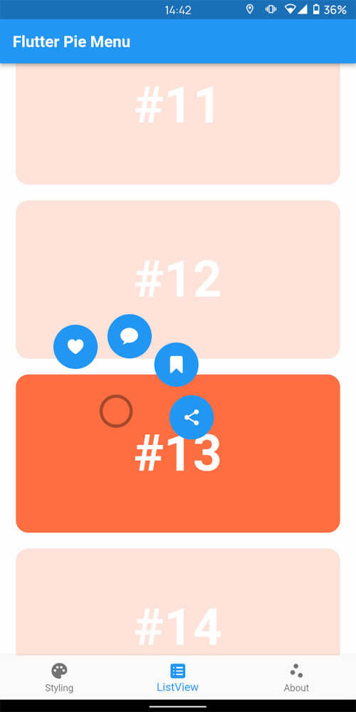
A Flutter package providing a highly customizable circular/radial context menu, similar to Pinterest's.

Click here to try Flutter Pie Menu online!

Table of Contents

Usage

Wrap the widget that should respond to gestures with the PieMenu widget, and provide the menu with a list of PieActions to display as circular buttons.

PieMenu(
  onPressed: () => print('pressed'),
  actions: [
    PieAction(
      tooltip: const Text('like'),
      onSelect: () => print('liked'),
      child: const Icon(Icons.favorite), // Can be any widget
    ),
  ],
  child: ChildWidget(),
),

💡 Note that PieMenu must be a descendant of a PieCanvas widget.

Wrap your page, or any other desired widget for drawing the menu and the background overlay, with the PieCanvas widget.

For instance, if you want the menu to be displayed at the forefront, wrap your Scaffold with a PieCanvas as follows:

PieCanvas(
  child: Scaffold(
    body: YourScaffoldBody(
      ...
        PieMenu(),
      ...
    ),
  ),
),

💡 You can use the onPressed callback defined in PieMenu to handle tap events without needing an extra widget like GestureDetector.

Customization

You can customize the appearance and behavior of menus using PieTheme.

Using the theme attribute of the PieCanvas widget, you can specify a theme for all descendant PieMenu widgets.

PieCanvas(
  theme: PieTheme(),
  ...
    PieMenu(), // Uses the canvas theme
  ...
    PieMenu(), // Uses the canvas theme
  ...
),

If you want to specify menu-specific themes, you can use the theme attribute of the PieMenu widget.

PieMenu(
  theme: PieTheme(), // Overrides the canvas theme
),

It is also possible to copy the canvas theme with additional parameters, but ensure you are accessing it with the correct context.

PieMenu(
  theme: PieTheme.of(context).copyWith(
    ...
  ),
),
Button themes

Button background and icon colors are defined by the theme's buttonTheme and buttonThemeHovered properties. You can create custom PieButtonTheme instances for your canvas and menu themes.

PieTheme(
  buttonTheme: PieButtonTheme(),
  buttonThemeHovered: PieButtonTheme(),
),

You can also style the buttons using the decoration property of PieButtonTheme.

PieButtonTheme(
  decoration: BoxDecoration(),
),
Custom button widgets

If you wish to use custom widgets inside buttons instead of just icons, use PieAction.builder(). Its builder provides the hover state as a parameter.

PieAction.builder(
  tooltip: const Text('like'),
  onSelect: () => print('liked'),
  builder: (hovered) {
    return Text(
      '<3',
      style: TextStyle(
        color: hovered ? Colors.green : Colors.red,
      ),
    );
  },
),
Display angle of menu buttons

To disable dynamic angle calculation and have the menu appear at a fixed angle, set the customAngle and customAngleAnchor attributes of PieTheme.

PieTheme(
  customAngle: 90, // In degrees
  customAngleAnchor: PieAnchor.center, // start, center, end
),

You can also use customAngleDiff or spacing to adjust the angle between buttons, and angleOffset to rotate the menu.

Specific menu position

Use the menuAlignment attribute of PieTheme to make the menu appear at a specific position regardless of the press location. Combine it with menuDisplacement to fine-tune the position.

PieTheme(
  menuAlignment: Alignment.center,
  menuDisplacement: Offset(0, 0),
),
Regular press, long press or right click to open the menu

Use the regularPressShowsMenu, longPressShowsMenu, and longPressDuration attributes of PieTheme to customize the menu opening behavior.

PieTheme(
  regularPressShowsMenu: true,
  longPressShowsMenu: true,
  longPressDuration: const Duration(milliseconds: 500),
),

Use the rightClickShowsMenu and leftClickShowsMenu attributes of PieTheme to customize mouse button behavior.

PieTheme(
  rightClickShowsMenu: true,
  leftClickShowsMenu: false,
),

Controllers and callbacks

To open, close, or toggle a menu programmatically, assign a PieMenuController to it.

// Create a controller inside a stateful widget.
final _pieMenuController = PieMenuController();

// Assign the controller to a PieMenu.
PieMenu(
  controller: _pieMenuController,
  ...
),

// Control the menu using the controller.
_pieMenuController.open(
  menuAlignment: Alignment.center,
);

If you need to perform actions when the menu is toggled, use the onToggle callback of PieMenu or the onMenuToggle callback of PieCanvas.

PieMenu(
  onToggle: (menuOpen) => print('Menu ${menuOpen ? 'opened' : 'closed'}'),
  ...
),

PieCanvas(
  onMenuToggle: (menuOpen) => print('A menu ${menuOpen ? 'opened' : 'closed'}'),
  ...
),

Contributing

Pull requests are welcome. For major changes, please open an issue first to discuss what you would like to change.

github

Donation

If you find this package useful, please consider donating to support the project.

buy me a coffee

所屬分類

依賴

依賴清單 1 項

原始碼儲存庫

使用此套件的專案