搜尋套件、儲存庫與 APP 分類

progress_dialog_null_safe 封面
套件詳情v3.1.0

progress_dialog_null_safe

一個輕量級、空安全的 Flutter 套件,用於顯示可自訂的進度對話方塊,支援動態內容更新及多種樣式選項。

AndroidiOSWebmacOSWindowsLinux
近 30 天下載
3000
喜歡數
46
Pub 分數
140

安裝套件

flutter pub add progress_dialog_null_safe

套件介紹

根據套件公開資料產生的選型評估,僅供參考。

一個輕量級、空安全的 Flutter 套件,專為顯示可自訂進度對話方塊而設計。支援動態內容更新,並提供多種樣式選項,確保跨平台的 UI 一致性。非常適合在非同步作業期間顯示載入狀態,確保類型安全並在 Android、iOS、Web、macOS、Windows 與 Linux 上提供順暢的使用者體驗。此套件易於整合與維護,適用於需要在資料處理過程中提供即時回饋之應用程式。

適用情境

  • 在 API 呼叫期間顯示載入狀態
  • 動態更新對話方塊文字
  • 顯示檔案上傳過程中的進度
  • 在後台任務期間提供反饋
  • 自定外觀以保持品牌一致性

主要特色

  • 空值安全設計
  • 動態內容更新
  • 多平台支援
  • 可自訂的樣式
  • 輕量且快速
  • 與 Flutter 的輕鬆整合

適合對象

  • 開發跨平台 Flutter 應用的開發者
  • 重視類型安全的團隊
  • 需要響應式載入指示器的應用程式
  • 依賴項最少的專案
  • 頻繁執行非同步操作的UI密集型應用

使用建議

  • 需要 Flutter 2.5 或更高版本
  • 僅限基本進度可視化
  • 無內建取消處理
  • 最適合簡單的加載場景
  • 可能需要額外的邏輯來處理複雜的工作流程

原始 README

以下為關聯原始碼儲存庫的 README 原文快照,最新內容請造訪原始碼儲存庫。

progress_dialog

A light weight package to show progress dialog. As it is a stateful widget, you can change the text shown on the dialog dynamically.

This is the original package and it's owner https://github.com/fayaz07/progress_dialog

It was discontinued by him, but i really liked the package so I am trynna revive it :D I added null safety and updated most of the stuff making it null safe and useable again :)

Demo

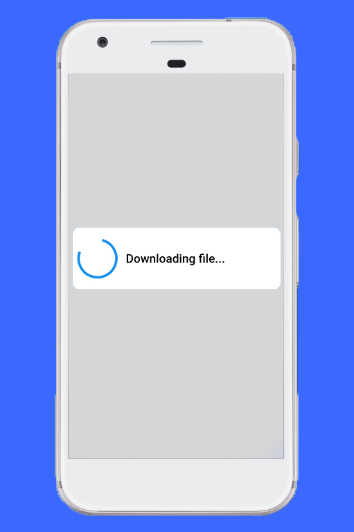
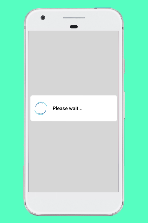
Normal dialog Demo Download dialog Demo

How to use

Import the package in your dart file

import 'package:progress_dialog/progress_dialog_null_safe.dart';

Create and initialise a ProgressDialog object inside the build() method passing context to it

  1. Initialize the ProgressDialog object
    final ProgressDialog pr = ProgressDialog(context);
    
  2. By default it is a normal dialog to show some message, if you would like to use it to show percentage of progress done, specify the optional type parameter and specify if you want your dialog to dismiss when back button is pressed isDismissible parameter (Optional)
    //For normal dialog
    pr = ProgressDialog(context,type: ProgressDialogType.Normal, isDismissible: true/false, showLogs: true/false);
        
    //For showing progress percentage
    pr =  ProgressDialog(context,type: ProgressDialogType.Download, isDismissible: true/false, showLogs: true/false);
    
  3. > Note: Please initialize the ```ProgressDialog```, where you have availability of the context
  4. Style the progress dialog (Optional)
    pr.style(
      message: 'Downloading file...',
      borderRadius: 10.0,
      backgroundColor: Colors.white,
      progressWidget: CircularProgressIndicator(),
      elevation: 10.0,
      insetAnimCurve: Curves.easeInOut,
      progress: 0.0,
      textDirection: TextDirection.rtl,
      maxProgress: 100.0,
      progressTextStyle: TextStyle(
         color: Colors.black, fontSize: 13.0, fontWeight: FontWeight.w400),
      messageTextStyle: TextStyle(
         color: Colors.black, fontSize: 19.0, fontWeight: FontWeight.w600)
      );
    
    Note: You don't need to use all parameters, all of them are optional
    
  5. Showing the progress dialog
    await pr.show();
    
  6. Dynamically update the content shown out there
    pr.update(
      progress: 50.0,
      message: "Please wait...",
      progressWidget: Container(
        padding: EdgeInsets.all(8.0), child: CircularProgressIndicator()),
      maxProgress: 100.0,
      progressTextStyle: TextStyle(
        color: Colors.black, fontSize: 13.0, fontWeight: FontWeight.w400),
      messageTextStyle: TextStyle(
        color: Colors.black, fontSize: 19.0, fontWeight: FontWeight.w600),
      );
    
    Note: You don't need to use all parameters, all of them are optional
    
  7. Dismissing the progress dialog
    pr.hide().then((isHidden) {
      print(isHidden);
    });
    
    // or
    await pr.hide();
    

Navigating to next screens must be done after the completion of Future - hide(). See here for example

Check if progress dialog is showing
bool isProgressDialogShowing = pr.isShowing();
print(isProgressDialogShowing);
Use custom body
    pr = ProgressDialog(
      context,
      type: ProgressDialogType.Normal,
      isDismissible: true,
      /// your body here
      customBody: LinearProgressIndicator(
        valueColor: AlwaysStoppedAnimation<Color>(Colors.blueAccent),
        backgroundColor: Colors.white,
      ),
    );

Demo

Normal dialog Demo Download dialog Demo

Default configuration/styles

If you don't like to configure/style the dialog and continue with the default style, it's okay but just have a look at our default configuration.

Attribute Value
Dismissible true
ProgressDialogType ProgressDialogType.Normal
BackgroundColor Colors.white
BorderRadius RoundedRectangularBorder(radius: 8.0)
AnimationCurve Curves.easeInOut
Elevation 8.0
ProgressWidget Double_rings_loding_indicator
MessageTextStyle color: Colors.black, fontSize: 19.0, fontWeight: FontWeight.w600
ProgressTextStyle color: Colors.black, fontSize: 13.0, fontWeight: FontWeight.w400
showLogs false
Well let's discuss limits for configuring it
Attribute Can be updated during instantiating Can be updated during styling Can be updated during dialog is shown
Dismissible Yes No No
ProgressDialogType Yes No No
BackgroundColor No Yes No
BorderRadius No Yes No
AnimationCurve No Yes No
Elevation No Yes No
ProgressWidget No Yes Yes
MessageTextStyle No Yes Yes
ProgressTextStyle No Yes Yes
ShowLogs Yes No No

Loading indicator -> https://loading.io/

所屬分類

原始碼儲存庫

使用此套件的專案

暫無相關資料。