搜尋套件、儲存庫與 APP 分類

progress_state_button 封面
套件詳情v1.0.4

progress_state_button

一個可自訂的進度按鈕小部件,適用於 Flutter Android、IOS 和 Web。

AndroidiOSWebmacOSWindowsLinux
近 30 天下載
2420
喜歡數
373
Pub 分數
130

安裝套件

flutter pub add progress_state_button

套件介紹

根據套件公開資料產生的選型評估,僅供參考。

一個可自訂的進度按鈕小部件,適用於 Flutter,支援 Android、iOS、Web、macOS、Windows 和 Linux。它允許開發者建立具有動態狀態(如載入、成功、錯誤和閒置)的按鈕,從而在表單提交或 API 呼叫等操作期間增強使用者反饋。此小部件高度可配置,可自訂顏色、標籤、圖示和動畫。它能無縫整合至現有的 Flutter 應用程式中,並在各個平台提供一致的體驗。

適用情境

  • 表單提交帶加載狀態
  • 驗證流程進度
  • 檔案上傳指示器
  • 支付處理UI
  • 引導向導步驟

主要特色

  • 多狀態支援(閒置、載入中、成功、錯誤)
  • 可自訂的外觀與行為
  • 跨平台相容性
  • 狀態之間的動畫過渡
  • 可設定的標籤與圖示
  • 與現有組件的輕鬆整合

適合對象

  • 開發互動式表單的開發者
  • 注重使用者體驗一致性的團隊
  • 需要即時反饋的應用程式
  • 跨平台行動與Web應用
  • 具有複雜使用者工作流程的專案

使用建議

  • 需要了解 Flutter 狀態管理
  • 複雜設計可能需要額外的樣式
  • 僅限按鈕特定使用案例
  • 不適用於非互動元素
  • 依賴於平台特定的渲染行為

原始 README

以下為關聯原始碼儲存庫的 README 原文快照,最新內容請造訪原始碼儲存庫。

Progress State Button

A customizable progress button for Flutter

Test with DartPad

Installation

https://pub.dev/packages/progress_state_button

progress_state_button: "^1.0.4"

Usage

Icon

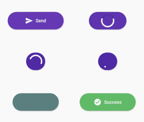
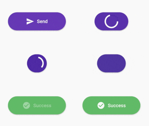
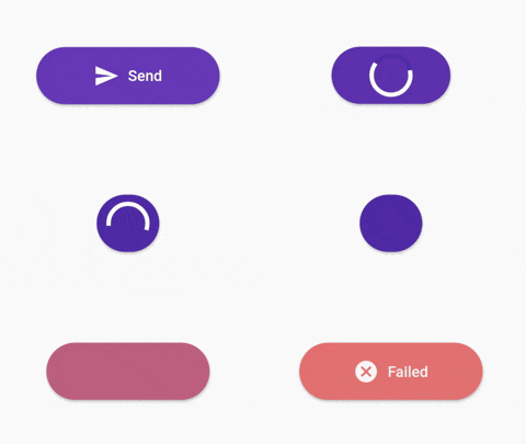
ProgressButton.icon(iconedButtons: {
      ButtonState.idle:
        IconedButton(
            text: "Send",
            icon: Icon(Icons.send,color: Colors.white),
            color: Colors.deepPurple.shade500),
      ButtonState.loading:
        IconedButton(
            text: "Loading",
            color: Colors.deepPurple.shade700),
      ButtonState.fail:
        IconedButton(
            text: "Failed",
            icon: Icon(Icons.cancel,color: Colors.white),
            color: Colors.red.shade300),
      ButtonState.success:
        IconedButton(
            text: "Success",
            icon: Icon(Icons.check_circle,color: Colors.white,),
            color: Colors.green.shade400)
    }, 
    onPressed: onPressed,
    state: ButtonState.idle);
With Custom Widgets

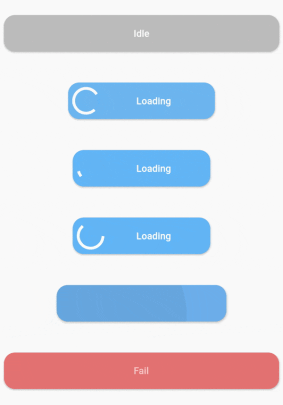
ProgressButton(
      stateWidgets: {
        ButtonState.idle: Text("Idle",style: TextStyle(color: Colors.white, fontWeight: FontWeight.w500),),
        ButtonState.loading: Text("Loading",style: TextStyle(color: Colors.white, fontWeight: FontWeight.w500),),
        ButtonState.fail: Text("Fail",style: TextStyle(color: Colors.white, fontWeight: FontWeight.w500),),
        ButtonState.success: Text("Success",style: TextStyle(color: Colors.white, fontWeight: FontWeight.w500),)
      },
      stateColors: {
        ButtonState.idle: Colors.grey.shade400,
        ButtonState.loading: Colors.blue.shade300,
        ButtonState.fail: Colors.red.shade300,
        ButtonState.success: Colors.green.shade400,
      },
      onPressed: onPressed,
      state: ButtonState.idle,
    );
Constructors
Default constructor of ProgressButton
stateWidgets - Widgets of states
stateColors - Background color oof states
state = ButtonState.idle` - Current state of button
onPressed - onPressed function same like MaterialButton
onAnimationEnd - onAnimatedEnd function calls like that onAnimatedEnd(AnimationStatus animationStatus,ButtonState currentState).
minWidth = 200.0 - Loading state width
maxWidth = 400.0 - failed,success,idle states width
radius = 16.0 - Button radius
height = 53.0 - Button height
circularProgressIndicator - CircularProgressIndicator widget, default is instating with current state color.
progressIndicatorAlignment = MainAxisAlignment.spaceBetween` - ProgressIndicator aligment
progressIndicatorSize = 35.0 - size of progress indicator
padding = EdgeInsets.zero - Padding of button
minWidthStates = List of min width states, loading is the default. If you want to make small only icon states define them on this.
animationDuration = Transition animation duration.
ProgressButton.icon() specific constructors
Map<ButtonState, IconedButton> iconedButtons- State and IconedButton map
double iconPadding: 4.0 - Padding of icon 
TextStyle textStyle - TextStyle of all of states

License

This project is licensed under the MIT License - see the LICENSE.md file for details

所屬分類

原始碼儲存庫

使用此套件的專案

暫無相關資料。