搜尋套件、儲存庫與 APP 分類

riff_switch 封面
套件詳情v0.0.4

riff_switch

使用 RiffSwitch 獲得流暢的過渡效果與引人入勝的互動體驗。這款開關庫能輕鬆實現滑動效果與令人著迷的動畫。

AndroidiOSWebmacOSWindowsLinux
近 30 天下載
185
喜歡數
10
Pub 分數
140

安裝套件

flutter pub add riff_switch

套件介紹

根據套件公開資料產生的選型評估,僅供參考。

RiffSwitch 是一個 Flutter 套件,專為透過流暢的滑動過渡和視覺上吸引人的動畫來增強使用者介面中的開關元件而設計。它讓開發者能以最少的程式碼建立引人入勝、互動性強的開關,非常適合用於設定、偏好或狀態指示器中的切換功能。該套件支援 Android、iOS、Web、macOS、Windows 和 Linux 多個平台,確保在不同裝置上行為一致。透過可自訂的樣式與回應式反饋,RiffSwitch 讓互動感覺動態且精緻,提升使用者體驗。

適用情境

  • 自訂切換開關
  • 使用者偏好設定
  • 開關狀態指示器
  • 互動式 UI 元素
  • 行動與Web應用介面

主要特色

  • 平滑的滑動動畫
  • 跨平台相容性
  • 可自訂外觀
  • 響應式互動回饋
  • 所需的設定最少

適合對象

  • 尋求視覺精緻的UI設計師
  • 開發互動式表單的開發者
  • 需要直覺式切換控制的應用程式
  • 跨平台 Flutter 項目
  • 重視使用者體驗的專案

使用建議

  • 可能需要額外的樣式才能適應複雜主題
  • 大型開關列表的效能影響
  • 僅限開關特定功能
  • 不適用於非切換式互動元件
  • 依賴於 Flutter 的動畫框架

原始 README

以下為關聯原始碼儲存庫的 README 原文快照,最新內容請造訪原始碼儲存庫。

RiffSwitch

Build pub package pub points popularity likes Star on Github Awesome Flutter License: BSD

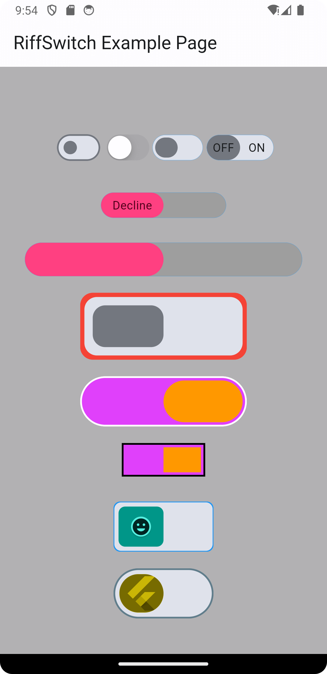
Breathe life into your Flutter UI with RiffSwitch, the switch library that empowers effortless sliding effects and captivating animations. Customize the sliding behavior for a unique user experience, while interactive dragging fosters a sense of control and responsiveness. Witness smooth state transitions as the switch flips, adding a touch of visual polish to your app. Whether you prefer simple or decorative switch types, RiffSwitch seamlessly integrates into your UI, transforming basic interactions into engaging experiences.

Experience seamless transitions and engaging interactions with RiffSwitch.

Table of Contents

Installation

To use RiffSwitch in your Flutter project, add the following to your pubspec.yaml file:

dependencies:
  riff_switch: ^0.0.4

Then, run:

flutter pub get

Usage

Import the package:

import 'package:riff_switch/riff_switch.dart';

Add the RiffSwitch widget to your UI, providing the necessary parameters:

RiffSwitch(
  value: _isEnabled,
  onChanged: (bool newValue) {
    setState(() {
      _isEnabled = newValue;
    });
  },
  // Additional customization options...
)

Features

  • Customization: Customize the appearance with various options such as colors, texts, and child widgets.
  • Sliding Effects: RiffSwitch supports sliding effects for a modern and interactive user experience.
  • Enum Types: Choose between simple and decorative switch types based on your UI requirements.
  • Animation:
    • Smooth Transitions: Enjoy smooth animations when the switch transitions between on and off states.
    • Interactive Dragging: The sliding effects are accompanied by interactive dragging animations for a responsive feel.

Examples

Here's a basic example of how to use RiffSwitch:

import 'package:flutter/material.dart';
import 'package:riff_switch/riff_switch.dart';

void main() {
  runApp(MyApp());
}

class MyApp extends StatelessWidget {
  @override
  Widget build(BuildContext context) {
    return MaterialApp(
      home: Scaffold(
        appBar: AppBar(
          title: Text('RiffSwitch Example'),
        ),
        body: Center(
          child: RiffSwitch(
            value: true,
            onChanged: (bool newValue) {
              // Handle switch state change
            },
            // Additional customization options...
          ),
        ),
      ),
    );
  }
}

More examples from main.dart

// 1
  RiffSwitch(
    value: _switchValue,
    onChanged: (value) => setState(() {
      _switchValue = value;
    }),
    type: RiffSwitchType.simple,
  ),

  const SizedBox(height: 30),

  // 2
  RiffSwitch(
    value: _switchValue,
    onChanged: (value) => setState(() {
      _switchValue = value;
    }),
    type: RiffSwitchType.simple,
    activeText: const Text("Accept"),
    inactiveText: const Text("Decline"),
    thumbColor: MaterialStateProperty.resolveWith((Set<MaterialState> states) {
      if (states.contains(MaterialState.selected)) {
        return Colors.greenAccent;
      }
      return Colors.pinkAccent;
    }),
    trackColor: MaterialStateProperty.resolveWith((Set<MaterialState> states) {
      if (states.contains(MaterialState.selected)) {
        return Colors.grey;
      }
      return Colors.grey;
    }),
  ),

  const SizedBox(height: 30),

  // 3
  RiffSwitch(
    value: _switchValue,
    onChanged: (value) => setState(() {
      _switchValue = value;
    }),
    type: RiffSwitchType.decorative,
    activeColor: Colors.orange,
  ),

  const SizedBox(height: 30),

  // 4
  RiffSwitch(
    value: _switchValue,
    onChanged: (value) => setState(() {
      _switchValue = value;
    }),
    type: RiffSwitchType.decorative,
    activeChild: const Card(
      color: CupertinoColors.systemBlue,
      child: FlutterLogo(),
    ),
    inactiveChild: const Card(
      color: CupertinoColors.systemYellow,
      child: FlutterLogo(),
    ),
  )

NOTE: It's important to note that the thumbColor property takes precedence over any color applied directly to the active or inactive thumb, whether through a container widget or any other means. This allows for consistent and predictable customization of the thumb's color across different states of the switch, ensuring a cohesive visual appearance throughout the application.

Screenshots

Screenshot 1 Screenshot 2 Screenshot 3
Screenshot 4 Screenshot 5 Screenshot 6
Screen Record 1 Screen Record 2

Contributing

Contributions are welcome! Feel free to open issues or submit pull requests.

  • Issues: If you encounter any bugs, have feature requests, or want to suggest improvements, please open an issue on our GitHub repository. Provide as much detail as possible to help us understand the problem or idea better.

  • Pull Requests: If you'd like to contribute code changes, feel free to submit a pull request. Before doing so, make sure to fork the repository and create a new branch for your changes. Follow the existing coding style and guidelines, and write clear and concise commit messages. Your pull request will undergo review, and we'll work together to ensure the changes align with the project's goals.

  • Feature Requests: If you have ideas for new features or enhancements, please open an issue to discuss them. We value community feedback and want to ensure that new features align with the project's direction and objectives.

  • Spread the Word: Help us grow the FontResoft community by sharing the project with others. Whether through social media, blog posts, or word of mouth, spreading the word about FontResoft helps attract more users and contributors.

License

This project is licensed under the BSD 3-Clause License - see the LICENSE file for details.

所屬分類

依賴

依賴清單 1 項

原始碼儲存庫

使用此套件的專案

暫無相關資料。