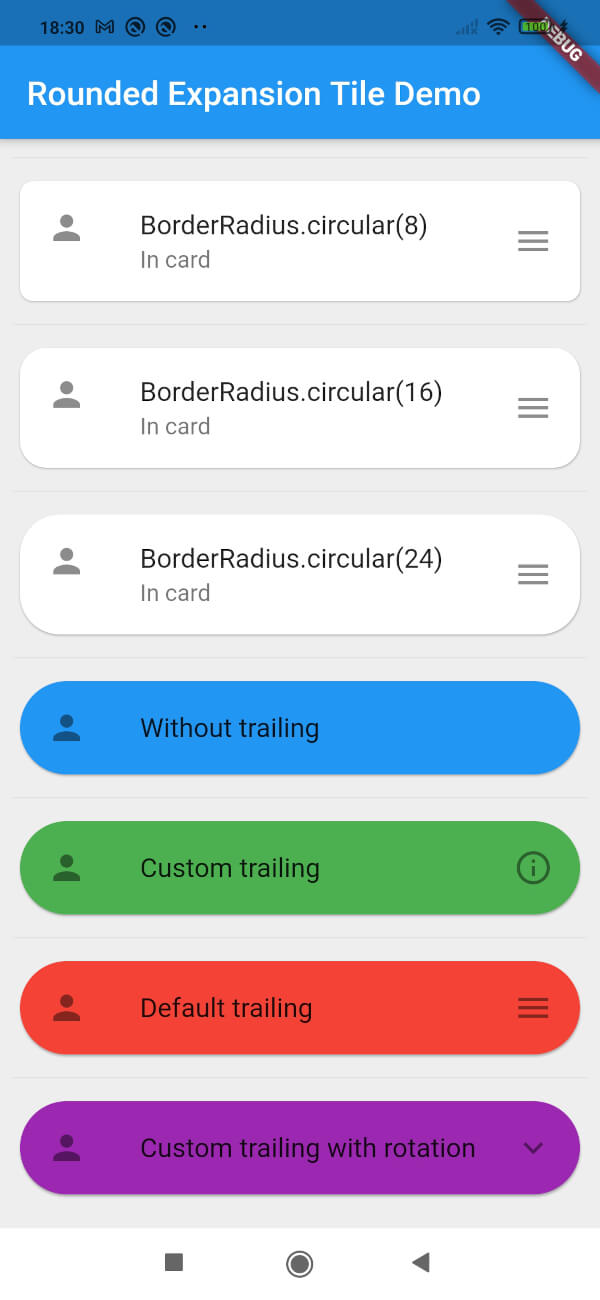
一個 Flutter 套件,提供可自訂圓角的增強版 ExpansionTile,為可摺疊內容區塊提供現代且視覺上吸引人的設計。專為簡潔性和整合性而建構,在所有平台擴展標準 ExpansionTile 的圓角功能。非常適合在行動與 Web 應用中建立乾淨、使用者友善的介面。此套件輕量級,並維持與 Flutter 核心組件的相容性。
適用情境
在表單中建立樣式化的可摺疊區段
在儀表板中設計響應式摺疊面板
透過圓角互動元素增強UI一致性
建構可存取的導航面板
在電子商務應用中實現可擴展的產品詳情
主要特色
可自訂邊框圓角
跨平台支援(Android、iOS、Web、macOS、Windows、Linux)
與現有 Flutter 專案的簡單整合
擴展標準 ExpansionTile
輕量級且依賴項最少
適合對象
尋求精緻使用者介面元件的開發者
專注於視覺一致性的UI設計師
需要一致的圓角卡片式擴展的專案
針對多平台的應用程式
Flutter 初學者探索 widget 自訂
使用建議
僅限邊框圓角樣式
不包括標準 ExpansionTile 之外的其他動畫
如需,需要手動處理內容填充
除了預設設定外,沒有內建的圖示或標題自訂功能
最適合簡單的擴展使用案例,無需複雜的版面
原始 README
以下為關聯原始碼儲存庫的 README 原文快照,最新內容請造訪原始碼儲存庫。
Rounded Expansiontile
A simple combination of widgets to provide an Expansiontile with rounded corners.
This widget uses default Flutter widgets only and is available for each platform.
Getting Started
This Widget returns a column with a ListTile and a ListView. It has all properties of the ListTile width a few custom inputfield.
Simply load the widget in your pubspec yaml and start using it.
Inputfields
Default ListTile and ExpansionTile inputfields
autofocus
contentPadding
dense
enabled
enableFeedback
focusColor
focusNode
horizontalTitleGap
hoverColor
isThreeLine
key
leading
minLeadingWidth
minVerticalPadding
mouseCursor
onLongPress
selected
selectedTileColor
shape
subtitle
title
tileColor
trailing
visualDensity
onTap
initiallyExpanded
Extra inputfields and tips
shapeShape()
The shape will be used for the shape of the ListTile, not for the children. This is visible when pressed and will be shown in the ink splash.
Use the RoundedExpansionTile in a Card-widget with the same shape for the best result.
This will be used to show the expansion animation. It is used for the Expansion it self and the rotation / animation of the Icon. By default the duration is 500 milliseconds.
childrenList<Widget>[]
The children that will be displayd when the ListTile is expanded.
childrenPaddingEdgeInsets()
The padding around the children. This is not the same as the contentpadding.
curveCurve()
The curve used for the children animation. By default it uses Curves.fastLinearToSlowEaseIn
trailingWidget()
When provided this will override the default hamburger menu icon (AnimatedIcon). This icon will rotate by default but can be set to false see rotateTrailing.
rotateTrailingbool
Rotate the custom trailing icon when provided. By default this is true. When set to false the icon stays the same. Provide the trailing with an arrow down to make the widget look like the default ExpansionTile.
noTrailing bool
When set to true there will be no trailing at all. Even when provided custom trailing this bool will prevent it from being shown.