搜尋套件、儲存庫與 APP 分類

scaled_app 封面
套件詳情v2.3.2

scaled_app

按比例縮放整個UI設計,當您的UI設計具有固定寬度時非常有用。

AndroidiOSWebmacOSWindowsLinux
近 30 天下載
5萬
喜歡數
96
Pub 分數
160

安裝套件

flutter pub add scaled_app

套件介紹

根據套件公開資料產生的選型評估,僅供參考。

Scaled_App 是一個 Flutter 套件,可根據參考設計寬度實現整個 UI 的比例縮放。它透過動態縮放組件,確保在不同螢幕尺寸上的佈局與字型一致性。適用於具有固定寬度基礎的設計,無需手動調整即可維持視覺保真度。此套件支援所有主要平台,包括行動裝置、網頁和桌面端,非常適合需要精確 UI 控制的跨平台應用。

適用情境

  • 固定寬度設計適應
  • 跨平台 UI 一致性
  • 響應式佈局縮放
  • 設計系統實施
  • 跨裝置的UI精確度

主要特色

  • 比例使用者介面縮放
  • 參考設計寬度支援
  • 跨平台相容性
  • 自動小工具調整大小
  • 最小設定需求

適合對象

  • 具有固定寬度設計規格的開發人員
  • 使用設計系統的團隊
  • 針對多種螢幕尺寸的應用
  • 需要像素級UI複製的項目
  • 具有嚴格設計約束的Flutter應用

使用建議

  • 最適合固定寬度設計工作流程
  • 可能需要初始設定參考寬度
  • 不適合流體或動態佈局
  • 性能影響可忽略不計,但取決於複雜性
  • 需要在目標設備上進行仔細測試

原始 README

以下為關聯原始碼儲存庫的 README 原文快照,最新內容請造訪原始碼儲存庫。

Scale the entire UI design proportionally.

Button, image, font, every widget is scaled simultaneously.

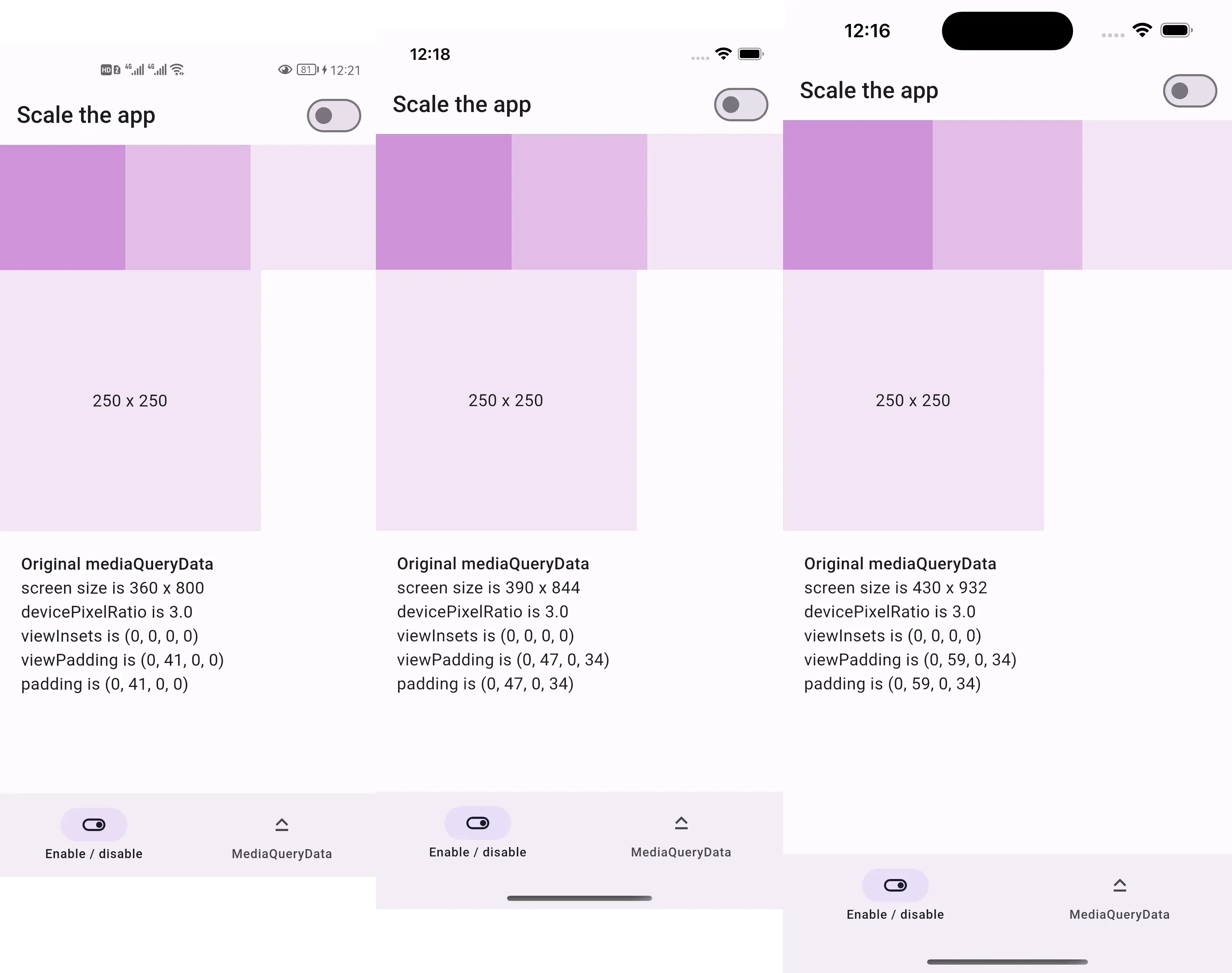
Before:

  • 250x250 square is the same size across devices

Screenshots of the same design before scaling

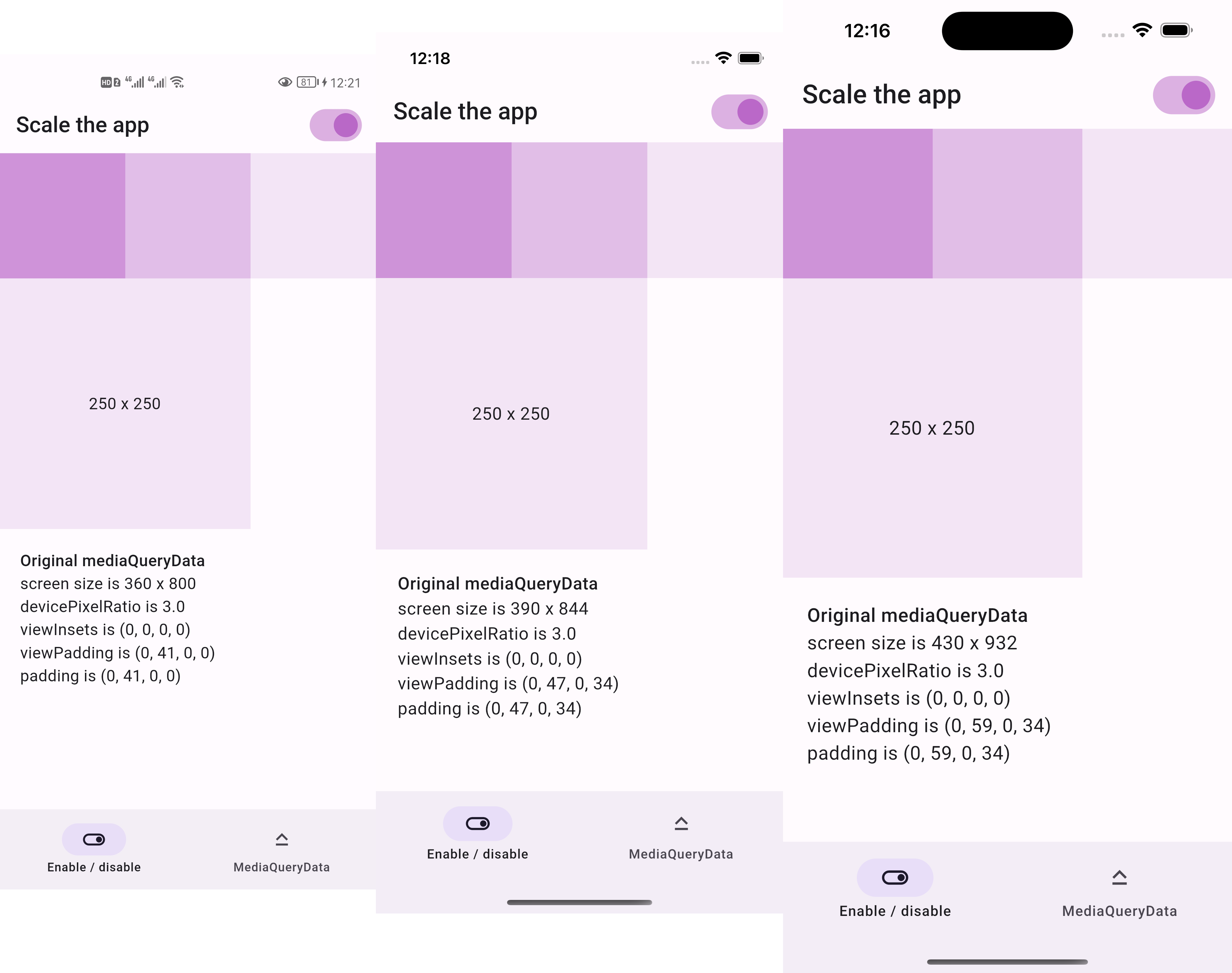
After:

  • 250x250 square is two thirds the screen width across devices

Screenshots of the same design after scaling

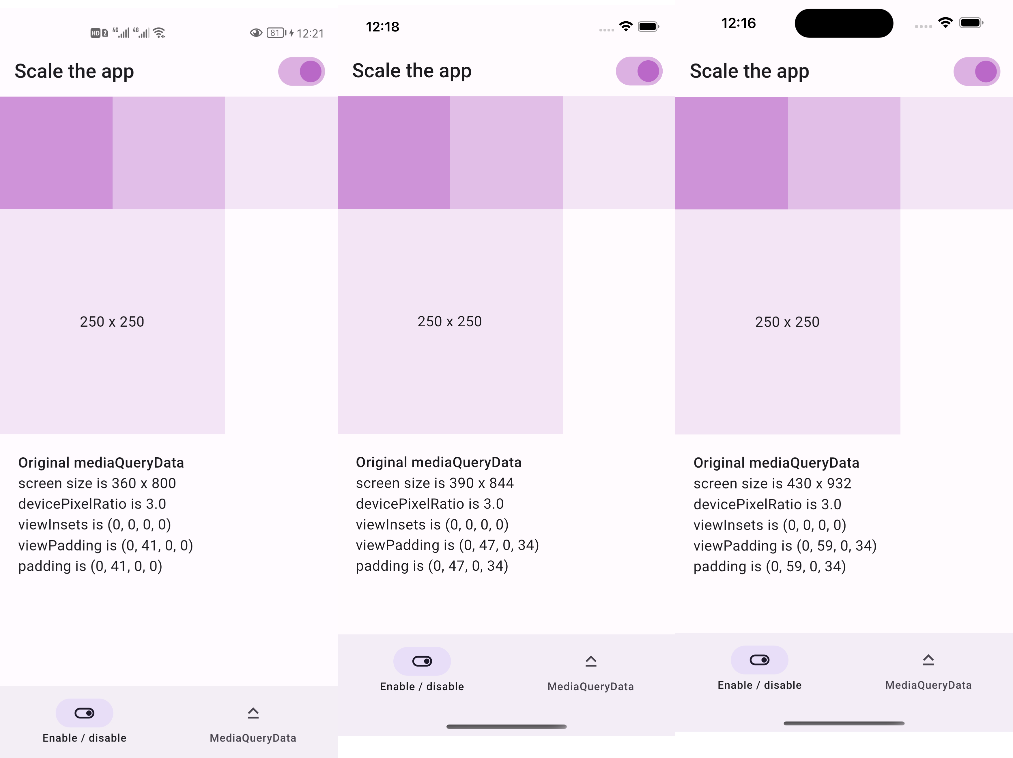
  • if we resize the screenshots above to be the same width
  • then everything appears the same size as below

Resized screenshots of the same design after scaling

Sponsor

庞征博引 — 想学的,慢慢都会

This package is sponsored by 庞征博引, which breaks complex subjects into 5–10 minute reads you work through, and ask questions about, at your own pace.

Live demo

https://lastmonopoly.github.io/flutter_web_app/scaled_app_demo/

Features

Use this package in your Flutter app when:

  • your UI design is fixed-width
  • you want to scale the entire UI, not just part of it

Usage

Firstly, replace runApp with runAppScaled

void main() {
  // 1st way to use this package
  runAppScaled(const MyApp(), scaleFactor: (deviceSize) {
    // screen width used in your UI design
    const double widthOfDesign = 375;
    return deviceSize.width / widthOfDesign;
  });
}

Or, replace WidgetsFlutterBinding with ScaledWidgetsFlutterBinding

void main() {
  // 2nd way to use this package
  // Scaling will be applied based on [scaleFactor] callback.
  ScaledWidgetsFlutterBinding.ensureInitialized(
    scaleFactor: (deviceSize) {
      // screen width used in your UI design
      const double widthOfDesign = 375;
      return deviceSize.width / widthOfDesign;
    },
  );
  runApp(const MyApp());
}

Then, use MediaQueryData.scale to scale size, viewInsets, viewPadding, etc.

class PageRoute extends StatelessWidget {
  const PageRoute({Key? key}) : super(key: key);

  @override
  Widget build(BuildContext context) {
    return MediaQuery(
      data: MediaQuery.of(context).scale(),
      child: const Scaffold(...),
    );
  }
}

Optionally, update ScaledWidgetsFlutterBinding.instance.scaleFactor to enable / disable scaling on demand.

Reference

https://juejin.cn/post/7078816723666731021

所屬分類

原始碼儲存庫

使用此套件的專案

所在榜單