搜尋套件、儲存庫與 APP 分類

scrollable_list_tabview 封面
套件詳情v0.1.6

scrollable_list_tabview

一個 Flutter 小部件,用於同步 ScrollView 與自訂標籤檢視。

近 30 天下載
49
喜歡數
166
Pub 分數
40

安裝套件

flutter pub add scrollable_list_tabview

套件介紹

根據套件公開資料產生的選型評估,僅供參考。

一個Flutter widget,可將可滾動列表與自訂標籤檢視同步,確保兩個組件之間的順暢對齊。它讓使用者可以透過捲動瀏覽內容,同時更新選取的標籤,反之亦然。非常適合建立列表項目與標籤密切相關的協調、互動式介面。此套件輕量且設計用於無縫整合至現有的Flutter專案中。

適用情境

  • 同步列表和標籤導航
  • 建立內容豐富的儀表板
  • 構建引導式入門流程
  • 實現可滾動的標籤頁介面

主要特色

  • 滾動與標籤頁的即時同步
  • 可自訂的標籤樣式
  • 支援動態內容
  • 與現有組件的簡單整合
  • 跨裝置的響應式行為

適合對象

  • 開發 tabbed 內容佈局的開發者
  • 需要同步滾動和標籤選擇的應用
  • 尋求互動式導航模式的UI設計師

使用建議

  • 需要手動處理選項卡項目資料
  • 有限的平台特定優化
  • 無內建動畫
  • 不適合高度複雜的嵌套導航

原始 README

以下為關聯原始碼儲存庫的 README 原文快照,最新內容請造訪原始碼儲存庫。

scrollable_list_tabview

Build Status Codemagic build status Coverage Status

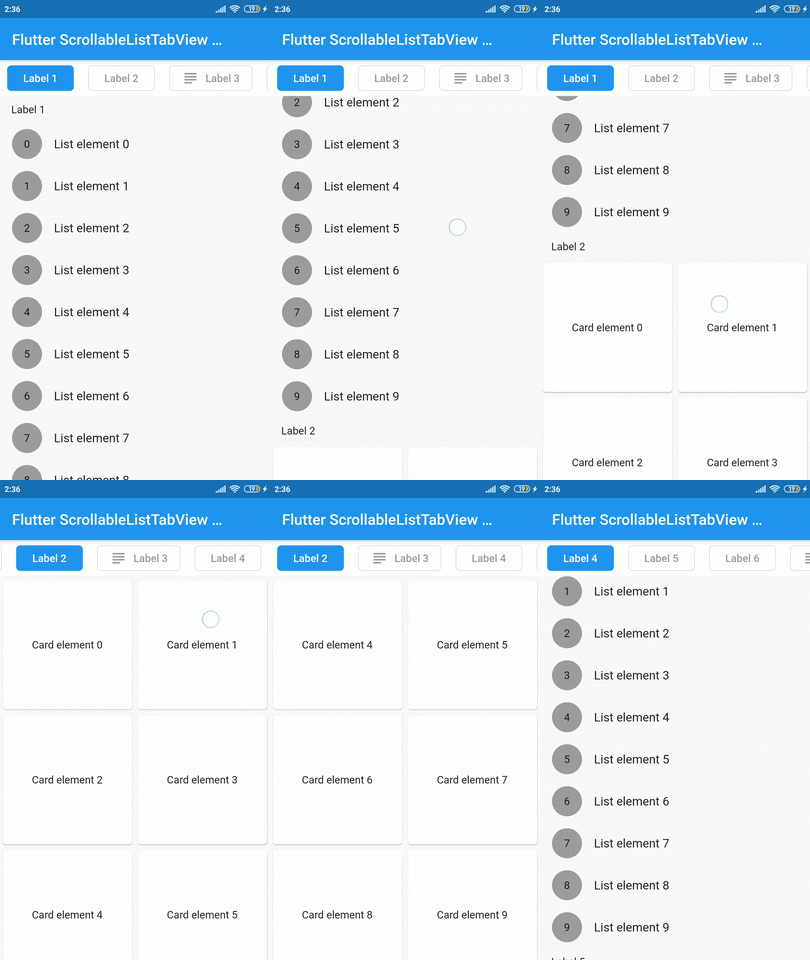
A Flutter widget which synchronize a ScrollView and a custom tab view.

The main idea is to create a custom tab view synchronizing with inner ScrollView. The scroll activity will trigger custom tab view at the top to follow the index of the inner scroll view widget.

Demo

Installation

Add dependency for package on your pubspec.yaml:

dependencies:
    scrollable_list_tabview: <latest>

Usage

To use this widget we must first define how our tabs will look like.

ListTab
Parameter Definition
Widget icon Trailing widget for a tab, typically an Icon.
Widget label Label to be shown in the tab, must be non-null.
BorderRadiusGeometry borderRadius BorderRadius value for a single tab.
Color activeBackgroundColor Color to be used when the tab is selected.
Color inactiveBackgroundColor Color to be used when the tab isn't selected.
bool showIconInList Decide whether show icon widget in the scrollable view.
Color borderColor Color of the border of tab when its not selected

Then we can use LisTab in ScrollableListTab.

ScrollableListTab
Parameter Definition
ListTab tab Data model used for rendering tab widgets.
ScrollView body An individual inner scrollable widget.

Then ScrollableListTabView will take a list of ScrollableListTab as an argument.

ScrollableListTabView
Parameter Definition
List<ScrollableListTab> tabs List of tabs to be built.
double height Height of the tab at the top of the view.
Duration tabAnimationDuration Duration of tab change animation.
Duration bodyAnimationDuration Duration of inner scroll view animation.
Curve tabAnimationCurve Animation curve used when animating tab change.
Curve bodyAnimationCurve Animation curve used when changing index of inner ScrollView(s).

Example

import 'package:flutter/material.dart';
import 'package:scrollable_list_tabview/scrollable_list_tabview.dart';

void main() {
  runApp(MyApp());
}

class MyApp extends StatelessWidget {
  // This widget is the root of your application.
  @override
  Widget build(BuildContext context) {
    return MaterialApp(
      title: 'Flutter Demo',
      debugShowCheckedModeBanner: false,
      theme: ThemeData(
        primarySwatch: Colors.blue,
        visualDensity: VisualDensity.adaptivePlatformDensity,
      ),
      home: MyHomePage(title: 'Flutter ScrollableListTabView Example'),
    );
  }
}

class MyHomePage extends StatefulWidget {
  MyHomePage({Key key, this.title}) : super(key: key);

  final String title;

  @override
  _MyHomePageState createState() => _MyHomePageState();
}

class _MyHomePageState extends State<MyHomePage> {
  @override
  Widget build(BuildContext context) {
    return Scaffold(
      appBar: AppBar(
        title: Text(widget.title),
      ),
      body: ScrollableListTabView(
        tabHeight: 48,
        tabs: [
          ScrollableListTab(
              tab: ListTab(label: Text('Label 1'), icon: Icon(Icons.group)),
              body: ListView.builder(
                shrinkWrap: true,
                physics: NeverScrollableScrollPhysics(),
                itemCount: 10,
                itemBuilder: (_, index) => ListTile(
                  leading: Container(
                    height: 40,
                    width: 40,
                    decoration: BoxDecoration(
                        shape: BoxShape.circle, color: Colors.grey),
                    alignment: Alignment.center,
                    child: Text(index.toString()),
                  ),
                  title: Text('List element $index'),
                ),
              )),
        ],
      ),
    );
  }
}

Limitations & Considerations

There are some limitations on this package. For example we only support ScrollView to be the body. Also, we could have used builder pattern to build the widgets.

I would like to thank Google developers for creating awesome package called ScrollablePositionedList.

Contribution

Contributions are accepted via pull requests. For more information about how to contribute to this package, please check the contribution guide.

License

This project is licensed under the MIT license, additional knowledge about the license can be found here.

所屬分類

依賴

依賴清單 1 項

原始碼儲存庫

使用此套件的專案

暫無相關資料。