Selector Wheel


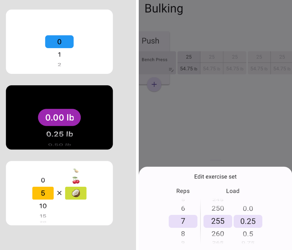
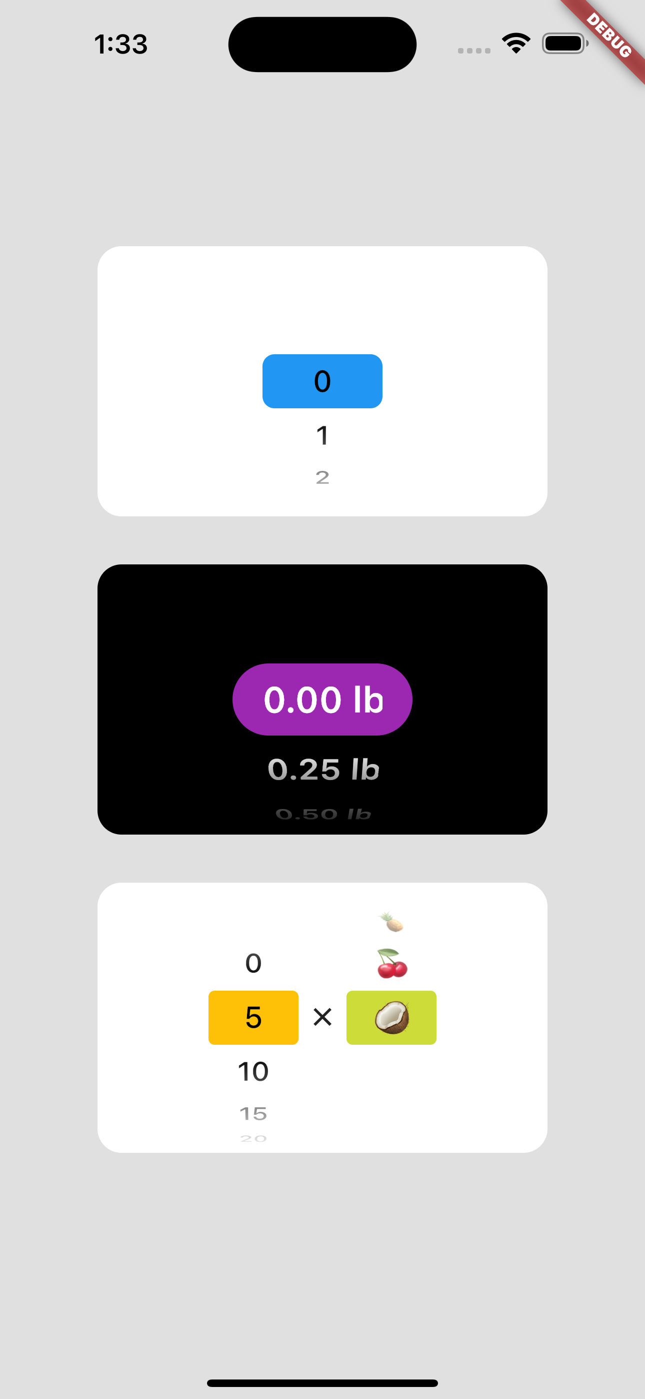
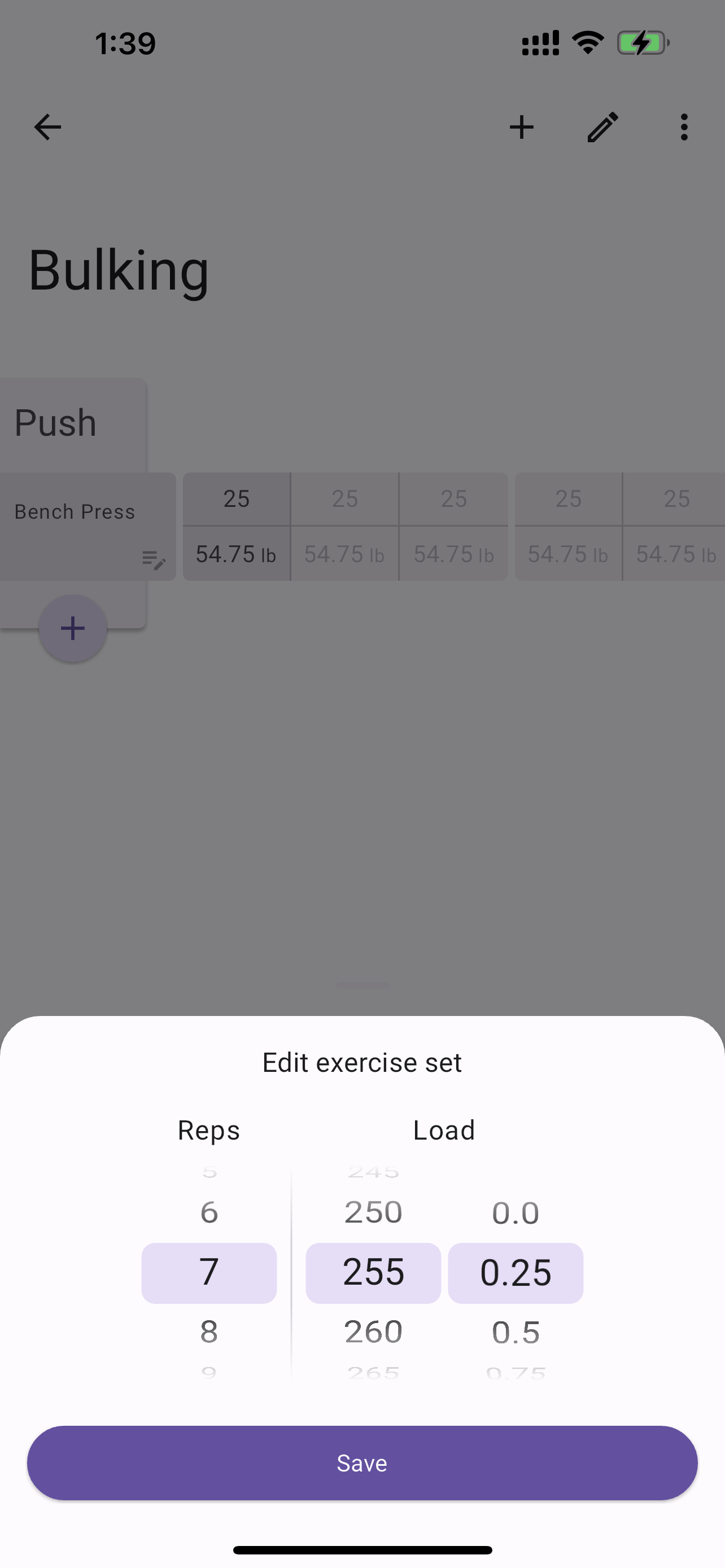
A Flutter package for creating customizable selector wheel widgets.
Table of Contents
Features
- Customizable selector wheel widget
- Supports variable wheel size, item width, item height, and more
- Built with Flutter's best practices for optimal performance
- Supports haptic feedback, fade-out effect, and more
- Can be used with any data type
Getting started
Add selector_wheel to your pubspec.yaml by running the following command:
flutter pub add selector_wheel
Usage
Import the package:
import 'package:selector_wheel/selector_wheel.dart';
Basic usage
Use the SelectorWheel widget in your app:
SizedBox(
width: 200,
height: 200,
child: SelectorWheel(
childCount: 10,
convertIndexToValue: (int index) {
return SelectorWheelValue(
label: index.toString(),
value: index,
index: index,
);
},
onValueChanged: (SelectorWheelValue<int> value) {
print(value);
},
),
)
Customizing the selector wheel
Keep in mind, that the convertIndexToValue function can be used to convert the index to any value.
In the example below, we are converting the index to a double value to represent quarter lbs.
SizedBox(
width: 200,
height: 200,
child: SelectorWheel(
childCount: 10,
convertIndexToValue: (int index) {
final quarter = index / 4;
return SelectorWheelValue(
label: '${quarter.toString()} lb',
value: quarter,
index: index,
);
},
onValueChanged: (SelectorWheelValue<double> value) {
print(value);
},
),
)
The colors of the selector wheel can be customized by overriding the ThemeData in the following way:
Theme(
data: ThemeData(
textTheme: Theme.of(context).textTheme.copyWith(
titleLarge: Theme.of(context).textTheme.titleLarge?.copyWith(
fontSize: 24.0,
fontWeight: FontWeight.w600,
),
),
colorScheme: Theme.of(context).colorScheme.copyWith(
surface: Colors.black,
onSurface: Colors.white,
secondaryContainer: Colors.amber,
),
),
child: SizedBox(
width: 200,
height: 200,
child: SelectorWheel(
childCount: 10,
highlightBorderRadius: 16.0,
highlightHeight: 40.0,
highlightWidth: 100.0,
convertIndexToValue: (int index) {
return SelectorWheelValue(
label: index.toString(),
value: index,
index: index,
);
},
onValueChanged: (value) {
print(value);
},
),
),
)
Notice, that we're also customizing the "highlighted" item's border radius, height, and width. To see
all the customizable properties, check out the SelectorWheel class.
Contributing
Contributions are welcome! If you find a bug or have a feature request, please open an issue on the GitHub repository.
License
This package is licensed under the MIT License. For more details, please refer to the LICENSE file included in the repository.