搜尋套件、儲存庫與 APP 分類

套件詳情v0.0.5

slider_controller

一個提供滑塊控制器和自定義組件的套件。此組件用於輕鬆自訂滑塊組件。

AndroidiOSWebmacOSWindowsLinux
近 30 天下載
36
喜歡數
40
Pub 分數
160

安裝套件

flutter pub add slider_controller

套件介紹

根據套件公開資料產生的選型評估,僅供參考。

slider_controller 套件為 Flutter 應用程式提供了一個可自訂的滑桿控制器與元件。它簡化了滑桿的建立與管理,並增強了外觀與行為的控制。開發者可以輕鬆地根據特定設計需求調整滑桿的外觀與功能。此套件支援所有主要平台,包括 Android、iOS、Web、macOS、Windows 與 Linux,確保跨裝置的一致性表現。透過直覺的 API,可順暢整合至現有專案。

適用情境

  • 自訂滑塊設計
  • 互動式 UI 元素
  • 具範圍選擇的表單輸入
  • 跨平台滑塊組件
  • 動態值調整

主要特色

  • 易於自訂
  • 跨平台支援
  • 內建控制器邏輯
  • 響應式設計整合
  • 可擴展的組件結構

適合對象

  • UI 開發人員
  • Flutter 初學者
  • 注重設計的應用
  • 互動式表單
  • 多平台專案

使用建議

  • 需要基本的 Flutter 知識
  • 僅限滑塊特定使用案例
  • 複雜版面可能需要額外的樣式
  • 依賴外部相依性以實現進階功能
  • 不適用於非滑塊元件

原始 README

以下為關聯原始碼儲存庫的 README 原文快照,最新內容請造訪原始碼儲存庫。

slider_controller

Flutter Website Dart Website MIT License

A package that gives us a slider controller a custom widget. This widget is used for easy customization for the slider widget.

Key Features

  • Ready to use custom slider widget.
  • Easy customization for the slider widget.

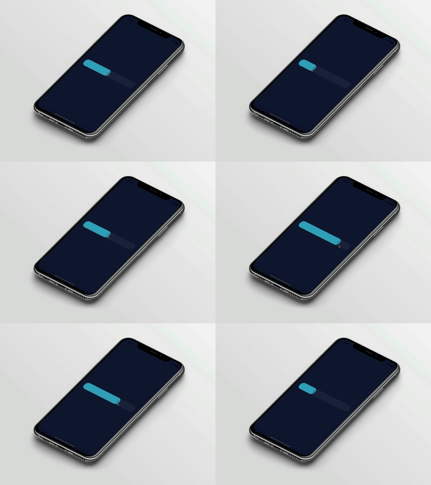
Preview

slider_controller

Basic Usage

Import it to your project file

import 'package:slider_controller/slider_controller.dart';

And add it in its most basic form like it:

SliderController(
  value: 50.0,
  onChanged: (value) {
    print('slider value : $value');
  },
);
Required parameters of SliderController

Parameter Description
double value Indicates the default slider thumb value between the 0.0 to 100.0
ValueChanged onChanged Called during a drag when the user is selecting a new value for the slider by dragging
Optional parameters of SliderController

Parameter Default Description
ValueChanged? onChangeEnd - Called when the user is done selecting a new value for the slider
ValueChanged? onChangeStart - Called when the user starts selecting a new value for the slider
double min 0.0 Indicates the Minimum value for the slider
double max 100.0 Indicates the Maximum value for the slider
SliderDecoration sliderDecoration -- Used to Decorate the Slider Widget
bool isDraggable true Used to Enable or Disable Drag Gesture of Slider
Optional parameters of SliderDecoration

Parameter Default Description
Color inactiveColor Colors.blueGrey Defines the background color of the inactive part of the slider
Color activeColor Colors.blue Defines the background color of the active part of the slider
Color thumbColor Colors.white Defines the thumb color of the slider
double borderRadius 20.0 Indicates the rounded border radius for the slider
double height 50.0 Indicates the height of the slider
bool isThumbVisible true Indicates that slider thumb is visible or not
double thumbHeight 25.0 Indicates the height of the slider thumb
double thumbWidth 5.0 Indicates the width of the slider thumb
Guideline for contributors

  • Contribution towards our repository is always welcome, we request contributors to create a pull request for development.
Guideline to report an issue/feature request

It would be great for us if the reporter can share the below things to understand the root cause of the issue.

  • Library version
  • Code snippet
  • Logs if applicable
  • Device specification like (Manufacturer, OS version, etc)
  • Screenshot/video with steps to reproduce the issue
  • Library used

LICENSE!

slider_controller is MIT-licensed.

Let us know!

We’d be really happy if you send us links to your projects where you use our component. Just send an email to sales@mindinventory.com And do let us know if you have any questions or suggestion regarding our work.

所屬分類

原始碼儲存庫

使用此套件的專案

暫無相關資料。