搜尋套件、儲存庫與 APP 分類

sliding_switch 封面
套件詳情v1.1.0

sliding_switch

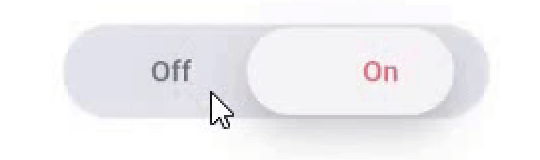
滑動開關 - 一個簡單的開關小部件。它可以完全自訂寬度、顏色、文字等。它還會維持選取狀態。

AndroidiOSWebmacOSWindowsLinux
近 30 天下載
731
喜歡數
33
Pub 分數
130

安裝套件

flutter pub add sliding_switch

套件介紹

根據套件公開資料產生的選型評估,僅供參考。

SlidingSwitch 是一個可自訂的開關組件,適用於 Flutter,允許使用者透過滑動動作在兩個狀態之間切換。它支援對寬度、顏色、文字標籤和動畫進行完全自訂。該組件在重新建構時會維持其選擇狀態,確保一致的使用者體驗。設計簡潔且彈性,可在 Android、iOS、Web、macOS、Windows 和 Linux 平台上順暢運作。非常適合應用程式中的設定、偏好以及開/關切換。

適用情境

  • 使用者偏好切換
  • 設定面板
  • 開關
  • 表單控制項
  • 深色模式切換

主要特色

  • 完全可自定義的外觀
  • 狀態持久化
  • 跨平台支援
  • 平滑滑動動畫
  • 文字標籤支援
  • 可設定的寬度與顏色

適合對象

  • 簡單的切換UI
  • 可自訂表單元素
  • 跨平台應用
  • 偏好設定
  • 輕量級開關組件

使用建議

  • 僅限兩態切換
  • 無內建的可存取性功能
  • 在複雜場景中需要手動處理狀態
  • 不適用於多選項選擇

原始 README

以下為關聯原始碼儲存庫的 README 原文快照,最新內容請造訪原始碼儲存庫。

sliding_switch

Sliding Switch - A simple switch widget. It can be fully customized with desired width, colors, text etc. It also maintains selection state.

Live Demo (Codeapprun)

codeapprun.io

Getting Started

In the pubspec.yaml of your flutter project, add the following dependency:

dependencies:
  ...
  sliding_switch: "latest"

Import it:

import 'package:sliding_switch/sliding_switch.dart';

Usage Examples

Minimum sliding switch configuration
SlidingSwitch(
 value: false,
 width: 250,
 onChanged: (bool value) {
   print(value);
 },
)

sliding switch

sliding switch other configurations
SlidingSwitch(
 value: false,
 width: 250,
 onChanged: (bool value) {
   print(value);
 },
 height : 55,
 animationDuration : const Duration(milliseconds: 400),
 onTap:(){},
 onDoubleTap:(){},
 onSwipe:(){},
 textOff : "Female",
 textOn : "Male",
 iconOff: Icons.human-female,
 iconOn: Icons.human-male,
 contentSize: 17,
 colorOn : const Color(0xffdc6c73),
 colorOff : const Color(0xff6682c0),
 background : const Color(0xffe4e5eb),
 buttonColor : const Color(0xfff7f5f7),
 inactiveColor : const Color(0xff636f7b),
),

If iconOn or iconOff are not null, they will be displayed in lieu of the respective textOn and textOff. The values for textOn and textOff are used as semantic labels for the icons for accessibility. The icons in the example are not in the default material icon set, but are from [Material Design Icons] (https://materialdesignicons.com/), available on pub.dev here.

contentSize drives the height of the text or icons.

Licensed Under the MIT License.

Inspiration

Jitu Raut

所屬分類

原始碼儲存庫

使用此套件的專案

暫無相關資料。