sliver_sticky_collapsable_panel
A Sliver implementation of sticky collapsable panel, with a box header rebuild on status and a sliver child as panel content.
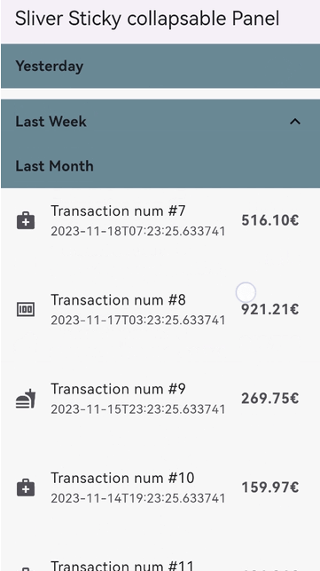
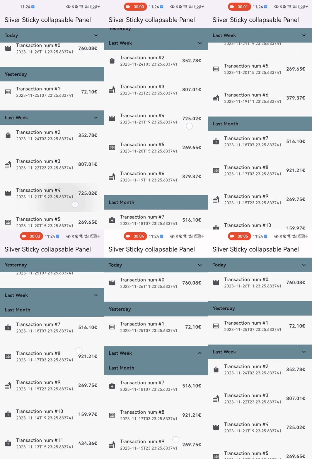
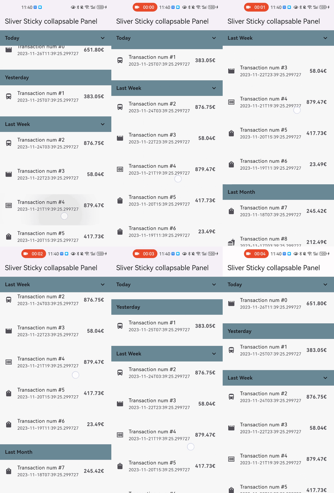
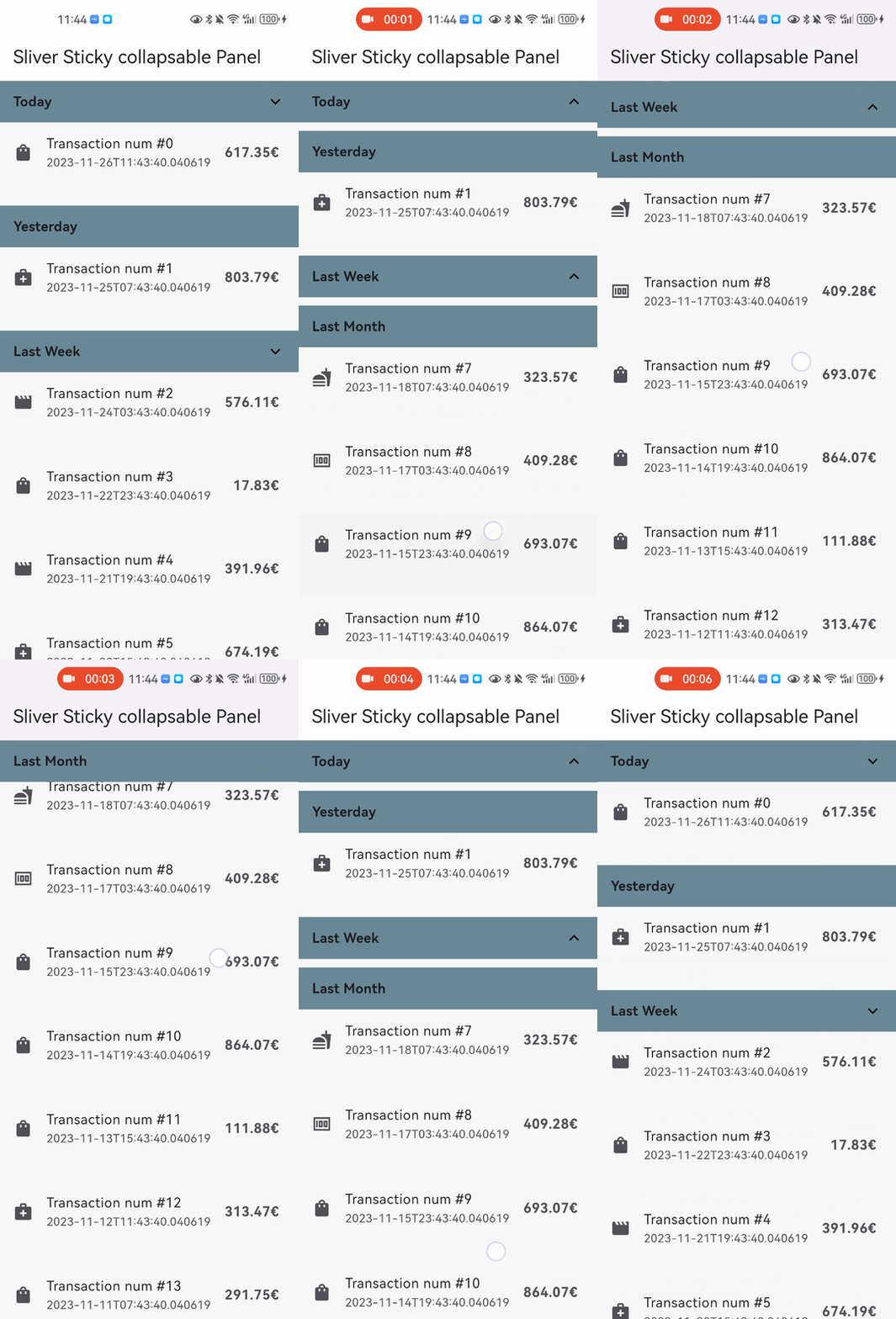
Snap Shot
Features
Relying solely on the Flutter framework itself, no any other dependencies.
Pure Dart implementation, running on any platform who supports Flutter.
Command style support for expand/collpase the panel.(it's still compatible with declarative style)
Accept one box child as header and one sliver child as panel content.
Header can overlap panel content (useful for sticky side header for example).
Notify and rebuild the header when status changed (scroll outside the viewport for example).
Support not sticky headers (with sticky: false parameter).
Support a controller which notifies the scroll offset of the current sticky header.
Support click the header to collapse the panel, or disable collapse (with disableCollapsable = true parameter in panelController).
Support iOS style sticky header, just like iOS's system contact app (with iOSStyleSticky = true parameter).
Support add padding for sliver child (with paddingBeforeCollapse parameter).
Support add padding after the header even the panel collapsed (with paddingAfterCollapse parameter).
Getting started
In the pubspec.yaml of your flutter project, add the following dependency:
dependencies:
  sliver_sticky_collapsable_panel: ^5.0.1
In your library add the following import:
import 'package:sliver_sticky_collapsable_panel/sliver_sticky_collapsable_panel.dart' ;
In your code, use the sliver like this:
CustomScrollView (
controller: _scrollController,
slivers: [
SliverStickyCollapsablePanel (
scrollController: _scrollController,
panelController: StickyCollapsablePanelController (key:'key_1' ),
headerBuilder: (context, status) => SizedBox .fromSize (size: Size .fromHeight (48 )),
sliverPanel: SliverList .list (children: [...]),
),
SliverStickyCollapsablePanel (
scrollController: _scrollController,
panelController: StickyCollapsablePanelController (key:'key_2' ),
headerBuilder: (context, status) => SizedBox .fromSize (size: Size .fromHeight (48 )),
sliverPanel: SliverList .list (children: [...]),
),
...,
],
);
For simple right side header arrow hint ^, you can build with widget in flutter framework like AnimatedRotation:
SliverStickyCollapsablePanel (
scrollController: _scrollController,
panelController: StickyCollapsablePanelController (key:'key_1' ),
headerBuilder: (context, status) => Container (
width: double .infinity,
height: 48 ,
child: Stack (
children: [
Text ("your title, or any other box widget you like" ),
Align (
alignment: Alignment .centerRight,
child: AnimatedRotation (
duration: const Duration (milliseconds: 0 ),
turns: status.isExpanded ? 0 : 0.5 ,
child: const Icon (Icons .expand_more),
),
),
],
),
),
sliverPanel: SliverList .list (children: [...]),
),
More Advanced Feature:
You can disable collapse for any sliver you wanted, just add disableCollapsable = true.CustomScrollView (
controller: _scrollController,
slivers: [
SliverStickyCollapsablePanel (
scrollController: _scrollController,
panelController: StickyCollapsablePanelController (key:'key_1' ,disableCollapsable: true ),
headerBuilder: (context, status) => SizedBox .fromSize (size: Size .fromHeight (48 )),
sliverPanel: SliverList .list (children: [...]),
),
...,
],
);
You can enable iOS style sticky header, just like the system's contact app with just one parameter iOSStyleSticky = true.CustomScrollView (
controller: _scrollController,
slivers: [
SliverStickyCollapsablePanel (
scrollController: _scrollController,
panelController: StickyCollapsablePanelController (key:'key_1' ),
iOSStyleSticky: true ,
headerBuilder: (context, status) => SizedBox .fromSize (size: Size .fromHeight (48 )),
sliverPanel: SliverList .list (children: [...]),
),
...,
],
);
You can add padding for sliver child (with paddingBeforeCollapse), even if the panel is collapsed, the padding still work between headers with paddingAfterCollapse.CustomScrollView (
controller: _scrollController,
slivers: [
SliverStickyCollapsablePanel (
scrollController: _scrollController,
panelController: StickyCollapsablePanelController (key:'key_1' ),
paddingBeforeCollapse: const EdgeInsets .all (16 ),
paddingAfterCollapse: const EdgeInsets .only (bottom: 10 ),
headerBuilder: (context, status) => SizedBox .fromSize (size: Size .fromHeight (48 )),
sliverPanel: SliverList .list (children: [...]),
),
...,
],
);
You can animate collapse/expand with only one parameter: panelAnimationDurationCustomScrollView (
controller: _scrollController,
slivers: [
SliverStickyCollapsablePanel (
scrollController: _scrollController,
panelController: StickyCollapsablePanelController (key:'key_1' ),
panelAnimationDuration: Duration (milliseconds: 300 ),
paddingBeforeCollapse: const EdgeInsets .all (16 ),
paddingAfterCollapse: const EdgeInsets .only (bottom: 10 ),
headerBuilder: (context, status) => SizedBox .fromSize (size: Size .fromHeight (48 )),
sliverPanel: SliverList .list (children: [...]),
),
...,
],
);
Performance configuration
You can use optional parameter headerSize to speed up the layout process when the size not change
if your header size maybe change, just keep this parameter null (which is the default)CustomScrollView (
controller: _scrollController,
slivers: [
SliverStickyCollapsablePanel (
scrollController: _scrollController,
panelController: StickyCollapsablePanelController (key:'key_1' ),
iOSStyleSticky: true ,
headerBuilder: (context, status) => SizedBox .fromSize (size: Size .fromHeight (48 )),
headerSize: Size (MediaQuery .of (context).size.width, 48 ),
sliverPanel: SliverList .list (children: [...]),
),
...,
],
);
Thanks