搜尋套件、儲存庫與 APP 分類

smooth_corner 封面
套件詳情v1.1.1

smooth_corner

一種模仿 Figma 的矩形邊框,具有可變的平滑度。

AndroidiOSWebmacOSWindowsLinux
近 30 天下載
2.4萬
喜歡數
64
Pub 分數
160

安裝套件

flutter pub add smooth_corner

套件介紹

根據套件公開資料產生的選型評估,僅供參考。

Smooth Corner 是一個 Flutter 套件,讓開發者能夠建立可調整平滑度的矩形邊框,緊密模擬 Figma 中的設計美學。它提供了一種彈性且高效的方式,使用自訂裁切邏輯為元件套用圓角或平滑曲線邊緣。非常適合需要現代、精緻外觀的 UI 元件,而不需依賴複雜的影像資源。此套件支援所有主要平台,確保跨裝置的一致呈現。

適用情境

  • 使用柔軟邊緣創建現代UI組件
  • 設計具有可變圓角半徑的按鈕和卡片
  • 實現類似 Figma 的邊框樣式
  • 增強應用程式介面的視覺質感
  • 構建可重複使用的裝飾性容器
  • 匹配設計系統要求

主要特色

  • 角落的可變平滑度控制
  • Figma 風格的邊框近似
  • 跨平台相容性
  • 輕量且高效的剪裁實作
  • 透過 pub add 輕鬆整合
  • 支援所有 Flutter 平台

適合對象

  • UI設計師實施Figma設計
  • 尋求乾淨現代邊框的開發者
  • 對視覺保真度要求較高的應用
  • 使用設計令牌保持一致性的項目
  • 團隊正在致力於像素級的UI複刻

使用建議

  • 效能影響可能會隨著複雜形狀而增加
  • 限制為帶有圓角的矩形邊框
  • 可能需要在所有目標平台上進行測試
  • 不適合高度不規則或自由形狀
  • 依賴於基於路徑的裁剪的準確渲染

原始 README

以下為關聯原始碼儲存庫的 README 原文快照,最新內容請造訪原始碼儲存庫。

Language: English | 中文简体

smooth_corner

Pub

Implement smooth iOS-style rounded corners in Flutter, mimicking Figma's "corner smoothing" feature. The algorithm is also inspired by Figma's blog post "Desperately seeking squircles".

The principle involves combining two Bezier curves and an arc to create smooth corners. Similar to Figma, the smoothness is adjustable. When the smoothness parameter is 0, it represents a normal rounded rectangle, and when the parameter is 1, the rounded corners are composed of only two Bezier curves, approaching a superellipse.

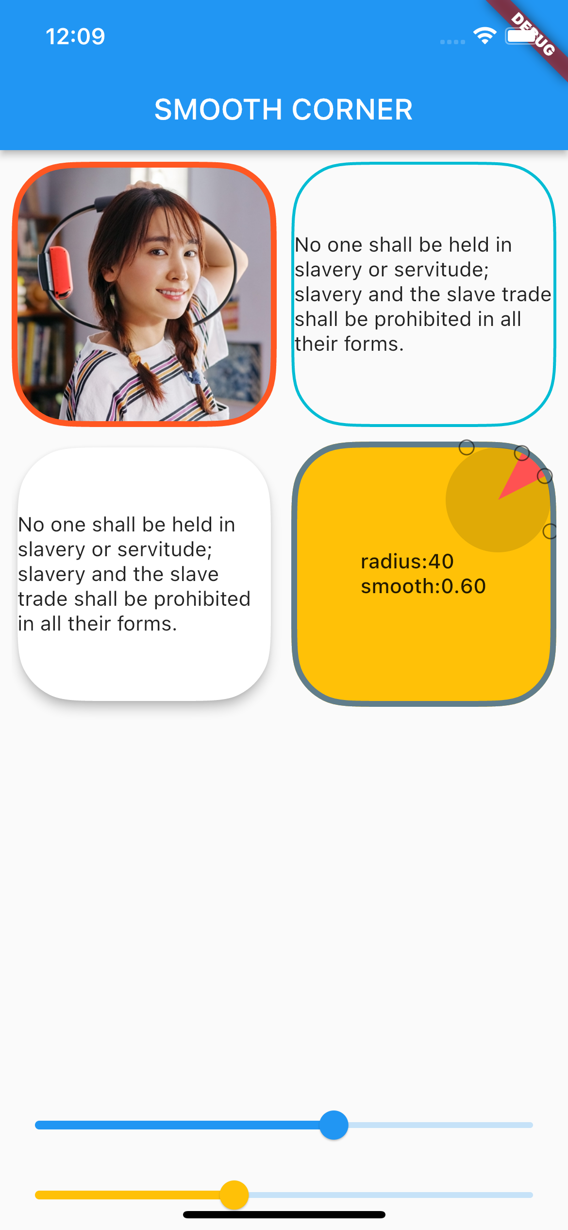
You can view the debug rounded corner components and image examples I wrote in the example project, adjusting their smoothness and corner size to observe the changes in the corner curves.

Example screen shot

Usage

Add dependency
dependencies:
  smooth_corner: ^1.1.1
Built-in Widgets

This library provides several commonly used widgets that allow you to adjust smooth rounded corners.

All widgets provide three parameters: smoothness, side, and borderRadius, to control smooth corners and borders.

  • smoothness: Represents the smoothness, ranging from [0, 1.0]. According to Figma's standards, 0.6 is the closest to iOS's rounded corner curve.

  • side: Type is BorderSide, used to set borders.

  • borderRadius: Used to set the corner radius. Note that if the x and y values of the radius are not equal, the smaller one will be chosen.

SmoothContainer

SmoothContainer includes all the parameters of Container.

SmoothContainer(
  width: 200,
  height: 200,
  smoothness: 0.6,
  side: BorderSide(color: Colors.cyan, width: 2),
  borderRadius: BorderRadius.circular(40),
  child: child,
  alignment: Alignment.center,
),
SmoothClipRRect

To enable images to have borders, SmoothClipRRect is provided.

SmoothClipRRect(
  smoothness: 0.6,
  side: BorderSide(color: Colors.deepOrange, width: 4),
  borderRadius: BorderRadius.circular(40),
  child: Image.network(
    url,
    fit: BoxFit.cover,
  ),
SmoothCard

SmoothCard includes all parameters of Card.

SmoothCard(
  smoothness: 0.6,
  borderRadius: BorderRadius.circular(40),
  elevation: 6,
  child: child,
),
Custom widget

The smooth corner capabilities of the above widgets are implemented by SmoothRectangleBorder. You can use this ShapeBorder to freely customize your smooth corner components.

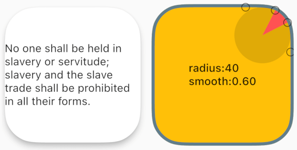
ShapeDecoration
Container(
  width: 200,
  height: 200,
  alignment: Alignment.center,
  decoration: ShapeDecoration(
    shape: SmoothRectangleBorder(
      borderRadius: BorderRadius.circular(40),
      smoothness: 0.6,
    ),
    color: Colors.amber,
  ),
  child: Text(''),
),
ShapeBorderClipper
Container(
  width: 200,
  height: 200,
  child: ClipPath(
    clipper: ShapeBorderClipper(
      shape: SmoothRectangleBorder(
        smoothness: 0.6,
        borderRadius:
            BorderRadius.circular(40),
      ),
    ),
    child: Image.network(url),
  ),
),

所屬分類

原始碼儲存庫

使用此套件的專案

暫無相關資料。