搜尋套件、儲存庫與 APP 分類

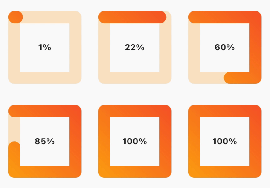
square_progress_bar 封面
套件詳情v1.1.1

square_progress_bar

一個方形進度條,您可以輕鬆使用。只需提供 0.0 到 1.0 範圍內的進度,即可立即使用。

AndroidiOSWebmacOSWindowsLinux
近 30 天下載
83
喜歡數
29
Pub 分數
150

安裝套件

flutter pub add square_progress_bar

套件介紹

根據套件公開資料產生的選型評估,僅供參考。

一個簡單且可自訂的方形進度條,適用於 Flutter 應用程式。它接受 0.0 到 1.0 之間的進度值,方便整合到任何需要載入或完成狀態視覺反饋的 UI 中。此組件輕量級,支援所有主要平台,包括 Android、iOS、Web、macOS、Windows 和 Linux。非常適合用於表單、檔案上傳或任何需要乾淨現代進度指示器的場景。

適用情境

  • 表單中的加載指示器
  • 檔案上傳進度追蹤
  • 任務完成可視化
  • 儀表板進度顯示
  • 動畫引導流程

主要特色

  • 方形設計
  • 從 0.0 到 1.0 的進度
  • 跨平台支援
  • 最小設定
  • 可自定義的顏色和大小
  • 平滑動畫

適合對象

  • 簡單的進度 UI
  • 輕量級應用
  • 一致的設計系統
  • 快速原型設計
  • 行動與Web應用程式

使用建議

  • 超出基本樣式之外的自訂有限
  • 無內建標籤支援
  • 不適用於複雜的進度工作流程
  • 需要手動處理動畫時序
  • 依賴外部套件的更新

原始 README

以下為關聯原始碼儲存庫的 README 原文快照,最新內容請造訪原始碼儲存庫。

Square progress bar because why not 😎

Build Status

Features

  • Dynamic sizing
  • Animated progress bar
  • Gradient color progress bar
  • Progress bar cap shape customization
  • RTL support
  • ✨Magic✨

alt text

Installation

dependencies:
  square_progress_bar: ^1.1.1

Getting started

Just provide the progress in a range from 0.0 to 1.0 and you are set to go.

Usage

              SquareProgressBar(
                width: 100, // default: max available space
                height: 100, // default: max available space
                progress: _progress, // provide the progress in a range from 0.0 to 1.0
                isAnimation: false, // default: false, animate the progress of the bar
                solidBarColor: Colors.amber, // default: blue, main bar color
                emptyBarColor: Colors.orange.withOpacity(0.2), // default: gray, empty bar color
                strokeWidth: 20, // default: 15, bar width
                barStrokeCap: StrokeCap.round, // default: StrokeCap.round, bar cap shape
                isRtl: false, // default: false, bar start point
                gradientBarColor: const LinearGradient(
                  begin: Alignment.topRight,
                  end: Alignment.bottomLeft,
                  colors: <Color>[Colors.red, Colors.amber],
                  tileMode: TileMode.repeated,
                ), // default: null, if you pass gradient color it will be used instead of solid color for the main bar
                child: Center(
                  child: Text(
                    _percentageLabel,
                    style: const TextStyle(fontWeight: FontWeight.bold),
                  ),
                ),
              )

License

MIT Free Software, Hell Yeah!

所屬分類

原始碼儲存庫

使用此套件的專案

暫無相關資料。