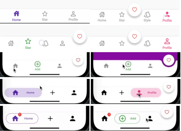
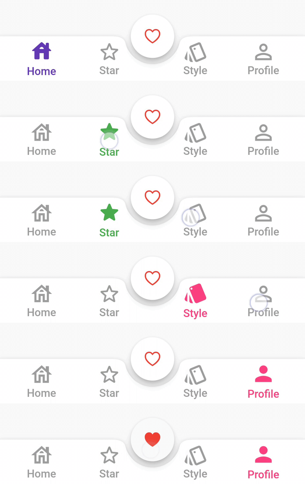
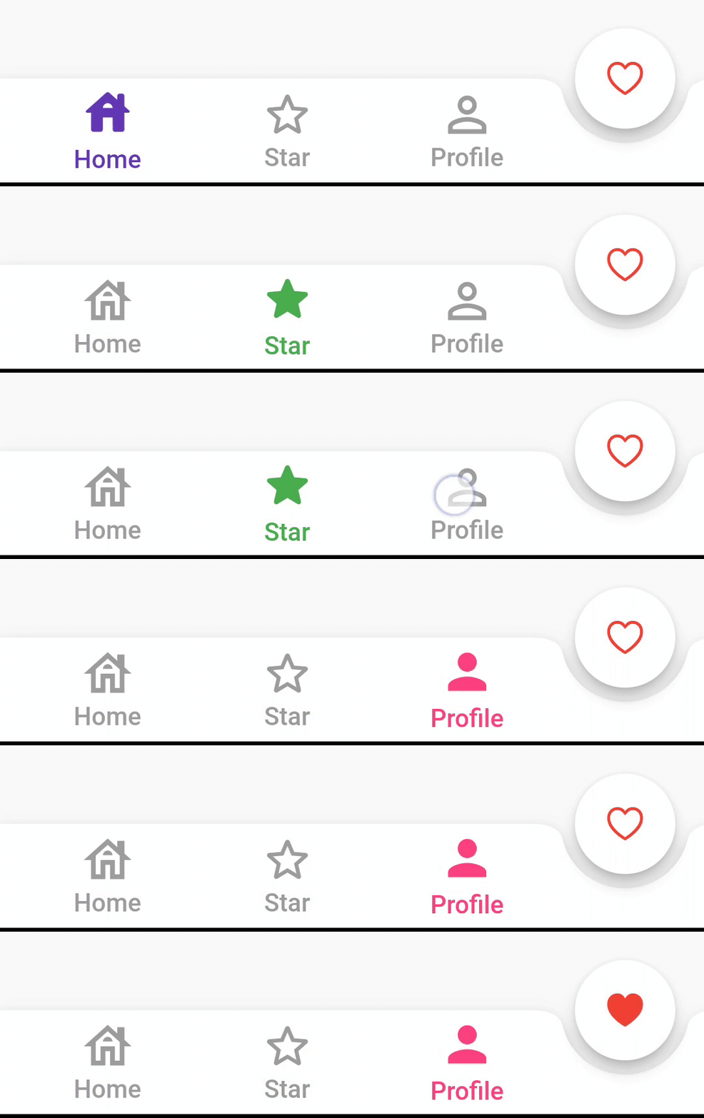
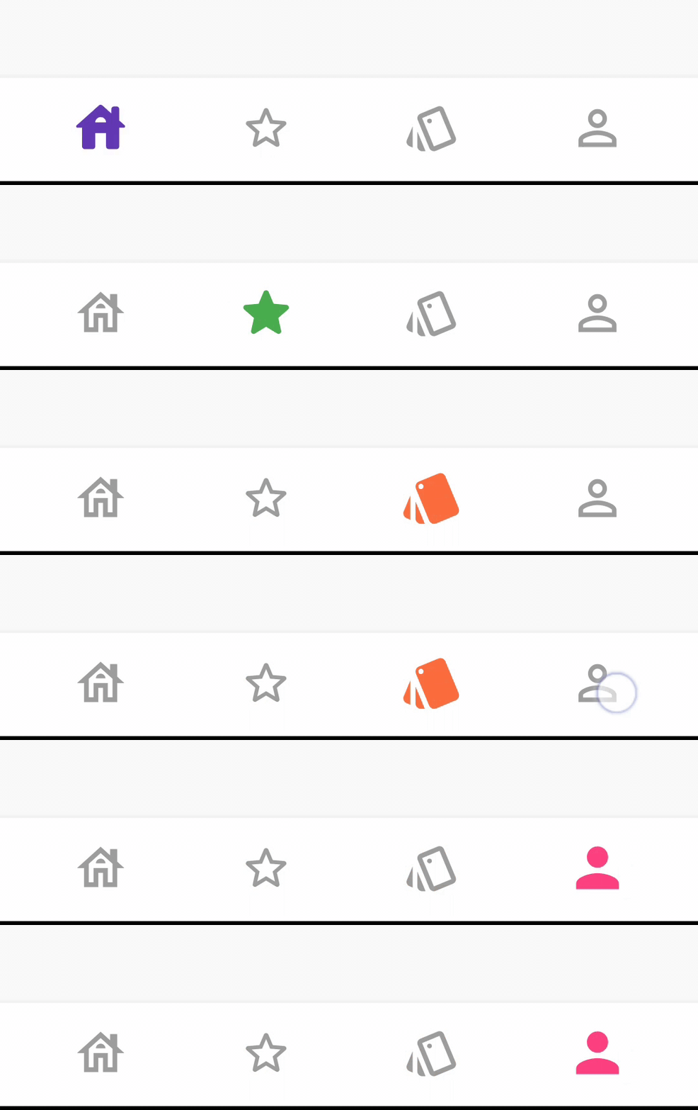
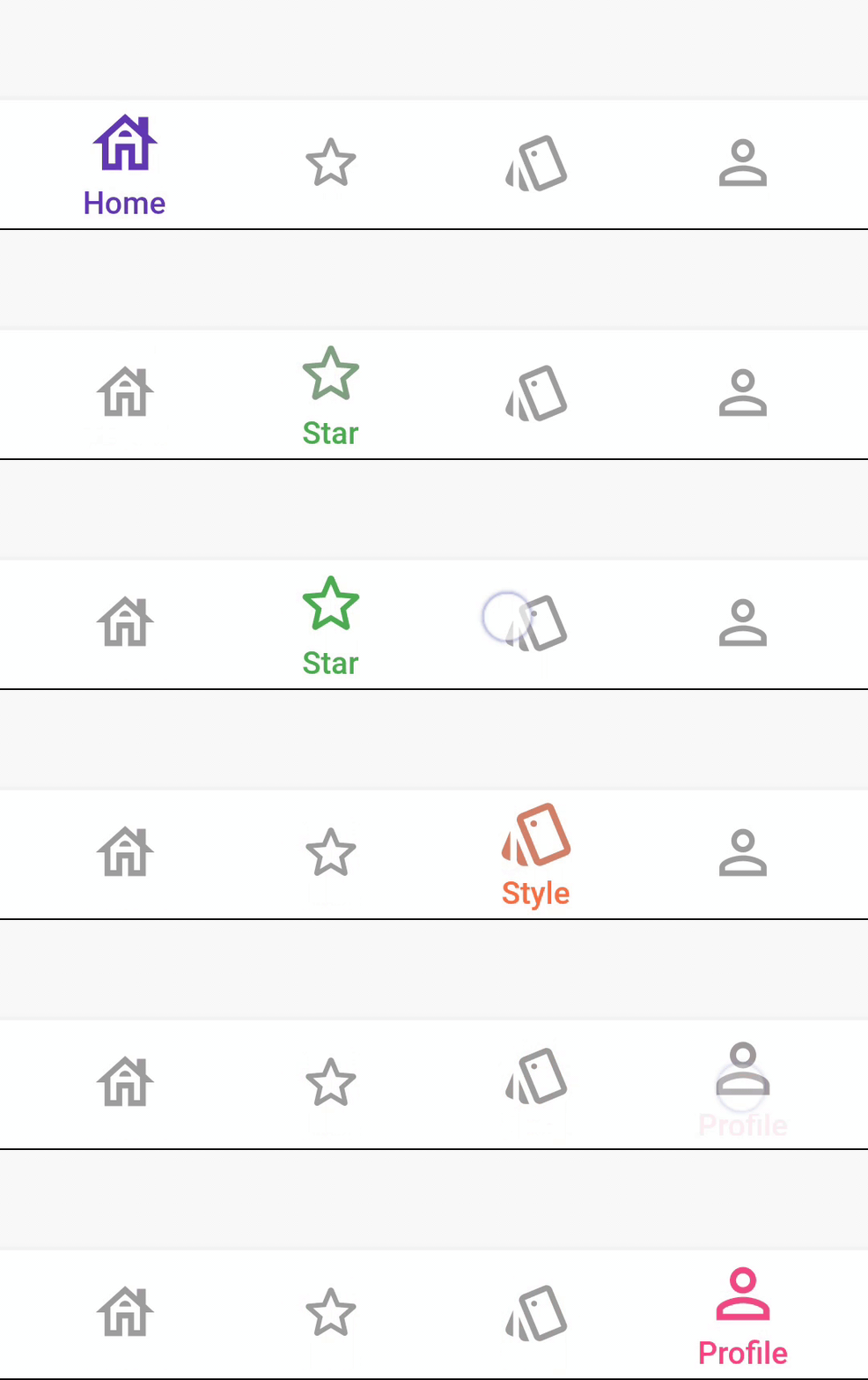
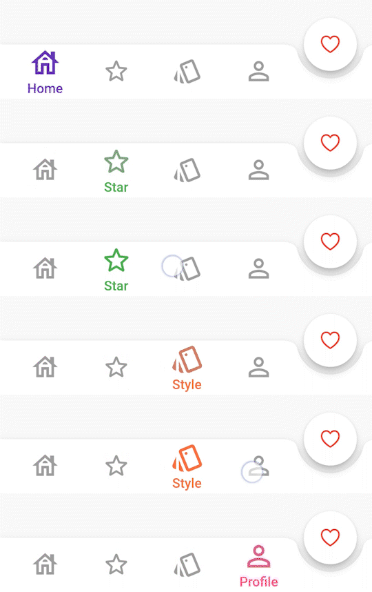
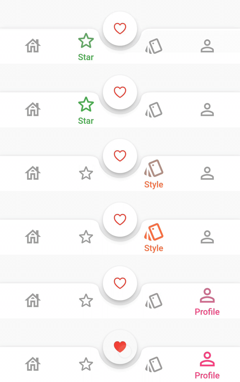
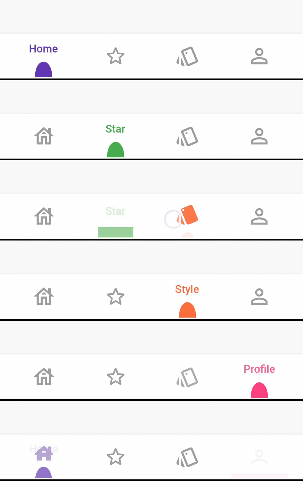
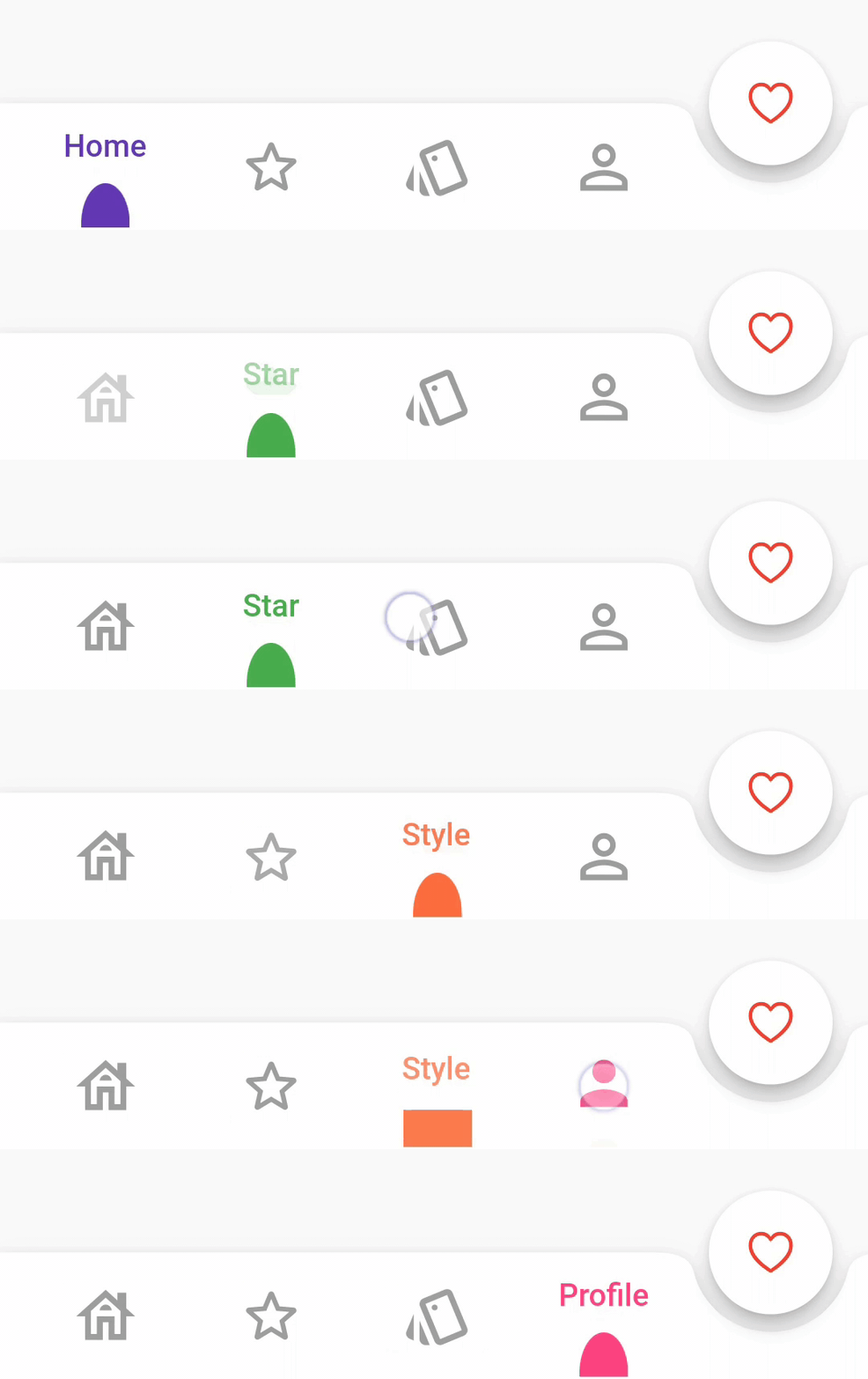
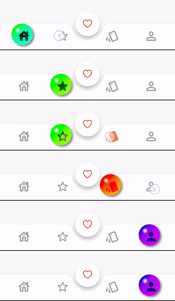
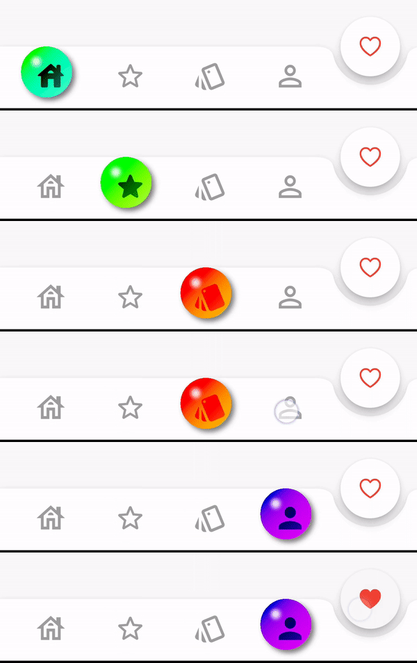
A collection of stylish bottom navigation bars like animated bottom bar and bubble bottom bar for flutter.
Table of contents
⭐ Installing
dependencies:
    stylish_bottom_bar: ^1.2.0-beta
⚡ Import
import 'package:stylish_bottom_bar/stylish_bottom_bar.dart' ;
📙 How To Use
items:
option:
backgroundColor:
elevation:
currentIndex:
iconSize:
padding:
inkEffect:
inkColor:
onTap:
opacity:
borderRadius:
fabLocation:
hasNotch:
barAnimation:
barStyle:
unselectedIconColor:
bubbleFillStyle:
iconStyle:
selectedIcon:
dotStyle:
Properties
items → List <BottomBarItem >
option → AnimatedBarOptions
option → BubbleBarOptions
option → DotBarOptions
option → BarBlurOptions
backgroundColor → Color
elevation → double
currentIndex → int
iconSize → double
padding → EdgeInsets
inkEffect → bool
inkColor → Color
onTap → Function (int )
opacity → double
borderRadius → BorderRadius
fabLocation → StylishBarFabLocation
hasNotch → bool
barAnimation → BarAnimation
barStyle → BubbleBarStyle
unselectedIconColor → Color
bubbleFillStyle → BubbleFillStyle
iconStyle → IconStyle
dotStyle → DotStyle
BarStyle
BubbleBarStyle .vertical
BubbleBarStyle .horizotnal
BubbleFillStyle
BubbleFillStyle .fill
BubbleFillStyle .outlined
FabLocation
StylishBarFabLocation .center
StylishBarFabLocation .end
BarAnimation
BarAnimation .fade
BarAnimation .blink
BarAnimation .transform3D
BarAnimation .liquid
BarAnimation .drop
IconStyle
IconStyle .Default
IconStyle .simple
IconStyle .animated
DotStyle
DotStyle .circle
DotStyle .tile
NotchStyle
NotchStyle .circle
NotchStyle .square
NotchStyle .themeDefault
Event
onTap: (index){
}
Showcase
BarBlurOptions
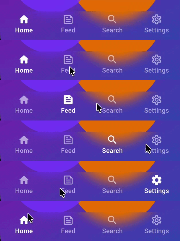
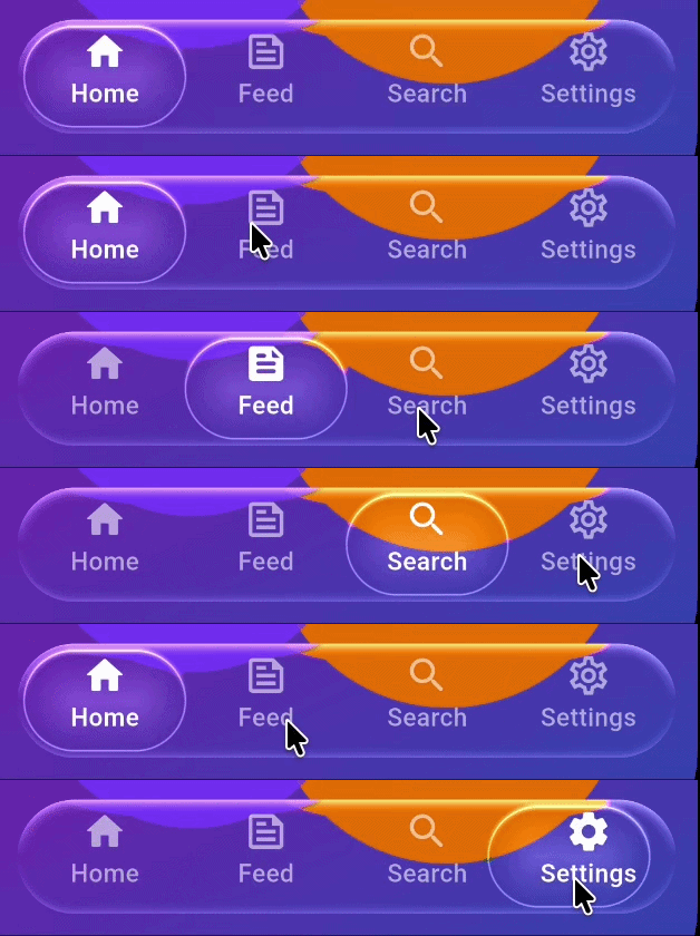
BarBlurOptions.frosted()
BarBlurOptions.liquidGlass()
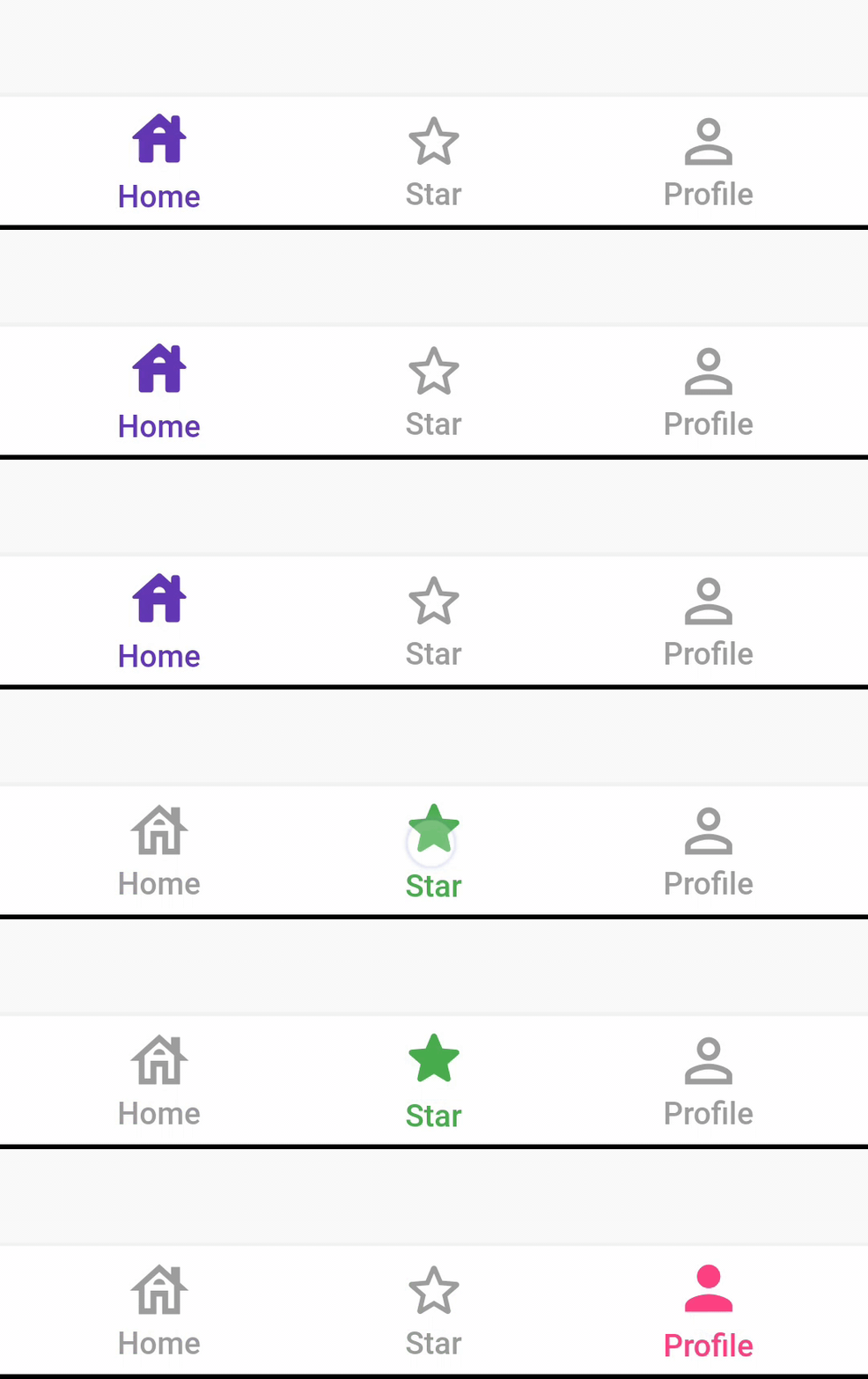
AnimatedBarOptions
IconStyle.Default
IconStyle.simple
IconStyle.animated
BarAnimation.fade
BarAnimation.blink
BarAnimation.liquid
BarAnimation.drop
DotBarOptions
DotStyle.circle
DotStyle.tile
BubbleBarOptions
BubbleBarStyle.horizotnal
BubbleFillStyle.outlined
BubbleBarStyle.vertical
BubbleFillStyle.outlined
Migrate to 1.0.0
List<dynamic> items is changed to List<BottomBarItem> items
From version 1.0.0 option: AnimatedBarOptions and BubbleBarOptions will be used to change the bar items type and properties.
Example
StylishBottomBar (
option: DotBarOptions (
dotStyle: DotStyle .tile,
gradient: const LinearGradient (
colors: [
Colors .deepPurple,
Colors .pink,
],
begin: Alignment .topLeft,
end: Alignment .bottomRight,
),
),
items: [
BottomBarItem (
icon: const Icon (Icons .abc),
title: const Text ('Abc' ),
backgroundColor: Colors .red,
selectedIcon: const Icon (Icons .read_more),
),
BottomBarItem (
icon: const Icon (Icons .safety_divider),
title: const Text ('Safety' ),
backgroundColor: Colors .orange,
),
BottomBarItem (
icon: const Icon (Icons .cabin),
title: const Text ('Cabin' ),
backgroundColor: Colors .purple,
),
],
fabLocation: StylishBarFabLocation .end,
hasNotch: true ,
currentIndex: selected,
onTap: (index) {
setState (() {
selected = index;
controller.jumpToPage (index);
});
},
)
Contributions and pull requests are welcome! We value your input and appreciate any improvements or suggestions you can provide. Feel free to submit a pull request with your changes. Don't forget to star the repository if you find it useful. Thank you for your collaboration!