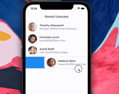
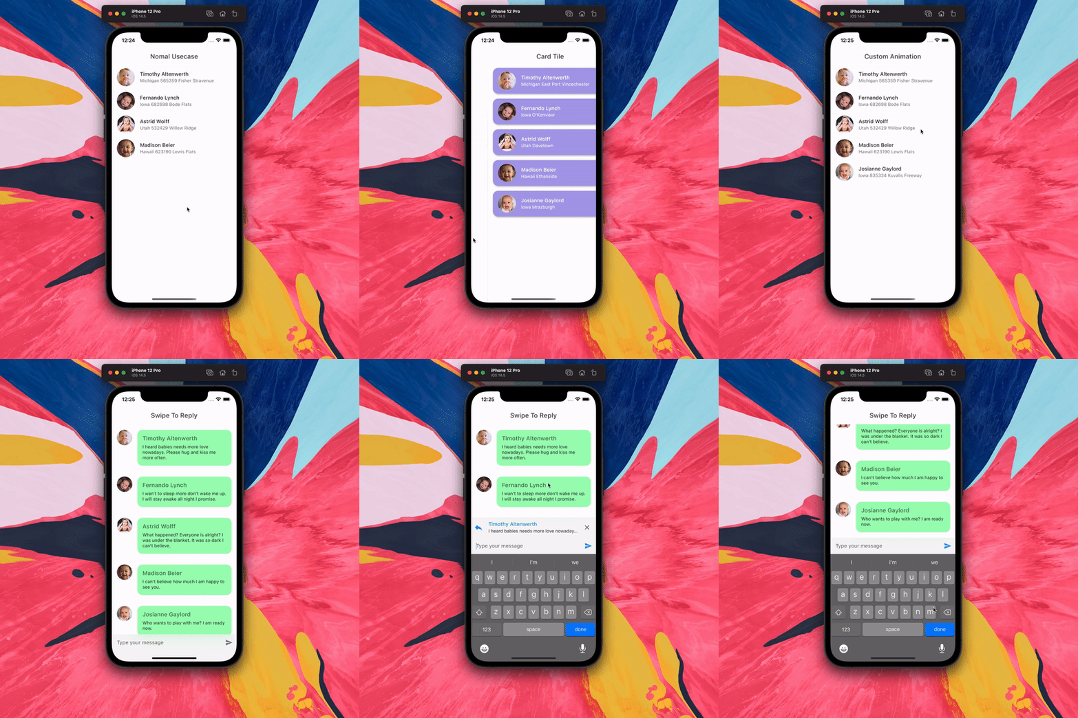
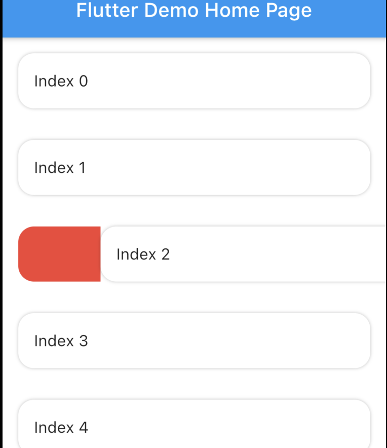
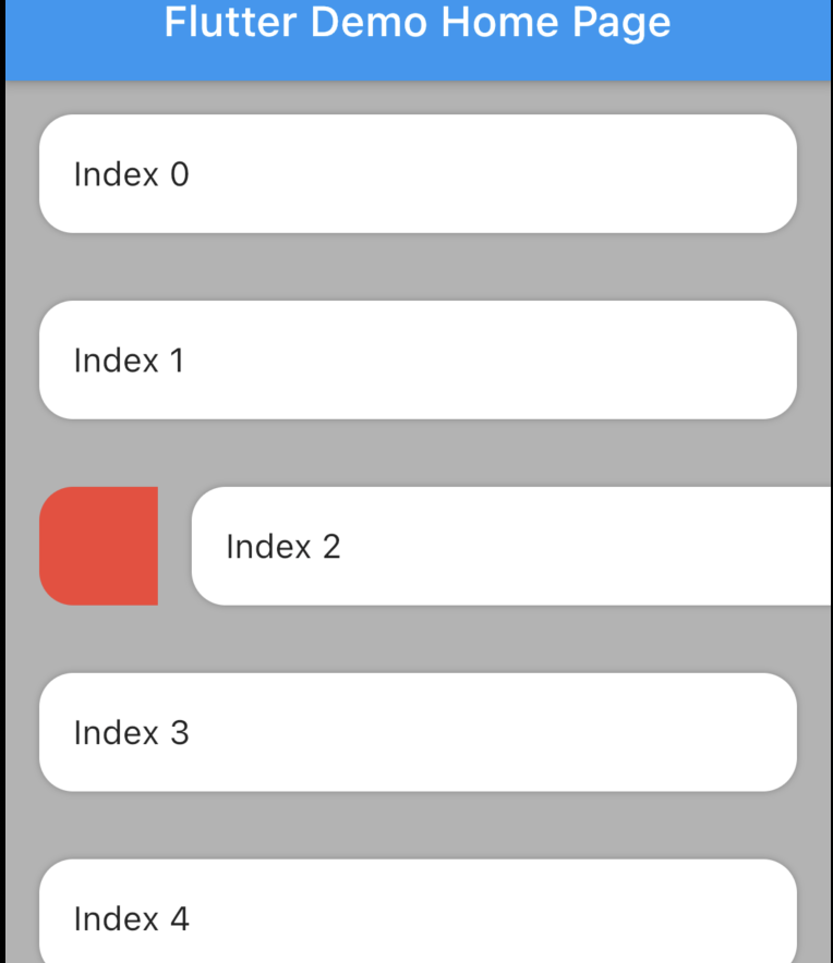
SwipeableTile 是一個 Flutter 套件,可實現帶有可自訂背景效果的動畫刪除功能。它支援滑動刪除手勢,以及滑動觸發動作但不刪除項目。非常適合用於實作具有視覺反饋的互動式清單項目,可在 Android、iOS、Web、macOS、Windows 和 Linux 等主要平台運作。此套件透過提供流暢的動畫與彈性化的觸控處理,提升基於清單介面的使用者體驗。
適用情境
在列表中實現滑動刪除功能
使用操作觸發器創建互動式清單項目
為任務管理應用建構直覺的使用者介面
為列表項互動添加動畫反饋
設計響應式卡片佈局
透過滑動手势提升使用者參與度
主要特色
滑動時的動畫背景
支援取消與觸發動作的滑動
跨平台相容性
可自訂的滑動閾值
平滑的動畫過渡
滑動行為的靈活設定
適合對象
開發互動式列表介面的開發者
需要基於滑動式互動的應用程式
UI 設計師專注於以手勢為導向的體驗
針對多個平台的專案
希望使用輕量級手勢解決方案的團隊
具有豐富觸控反饋的行動優先應用
使用建議
可能需要額外的樣式來處理複雜的背景
大型列表的性能影響
動畫曲線的內建自訂功能有限
未針對極高頻率的滑動事件進行優化
在滑動操作期間需要仔細處理狀態
最適合中等大小的清單以維持回應性
原始 README
以下為關聯原始碼儲存庫的 README 原文快照,最新內容請造訪原始碼儲存庫。
Features
Animated tile and backgound while swiping. Add padding to tile. Swipe to trigger action.
The package is fork of Dismissible. Without any vertical, up and down swipe.
Problems with dismissible
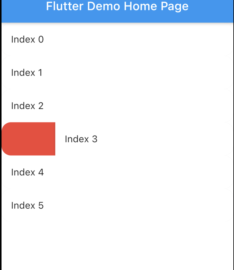
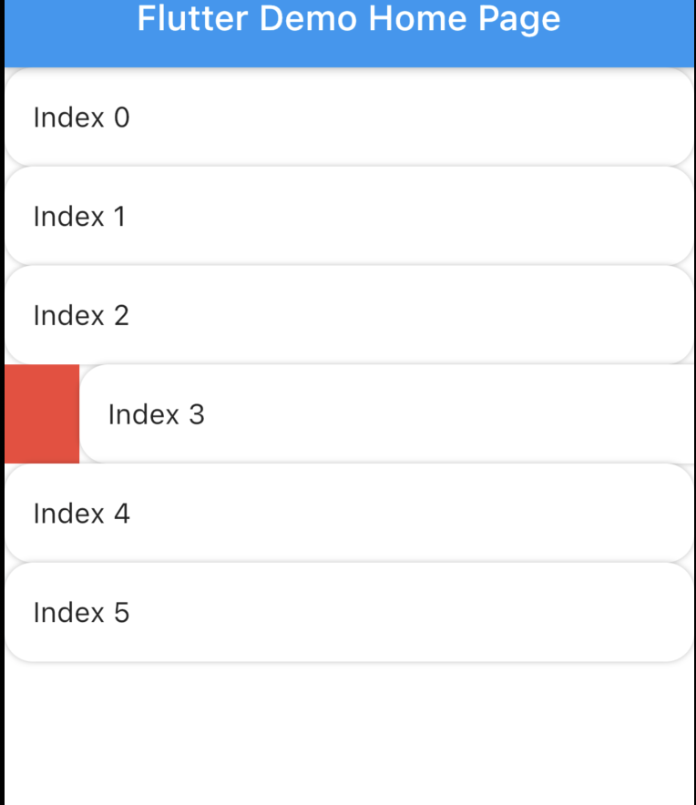
Dismissible doesn't allow animated rounded corner and elevation similar to google Gmail, Telegram, Messages (these are android apps) if you swipe you will notice. Here is the result with Dismissible.
Dismissible can't make rounded Card there is always some UI issue. Here is the result with Dismissible.
It's not possible to animated the background while swiping.
Swipe to trigger action function. Similar to telegram or instagram DM message reply.
How to use?
Installation
Add swipeable_tile to your pubspec.yaml dependencies then run flutter pub get
Set the Scaffold's (or whatever background widget you are using) backgroundColor and SwipeableTile or SwipeableTile.swipeToTrigger's color same.
There are four named constructors:
SwipeableTile When the tile is swiped there will be an elevation (remove elevation by setting isElevated to false) and rounded corner to the tile (set borderRadius to 0 if you don't want rounded corner).
SwipeableTile(
color: Colors.white,
swipeThreshold: 0.2,
direction: SwipeDirection.horizontal,
onSwiped: (direction) {// Here call setState to update state
},
backgroundBuilder: (context, direction, progress) {
if (direction == SwipeDirection.endToStart) {
// return your widget
} elseif (direction == SwipeDirection.startToEnd) {
// return your widget
}
returnContainer();
},
key: UniqueKey(),
child: // Here Tile which will be shown at the top
),
SwipeableTile.card This will make the tile look like card with constant rounded corner, unlike SwipeableTile. You also have to set the padding which will wrap around the tile as well background.
SwipeableTile.card(
color: Color(0xFFab9ee8),
shadow: BoxShadow(
color: Colors.black.withOpacity(0.35),
blurRadius: 4,
offset: Offset(2, 2),
),
horizontalPadding: 16,
verticalPadding: 8,
direction: SwipeDirection.horizontal,
onSwiped: (direction) {
// Here call setState to update state
},
backgroundBuilder: (context, direction, progress) {
// You can animate background using the progressreturnAnimatedBuilder(
animation: progress,
builder: (context, child) {
returnAnimatedContainer(
duration: constDuration(milliseconds: 400),
color: progress.value > 0.4
? Color(0xFFed7474)
: Color(0xFFeded98),
);
},
);
},
key: UniqueKey(),
child: Padding(
padding: constEdgeInsets.symmetric(vertical: 4.0),
child: // Here Tile which will be shown at the top
),
),
SwipeableTile.swipeToTrigger This is exactly the same as SwipeableTile but instead of dismiss it, it will trigger an action. The tile will return back to initial position when maximum drag reaches swipeThreshold
SwipeableTile.swipeToTriggerCard This is exactly the same as SwipeableTile.card but instead of dismiss it, it will trigger an action. The tile will return back to initial position when maximum drag reaches swipeThreshold
You can build the background dynamically and animate them using backgroundBuilder. Use direction parameter to check swipe direction and show different widget.
The progress is basically the same animation controller responsible for tile slide animation. You can use this controller to animate the background.
To trigger vibration you have to check when tile is dragged certain animation controller value. And I used vibration package for vibration and worked batter than HapticFeedback
swipeThreshold defines how far you can drag and will consider as dismiss. In case of swipe to trigger this will define maximun drag limit.
How to swipe to trigger action?
It's possible to do from backgroundBuilder using progress parameter but to select exact message (or tile) requires calling setState() which is not possible from backgroundBuilder however you can call setState() from onSwiped callback which will invoke when the tile return to initial position.
Vibrate & animate the icon when it's dragged maximum by checking progress.isCompleted or you can check animation value. Then call setState() from onSwiped User will not notice unless you set movementDuration to longer time and swipeThreshold to 0.4 (which is default). Check the example app how it's implemented.