搜尋套件、儲存庫與 APP 分類

timeline_tile 封面
套件詳情v2.0.0

timeline_tile

一個用來幫助您使用 Flutter 建立高度可自訂時間軸的套件。

AndroidiOSWebmacOSWindowsLinux
近 30 天下載
6.3萬
喜歡數
1920
Pub 分數
150

安裝套件

flutter pub add timeline_tile

套件介紹

根據套件公開資料產生的選型評估,僅供參考。

timeline_tile 是一個專為建立高度可自訂時間軸而設計的 Flutter 套件。它提供靈活的組件,用於建立垂直或水平時間軸,支援各種樣式、顏色和內容佈局。開發者可以自訂時間軸指示器、連接線和時間軸項目外觀,以符合其應用程式的設計。此套件輕量且能順暢整合至現有的 Flutter 專案中,非常適合以吸引人的方式顯示事件歷程、專案進度或時間序列資料。

適用情境

  • 顯示事件歷史
  • 顯示專案里程碑
  • 可視化逐步過程
  • 建立互動式時間軸
  • 展示歷史數據
  • 增強入職流程

主要特色

  • 高度可自訂的時間軸設計
  • 支援垂直與水平佈局
  • 可設定的指示器與連接器
  • 靈活的磚塊內容置放
  • 輕量級且易於整合
  • 可擴充的元件結構

適合對象

  • 開發時間順序使用者介面的開發者
  • 需要視覺進度追蹤的應用程式
  • 教育或入門介面
  • 專案管理工具
  • 內容豐富的應用程式

使用建議

  • 複雜設計需要手動佈局設定
  • 有限的內建動畫
  • 最適合靜態或簡單動態時間線
  • 可能需要額外的樣式以實現響應式行為
  • 未針對極長的時間線進行優化,需性能調校

原始 README

以下為關聯原始碼儲存庫的 README 原文快照,最新內容請造訪原始碼儲存庫。

TimelineTile

A package to help build customisable timelines in Flutter.


Example

Some use cases:


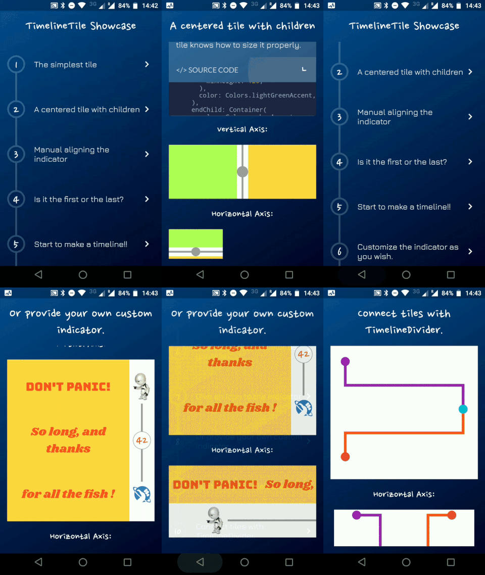
Timeline Showcase

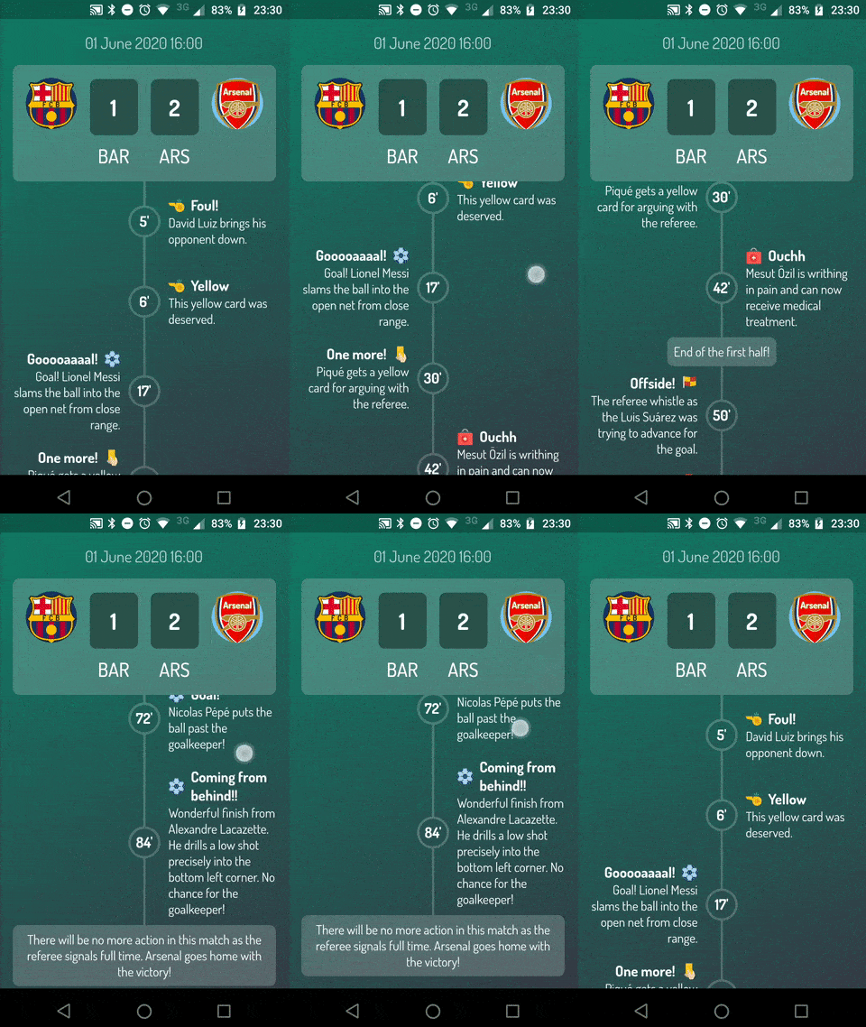
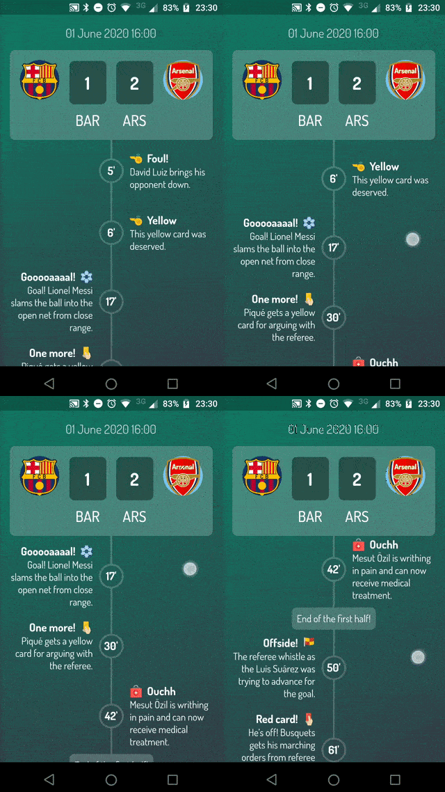
Football Timeline

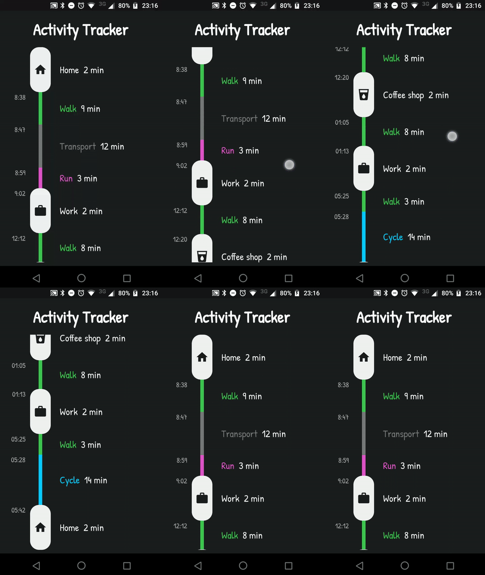
Activity Timeline

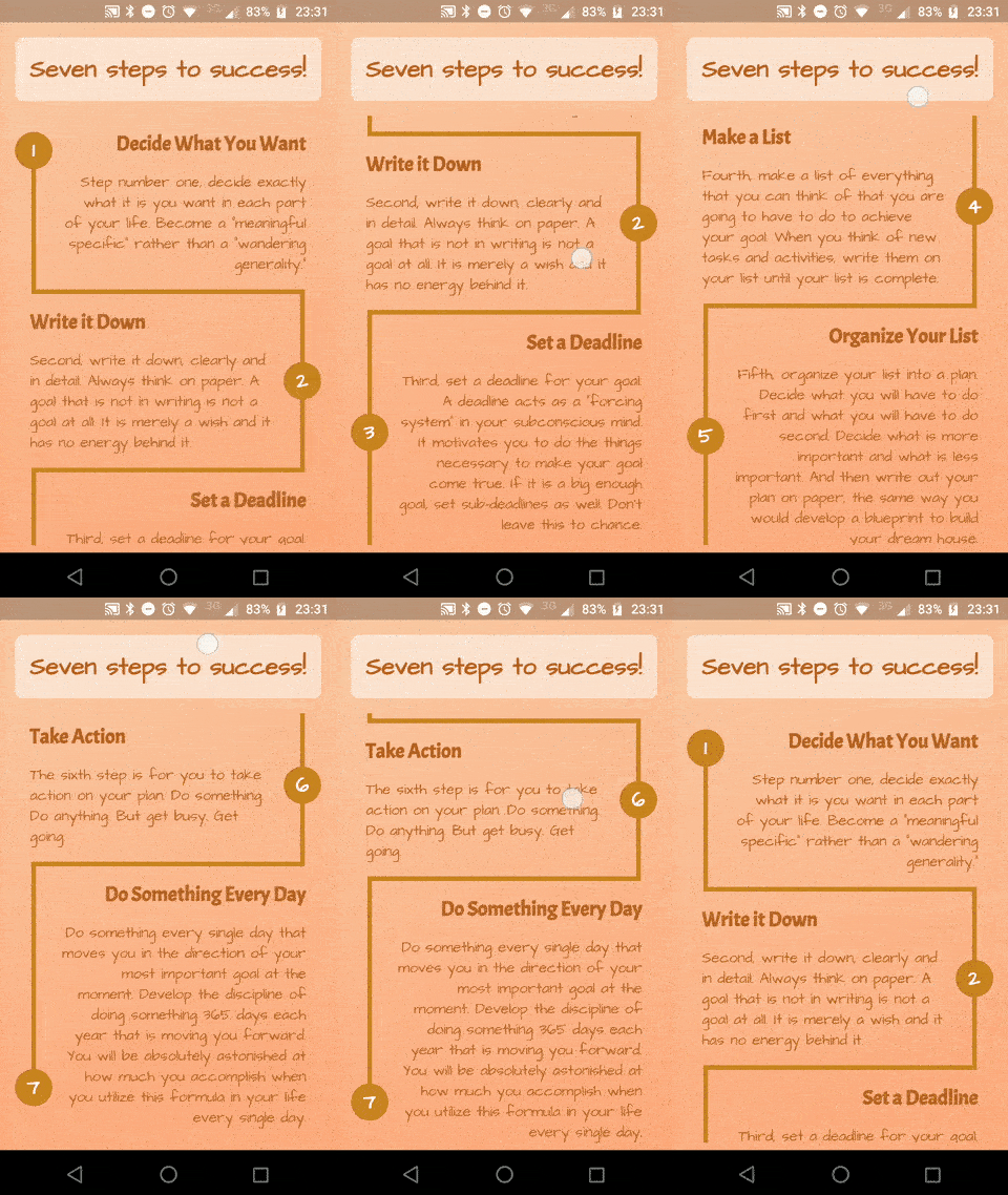
Success Timeline

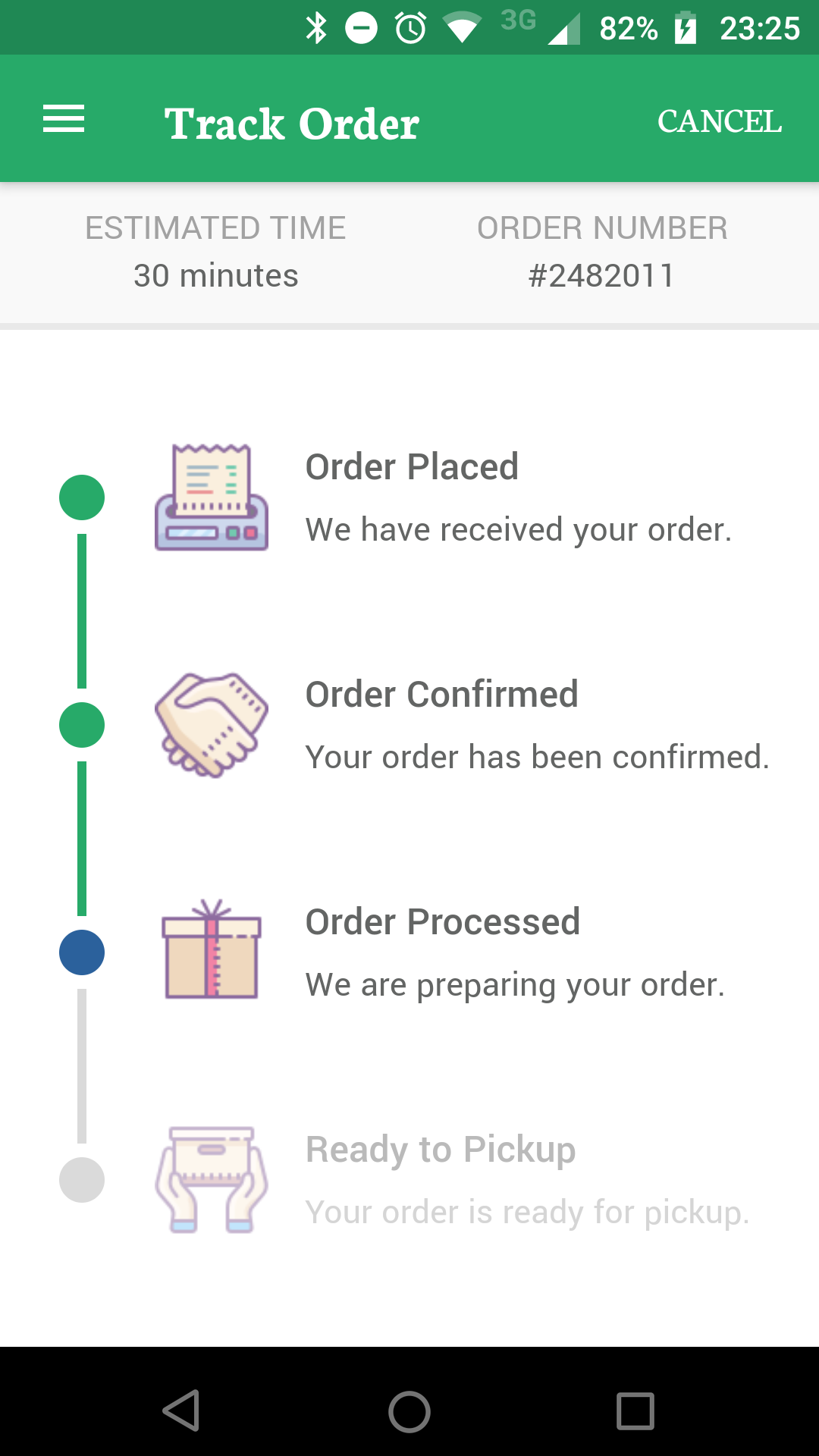
Delivery Timeline

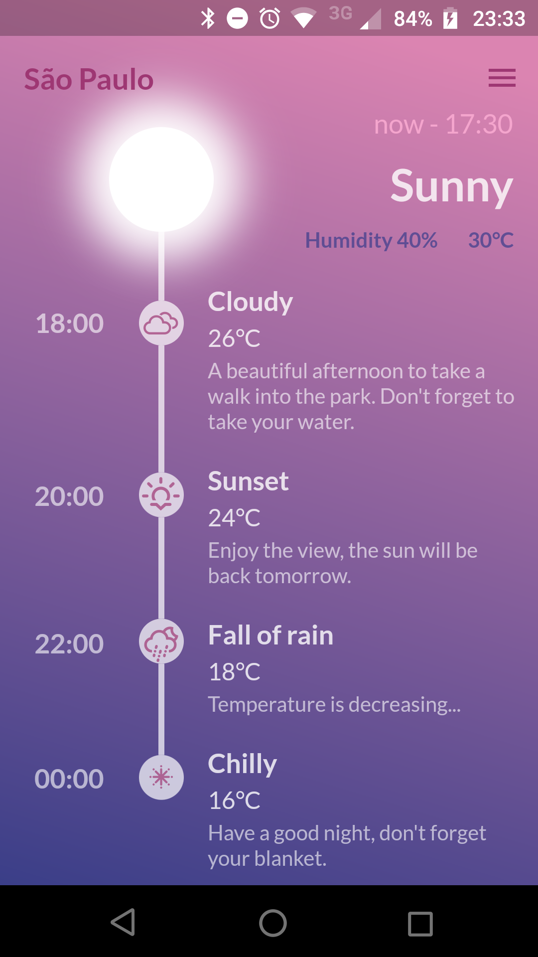
Weather Timeline

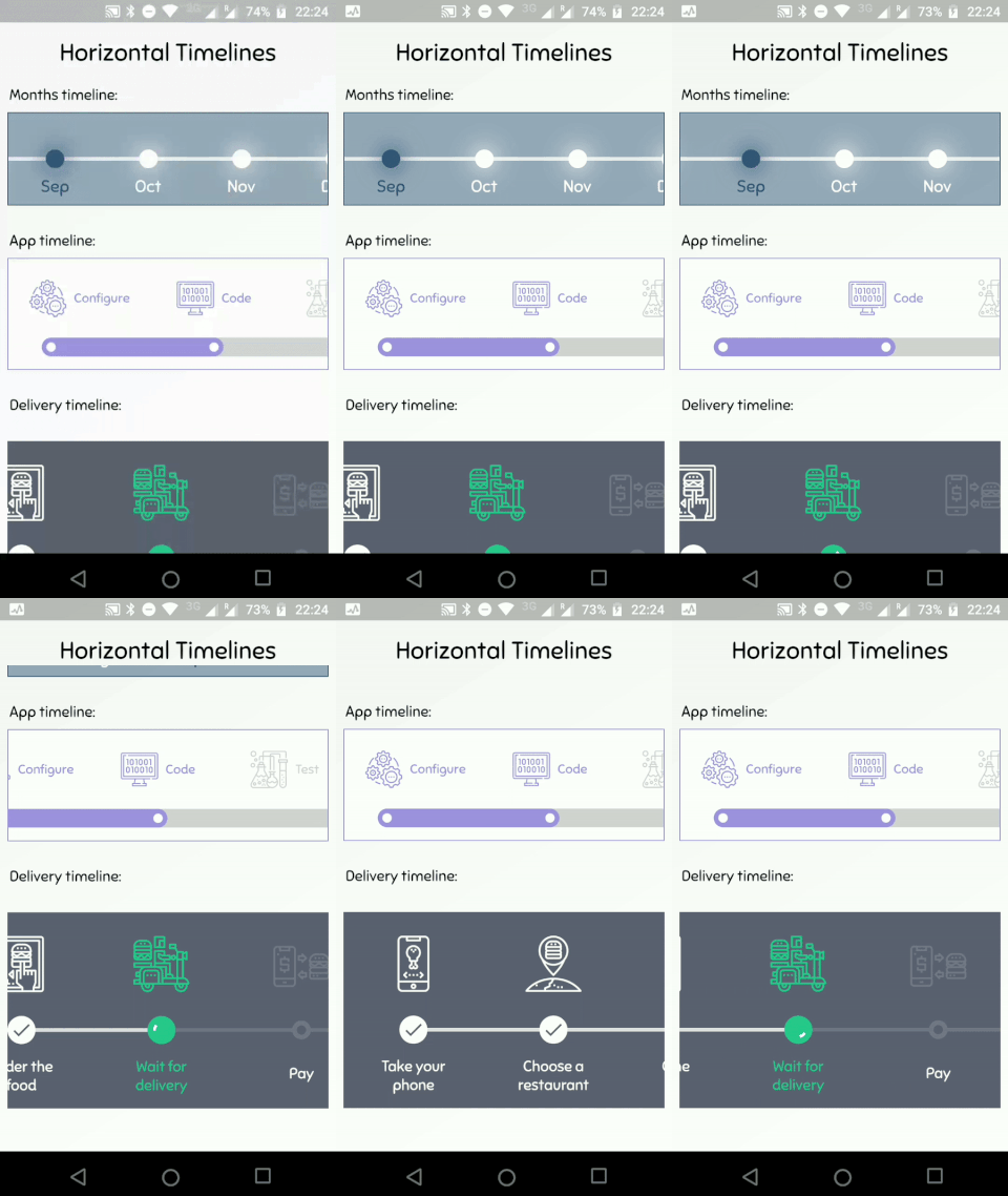
Horizontal Timelines

Getting Started

A Timeline consists in a group of TimelineTiles. To build a tile you can simply use:

TimelineTile()

Which will build a default tile with a vertical axis, that aligns to the start, with a height of 100:

Simple Timeline

The axis can be switched to render an horizontal tile, aligned to the start, with a default width of 100:

TimelineTile(axis: TimelineAxis.horizontal)

Horizontal Simple Timeline

There are 4 types of alignment.

  • TimelineAlign.start
  • TimelineAlign.end
  • TimelineAlign.center
  • TimelineAlign.manual

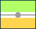
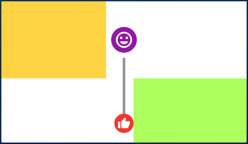
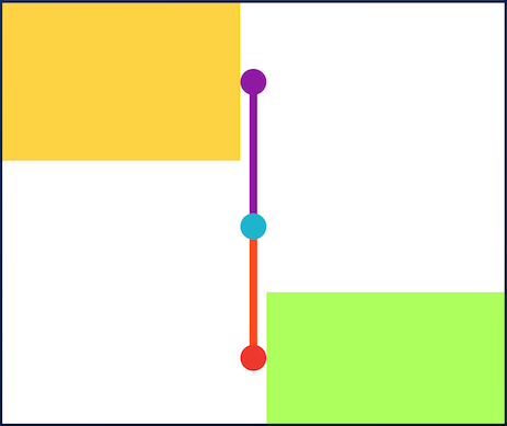
The start and end alignment allows a child in their opposite sides. On the other hand, both center and manual allows children on both sides. For example, one tile with alignment to the center:

TimelineTile(
  alignment: TimelineAlign.center,
  endChild: Container(
    constraints: const BoxConstraints(
      minHeight: 120,
    ),
    color: Colors.lightGreenAccent,
  ),
  startChild: Container(
    color: Colors.amberAccent,
  ),
);

When providing children to the vertical tile, the height will be as minimum as possible, so you can control it with a height constraint (at least minHeight). This way the tile knows how to size it properly.

Centered Tile

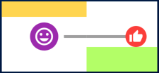
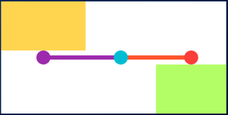
If the axis is horizontal, the things are the opposite. The width will be as minimum as possible, so you can control it with a width constraint (at least minWidth). This way the tile knows how to size it properly.

TimelineTile(
  axis: TimelineAxis.horizontal,
  alignment: TimelineAlign.center,
  endChild: Container(
    constraints: const BoxConstraints(
      minWidth: 120,
    ),
    color: Colors.lightGreenAccent,
  ),
  startChild: Container(
    color: Colors.amberAccent,
  ),
);

Horizontal Centered Tile

Manual aligning the idicator

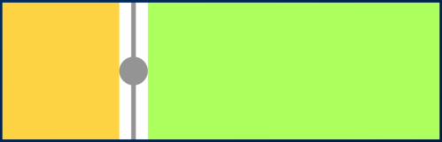
With TimelineAlign.manual you can provide the lineXY, which allows you to specify a value from 0.0 to 1.0, that represents a size percentage. For example, aligning at 30% of the width or height:

TimelineTile(
  alignment: TimelineAlign.manual,
  lineXY: 0.3,
  endChild: Container(
    constraints: const BoxConstraints(
      minHeight: 120,
    ),
    color: Colors.lightGreenAccent,
  ),
  startChild: Container(
    color: Colors.amberAccent,
  ),
);

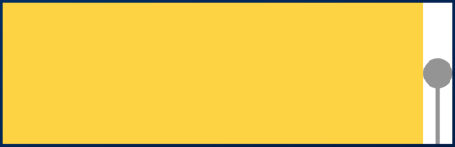
Manual align indicator

TimelineTile(
  axis: TimelineAxis.horizontal,
  alignment: TimelineAlign.manual,
  lineXY: 0.3,
  endChild: Container(
    constraints: const BoxConstraints(
      minWidth: 120,
    ),
    color: Colors.lightGreenAccent,
  ),
  startChild: Container(
    color: Colors.amberAccent,
  ),
);

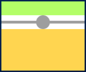
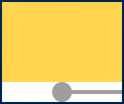
Horizontal manual align indicator

Is it the first or the last?

You can decide if a tile is the first os the last in a timeline. This way you control whether a before or after line must be rendered.

First and last

Horizontal first and last

See the implementation here

Start to make a timeline

You can finally start to combine some tiles to make a Timeline. The flag hasIndicator can control whether an indicator should or shouldn't be rendered.

Timeline

Horizontal timeline

See the implementation here

Customize the indicator as you wish

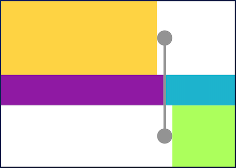
The default indicator is a circle, and you can customize it as you wish. With IndicatorStyle you can change the color, the X/Y position based on values from 0.0 to 1.0 or give it a padding. You must explicitly provide its width (vertical) or height (horizontal) though.

Custom indicator

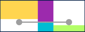
Horizontal custom indicator

See the implementation here

Give an icon to the indicator

With IconStyle you can provide an Icon to be rendered inside the default indicator.

Icon indicator

Horizontal icon indicator

See the implementation here

Or provide your custom indicator

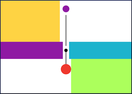
With the indicator parameter you can customize the tile with your own indicator. However, you must control its size through both width and height parameters.

Custom indicator

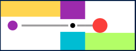
Horizontal custom indicator

See the implementation here

Customize the tile's line

With LineStyle you can customize both beforeLine and afterLine.

Custom line

Horizontal custom line

See the implementation here

Connect tiles with TimelineDivider

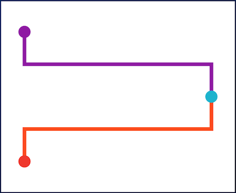
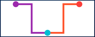
The TimelineDivider widget allows you to connect tiles that are aligned in different X/Y axis, when combined with TimelineAlign.manual.

Timeline divider

Timeline divider

See the implementation here

所屬分類

原始碼儲存庫

使用此套件的專案