You can install packages from the command line:
with Flutter:
$ flutter packages get
3. Import it
Now in your Dart code, you can use:
import'package:tip_dialog/tip_dialog.dart';
4. Use
Available attributes
/// [TipDialogContainer]@requiredthis.child,
/// automatically disappear timethis.duration: constDuration(seconds: 3),
/// mask layer alphathis.maskAlpha: 0.3// outside touchable, default false// if true and onOutsideTouch not set, when use TipDialogHelper.loading(), you can touch mask layer to dismiss// if true and onOutsideTouch set, when touching the mask layer, onOutsideTouch will be called.this.outsideTouchable: false// outside touch callback {@link OutsideTouchCallback}this.onOutsideTouch
Global Use
/// Use [TipDialogContainer] globally/// This widget can be globally supportedvoidmain() => runApp(newMyApp());
classMyAppextendsStatelessWidget{
@overrideWidgetbuild(BuildContext context) {
returnnewMaterialApp(
title: 'TipDialog Demo',
theme: newThemeData(),
home: Stack(
children: <Widget>[
MyHomePage(title: 'TipDialog Demo Home Page'),
// add [TipDialogContainer] widget hereTipDialogContainer(duration: constDuration(seconds: 2))
],
),
);
}
}
/// use TipDialogHelper to show or dismiss tipWidgetbuild(BuildContext context) {
returnnewScaffold(
appBar: newAppBar(
title: newText(widget.title),
elevation: 0.5,
),
body: newListView(children: <Widget>[
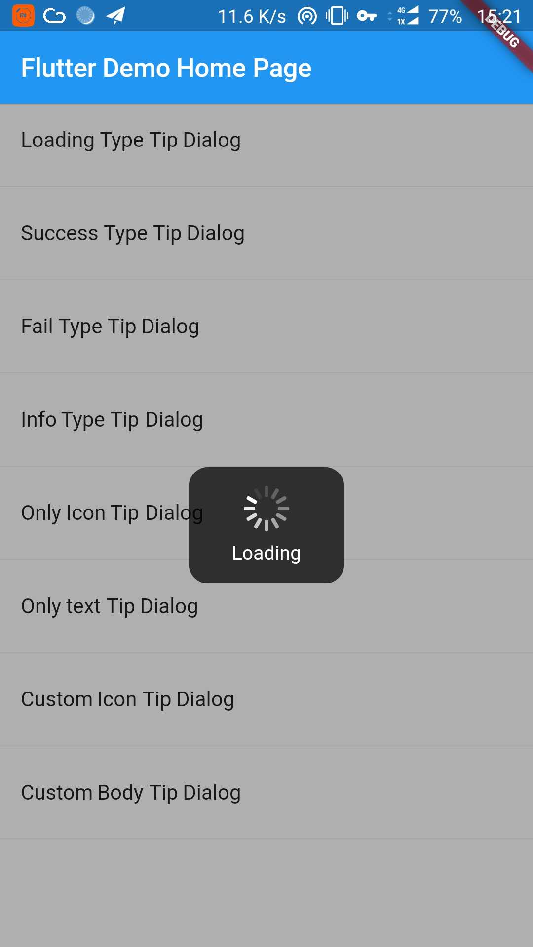
_buildItem("Loading Type Tip Dialog", () async {
TipDialogHelper.loading("Loading");
awaitnewFuture.delayed(newDuration(seconds: 5));
TipDialogHelper.dismiss();
}),
newDivider(),
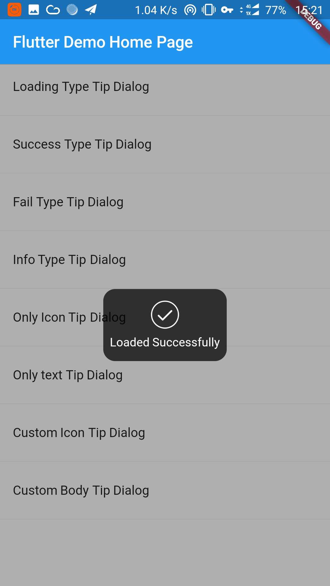
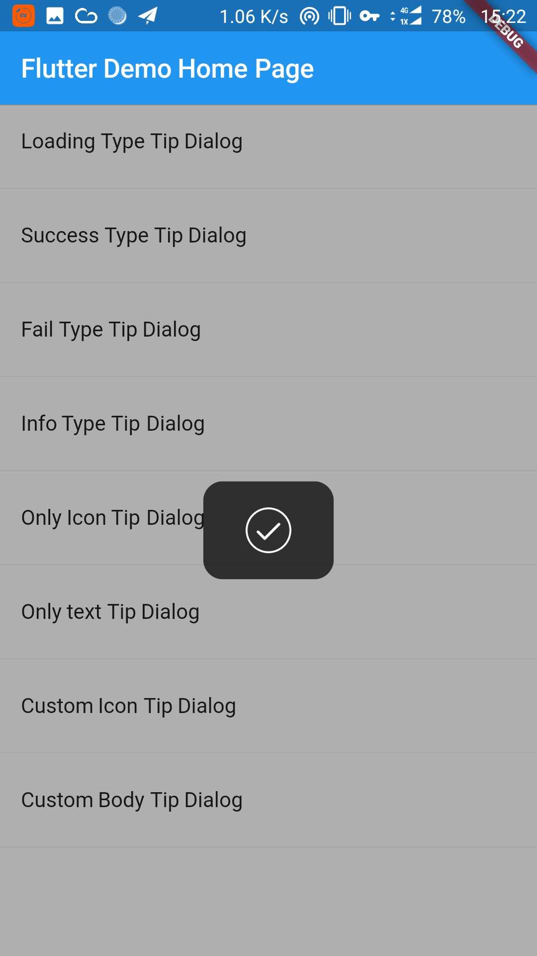
_buildItem("Success Type Tip Dialog", () async {
TipDialogHelper.success("Loaded Successfully");
}),
newDivider(),
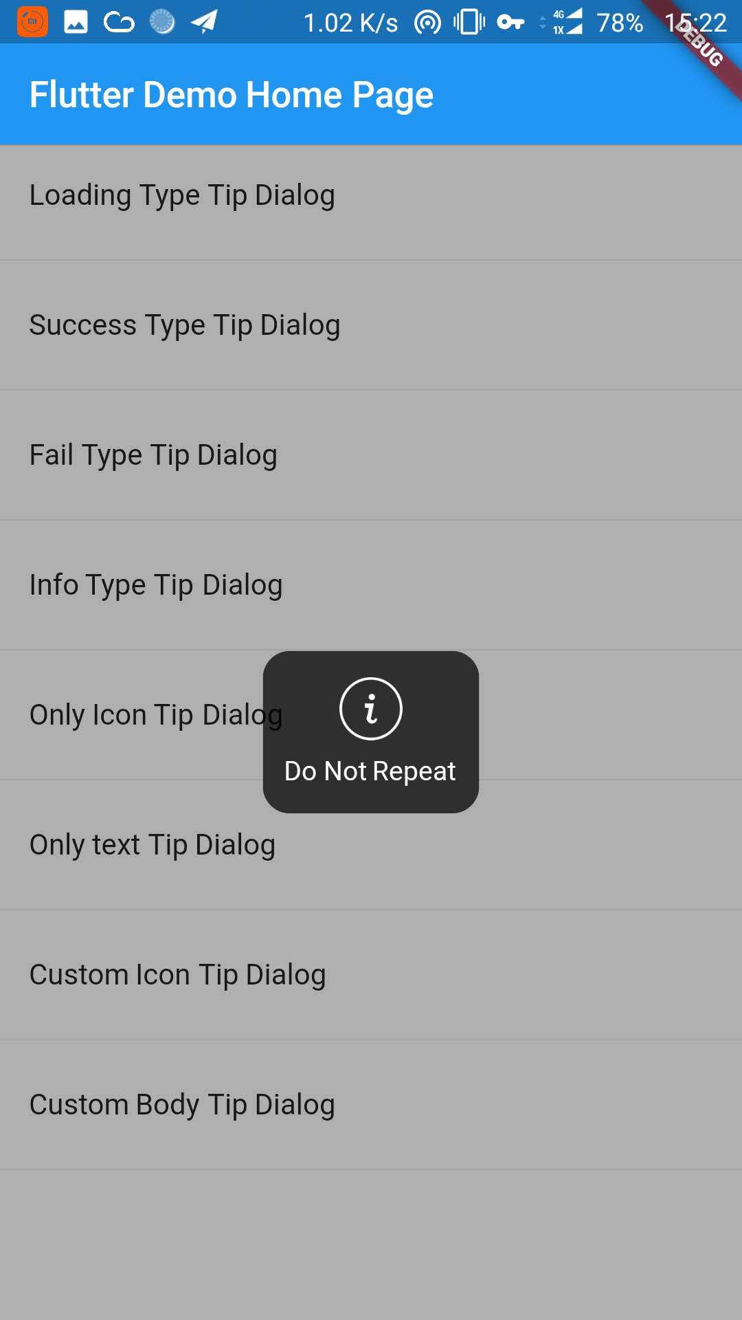
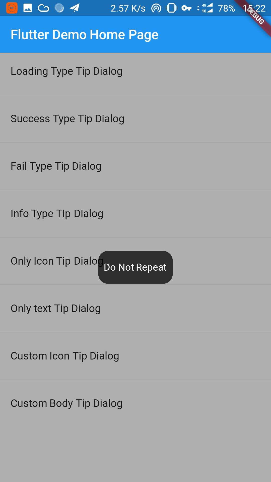
_buildItem("Only text Tip Dialog", () async {
TipDialogHelper.show(newTipDialog(
type: TipDialogType.NOTHING,
tip: "Do Not Repeat",
));
}),
newDivider(),
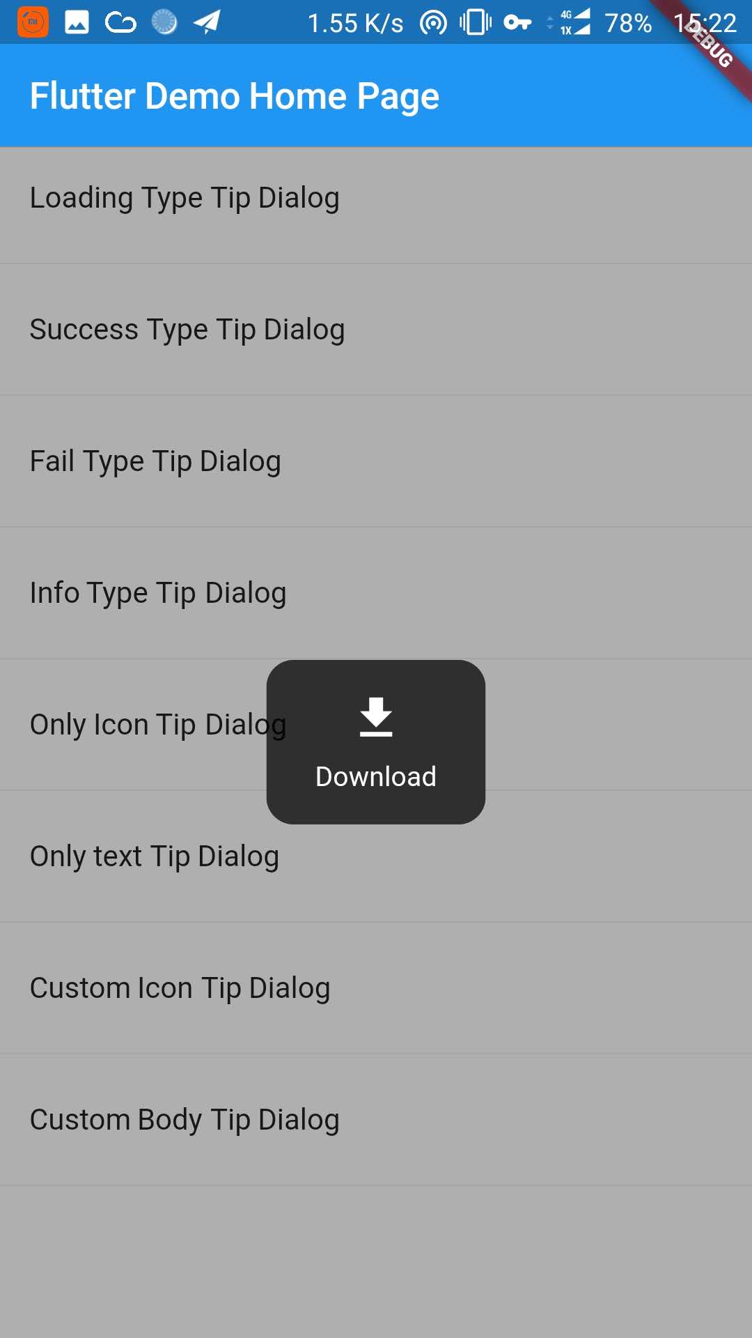
_buildItem("Custom Icon Tip Dialog", () async {
TipDialogHelper.show(newTipDialog.customIcon(
icon: newIcon(
Icons.file_download,
color: Colors.white,
size: 30.0,
textDirection: TextDirection.ltr,
),
tip: "Download",
));
}),
newDivider(),
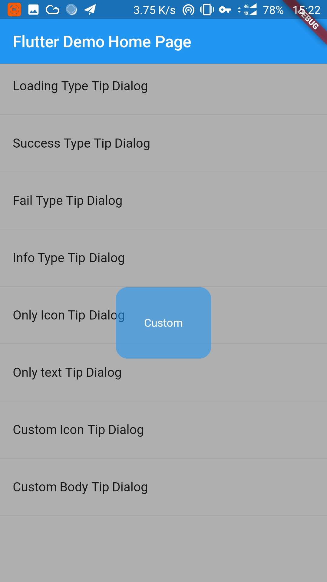
_buildItem("Custom Body Tip Dialog", () async {
TipDialogHelper.show(newTipDialog.builder(
bodyBuilder: (context) {
returnnewContainer(
width: 120.0,
height: 90.0,
alignment: Alignment.center,
child: newText(
"Custom",
style: newTextStyle(color: Colors.white),
/// if TipDialogContainer are outside of MaterialApp,/// here is a must to set
textDirection: TextDirection.ltr,
),
);
},
color: Colors.blue.withAlpha(150),
));
}),
newDivider(),
]));
}
Use a custom widget when using [TipDialogContainer] globally, there may be appear some unexpected errors.
such as Text or Icon, will appear similar to the following error.
No Directionality widget found.
Just set TextDirection just fine. See the custom Widget in the example for details.
5. Default Dialog Type
enumTipDialogType { NOTHING, LOADING, SUCCESS, FAIL, INFO }
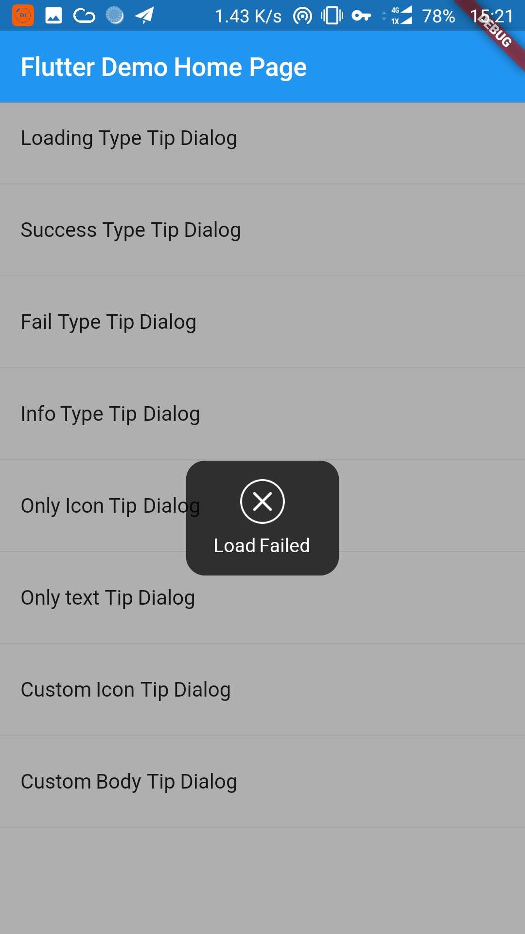
NOTHING:noiconLOADING:havealoadingiconSUCCESS:haveasuccessiconFAIL:haveafailiconINFO:haveainfoiconCUSTOM:customtipdialogtype,justasign,donothing
6. TipDialogHelper Method
/// tipDialog: Need to display the widget////// isAutoDismiss: decide whether to disappear automatically, default is true/// if true, the dialog will not automatically disappear/// otherwise, the dialog will automatically disappear after the [Duration] set by [TipDialogContainer]voidshow(Widget tipDialog, {bool isAutoDismiss: true});
/// dismiss dialogvoiddismiss();
/// show info dialogvoidinfo(String tip);
/// show fail dialogvoidfail(String errMsg);
/// show success dialogvoidsuccess(String success);
/// show loading dialogvoidloading(String loadingTip);
See the example directory for more details.
7. Change log
[4.0.0]
migrating to null safety
[3.1.0]
add outside touchable features
[3.0.0]
fix performance issues
easier way to call
[2.1.0]
add TipDialogHelper and deprecated TipDialogConnector