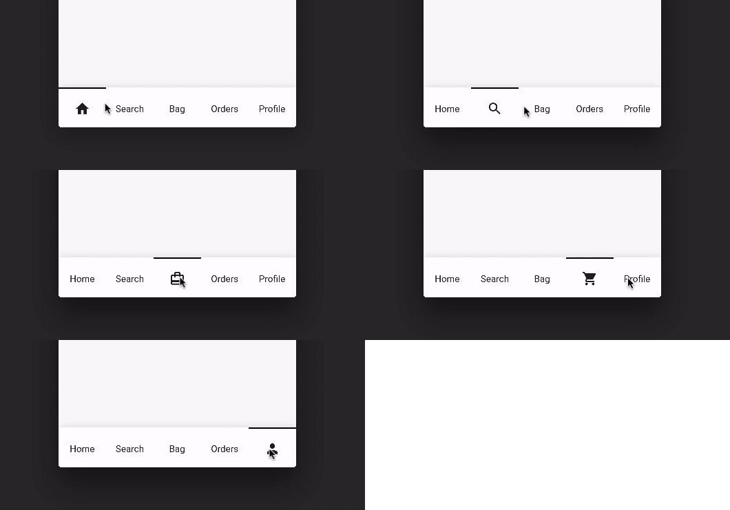
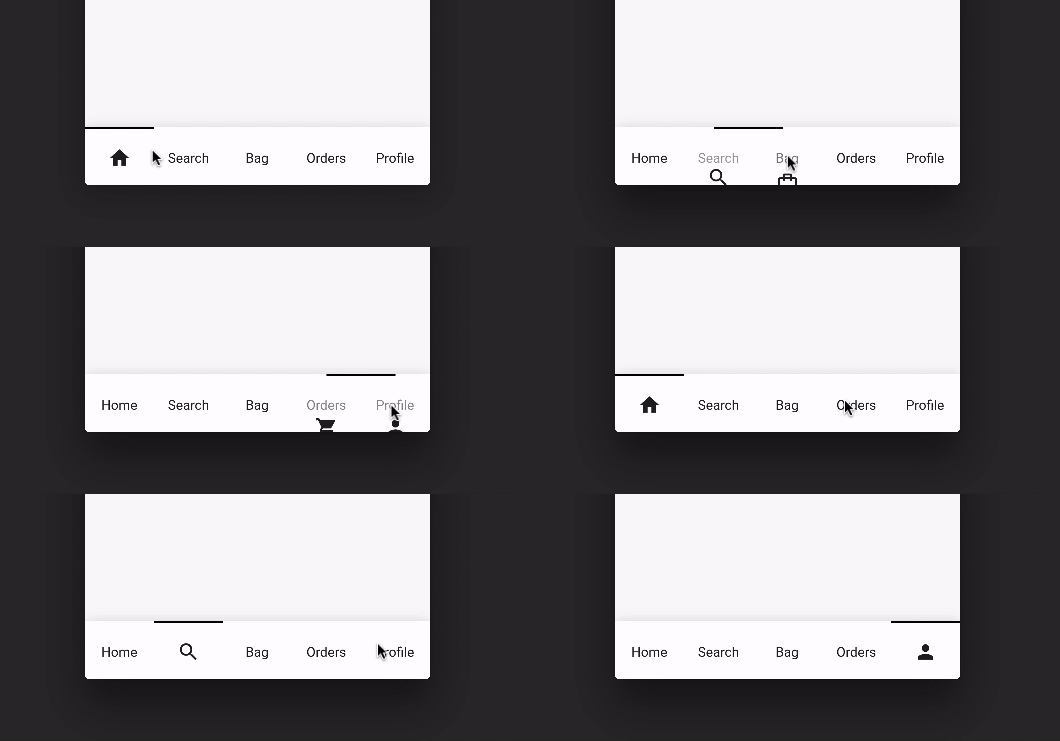
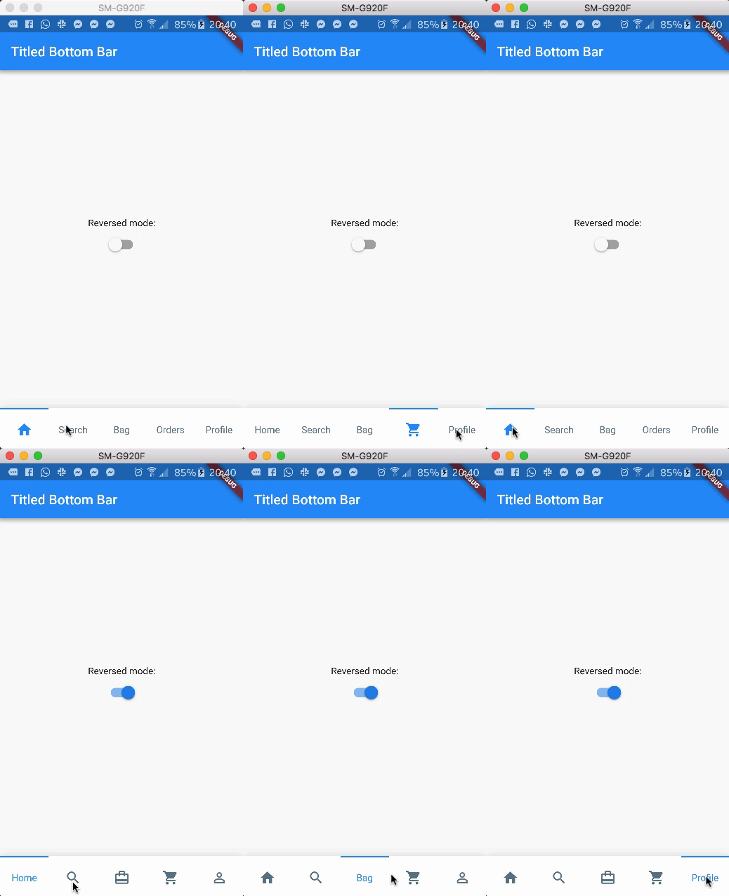
A beautiful, clean and simple bottom navigation bar with smooth animation on click. This package is high customizable, read more bellow for more details.
You can see the source code of this lib inside the /lib folder.
Show some :heart: and star the repo to support this project
Preview (default mode)
Preview (with reverse mode)
Package overview
[x] Custom icon color
[x] Custom indicator color
[x] Support from two to five items
[x] Reverse mode (show selected item as icon or title)
[x] Option to define custom item background color
[x] Use currentIndex property to update the Bar giving a tab position
[x] No need setState(...) to update the current index
[x] Support RTL TextDirection (thanks to Victor Uvarov)
bottomNavigationBar: TitledBottomNavigationBar(
  currentIndex: 2, // Use this to update the Bar giving a position
  onTap: (index){
    print("Selected Index: $index");
  },
  items: [
      TitledNavigationBarItem(title: Text('Home'), icon: Icons.home),
      TitledNavigationBarItem(title: Text('Search'), icon: Icons.search),
      TitledNavigationBarItem(title: Text('Bag'), icon: Icons.card_travel),
      TitledNavigationBarItem(title: Text('Orders'), icon: Icons.shopping_cart),
      TitledNavigationBarItem(title: Text('Profile'), icon: Icons.person_outline),
  ]
)
Customization (Optional)
TitledBottomNavigationBar
onTap - Use this to get notified when an item is clicked, you can retrieve the current item's index on this function. Should not be null! items - The items of your bottom navigation bar. Use the TitledNavigationBarItem class to add items. Should not be null! curve - Use this to define your custom curve animation. Should not be null! reverse - If true, the visible widget of the selected item will be the Text (with the title of the item). If false, the visible widget of the selected item will be the icon. Default to false activeColor - The active Text/Icon color. The default color is the indicatorColor of your app Theme. inactiveColor - The inactive Text/Icon color. The default is the black color. indicatorColor - The indicator color. The default color is the indicatorColor of your app Theme. currentIndex - Use this to update the Bar giving a position. enableShadow - Use this to remove the NavigationBar's shadow
TitledNavigationBarItem
icon -The icon of this item. This will be used as default state if reverse mode is disabled title - The title of this item. This will be used as default state if reverse mode is enabled