搜尋套件、儲存庫與 APP 分類

universal_stepper 封面
套件詳情v1.0.0+1

universal_stepper

為 Flutter 提供一個通用的步進器小部件。該小部件可用於建立水平和垂直的步進器。

AndroidiOSWebmacOSWindowsLinux
近 30 天下載
7
喜歡數
5
Pub 分數
160

安裝套件

flutter pub add universal_stepper

套件介紹

根據套件公開資料產生的選型評估,僅供參考。

一個多功能的 Flutter 套件,提供通用的步進器小組件,支援水平與垂直佈局。它簡化了在所有主要平台建立表單、引導流程或多階段流程的逐步介面。該元件可自訂,並能順暢整合至現有的 Flutter 應用程式中。設計上強調彈性和易用性,讓開發者能以最少的程式碼維持一致的 UI 範式。其跨平台相容性確保在 Android、iOS、Web、macOS、Windows 與 Linux 上行為一致。

適用情境

  • 引導向導
  • 多步驟表單導航
  • 結帳流程設計
  • 進度追蹤介面
  • 設定向導

主要特色

  • 支援橫向與縱向方向
  • 跨平台相容性
  • 可自訂樣式
  • 簡單的 API 結合
  • 可重用的步驟組件

適合對象

  • 開發人員建構引導式工作流程
  • 需要一致步進器 UI 的團隊
  • 需要多步驟用戶輸入的應用程式
  • 使用可重複組件設計系統
  • 跨平台應用程式

使用建議

  • 可能需要額外的樣式才能適應複雜主題
  • 有限的內建動畫選項
  • 最適合線性步驟序列
  • 不適合高度動態的步驟邏輯
  • 依賴正確的狀態管理來控制步驟

原始 README

以下為關聯原始碼儲存庫的 README 原文快照,最新內容請造訪原始碼儲存庫。

A simple package to build steppers with custom elements. You can set up your own body content, badges, and paths using indexed builders.

Vertical Stepper

To create a vertical stepper, set stepperDirection to Axis.vertical.

UniversalStepper(
  inverted: false,
  stepperDirection: Axis.vertical,
  elementBuilder: (context, index) {
    return Expanded(
      child: Container(
        padding: const EdgeInsets.only(left: 10, bottom: 15),
        child: ... // your element
      ),
    );
  },
  badgeBuilder: (context, index) {
    return Container(
      width: 30,
      padding: const EdgeInsets.all(6),
      decoration: const BoxDecoration(
        color: Colors.green,
        borderRadius: BorderRadius.all(Radius.circular(30)),
      ),
      child: const FittedBox(child: Icon(Icons.fastfood, color: Colors.white)),
    );
  },
  pathBuilder: (context, index) {
    return Container(
      color: index == stepperData.length - 1
          ? Colors.transparent
          : (index < currentStep ? Colors.green : Colors.grey),
      width: 4,
    );
  },
  subPathBuilder: (context, index) {
    return Container(
      color: index == stepperData.length - 1
          ? Colors.transparent
          : (index < currentStep ? Colors.green : Colors.grey),
      width: 4,
    );
  },
  elementCount: stepperData.length,
  badgePosition: StepperBadgePosition.start,
)

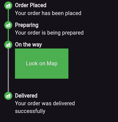
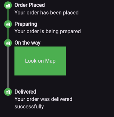
Here’s an example of what the result might look like:

Parameters

  • elementBuilder: A builder for the content of the stepper.

  • badgeBuilder: A builder for the badge.

  • badgePosition: Determines the alignment of the badge. Options include StepperBadgePosition.start, StepperBadgePosition.center, or StepperBadgePosition.end.

  • pathBuilder: A builder for the main path (e.g., a line, dotted line, etc.). This is the most commonly used path.

  • subPathBuilder: A builder for the secondary path, used when badgePosition is set to StepperBadgePosition.center. This path is displayed under the badge and allows you to control its visibility based on the active step.

  • elementCount: The number of elements in the stepper.

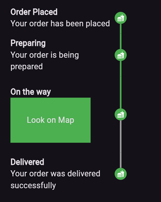
  • inverted: A flag to invert the position of the path and badge relative to the element. By default, this is false, and for vertical steppers, the path appears on the left. When set to true, the path appears on the right. For horizontal steppers, the path appears on the top and when set to true, the path appears on the bottom.

For example, if you set inverted to true and badgePosition to StepperBadgePosition.center, the result will look like this:

Horizontal Stepper

To create a horizontal stepper, set stepperDirection to Axis.horizontal.

Here’s an example of a horizontal stepper:

And here’s the inverted variant:

For full examples, check out the example app.

所屬分類

原始碼儲存庫

使用此套件的專案

暫無相關資料。