搜尋套件、儲存庫與 APP 分類

user_profile_avatar 封面
套件詳情v0.1.3

user_profile_avatar

一個簡單的組件,用於顯示圓形頭像,並在圖像載入時顯示原生的圓形進度指示器。

AndroidiOSmacOSWindowsLinux
近 30 天下載
77
喜歡數
37
Pub 分數
140

安裝套件

flutter pub add user_profile_avatar

套件介紹

根據套件公開資料產生的選型評估,僅供參考。

一個 Flutter 小部件,用於顯示圓形頭像,並在圖像載入期間顯示原生風格的圓形進度指示器。它透過無縫處理圖像取得和視覺反饋,簡化了應用程式中使用者頭像的實作。此小部件確保跨平台外觀一致,支援 Android、iOS、macOS、Windows 和 Linux。非常適合聊天介面、使用者資料,以及任何需要帶有平滑載入狀態的圓形頭像的 UI。

適用情境

  • 使用者資料顯示
  • 聊天介面
  • 社群媒體應用頭像
  • 驗證畫面
  • 儀表板用戶卡片

主要特色

  • 圓形頭像圖像渲染
  • 原生圓形進度指示器
  • 跨平台相容性
  • 簡單 API 結合
  • 自動圖像加載狀態管理

適合對象

  • 開發聊天應用的開發者
  • 需要乾淨頭像的UI設計師
  • 帶有使用者驗證的應用程式
  • 跨平台移動和桌面應用
  • 專案需要最少的樣板程式碼來處理個人檔案圖片

使用建議

  • 需要互聯網訪問以取得遠端影像
  • 超出基本樣式的自訂功能有限
  • 依賴外部圖像加載邏輯
  • 不適合非圓形頭像設計
  • 高性能應用可能需要額外的快取以提升效能

原始 README

以下為關聯原始碼儲存庫的 README 原文快照,最新內容請造訪原始碼儲存庫。

Flutter User Profile Avatar

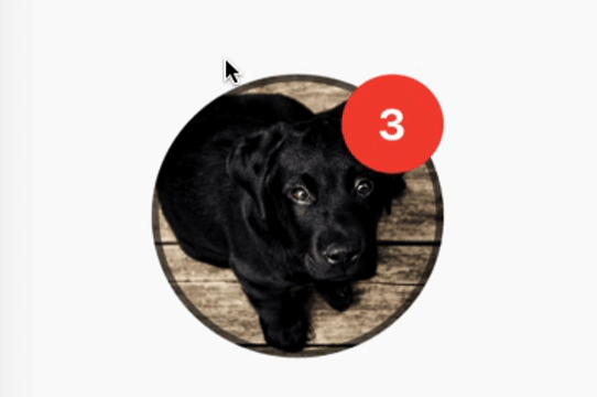
A simple widget that display round profile picture where the picture is fetched from network and displays circular progress indicator whilst the image is being loaded. Also, has the ability to display notification bubble.


How to use


UserProfileAvatar(
        avatarUrl: 'https://picsum.photos/id/237/5000/5000',
        onAvatarTap: () {
          print('Avatar Tapped..');
        },
        notificationCount: 10,
        notificationBubbleTextStyle: TextStyle(
          fontSize: 30,
          color: Colors.white,
          fontWeight: FontWeight.bold,
        ),
        avatarSplashColor: Colors.purple,
        radius: 100,
        isActivityIndicatorSmall: false,
        avatarBorderData: AvatarBorderData(
          borderColor: Colors.white,
          borderWidth: 5.0,
        ),
      )

Properties

  • avatarUrl
    The url for the image, if this set to null or empty then an empty user avatar gets displayed by default.


  • onAvatarTap
    Use this to perform any action when the avatar gets tapped.

  • notificationCount
    Pass an int to display the notification bubble. 99+ gets displayed if notification count was larger than 100.

  • notificationBubbleTextStyle
    Used to style the notification count, if null then the default one will be applied.

  • avatarSplashColor
    Splash color when user taps on the avatar.

  • radius
    Use this to size the avatar.

    • minimum default radius is 15
    • maximum default radius is 150
  • isActivityIndicatorSmall
    use this to display small/large circular progress indicator (native) when image is loading, default is true.


  • avatarBorderData
    Use this to apply border width and color of the avatar.

所屬分類

依賴

依賴清單 1 項

原始碼儲存庫

使用此套件的專案

暫無相關資料。