Wheel Slider
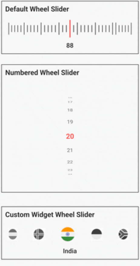
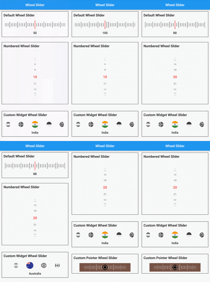
A versatile and highly customizable slider widget for Flutter, with a wheel-like scrolling appearance.
Built on top of wheel_chooser
✨ Features
🔢 Number Display : Show numbers instead of simple lines.↔↕ Scroll Orientation : Horizontal and vertical scrolling options.📳 Haptic Feedback : Vibrates during scroll for a tactile experience.🔧 Custom Widgets : Fully customizable items and pointers.🖼️ Background Support : Add a widget as the slider's background.🎨 Styling Options : Easily customize line and pointer colors.
🚀 Getting Started
Installation
Add the following to your pubspec.yaml under dependencies:
  dependencies:
    wheel_slider:
Import
import 'package:wheel_slider/wheel_slider.dart' ;
Android Permissions
Add the vibration permission to your AndroidManifest.xml file:
<uses-permission android:name ="android.permission.VIBRATE" />
IOS Compatibility
Supports vibration with duration and pattern on CoreHaptics devices. On older devices, the pattern is emulated with 500ms long vibrations.
📖 Usage
To use Line Slider :
WheelSlider (
totalCount: _totalCount,
initValue: _initValue,
onValueChanged: (val) {
setState (() {
_currentValue = val;
});
},
hapticFeedbackType: HapticFeedbackType .vibrate,
),
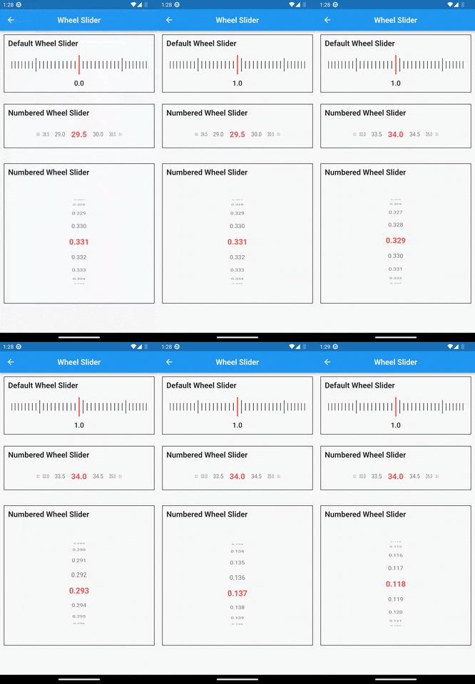
To use Line Slider with displaying double value:
WheelSlider (
interval: 0.5 ,
totalCount: _totalCount,
initValue: _initValue,
onValueChanged: (val) {
setState (() {
_currentValue = val;
});
},
hapticFeedbackType: HapticFeedbackType .vibrate,
),
To use Number Slider :
WheelSlider .number (
perspective: 0.01 ,
totalCount: _nTotalCount,
initValue: _nInitValue,
unSelectedNumberStyle: const TextStyle (
fontSize: 12.0 ,
color: Colors .black54,
),
currentIndex: _nCurrentValue,
onValueChanged: (val) {
setState (() {
_nCurrentValue = val;
});
},
hapticFeedbackType: HapticFeedbackType .heavyImpact,
),
To use Number Slider with displaying double value:
WheelSlider .number (
interval: 0.5 ,
perspective: 0.01 ,
totalCount: _nTotalCount,
initValue: _nInitValue,
unSelectedNumberStyle: const TextStyle (
fontSize: 12.0 ,
color: Colors .black54,
),
currentIndex: _nCurrentValue,
onValueChanged: (val) {
setState (() {
_nCurrentValue = val;
});
},
hapticFeedbackType: HapticFeedbackType .heavyImpact,
),
To use Custom Widget Slider :
WheelSlider .customWidget (
totalCount: 12 ,
initValue: 5 ,
isInfinite: false ,
scrollPhysics: const BouncingScrollPhysics (),
children: List .generate (12 , (index) => const Center (
child: FlutterLogo (
size: 100 ,
),
)),
onValueChanged: (val) {
setState (() {
_cCurrentValue = val;
});
},
hapticFeedbackType: HapticFeedbackType .vibrate,
showPointer: false ,
itemSize: 80 ,
),
🛠️ Properties
controller - A FixedExtentScrollController that allows you to manage and control the scroll position of the slider.interval - To display decimal values. By default it is set to 1, when changed totalCount also to be updated accordingly.currentIndex - Gets the current value as you scroll the Number Slider.perspective - Change the way you want the slider to look from a flat to a wheel like shape and the value must be <= 0.01.squeeze - Adjust the spacing between each item in the slider.isVibrate - To turn on/off vibration while scrolling.hapticFeedbackType - Allows you to change the vibration type.itemSize - Size of each item in the slider.background - Use any widget to add as a background to the slider.allowPointerTappable:
When this is set to false scroll functionality won't work for the occupied region.
When using customPointer with GestureDetector/InkWell, set it to false to enable gestures.
When using default pointer set it to default state i.e true.