This package helps in creation of forms in Flutter by removing the boilerplate code, reusing validation, react to changes, and collect final user input.
Package selection guidance compiled from public package information, community data, and project usage.
Flutter FormBuilder simplifies form creation in Flutter by reducing boilerplate code, enabling reusable validation logic, and providing reactive form handling. It allows developers to easily manage form state, respond to user input changes, and collect structured data from completed forms. The package supports multiple platforms and integrates seamlessly with Flutter's widget system, making it ideal for building dynamic, validated forms efficiently.
Use cases
Building dynamic forms with real-time validation
Reusing validation rules across multiple form fields
Creating complex nested forms with minimal code
Handling form submission with structured data output
Implementing responsive form behavior based on user input
Key features
Reduces repetitive form code
Supports custom and built-in validators
Provides reactive form state management
Enables easy form reset and submission
Integrates with Flutter's native widgets
Suitable for
Developers building data collection forms
Teams prioritizing maintainable form code
Projects requiring consistent validation logic
Apps with multi-step or conditional forms
Frontend developers using Flutter for cross-platform apps
Considerations
Requires understanding of Flutter's state management
May need additional setup for complex validation scenarios
Limited documentation for advanced use cases
Best suited for forms with predictable structure
Not ideal for highly customized form rendering without extra work
Original README
Original README snapshot from the linked source repository. Visit the repository for the latest content.
Flutter Form Builder
This package helps in creation of data collection forms in Flutter by removing the boilerplate needed to build a form, validate fields, react to changes and collect final user input.
Also included are common ready-made form input fields for FormBuilder. This gives you a convenient way of adding common ready-made input fields instead of creating your own FormBuilderField from scratch.
Call for Maintainers
We are looking for maintainers to contribute to the development and maintenance of Flutter Form Builder Ecosystem. Is very important to keep the project alive and growing, so we need your help to keep it up to date and with new features. You can contribute in many ways, we describe some of them in Support section.
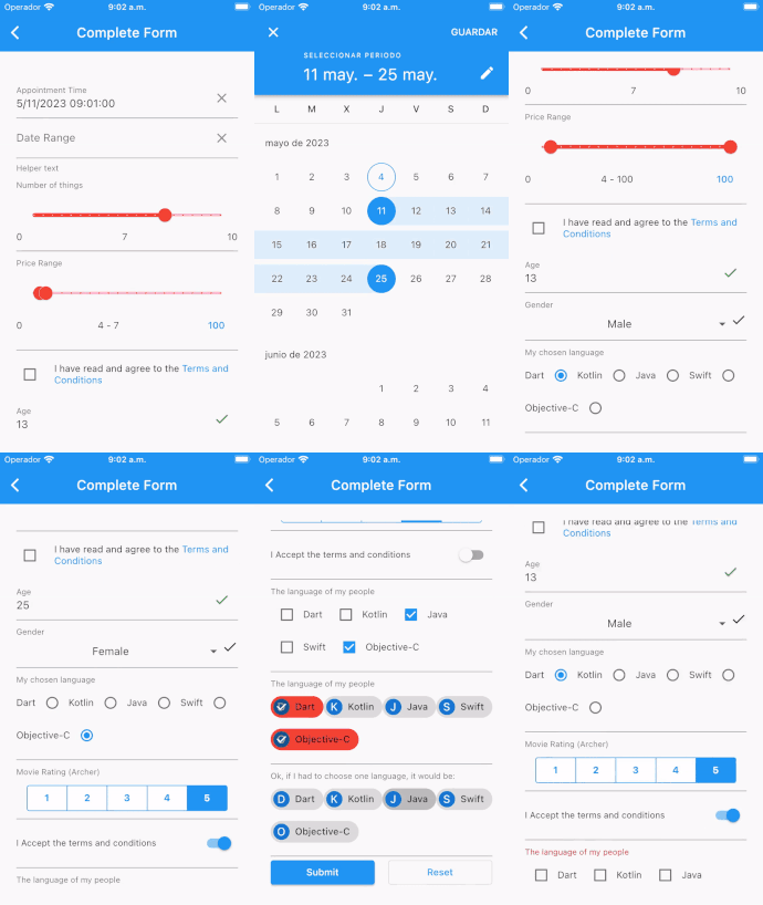
FormBuilderCheckboxGroup - List of checkboxes for multiple selection
FormBuilderChoiceChip - Creates a chip that acts like a radio button.
FormBuilderDateRangePicker - For selection of a range of dates
FormBuilderDateTimePicker - For Date, Time and DateTime input
FormBuilderDropdown - Used to select one value from a list as a Dropdown
FormBuilderFilterChip - Creates a chip that acts like a checkbox
FormBuilderRadioGroup - Used to select one value from a list of Radio Widgets
FormBuilderRangeSlider - Used to select a range from a range of values
FormBuilderSlider - For selection of a numerical value on a slider
FormBuilderSwitch - On/Off switch field
FormBuilderTextField - A Material Design text field input
Parameters
In order to create an input field in the form, along with the label, and any applicable validation, there are several attributes that are supported by all types of inputs namely:
Attribute
Type
Default
Required
Description
name
String
Yes
This will form the key in the form value Map
initialValue
T
null
No
The initial value of the input field
enabled
bool
true
No
Determines whether the field widget will accept user input.
decoration
InputDecoration
InputDecoration()
No
Defines the border, labels, icons, and styles used to decorate the field.
validator
FormFieldValidator<T>
null
No
A FormFieldValidator that will check the validity of value in the FormField
onChanged
ValueChanged<T>
null
No
This event function will fire immediately the the field value changes
valueTransformer
ValueTransformer<T>
null
No
Function that transforms field value before saving to form value. e.g. transform TextField value for numeric field from String to num
The rest of the attributes will be determined by the type of Widget being used.
Use
Setup
No specific setup required: only install the dependency and use :)
Basic use
final _formKey = GlobalKey<FormBuilderState>();

FormBuilder(
    key: _formKey,
    child:  FormBuilderTextField(
        name: 'text',
        onChanged: (val) {
            print(val); // Print the text value write into TextField
        },
    ),
)
final _formKey = GlobalKey<FormBuilderState>();
final _emailFieldKey = GlobalKey<FormBuilderFieldState>();
...
FormBuilder(
key: _formKey,
child: Column(
children: [
FormBuilderTextField(
key: _emailFieldKey,
name: 'email',
decoration: constInputDecoration(labelText: 'Email'),
validator: FormBuilderValidators.compose([
FormBuilderValidators.required(),
FormBuilderValidators.email(),
]),
),
ElevatedButton(
child: constText('Submit'),
onPressed: () async {
if(awaitcheckIfEmailExists()){
// Either invalidate using Form Key
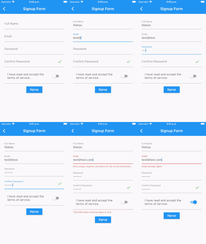
_formKey.currentState?.fields['email']?.invalidate('Email already taken');
// OR invalidate using Field Key
_emailFieldKey.currentState?.invalidate('Email already taken');
}
},
),
],
),
),
Validation focus and auto-scroll options
validate and saveAndValidate can focus the first invalid field and scroll it
into view:
final isValid = _formKey.currentState?.saveAndValidate(
  focusOnInvalid: true,
  autoScrollWhenFocusOnInvalid: true,
);
focusOnInvalid defaults to true, and autoScrollWhenFocusOnInvalid defaults
to false. This is useful when the first invalid field is not a text field or
is inside a custom field that does not automatically scroll into view when
focused.
The same behavior can be used when setting a custom field error:
Starting with version 11.0.0 this package migrated to the official material_ui library. Properties exposing Material types (e.g. InputDecoration, DropdownMenuItem, ListTileControlAffinity) now use material_ui
types, so import package:material_ui/material_ui.dart instead of package:flutter/material.dart when configuring them. See the migration guide.
v9 to v10
Remove invalidateField and invalidateFirstField methods from FormBuilderState. Use fields[name]?.invalidate(errorText) and fields.first.invalidate(errorText) instead
[FormBuilderTextField] Deprecate canRequestFocus property. Use FocusNode.canRequestFocus. instead
Assert on FormBuilderField.decoration.enabled property. Use FormBuilderField.enabled instead
Easy way! Only need execute dart fix --apply on your project to fix the following changes:
Rename FormBuilderChoiceChip to FormBuilderChoiceChips.
Rename FormBuilderFilterChip to FormBuilderFilterChips.