Search packages, repositories and app categories

flutter_progress_hud cover
Package detailsv2.0.2

flutter_progress_hud

Highly customizable modal progress indicator with fade animation.

AndroidiOSWebmacOSWindowsLinux
30-day downloads
28.9K
Likes
131
Pub points
150

Install package

flutter pub add flutter_progress_hud

Package Overview

Package selection guidance compiled from public package information, community data, and project usage.

A highly customizable modal progress indicator for Flutter that displays a loading overlay with smooth fade animations. It provides an easy way to show and hide loading states during asynchronous operations, improving user experience by indicating ongoing processes. The HUD can be customized with different messages, colors, and shapes, and supports various platforms including mobile, web, and desktop. Ideal for use in forms, API calls, or any operation requiring visual feedback.

Use cases

  • Displaying loading state during API requests
  • Showing progress in form submissions
  • Enhancing UX during data fetching
  • Providing feedback during background tasks
  • Indicating processing status in long-running operations

Key features

  • Fade-in and fade-out animations
  • Customizable message and appearance
  • Supports multiple platforms
  • Easy show/hide methods
  • Configurable overlay color and opacity
  • Responsive design across devices

Suitable for

  • Developers building apps with frequent async operations
  • Teams prioritizing user experience
  • Projects requiring consistent loading indicators
  • Apps targeting multiple platforms
  • UI-heavy applications needing polished feedback

Considerations

  • May require careful management to avoid overlapping with other UI elements
  • Customization options can increase complexity for simple use cases
  • Performance impact on very frequent show/hide cycles
  • Not suitable for non-modal loading scenarios
  • Limited built-in themes compared to third-party alternatives

Original README

Original README snapshot from the linked source repository. Visit the repository for the latest content.

pub package

Flutter Progress HUD

Highly customizable modal progress indicator with fade animation.

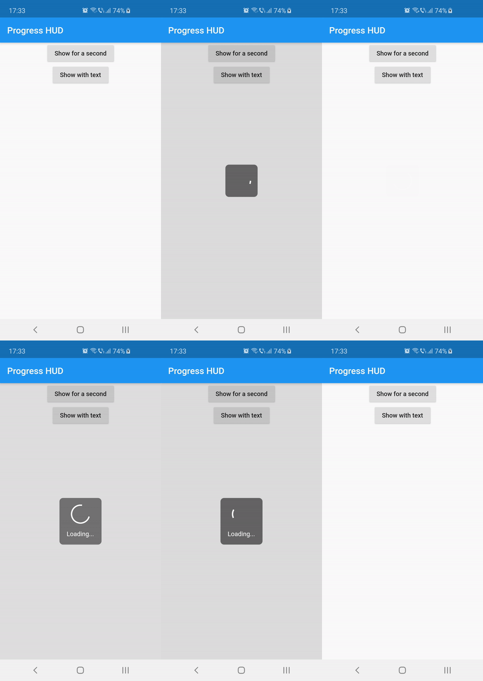
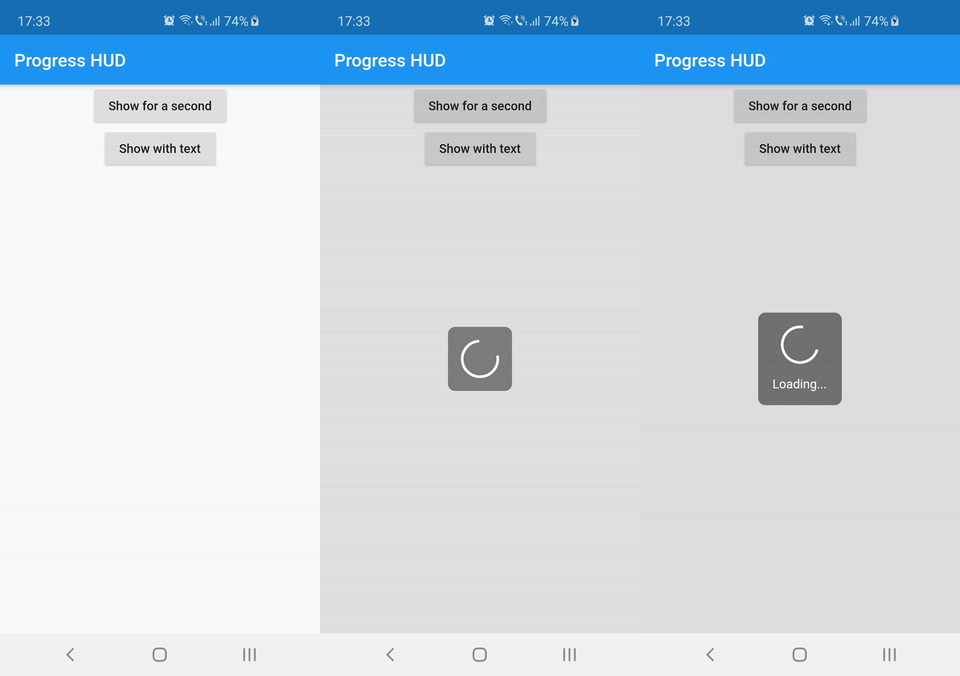
Preview

Usage

Wrap with ProgressHUD the widget on top of which you want to show the modal indicator.

ProgressHUD(
  child: HomePage(),
)

Get a reference of ProgressHUD

final progress = ProgressHUD.of(context);

Show indeterminate progress

progress.show();

Or a progress with text

progress.showWithText('Loading...');

Then dismiss

progress.dismiss();

Example (full)

ProgressHUD(
        child: Builder(
          builder: (context) => Center(
                child: Column(
                  children: <Widget>[
                    RaisedButton(
                      child: Text('Show for a second'),
                      onPressed: () {
                        final progress = ProgressHUD.of(context);
                        progress.show();
                        Future.delayed(Duration(seconds: 1), () {
                          progress.dismiss();
                        });
                      },
                    ),
                    RaisedButton(
                      child: Text('Show with text'),
                      onPressed: () {
                        final progress = ProgressHUD.of(context);
                        progress.showWithText('Loading...');
                        Future.delayed(Duration(seconds: 1), () {
                          progress.dismiss();
                        });
                      },
                    ),
                  ],
                ),
              ),
        ),
      ),

Customization

Attribute Name Default Value Description
indicatorColor Colors.white When using the default indicator widget, this is how you set its color
indicatorWidget A basic CircularProgressIndicator Custom indicator widget
backgroundColor Colors.black54 Indicator background color
backgroundRadius Radius.circular(8.0) Indicator background radius
borderColor Colors.white Indicator background border color
borderWidth 0.0 Indicator background border width
barrierEnabled true You can disable the modal barrier if you want to allow touches while the progress is shown
barrierColor Colors.black12 Color of the Barrier displayed behind the indicator
textStyle TextStyle(color: Colors.white, fontSize: 14.0) TextStyle for the Text displayed below the indicator
padding EdgeInsets.all(16.0)} Indicator content padding

Categories

Source repository

Projects using this package