Search packages, repositories and app categories

grouped_checkbox cover
Package detailsv2.0.0

grouped_checkbox

A package to easily group checkboxes in different styles in Flutter projects.

AndroidiOSWebmacOSWindowsLinux
30-day downloads
156
Likes
11
Pub points
140

Install package

flutter pub add grouped_checkbox

Package Overview

Package selection guidance compiled from public package information, community data, and project usage.

The grouped_checkbox package simplifies the creation and management of grouped checkboxes in Flutter applications. It provides flexible styling options and easy integration for forms or selection interfaces. Developers can quickly implement multiple checkboxes with consistent behavior, including selection handling and state management. The package supports all major platforms, ensuring a uniform experience across devices. Ideal for surveys, filters, and configuration panels, it enhances user interaction with minimal setup.

Use cases

  • Form inputs with multiple selections
  • Filtering options in dashboards
  • User preference settings
  • Survey or questionnaire interfaces
  • Dynamic checkbox groups
  • Multi-select dropdown alternatives

Key features

  • Easy grouping of checkboxes
  • Multiple visual styles
  • Built-in selection management
  • Cross-platform compatibility
  • Simple API for customization
  • Supports both single and multiple selections

Suitable for

  • Developers building interactive forms
  • UI designers needing reusable checkbox components
  • Projects requiring multi-selection inputs
  • Apps with dynamic form generation
  • Teams prioritizing consistent UI patterns

Considerations

  • Limited to checkbox-specific functionality
  • No built-in validation features
  • Requires manual handling of complex state logic
  • Not suitable for non-interactive use cases
  • Depends on external state management for advanced scenarios

Original README

Original README snapshot from the linked source repository. Visit the repository for the latest content.

Grouped Checkbox Widget for Flutter

pub package

Overview

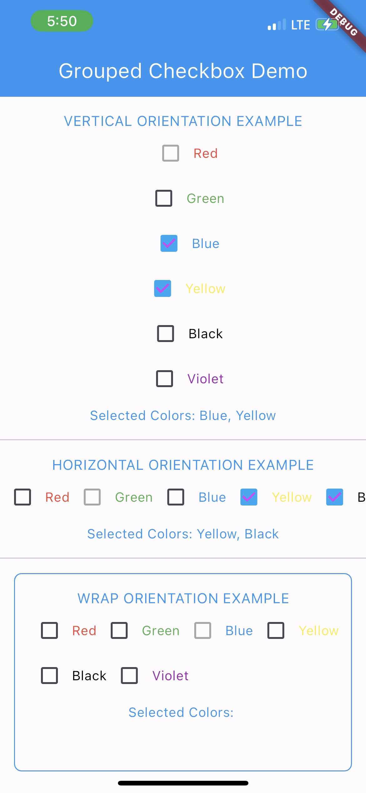
The GroupedCheckbox widget enables displaying a list of checkboxes in various orientations and styles. It's designed for flexibility, supporting generic types, and offers customizable options.

Features

  • Supports generic data types.
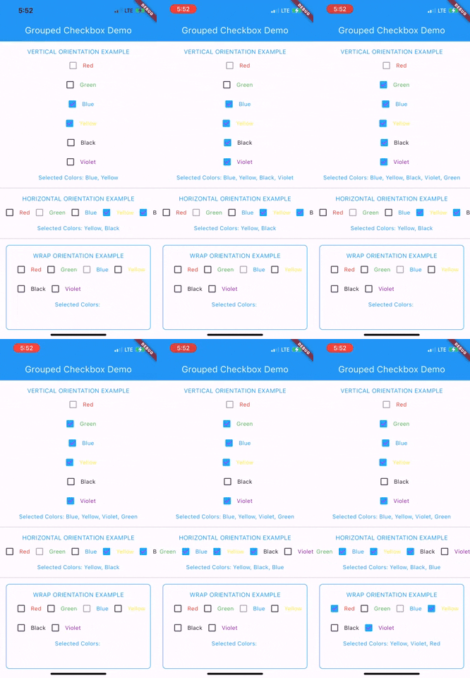
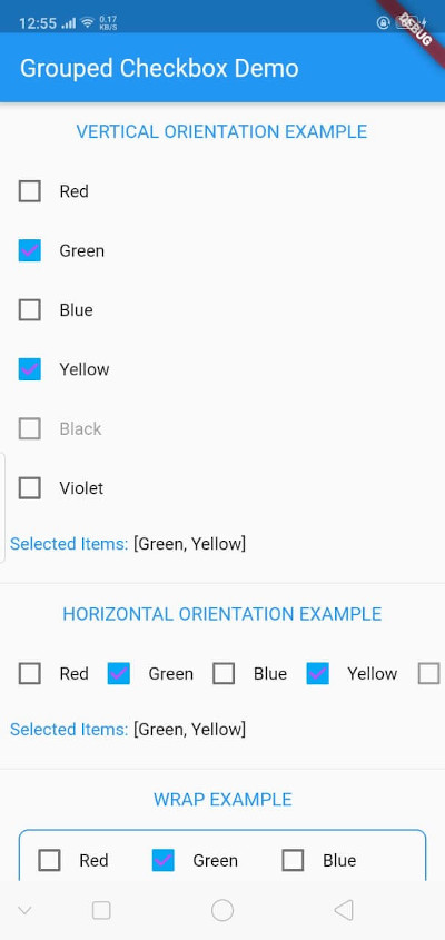
  • Vertical, horizontal, and wrap orientations.
  • Disabled state support.
  • Callbacks for state changes.

Installation

Add grouped_checkbox to your Flutter project's dependencies.

Usage

To use this plugin, add grouped_checkbox as a dependency in your pubspec.yaml file.

dependencies: grouped_checkbox: 2.0.0
Example
import 'package:grouped_checkbox/grouped_checkbox.dart';
    final List<ColorItem> allItemList = [
      ColorItem('Red', Colors.red), 
      ColorItem('Green', Colors.green), 
      ColorItem('Blue', Colors.blue),
      ColorItem('Yellow', Colors.yellow),
      ColorItem('Black', Colors.black),
      ColorItem('Violet', Colors.purple)
    ];

    class ColorItem {
      String name;
      Color color;
    
      ColorItem(this.name, this.color);
    }

    GroupedCheckbox<ColorItem>(
      itemList: allItemList,
      checkedItemList: selectedItems,
      disabled: disabledItems,
      onChanged: (itemList) {
        updateFunction(itemList!);
      },
      orientation: orientation,
      checkColor: Colors.purpleAccent,
      activeColor: Colors.lightBlue,
      itemWidgetBuilder: (item) => Text(item.name, style: TextStyle(color: item.color)),
    )

Categories

Source repository

Projects using this package

No data available yet.