Orientação gerada a partir de informações públicas. Apenas para referência.
adv_fab é um pacote Flutter que aprimora o botão flutuante padrão, permitindo que ele se expanda e revele widgets ocultos, oferecendo interação dinâmica. Ele suporta uso como uma NavigationBar personalizável ou uma barra flutuante de espaço, ideal para designs de interface modernos que exigem navegação intuitiva e hierarquia visual. O pacote é leve e se integra perfeitamente em projetos existentes do Flutter com configuração mínima. Seu comportamento expansível melhora acessibilidade e engajamento do usuário em aplicativos móveis.
Casos de uso
Navegação inferior com ações expansíveis
Botões de ação flutuantes aprimorados em painéis
Barras de ferramentas de aplicativos interativos
Barras de navegação personalizáveis
Barras de espaço flutuantes em layouts roláveis
Principais recursos
FAB expansível com animações suaves
Suporta múltiplos widgets filhos
Reutilizável como NavigationBar ou floatingSpaceBar
Leve e fácil integração
Direção e cronometragem de expansão configuráveis
Indicado para
Desenvolvedores construindo aplicativos interativos do Flutter
Designers procurando padrões de UI modernos
Aplicativos que exigem controles flutuantes acessíveis
Projetos com necessidades complexas de navegação inferior
aplicações com interface pesada e layouts dinâmicos
Considerações
Pode exigir gerenciamento cuidadoso do layout
O desempenho da animação depende do dispositivo
Personalização limitada por plataforma
Não adequado para FABs estáticos simples
Melhor usado com hierarquia visual clara
README original
Snapshot do README original do repositório-fonte vinculado. Consulte o repositório para o conteúdo mais recente.
AdvFAB (More Than Just A Floating Action Button)
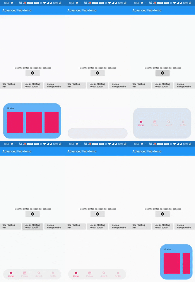
AdvFAB is An Advanced floating action button that expands itself to reveal its hidden widget. It can also be used as an AnimatedbottomNavigationbar or just an AnimatedFloatingActionBar with the same expansion capabilities.
Have a look at the gif below
Image 1
Image 2
NOTE: This package has lots of functionalities and parameters to customize your AdvFab please refer to the example floder and the full documentation in order to take advantage of this package to the fullest. Use this quick guide to setup your work environment and understand the basics :)
Create an Advanced FLoating Action Button (AdvFab)
First import the package inside your project
import'package:adv_fab/adv_fab.dart';
In your project, create a AdvFabController
AdvFabController controller;
//now inside the inti function@overridevoidinitState() {
super.initState();
controller = AdvFabController();
}
This controller will allow you to expand, collapse and more importantly "setExpandedWidgetConfiguration". It will also give you the state of the AdvFab( true or false depending on whether the widget is expanded or not)
IMPORTANT : The "setExpandedWidgetConfiguration" shall be called at least once in the life time of your widget, to configure what has to be displayed once the AdvFab is expanded else you will get an error.
Create an AdvFab widget inside the floatingActionButton of the scaffold
Scaffold(
	floatingActionButton: AdvFab(
		//controller shall not be null (actually it can but still....)
		controller: controller
	),
)
Use flags
AdvFab allows you to create a navigation bar, an empty bar (where you can add a ny widget you want) or just a normal floating action button. To enable these functionalities, here are the flags to toggle
useAsFloatingSpaceBar: false (by default )
useAsFloatingActionButton: true ( by default )
useAsNavigationBar: false (by default )
IMPORTANT : There can be only one value as "true", if you set more than one value as true, then a priority rule will be applied and will set the flag with higher priority to true and you will get a configuration error warning
Important Note
In order to maintain the screen adaptability of this widget (to make it look even on all screens), I opted for a formula based on percentages of the screen.
This means that every width and height shall be given by you in the range [0 - 100],100 inclusive.
Example:
To help you debug your code easily, I included a log facility, You just have to set the ShowLogs property to true and you will get all of them.
When you use AdvFab as a floating Action Button, the default Icon displayed will be a warning icon in red, just use the floatingActionButtonIconColor and floatingActionButtonIcon properties to change them; The floating action button also has its idenpendent ontap property called onFloatingActionButtonTapped
To use the AnimatedBottomNavigationBar, the body of the scaffold shall be a AdvBottomBarBody
Conclusion
Thank you for using my package, if you have any question feel free to contact me on instagram or directly on my mail emile@emilecode.com