Buscar pacotes, repositórios e categorias de apps

Capa de animated_bottom_navigation_bar
Detalhes do pacotev1.4.1

animated_bottom_navigation_bar

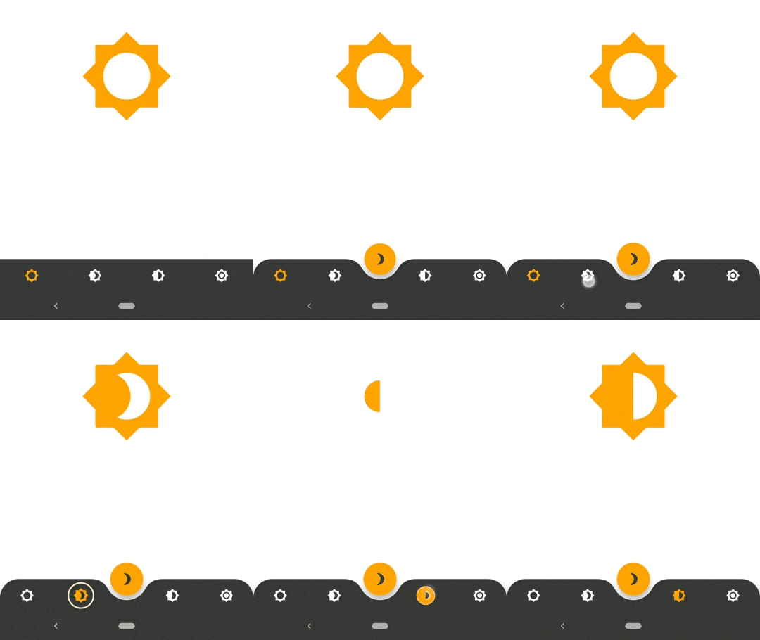
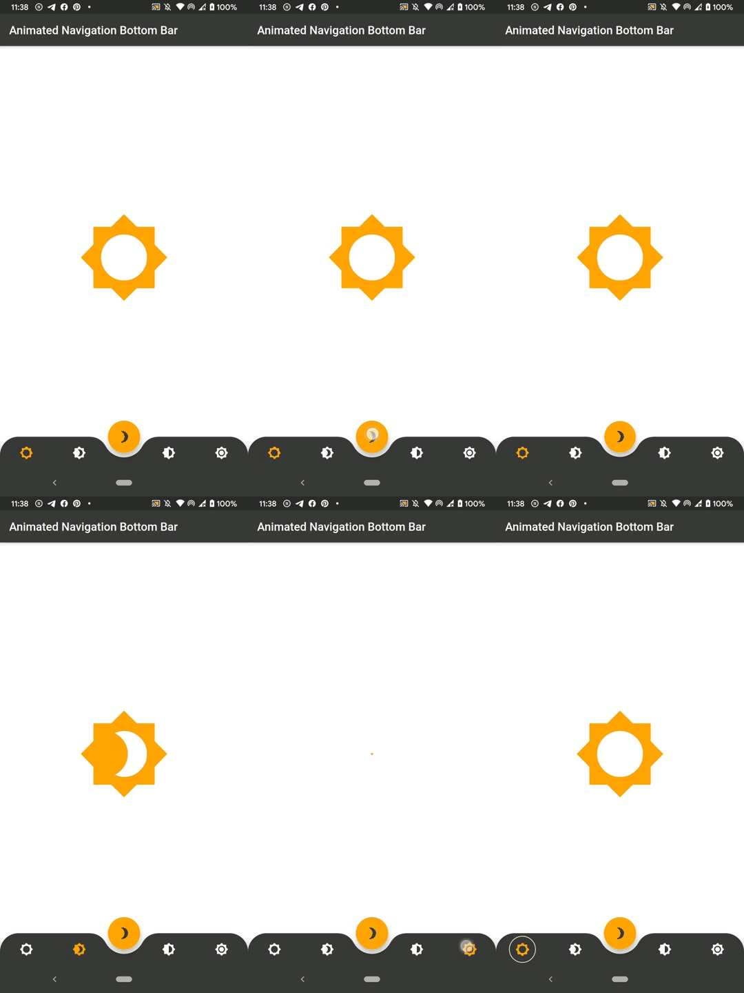
Implementação do widget de barra de navegação inferior animada inspirada em https://dribbble.com/shots/7134849-Simple-Tab-Bar-Animation

AndroidiOSWebmacOSWindowsLinux
Downloads em 30 dias
19,3 mil
Curtidas
1,5 mil
Pontos Pub
150

Instalar pacote

flutter pub add animated_bottom_navigation_bar

Visão geral do pacote

Orientação gerada a partir de informações públicas. Apenas para referência.

Um pacote Flutter que fornece um widget de barra de navegação inferior animada, inspirado em um design do Dribbble. Oferece transições suaves e visualmente atraentes entre abas com animações, cores e ícones personalizáveis. O widget é leve e fácil de integrar em qualquer aplicativo Flutter, com suporte a múltiplas plataformas, incluindo Android, iOS, Web, macOS, Windows e Linux. Ideal para melhorar a experiência do usuário com interfaces de navegação dinâmicas.

Casos de uso

  • Navegação de aplicativo móvel
  • Painéis de aplicativos web
  • Melhorias de interface do usuário multiplataforma
  • Alternância de guias interativa
  • Design de aplicativo moderno

Principais recursos

  • Transições de animação suaves
  • Cores e ícones personalizáveis
  • Design responsivo em várias plataformas
  • Integração fácil com projetos Flutter existentes
  • Suporte para múltiplos destinos de plataforma

Indicado para

  • Desenvolvedores procurando componentes de interface modernos
  • Aplicações Flutter com foco em design
  • Aplicativos que exigem experiências de navegação envolventes
  • Aplicativos móveis e web multiplataforma
  • Designers de UI/UX implementando elementos interativos

Considerações

  • Pode exigir estilos adicionais para layouts complexos
  • O desempenho da animação deve ser testado em dispositivos de baixa configuração
  • Personalização limitada além das propriedades básicas
  • Mais adequado para aplicativos com 3 a 5 itens de navegação
  • Não recomendado para estruturas de navegação altamente complexas

README original

Snapshot do README original do repositório-fonte vinculado. Consulte o repositório para o conteúdo mais recente.

SWUbanner

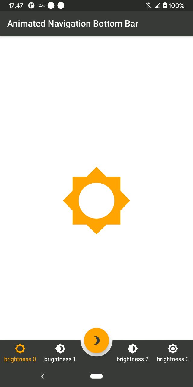
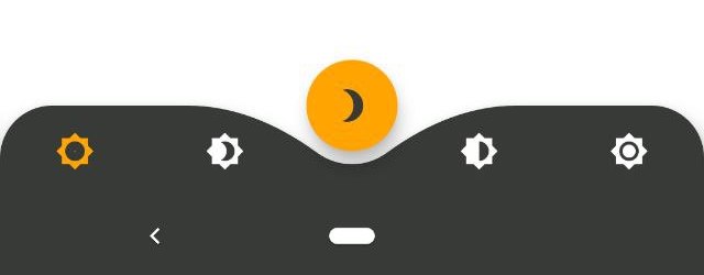
AnimatedBottomNavigationBar is a customizable widget inspired by dribble shot.

pub package

"Buy Me A Coffee"

With AnimatedBottomNavigationBar.builder you are able to customize tab view however you need. In this case you are responsible to handle an active(inactive) state of tabs.

Getting Started

To get started, place your AnimatedBottomNavigationBar or AnimatedBottomNavigationBar.builder in the bottomNavigationBar slot of a Scaffold. The AnimatedBottomNavigationBar respects FloatingActionButton location. For example:

Scaffold(
   body: Container(), //destination screen
   floatingActionButton: FloatingActionButton(
      //params
   ),
   floatingActionButtonLocation: FloatingActionButtonLocation.centerDocked,
   bottomNavigationBar: AnimatedBottomNavigationBar(
      icons: iconList,
      activeIndex: _bottomNavIndex,
      gapLocation: GapLocation.center,
      notchSmoothness: NotchSmoothness.verySmoothEdge,
      leftCornerRadius: 32,
      rightCornerRadius: 32,
      onTap: (index) => setState(() => _bottomNavIndex = index),
      //other params
   ),
);

There is also a more flexible way to build bottomNavigationBar with Builder (see example for more insights):

Scaffold(
   body: Container(), //destination screen
   floatingActionButton: FloatingActionButton(
      //params
   ),
   floatingActionButtonLocation: FloatingActionButtonLocation.centerDocked,
   bottomNavigationBar: AnimatedBottomNavigationBar.builder(
      itemCount: iconList.length,
      tabBuilder: (int index, bool isActive) {
        return Icon(
          iconList[index],
          size: 24,
          color: isActive ? colors.activeNavigationBarColor : colors.notActiveNavigationBarColor,
        );
      activeIndex: _bottomNavIndex,
      gapLocation: GapLocation.center,
      notchSmoothness: NotchSmoothness.verySmoothEdge,
      leftCornerRadius: 32,
      rightCornerRadius: 32,
      onTap: (index) => setState(() => _bottomNavIndex = index),
      //other params
   ),
);

Customization

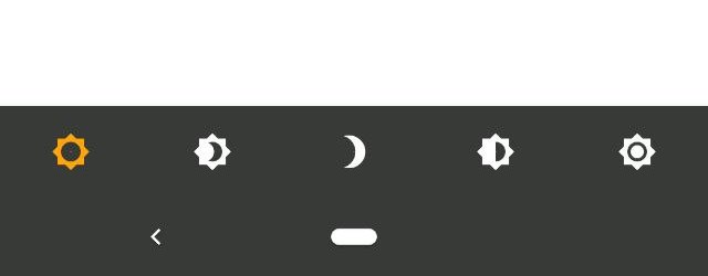
AnimatedBottomNavigationBar is customizable and works with 2, 3, 4, or 5 navigation elements.

Scaffold(
   bottomNavigationBar: AnimatedBottomNavigationBar(
      icons: iconList,
      activeIndex: _bottomNavIndex,
      onTap: (index) => setState(() => _bottomNavIndex = index),
      //other params
   ),
);
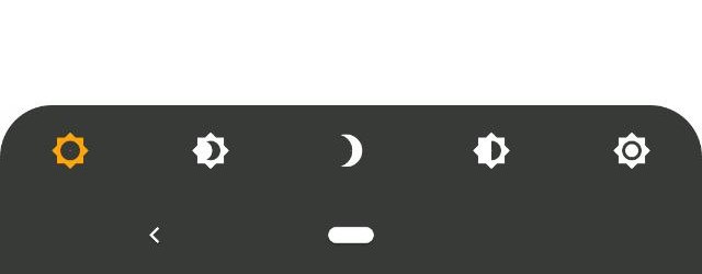
Scaffold(
   bottomNavigationBar: AnimatedBottomNavigationBar(
      icons: iconList,
      activeIndex: _bottomNavIndex,
      leftCornerRadius: 32,
      rightCornerRadius: 32,
      onTap: (index) => setState(() => _bottomNavIndex = index),
      //other params
   ),
);
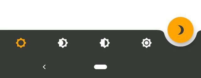
Scaffold(
   floatingActionButton: FloatingActionButton(
      //params
   ),
   floatingActionButtonLocation: FloatingActionButtonLocation.endDocked,
   bottomNavigationBar: AnimatedBottomNavigationBar(
      icons: iconList,
      activeIndex: _bottomNavIndex,
      gapLocation: GapLocation.end,
      notchSmoothness: NotchSmoothness.defaultEdge,
      onTap: (index) => setState(() => _bottomNavIndex = index),
      //other params
   ),
);
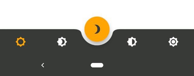
Scaffold(
   floatingActionButton: FloatingActionButton(
      //params
   ),
   floatingActionButtonLocation: FloatingActionButtonLocation.centerDocked,
   bottomNavigationBar: AnimatedBottomNavigationBar(
      icons: iconList,
      activeIndex: _bottomNavIndex,
      gapLocation: GapLocation.center,
      notchSmoothness: NotchSmoothness.defaultEdge,
      onTap: (index) => setState(() => _bottomNavIndex = index),
      //other params
   ),
);
Scaffold(
   floatingActionButton: FloatingActionButton(
      //params
   ),
   floatingActionButtonLocation: FloatingActionButtonLocation.centerDocked,
   bottomNavigationBar: AnimatedBottomNavigationBar(
      icons: iconList,
      activeIndex: _bottomNavIndex,
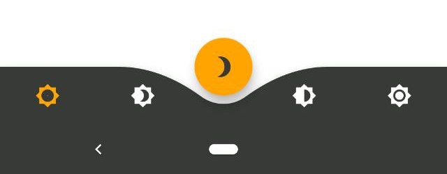
      gapLocation: GapLocation.center,
      notchSmoothness: NotchSmoothness.softEdge,
      onTap: (index) => setState(() => _bottomNavIndex = index),
      //other params
   ),
);
Scaffold(
   floatingActionButton: FloatingActionButton(
      //params
   ),
   floatingActionButtonLocation: FloatingActionButtonLocation.centerDocked,
   bottomNavigationBar: AnimatedBottomNavigationBar(
      icons: iconList,
      activeIndex: _bottomNavIndex,
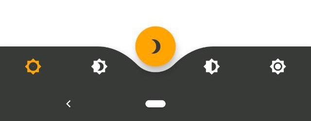
      gapLocation: GapLocation.center,
      notchSmoothness: NotchSmoothness.smoothEdge,
      onTap: (index) => setState(() => _bottomNavIndex = index),
      //other params
   ),
);
Scaffold(
   floatingActionButton: FloatingActionButton(
      //params
   ),
   floatingActionButtonLocation: FloatingActionButtonLocation.centerDocked,
   bottomNavigationBar: AnimatedBottomNavigationBar(
      icons: iconList,
      activeIndex: _bottomNavIndex,
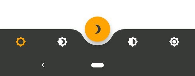
      gapLocation: GapLocation.center,
      notchSmoothness: NotchSmoothness.verySmoothEdge,
      onTap: (index) => setState(() => _bottomNavIndex = index),
      //other params
   ),
);

Driving Navigation Bar Changes

You have to change the active navigation bar tab programmatically by passing a new activeIndex to the AnimatedBottomNavigationBar widget.

class _MyAppState extends State<MyApp> {
  int activeIndex;

  /// Handler for when you want to programmatically change
  /// the active index. Calling `setState()` here causes
  /// Flutter to re-render the tree, which `AnimatedBottomNavigationBar`
  /// responds to by running its normal animation.
  void _onTap(int index) {
    setState((){
      activeIndex = index;
    });
  }

  Widget build(BuildContext context) {
    return AnimatedBottomNavigationBar(
      activeIndex: activeIndex,
      onTap: _onTap,
      //other params
    );
  }
}

Categorias

Repositório-fonte

Projetos que usam este pacote