Orientação gerada a partir de informações públicas. Apenas para referência.
AnimatedDigit é um widget do Flutter que fornece efeitos de animação suave de rolagem para números, ideal para exibir valores numéricos dinâmicos com uma transição visualmente envolvente. Simplifica a implementação de contadores animados ou exibições de pontuação ao lidar automaticamente com o deslocamento dos dígitos, tornando fácil integrá-lo em aplicativos que exigem atualizações em tempo real de números. O pacote oferece suporte a múltiplas plataformas, incluindo Android, iOS, Web, macOS, Windows e Linux, garantindo comportamento consistente entre dispositivos.
Casos de uso
Exibindo placares ao vivo em jogos
Contadores regressivos animados
Mostrando estatísticas dinâmicas
Atualizando indicadores de progresso
Criando relógios digitais
Visualizando métricas em mudança
Principais recursos
Animação de rolagem suave para dígitos
API fácil de usar
Suporta qualquer valor inteiro
Compatibilidade multiplataforma
Velocidade e duração personalizáveis
Configuração mínima necessária
Indicado para
Desenvolvedores de jogos
Construtores de painel
Aplicativos de exibição de dados em tempo real
Aplicativos educacionais
Componentes de interface interativa
Considerações
Mais adequado para inteiros, não para decimais
Personalização limitada para estilos individuais de dígitos
O desempenho pode variar com taxas de atualização muito altas
Não projetado para grandes faixas de números sem otimização
Requer manipulação manual das mudanças de valor
README original
Snapshot do README original do repositório-fonte vinculado. Consulte o repositório para o conteúdo mais recente.
Scroll animation numbers widget, any number that need animation effects and easy to use.
Usage
🚴🏻 Easy Show
// only showAnimatedDigitWidget(
value: 9999
),
🚄 Easy Show & State
// simple state control
int value = 9999;
AnimatedDigitWidget(
  value: value
  textStyle: TextStyle(color: Colors.pink),
),
setState((){
  value = 191919;
});
🎡 Controller
Built-in accuracy calculation
AnimatedDigitController _controller = AnimatedDigitController(10240.987);
AnimatedDigitWidget(
controller: _controller,
textStyle: TextStyle(color: Colors.pink),
fractionDigits: 2, // number of decimal places reserved, not rounded
enableSeparator: true, // like this 10,240.98
),
// UI Result => 10,240.98// increment
_controller.addValue(1314);
// minus
_controller.minusValue(1314); // from v3.1.0 added// times
_controller.timesValue(1314); // from v3.1.0 added// divide
_controller.divideValue(1314); // from v3.1.0 added// reset
_controller.resetValue(1314);
// last
_controller.dispose();
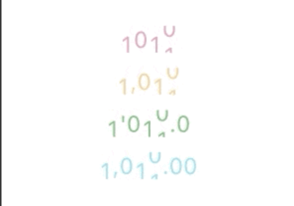
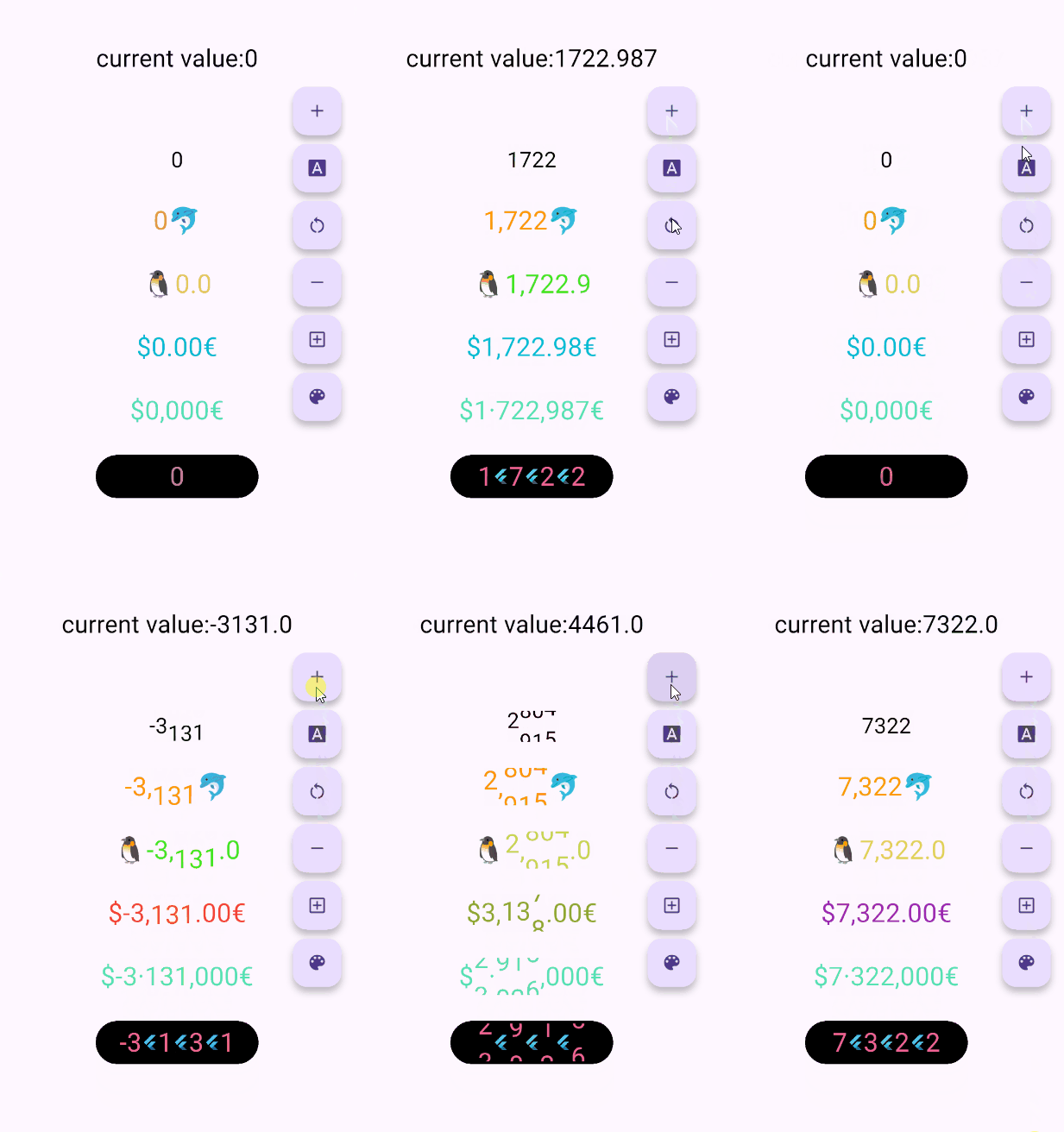
🖼 UI Effect Image & 💻 Code Example
AnimatedDigitWidget(
  value: 12531.98, // or use controller
),
AnimatedDigitWidget(
  value: 12531.98, // or use controller
  enableSeparator: true,
),
AnimatedDigitWidget(
  value: 12531.98, // or use controller
  fractionDigits: 2,
  enableSeparator: true,
),
The add a ValueColor object to valueColors, which is an array, you can add more ...,but always take the last eligible
Since version v3.3.1+1, colors have supported animated transitions instead of abrupt direct color switching, eliminating harsh transitions.
int value = 9999; // or use Controller.valueAnimatedDigitWidget(
value: value,
textStyle: TextStyle(
color: Colors.orange[200],
fontSize: 30,
),
valueColors: [
ValueColor(
//When value <= 0 , the color changes to red
condition: () => value <= 0,
color: Colors.red,
),
// you can add more ...,but always take the last eligible.
],
),
🍓Disable the initial scroll animation.
AnimatedDigitWidget(
...,
firstScrollAnimate: false// set false | >= v3.3.1+1
),
🍋Support for padding the integer part with leading zeros when the number of digits is less than the specified minimum
range: [0, 9], 🐧0 ➡️ 00、1 ➡️ 01、2 ➡️ 02 ...
AnimatedDigitWidget(
...,
fractionDigits: 0, // It must be set to 0; if there are decimal places, it's really unnecessary (wry smile)~~
enableMinIntegerDigits: true// set true, | >= v3.3.1+2
),
⚠️ value and controller cannot be both null.
⚠️ controller has higher priority.
controller - digit controller, The displayed number can be controlled via addValue and resetValue.
value - the display number.
🍑 TextStyle And BoxStyle Setting
textStyle - the numbers text style.
boxDecoration - Use with decoration of Container.
🍇 Int Type(default) Or Decimal Type Setting
fractionDigits - the fraction digits, int, default0.
🖌 Example ( 1000520.98765 ):
0 => 1000520;
1 => 1000520.9;
2 => 1000520.98;
3 => 1000520.987;
N => 1000520.[N];
The default 0 means an integer, when it is a decimal, if the value is less than the fractionDigits, it will be filled with 0 to the right, and the truncation method is used, so there is no rounding.
🍓 Numbers Free Style Setting
decimalSeparator - the decimal separator,can be replaced by other symbols in place of decimal separators, default..
enableSeparator - enable digit separator. defaultfalse not enable, only true, separateLength and separateSymbol valid.
🖌 Example (true): 1000520 => 1,000,520 (seealso separateLength or separateSymbol)
separateSymbol - the numbers separator symbol (only enableSeparator is true), make numbers much easier to read, default,.
🖌 Example ( 1000520 ):
, => 1,000,520
' => 1'000'520
- => 1-000-520
separateLength - the numbers separator length (only enableSeparator is true), separateSymbol by separator length insert, default3.
🖌 Example ( 1000520 ):
1 => 1,0,0,0,5,2,0
2 => 1,00,05,20
3 => 1,000,520
🥝 Scroll Animation Setting
duration - the animate duration, default Duration(milliseconds: 300).
curve - the animate curve, default Curves.easeInOut. look animate curve.
loop - enable loop scroll animate. default true, always scroll down, not scroll up from 9 -> 0; false, scroll up and down.
🍎 Digital Size Scheme Setting
autoSize - the default true is to automatically expand and contract according to the size of the ( number / symbol ) itself, false, the text size of the number 0 is used as the container size of each number, which can ensure the same width, but it seems that there is a slight interval between 1 and other numbers 😊 .
animateAutoSize - the animation resizing. default true, false will change directly to the size of the number/symbol.
🍒 Number prefix and suffix Setting
prefix - the text to display in front of the counter.