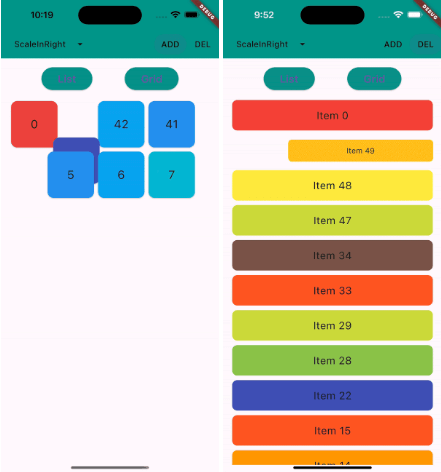
Snapshot do README original do repositório-fonte vinculado. Consulte o repositório para o conteúdo mais recente.

animated_reorderable_list
This library is a powerful and easy-to-use solution for implementing animated list and grid with
drag-and-drop functionality in Flutter.
Features
- [x] Smooth transition during item insertion and removal from the list with animations.
- [x] Drag and Drop support (ReorderableList) for both ListView and GridView with Animation.
- [x] It can be both animated and reordered at the same time
- [x] Animating items is as simple as updating the list.
- [x] Pre-built animation like fade,scale, slide, flip etc for Flutter list.
- [x] Provides support for both lists and grids
- [x] Supports large lists and creates items on demand as they come into the viewport.
- [x] Enable/disable drag and drop functionality.
- [x] Control reordering of item / locked an item.
Demo
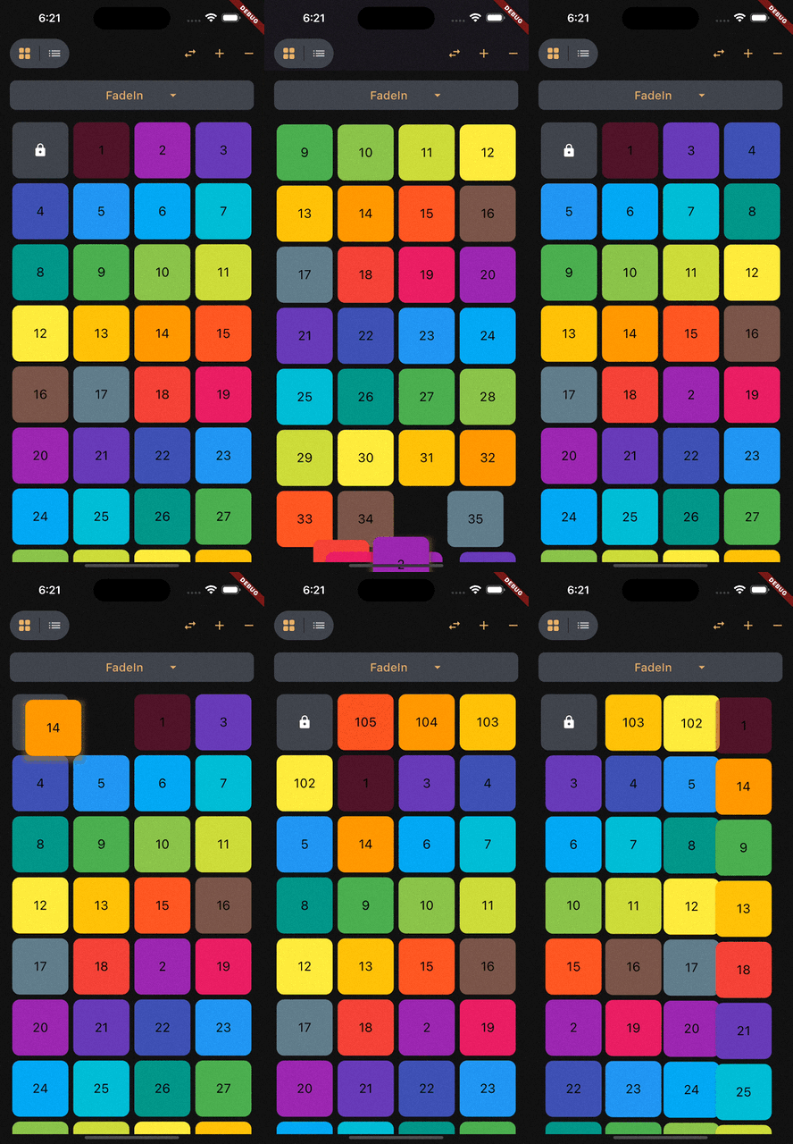
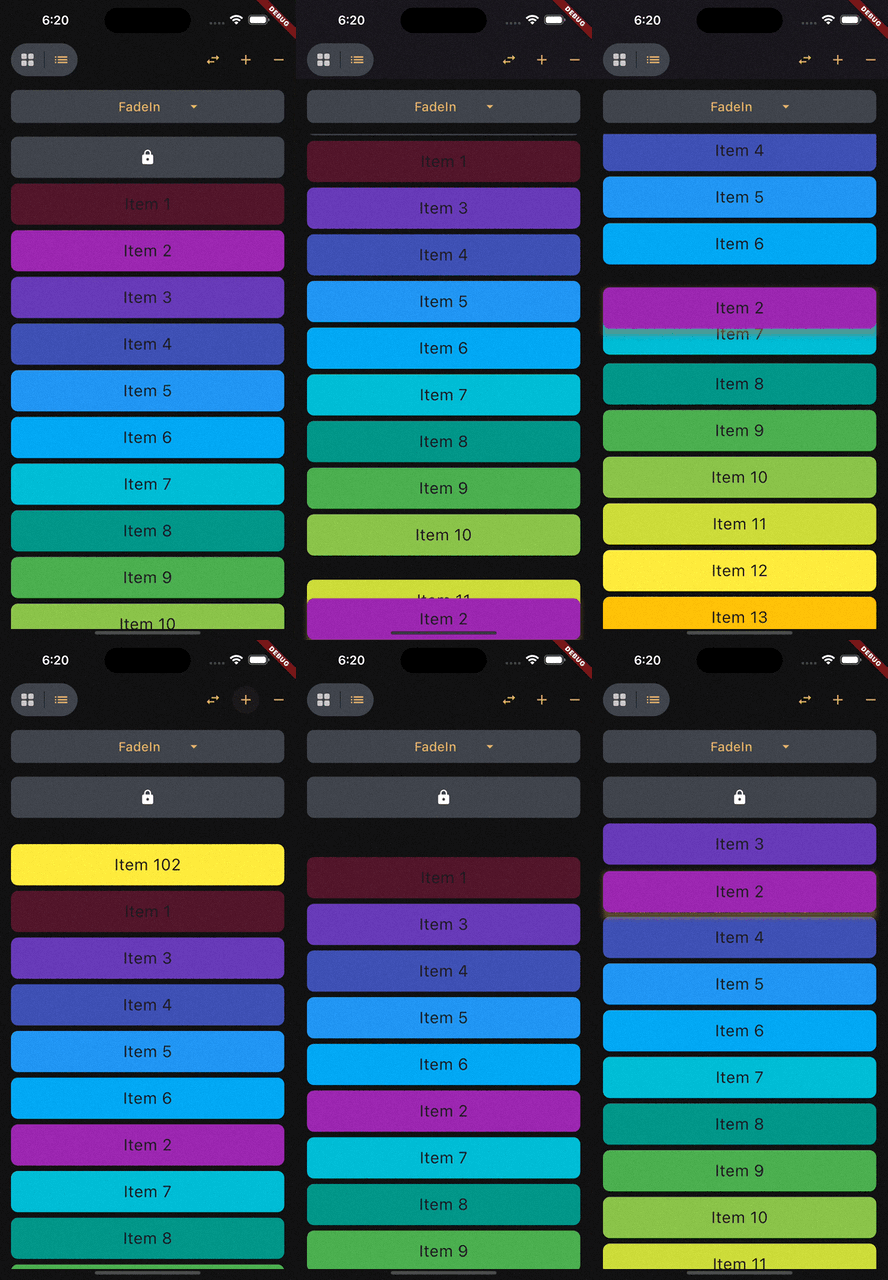
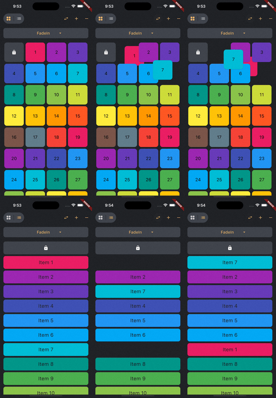
Reorderable List
 |
 |
 |
| ReorderableGridView |
ReorderableListView |
Swap Animation |
How to use it?
1. Add dependency
Add this to your package's pubspec.yaml file:
dependencies:
  animated_reorderable_list: <latest_version>
2. Install it
You can install packages from the command line:
with pub:
$ pub get
with Flutter:
$ flutter pub get
3. Import it
Now in your Dart code, you can use:
import 'package:animated_reorderable_list/animated_reorderable_list.dart';
4. Use it
Sample app demonstrates
how simple the usage of the library actually is.
Basic usage
AnimatedReorderableGridView
A AnimatedGridView with built-in support for drag and drop functionality.
AnimatedReorderableGridView(
  items: list,
  itemBuilder: (BuildContext context, int index) {
    final user = list[index];
    return ItemCard(
      key: ValueKey(user.id),
      id: user.id,
    );
  },
  sliverGridDelegate:
      SliverReorderableGridDelegateWithFixedCrossAxisCount(
          crossAxisCount: 4),
  enterTransition: [FlipInX(), ScaleIn()],
  exitTransition: [SlideInLeft()],
  insertDuration: const Duration(milliseconds: 300),
  removeDuration: const Duration(milliseconds: 300),
  onReorder: (int oldIndex, int newIndex) {
    setState(() {
      final User user = list.removeAt(oldIndex);
      list.insert(newIndex, user);
    });
  },
  dragStartDelay: const Duration(milliseconds: 300),
  isSameItem: (a, b) => a.id == b.id,
)
AnimatedReorderableListView
A AnimatedListView with built-in support for drag-and-drop functionality.
 AnimatedReorderableListView(
  items: list,
  itemBuilder: (BuildContext context, int index) {
    final user = list[index];
    return ItemTile(
      key: ValueKey(user.id),
      id: user.id,
    );
  },
  enterTransition: [SlideInDown()],
  exitTransition: [SlideInUp()],
  insertDuration: const Duration(milliseconds: 300),
  removeDuration: const Duration(milliseconds: 300),
  dragStartDelay: const Duration(milliseconds: 300),
  onReorder: (int oldIndex, int newIndex) {
    setState(() {
      final User user = list.removeAt(oldIndex);
      list.insert(newIndex, user);
    });
  },
  isSameItem: (a, b) => a.id == b.id
)
AnimatedListView
A AnimatedListView that animates insertion and removal of the item. Use this widget when you don't
need drag-and-drop functionality.
AnimatedListView(
  items: list,
  itemBuilder: (context, index) {
    final user = list[index];
    return ItemTile(
      key: ValueKey(user.id),
      id: user.id,
    );
  },
  enterTransition: [FadeIn(), ScaleIn()]
  exitTransition: [SlideInUp()],
  isSameItem: (a, b) => a.id == b.id,
)
AnimatedGridView
A AnimatedGridView that animates insertion and removal of the item. Use this widget when you don't
need drag-and-drop functionality.
AnimatedGridView(
  items: list,
  itemBuilder: (context, index) {
    final user = list[index];
    return ItemCard(
      key: ValueKey(user.id),
      id: user.id,
    );
  },
  sliverGridDelegate:
      SliverReorderableGridDelegateWithFixedCrossAxisCount(
          crossAxisCount: 4),
  enterTransition: [FadeIn(), ScaleIn()],
  exitTransition: [SlideInDown()],
  isSameItem: (a, b) => a.id == b.id),
Duration for animation
insertDuration: const Duration(milliseconds: 300),
removeDuration: const Duration(milliseconds:300),
The duration for item insertion and removal animation. If not specified, the default duration is
Duration(milliseconds: 300).
Enter and exit Animation
To apply animation, while inserting or removing item, specify a list of animation:
enterTransition: [FadeIn(), ScaleIn()],
exitTransition: [SlideIn()],
If not specified, then default FadeIn() animation will be applied.
Delay, duration, curve
Animation have optional delay, duration, begin, end and curve parameters. Animations run
in parallel, but you can use a delay to run them sequentially:
enterTransition: [
FadeIn(
duration: const Duration(milliseconds: 300),
delay: const Duration(milliseconds: 100)),
ScaleIn(
duration: const Duration(milliseconds: 500),
curve: Curves.bounceInOut)
],
If a specific duration is provided for the animation, it will run for that specified duration.
However, if insertDuration or removeDuration are specified, it will override specific item
duration.
Custom AnimationBuilder
insertItemBuilder: (Widget child, Animation<double> animation){
return ScaleTransition(
scale: animation,
child: child,
);
}
removeItemBuilder: (Widget child, Animation<double> animation){
return ScaleTransition(
scale: animation,
child: child,
);
}
You can use custom insertItemBuilder or removeItemBuilder if you wish to implement your own
customized animations instead of relying on the built-in animations provided by the library.
In these custom builder functions, the child parameter represents the widget returned by the
itemBuilder callback, and the animation parameter provides the animation control.
If a custom insertItemBuilder is provided, it will override the enterTransition. Similarly, if
removeItemBuilder is provided, then it will override exitTransition.
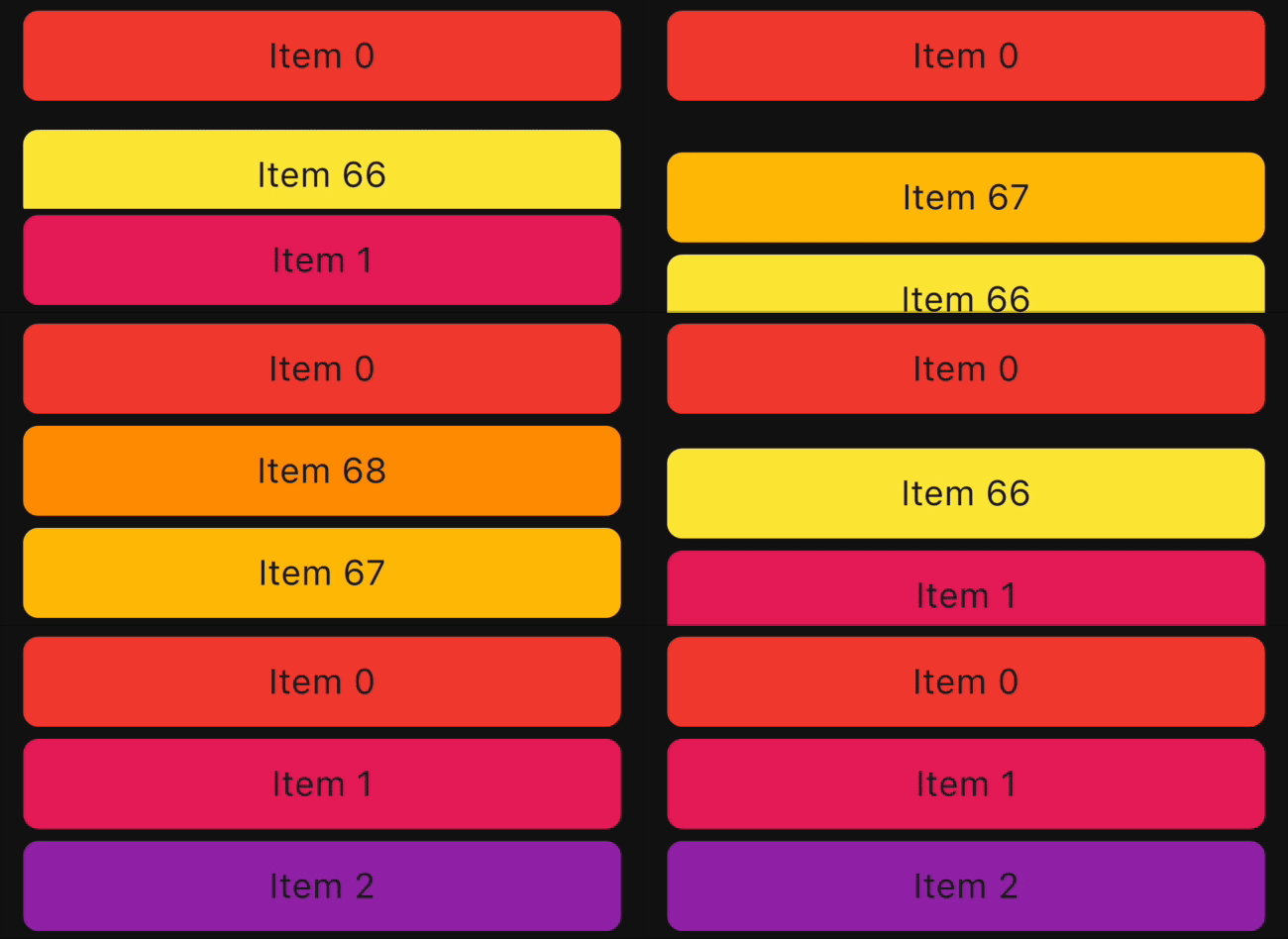
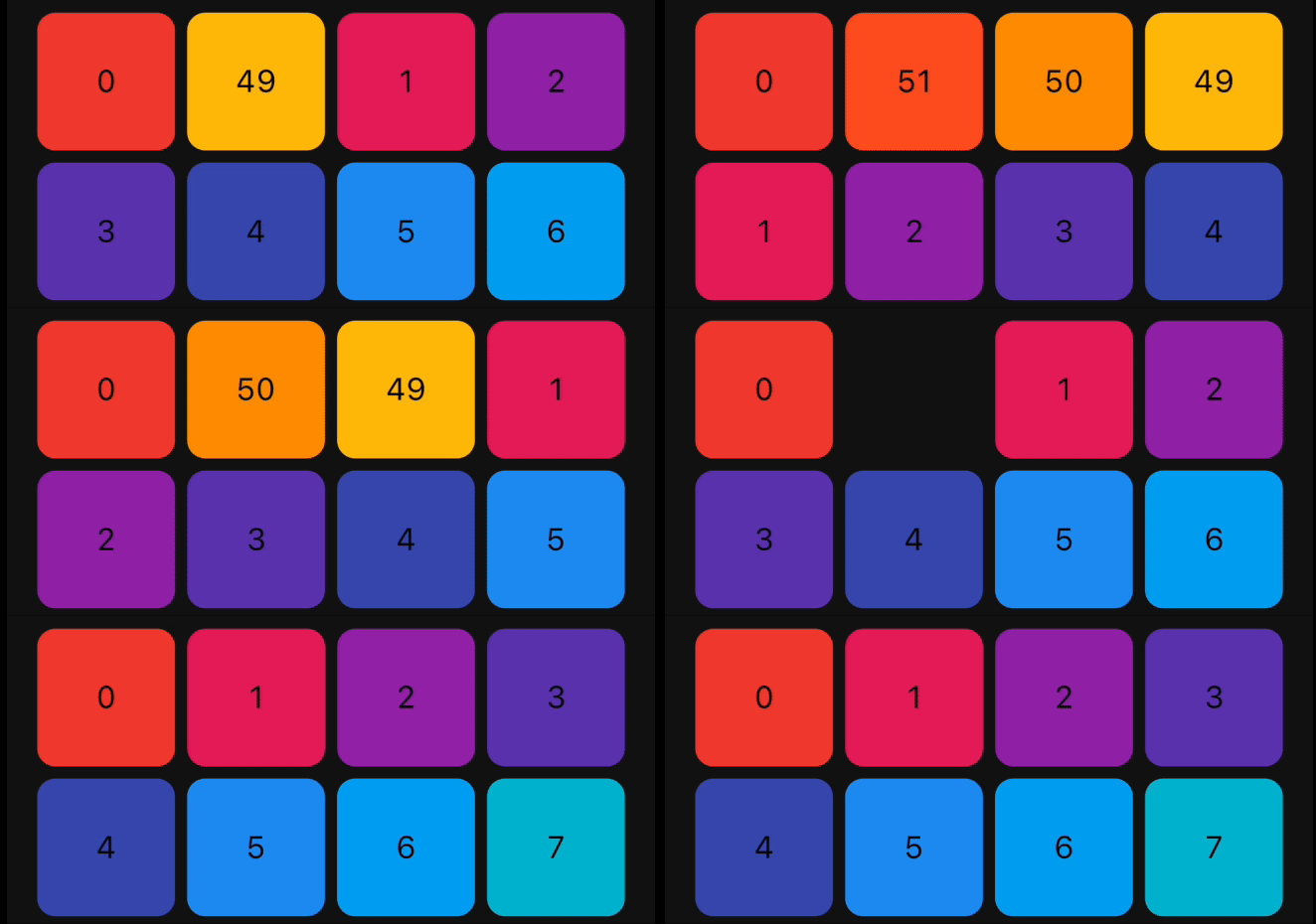
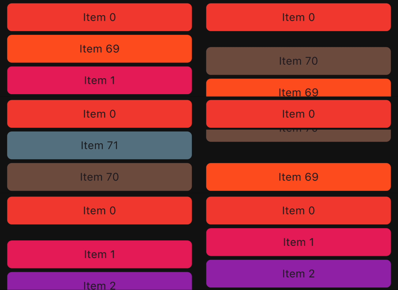
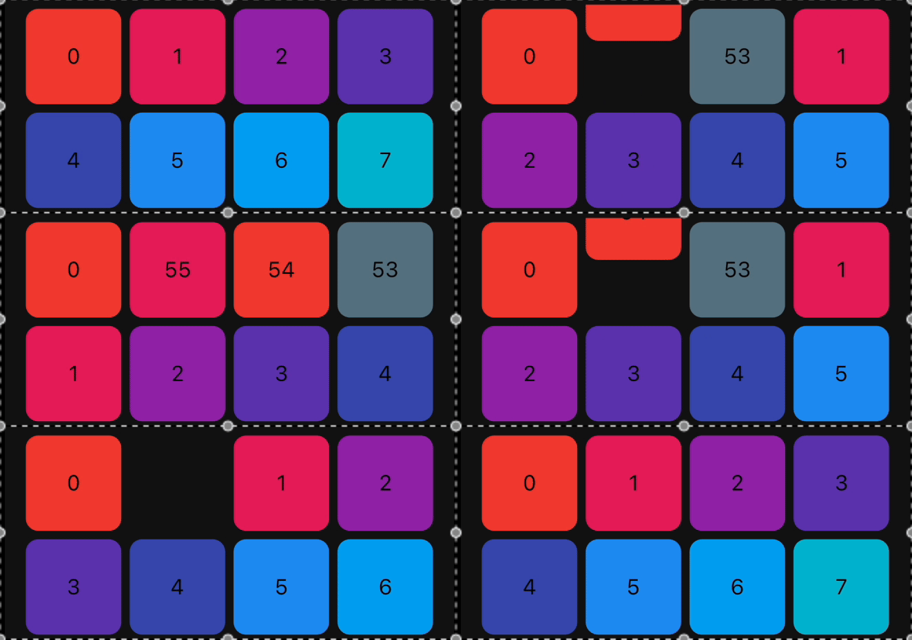
Animations
The library provides a set of pre-built animations that can be used for item insertion and removal.
You can use multiple animations at the same time by providing a list of animations.
The following animations are available:
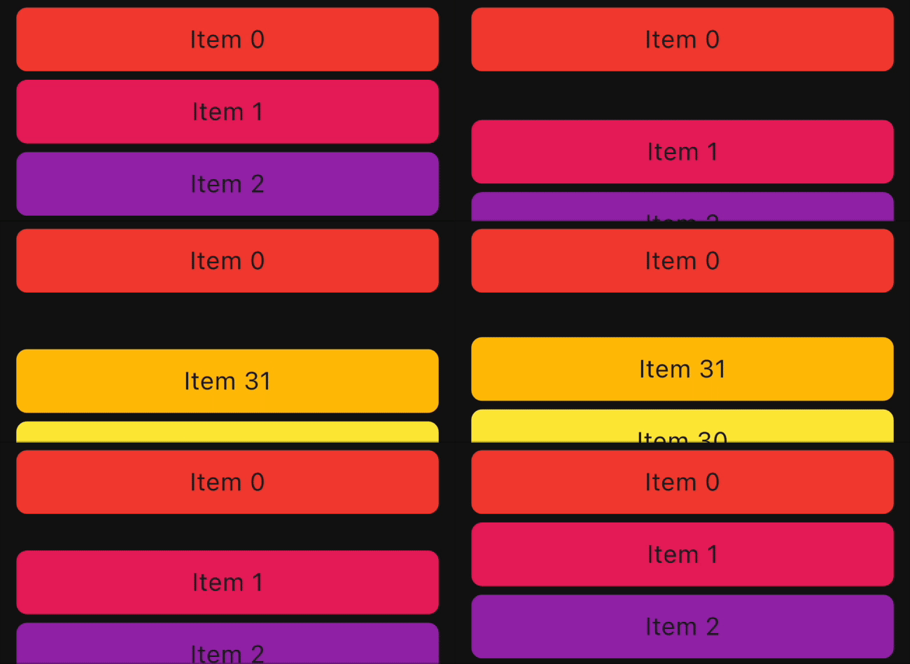
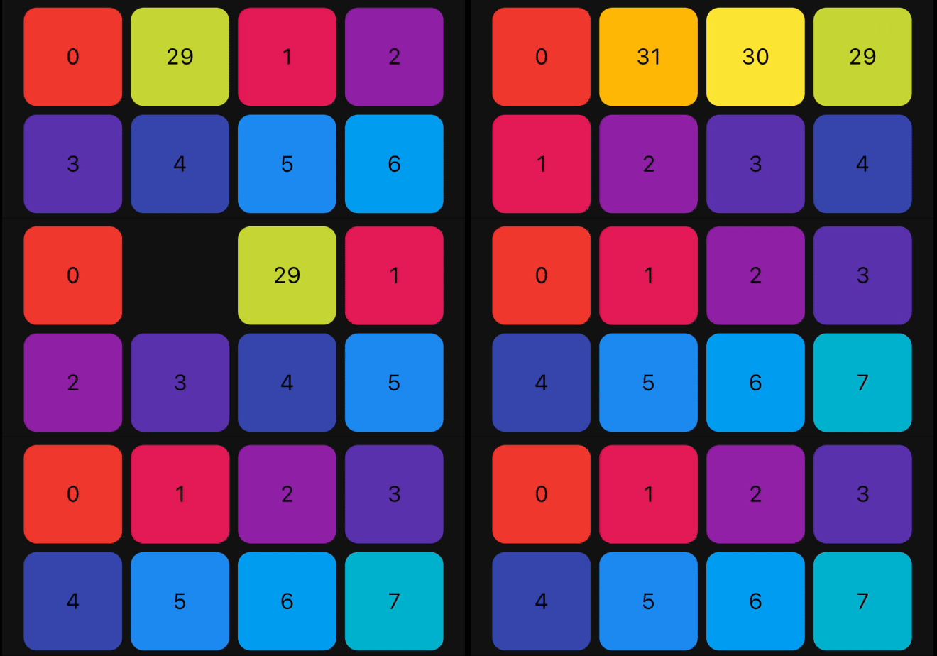
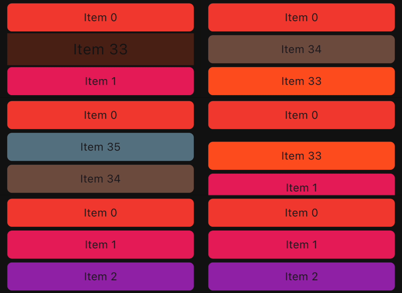
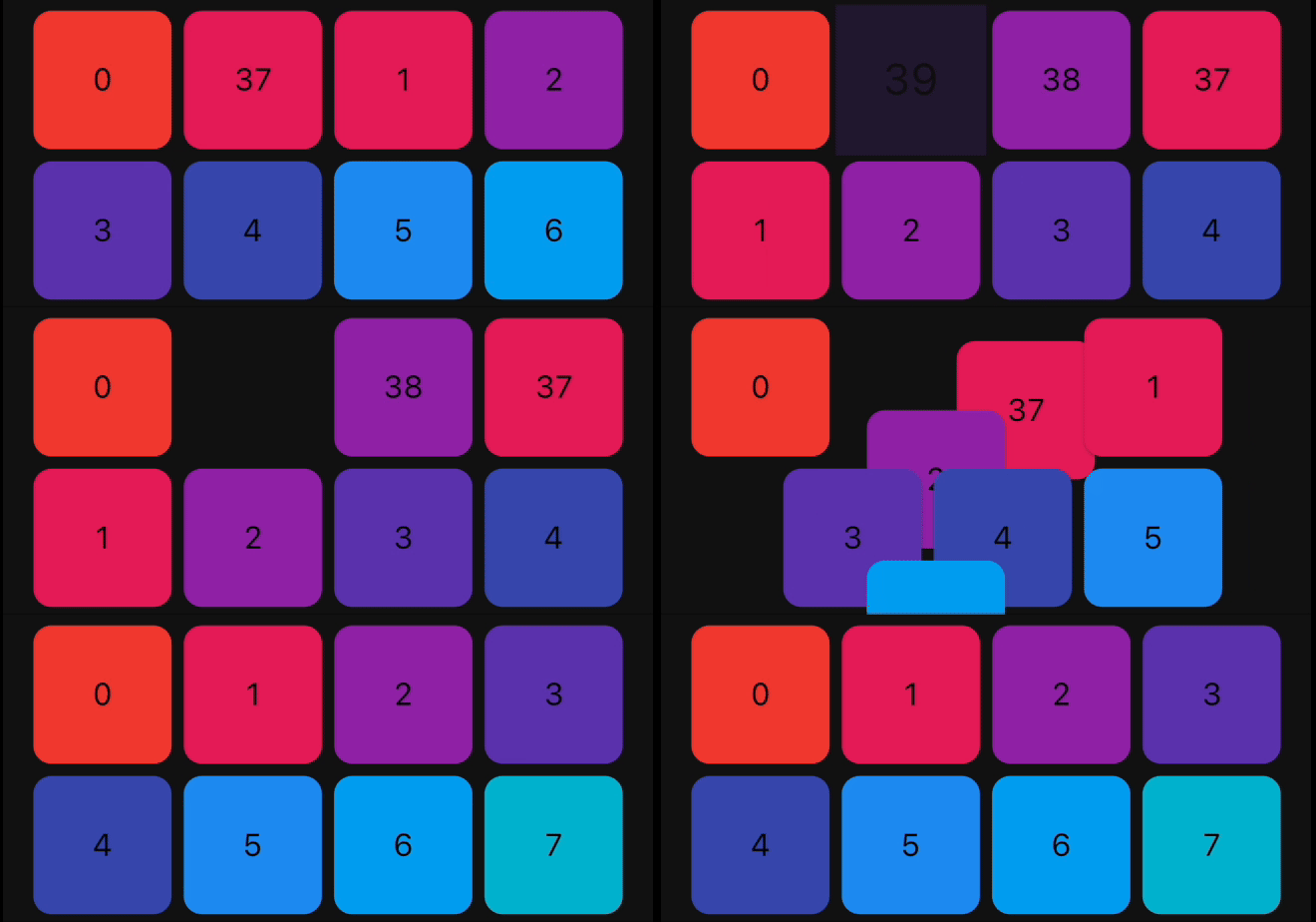
| Animation Type |
ListView Example |
GridView Example |
| FadeIn |
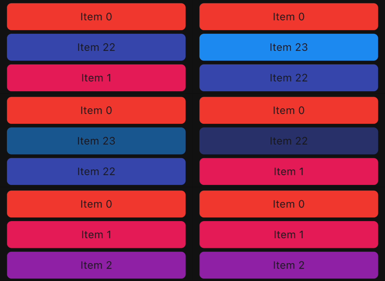 |
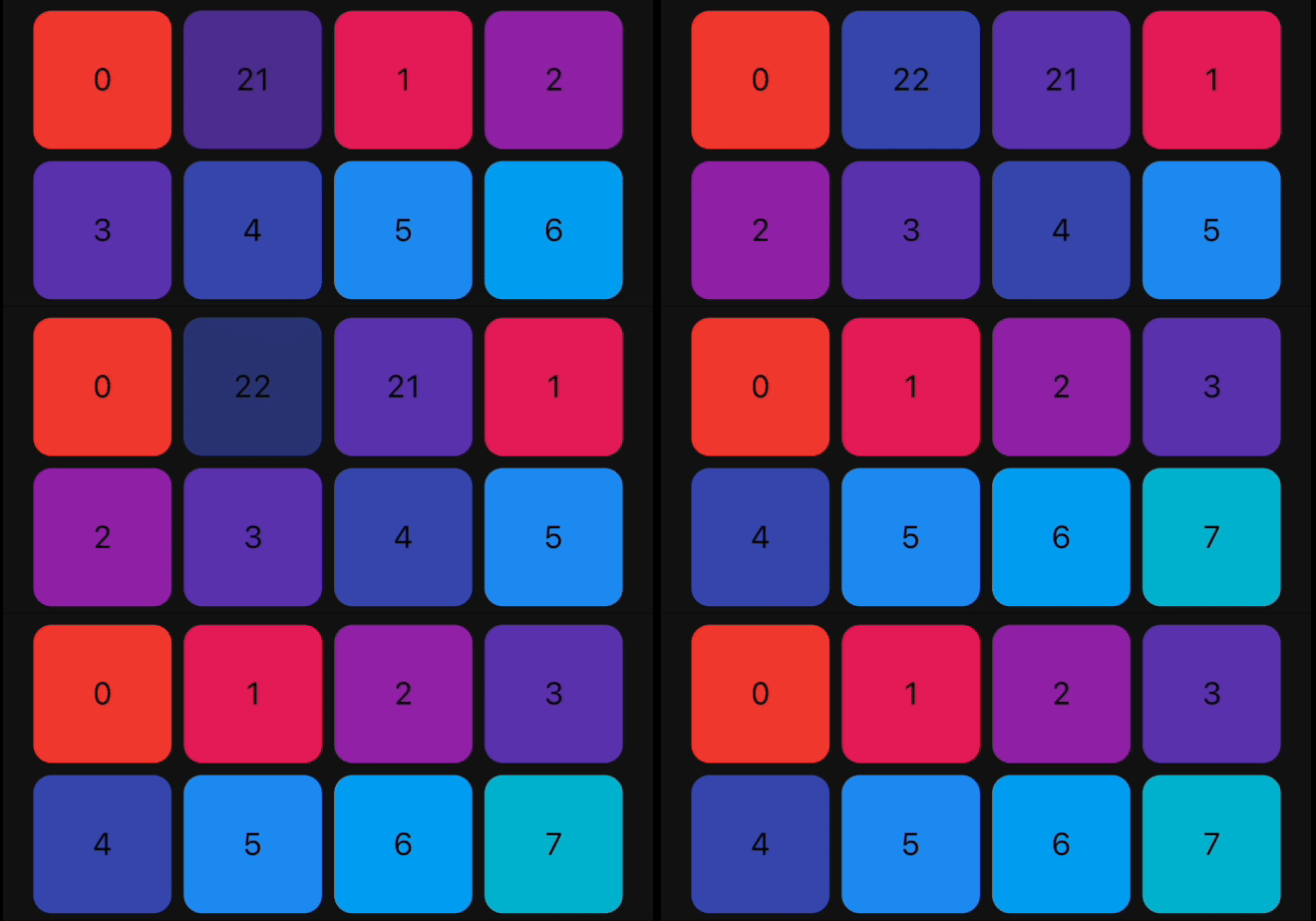 |
| FlipInY |
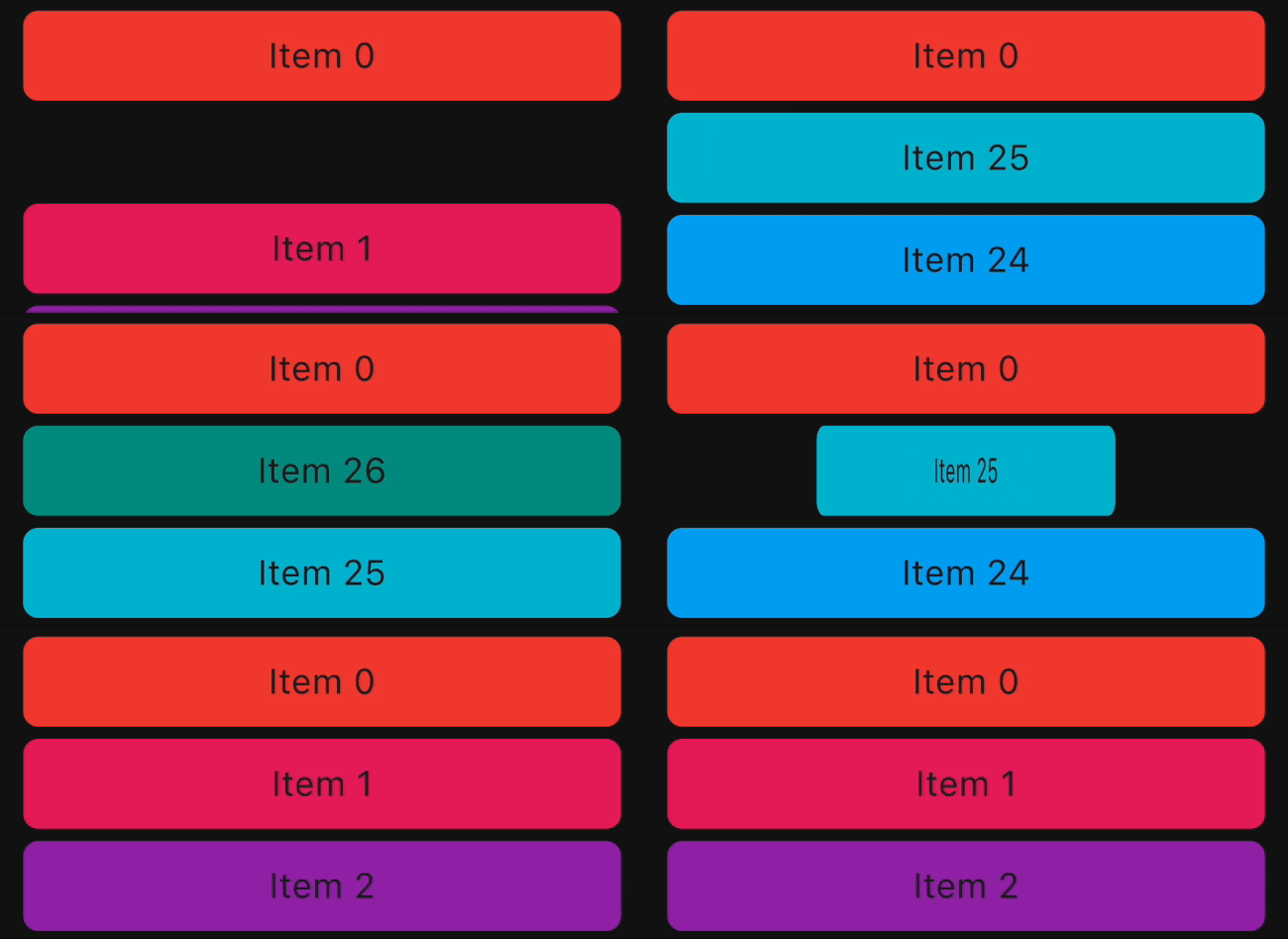 |
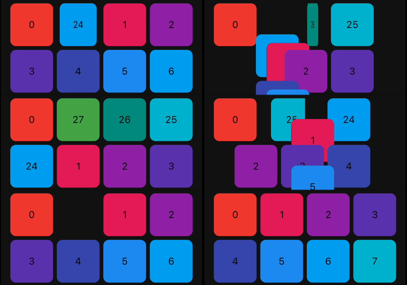 |
| FlipInX |
 |
 |
| Landing |
 |
 |
| ScaleIn |
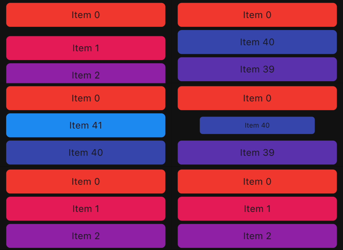 |
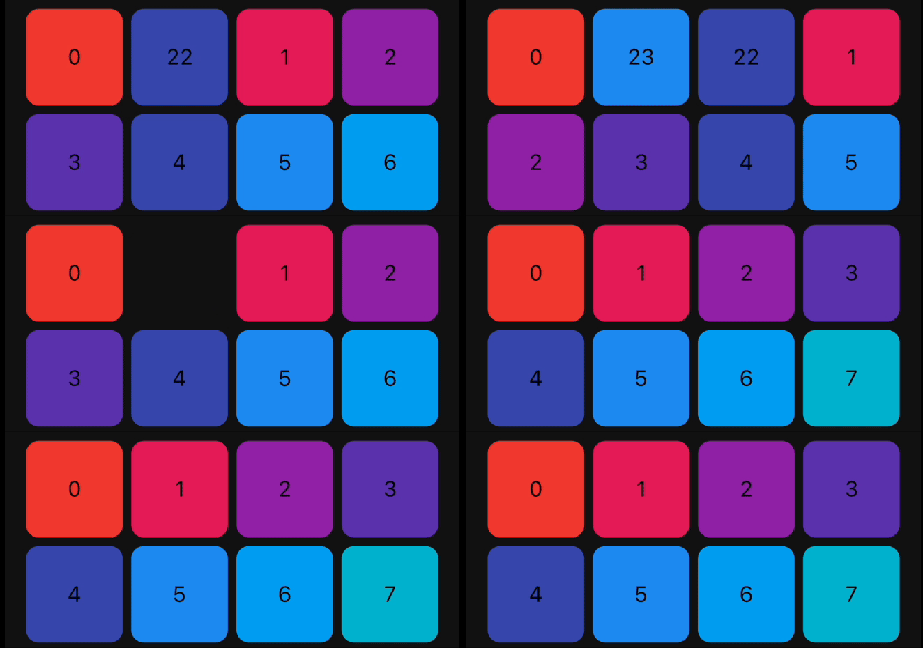 |
| ScaleInTop |
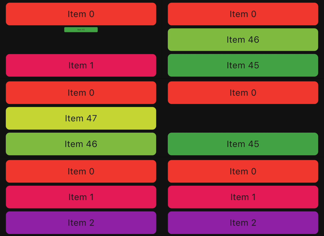 |
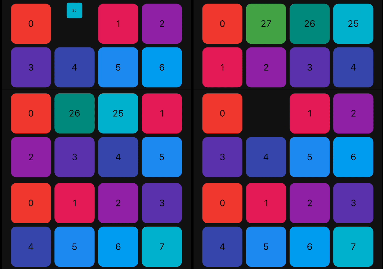 |
| ScaleInBottom |
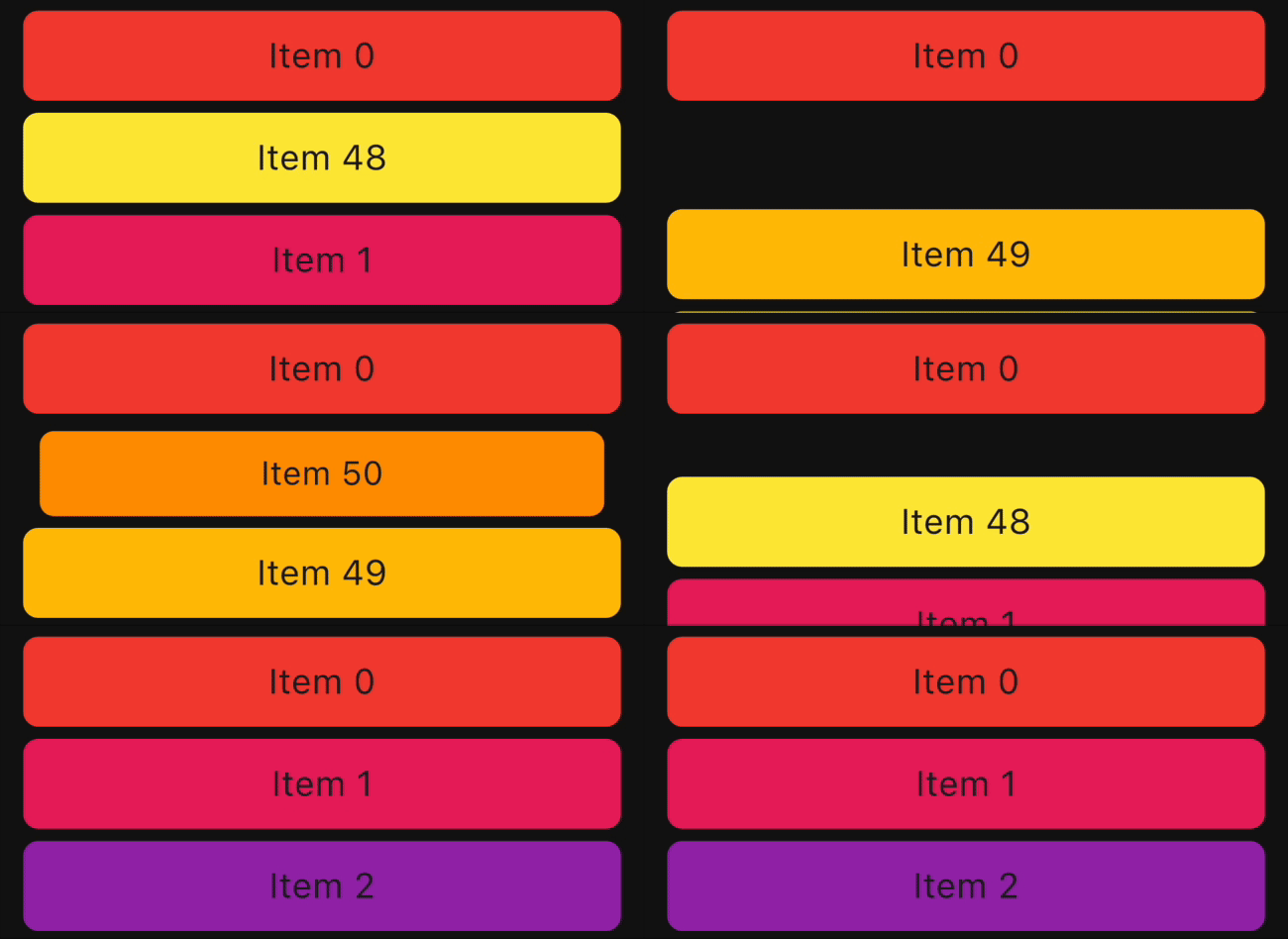 |
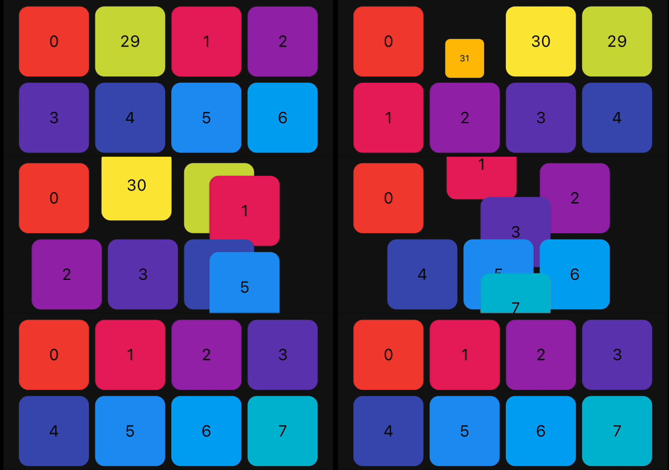 |
| ScaleInLeft |
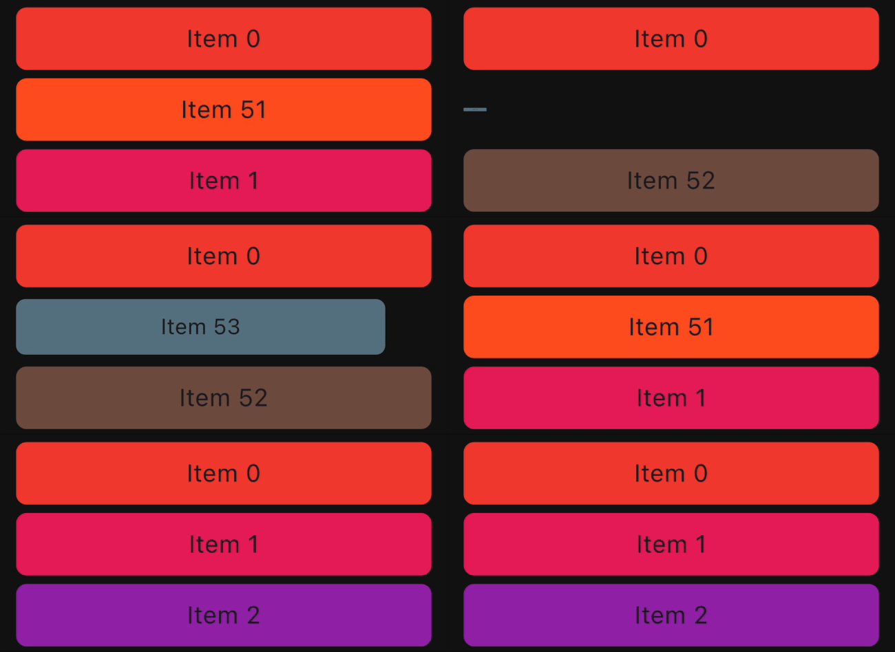 |
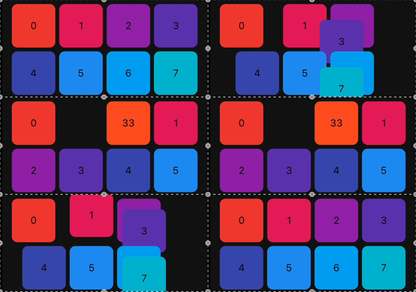 |
| ScaleInRight |
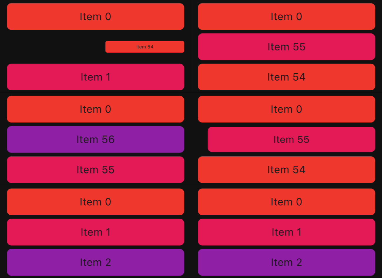 |
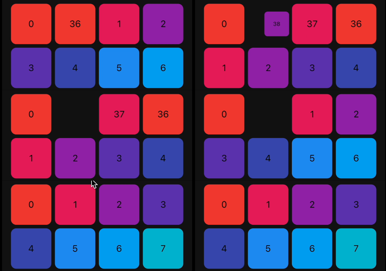 |
| Size |
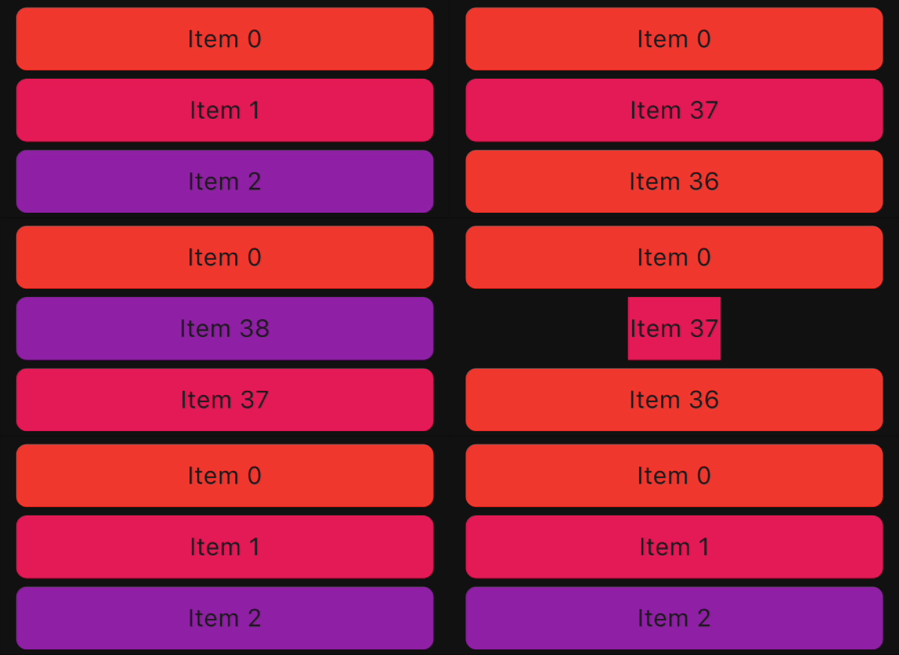 |
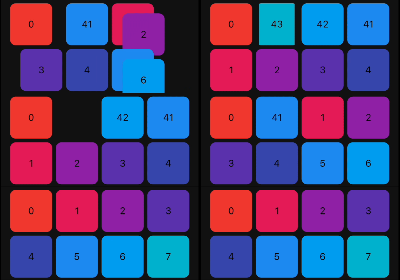 |
| SlideInLeft |
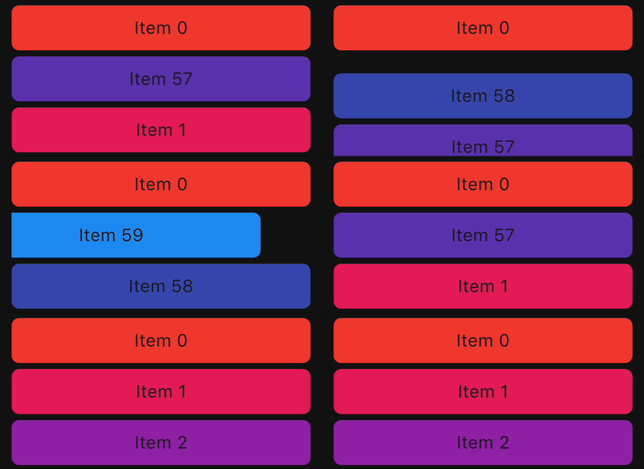 |
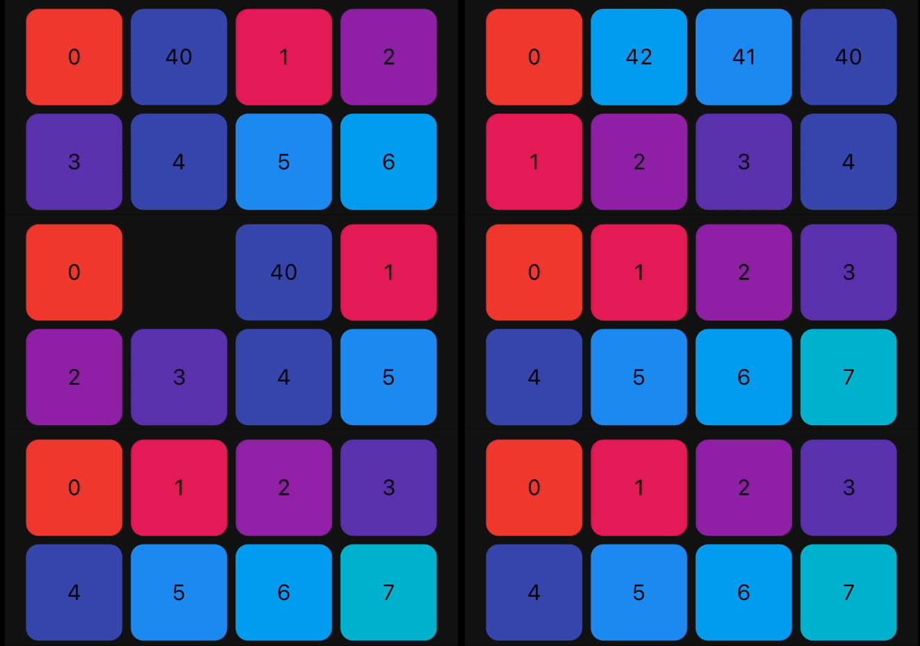 |
| SlideInRight |
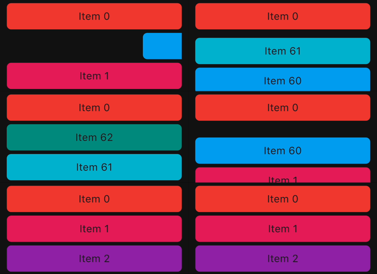 |
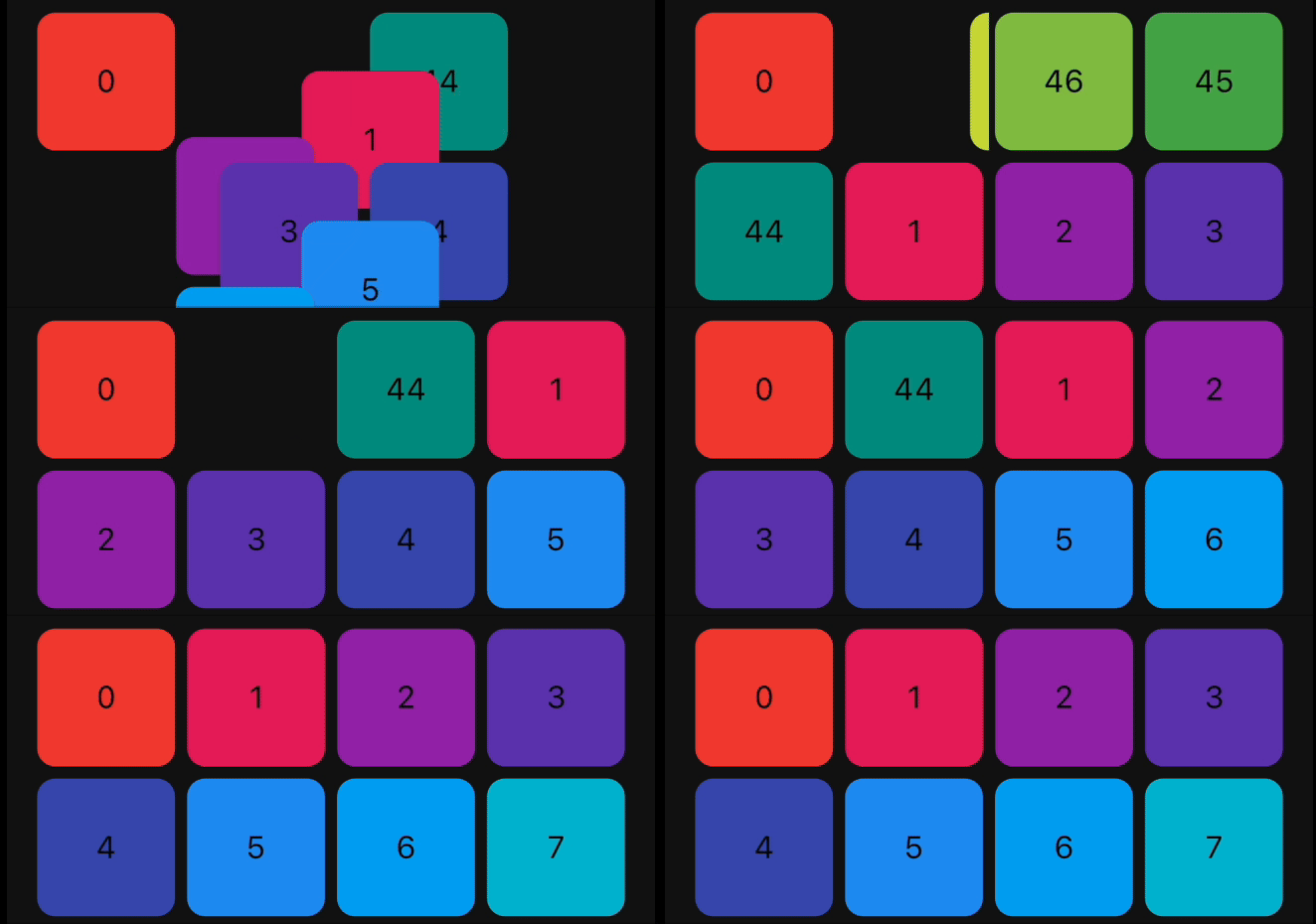 |
| SlideInDown |
 |
 |
| SlideInUp |
 |
 |
Bugs and Feedback
We welcome and appreciate any suggestions you may have for improvement.
For bugs, questions, and discussions please use
the Github Issues.

Acknowledgments
This library builds upon the foundation laid by the incredible work of the Flutter team.
The core logic for animated list and drag-and-drop functionality are derived from Flutter's native
widgets, specifically AnimatedList and ReorderableListView.
Contribution
The Canopas team enthusiastically welcomes contributions and project participation! There are a
bunch of things you can do if you want to contribute! The Contributor Guide has
all the information you need for everything from reporting bugs to contributing entire new features.
Please don't hesitate to jump in if you'd like to, or even ask us questions if something isn't
clear.
Credits
animated_reorderable_list is owned and maintained by the Canopas team.
You can follow them on Twitter at @canopassoftware for
project updates and releases.
Inspired by recyclerview-animators in Android.