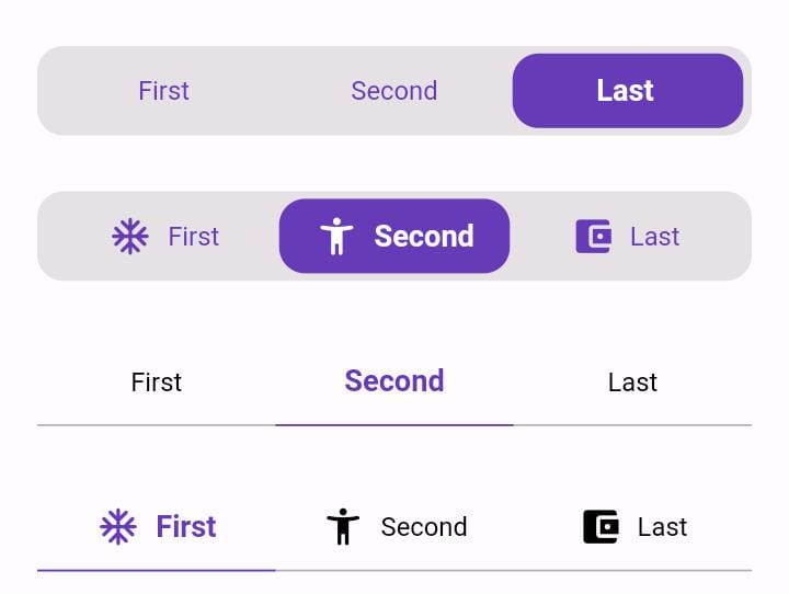
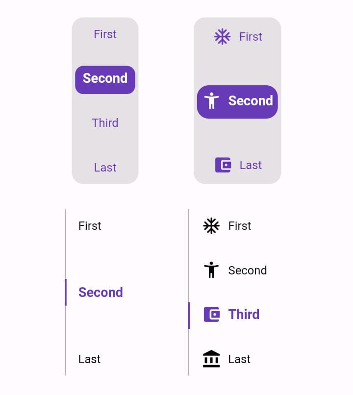
Orientação gerada a partir de informações públicas. Apenas para referência.
Animated Toggle é um pacote Flutter que simplifica a criação de interruptores personalizados com animação. Ele oferece transições suaves e visualmente atraentes entre os estados ligado/desligado com configuração mínima. Projetado para desenvolvedores que desejam melhorar a interatividade da IU sem código complexo de animações, suporta múltiplas plataformas, incluindo Android, iOS, Web, macOS, Windows e Linux. O pacote é leve e se integra perfeitamente em projetos Flutter existentes com um simples comando de adição. Ideal para painéis de configurações, alternadores de tema ou qualquer interface de interruptor interativa.
Casos de uso
Alternadores de tema personalizados
interruptores de preferência do usuário
Componentes da interface de configurações
indicadores de fluxo de onboarding
Elementos de formulário interativos
Principais recursos
Transições de animação suaves
Aparência personalizável
Suporte multiplataforma
Boilerplate mínimo
Integração fácil por meio do pub
Comportamento de alternância configurável
Indicado para
Designers de UI procurando elementos interativos
Desenvolvedores construindo telas de configurações
Aplicativos que exigem feedback visual
Iniciantes do Flutter explorando animações
Projetos com necessidades de plataforma cruzada
Considerações
Limitado a casos de uso específicos do interruptor
Requer estilização manual para designs avançados
Sem recursos de acessibilidade embutidos
Depende da lógica externa de animação
Não adequado para máquinas de estado complexas
Pode ser necessário pacotes adicionais para personalização completa
README original
Snapshot do README original do repositório-fonte vinculado. Consulte o repositório para o conteúdo mais recente.
Animated Toggle
Animated Toggle Give you easy way to make your custom Animated toggle.
Installation
Add this to your pubspec.yaml:
dependencies:animated_toggle:^LastVersion
Features
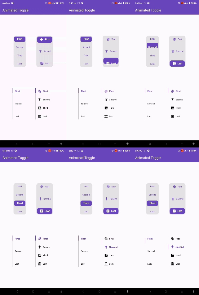
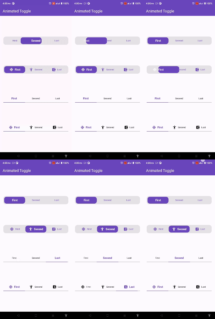
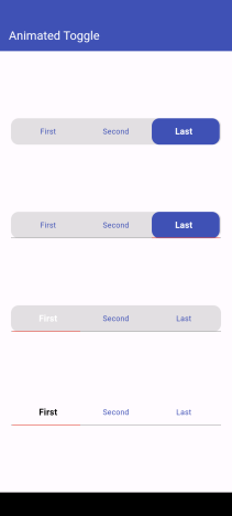
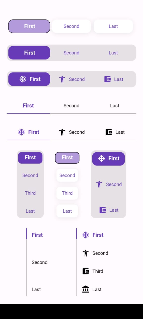
Easy to use the Animated Toggle Package you can handle all colors and width and the height and you can make it vertical or horizontal.
You can control the start from left or right if you need this for arabic or english or etc.
you can control the Text Style and the padding for the Animated Toggle.
Getting started
import'package:animated_toggle/animated_toggle.dart';
voidmain() {
}
// Start use th package in your State Widget
classMyAnimatedToggleextendsStatefulWidget{
constMyAnimatedToggle({super.key});
@overrideState<MyAnimatedToggle> createState() => _MyAnimatedToggleState();
}
class_MyAnimatedToggleStateextendsState<MyAnimatedToggle> {
@overrideWidgetbuild(BuildContext context) {
returnScaffold(
appBar: AppBar(
backgroundColor: Theme.of(context).colorScheme.inversePrimary,
title: constText('Animated Toggle'),
),
body: Center(
child: AnimatedHorizontalToggle(
taps: const ['First', 'Second', 'Last'],
// write you taps names
width: MediaQuery.of(context).size.width - 40,
height: 48,
duration: constDuration(milliseconds: 300),
initialIndex: 0,
background: Colors.black.withOpacity(0.1),
activeColor: Colors.deepPurple,
// here you can control the active text style
activeTextStyle: constTextStyle(
fontSize: 16, fontWeight: FontWeight.w600, color: Colors.white),
// here you can control the inactive text style
inActiveTextStyle: constTextStyle(
fontSize: 14,
fontWeight: FontWeight.w400,
color: Colors.deepPurple),
// the next 2 line if you need to put padding for the inactive buttons
horizontalPadding: 4,
verticalPadding: 4,
// the next 2 line if you need to put padding for the active button
activeHorizontalPadding: 2,
activeVerticalPadding: 4,
radius: 14,
// you can control the radius for the Animated widget
activeButtonRadius: 14,
// you can control the radius for the active button
onChange: (int currentIndex, int targetIndex) {
// write Your Personal Code Here
},
showActiveButtonColor: true,
// 'en' mean make the start from left other mean start from right
local:
'en', // her you can add the local to control the alignment like if you use en its the normal to start from left to right and if you use ar the will start from right to left
),
),
);
}
}
How to use Vertical Animated Toggle
classMyAnimatedToggleextendsStatefulWidget{
constMyAnimatedToggle({super.key});
@overrideState<MyAnimatedToggle> createState() => _MyAnimatedToggleState();
}
class_MyAnimatedToggleStateextendsState<MyAnimatedToggle> {
@overrideWidgetbuild(BuildContext context) {
returnScaffold(
appBar: AppBar(
backgroundColor: Theme.of(context).colorScheme.inversePrimary,
title: constText('Animated Toggle'),
),
body: Center(
child: AnimatedVerticalToggle(
taps: const ['First', 'Second', 'Third', 'Last'],
width: 80,
height: 200,
duration: constDuration(milliseconds: 300),
activeButtonHeight: 34,
initialIndex: 0,
background: Colors.black.withOpacity(0.1),
activeColor: Colors.deepPurple,
// here you can control the active text style
activeTextStyle: constTextStyle(
fontSize: 16,
fontWeight: FontWeight.w600,
color: Colors.white),
// here you can control the inactive text style
inActiveTextStyle: constTextStyle(
fontSize: 14,
fontWeight: FontWeight.w400,
color: Colors.deepPurple),
// the next 2 line if you need to put padding for the inactive buttons
horizontalPadding: 4,
verticalPadding: 4,
// the next 2 line if you need to put padding for the active button
activeHorizontalPadding: 4,
activeVerticalPadding: 2,
radius: 14,
// you can control the radius for the Animated widget
activeButtonRadius: 10,
// you can control the radius for the active button
onChange: (int currentIndex, int targetIndex) {
// write Your Personal Code Here
},
showActiveButtonColor: true,
// 'en' mean make the start from left other mean start from right
local:
'en', // her you can add the local to control the alignment like if you use en its the normal to start from left to right and if you use ar the will start from right to left
),
),
);
}
}
Additional information
Say to me in GitHub what you need to see in the package in the next update.
Wait for more feature soon.