Another Xlider Um controle deslizante e de intervalo com design material, horizontal e vertical, com suporte a RTL e muitas opções e personalizações para o flutter
Orientação gerada a partir de informações públicas. Apenas para referência.
Another Xlider é um controle deslizante e de faixa personalizável com design material para Flutter, suportando orientações horizontal e vertical com compatibilidade total com layout RTL (da direita para a esquerda). Oferece opções extensas para estilização, comportamento e interação, tornando-o ideal para aplicações que exigem controle preciso da entrada do usuário. O pacote é multiplataforma, funcionando perfeitamente em Android, iOS, Web, macOS, Windows e Linux. Com APIs intuitivas e personalização rica, ele melhora a consistência da IU e a experiência do usuário em diversos ambientes de aplicativos.
Casos de uso
Entradas de formulário com seleção de valor
controles deslizantes de configuração interativos
Seletores de intervalo personalizáveis
Suporte de interface de idioma RTL
Componentes de interface do usuário multiplataforma
Principais recursos
Suporte a deslizador horizontal e vertical
Compatibilidade de layout RTL
Opções extensas de personalização
Compatibilidade com o Material Design
Suporte para seleção de intervalo
Disponibilidade multiplataforma
Indicado para
Desenvolvedores de aplicativos internacionalizados
Designers que precisam de interfaces de controle deslizante flexíveis
Aplicativos que exigem controles de entrada precisos
Projetos Flutter com interações de formulário complexas
Equipes direcionadas para múltiplas plataformas
Considerações
Pode exigir estilos adicionais para temas não materiais
Impacto no desempenho com muitas instâncias
Documentação limitada além do uso básico
A personalização pode aumentar a complexidade da compilação
Não otimizado para atualizações de frequência extremamente alta
README original
Snapshot do README original do repositório-fonte vinculado. Consulte o repositório para o conteúdo mais recente.
another_xlider
(Flutter Slider) A material design slider and range slider, horizontal and vertical, with rtl support and lots of options and customizations for flutter
IMPORTANT: Breaking Changes!
Flutter Version 2.x - Take any version up to 1.1.1
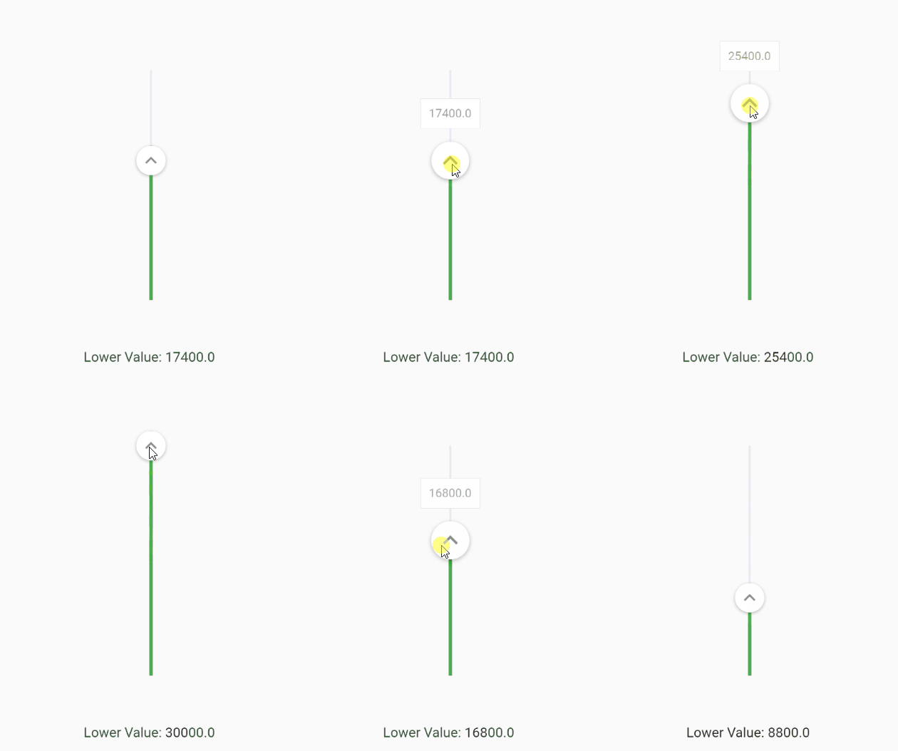
You can change the axis of your slider by setting axis to Axis.vertical. Default is horizontal
FlutterSlider(
  ...
  axis: Axis.vertical,
  ...
)
Handlers
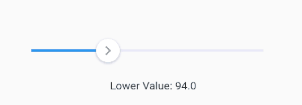
You can customize handlers using handler and rightHandler properties.
Both handler and rightHandler accept FlutterSliderHandler class which has following properties:
child: is a widget
disabled: to disable the handler
decoration, foregroundDecoration and transform are come from Container() widget
You can control the scale animation type of your handlers, it's duration and it's scale size using handlerAnimation handlerAnimation accepts a FlutterSliderHandlerAnimation class which has 4 properties as following
If you want to have a non-linear slider with different steps, simply use rangeStep feature.
FlutterSlider(
  min: 0,
  max: 1000000,
  ...
  step: FlutterSliderStep(
    step: 1, // default
    isPercentRange: true, // ranges are percents, 0% to 20% and so on... . default is true
    rangeList: [
      FlutterSliderRangeStep(from: 0, to: 20, step: 10000),
      FlutterSliderRangeStep(from: 20, to: 100, step: 200000),
    ]
  ),
  ...
)
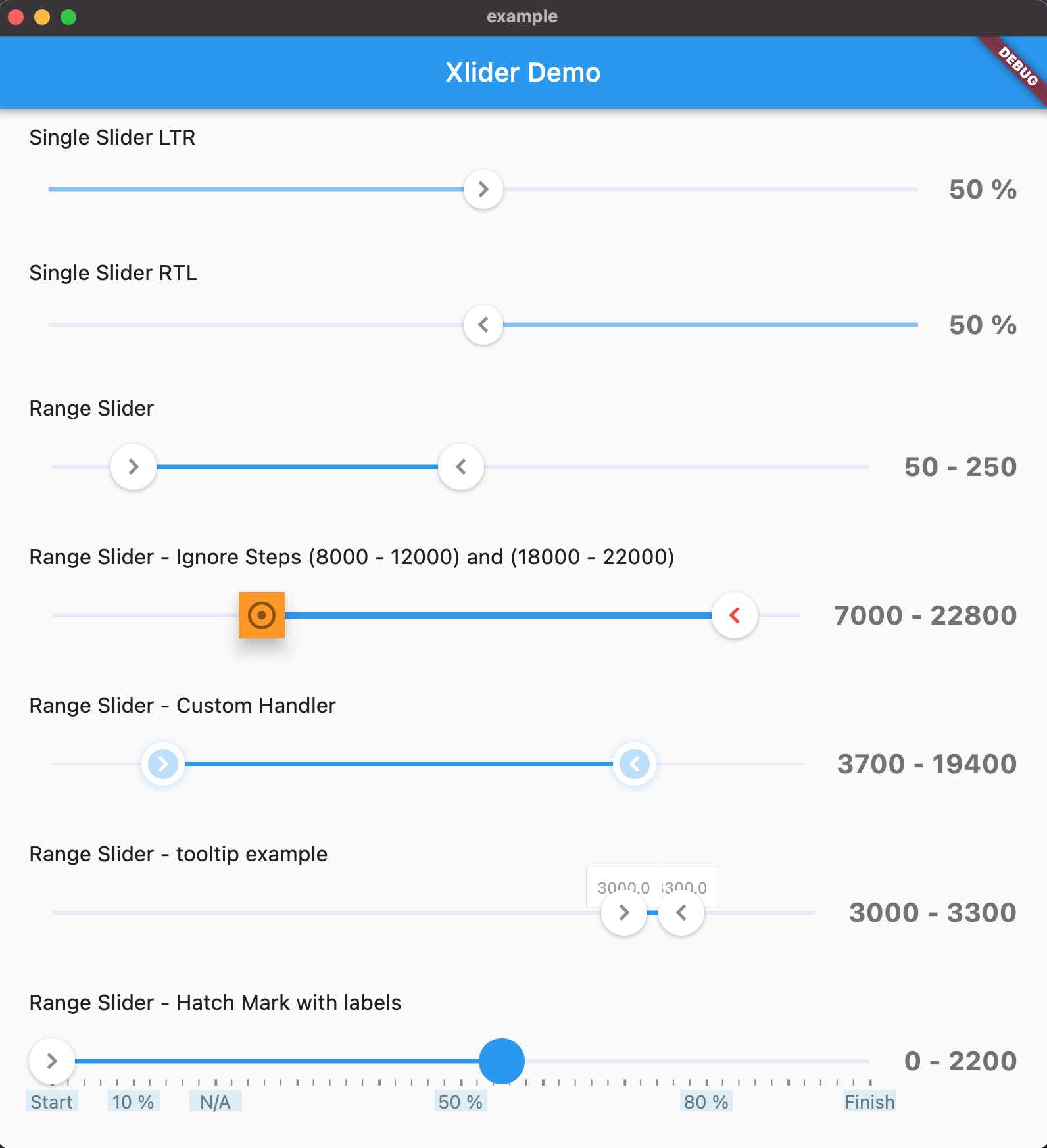
Ignore Steps
If your configurations requires that some steps are not available, you can use ignoreSteps property.
this property accepts a simple class to define from and to ranges.
FlutterSlider(
  ...
    ignoreSteps: [
      FlutterSliderIgnoreSteps(from: 8000, to: 12000),
      FlutterSliderIgnoreSteps(from: 18000, to: 22000),
    ],
  ...
)
Fixed Values
If you want to have an array of fixed items and slide through it, you can use fixedValues property. use FlutterSliderFixedValue to add your fixed values. FlutterSliderFixedValue has following properties:
percent: (int) ( between 0..100 inclusive). the position of fixed item
value: (dynamic) the value of fixed item
when using fixedValues, values of values property, must be within 0..100
using above example, you get (string) 10K as upperValue or lowerValue (depends on handler), when you reach to 10 percent of the slider,
you get (int) 50000 when you reach 50 percent of the slider and so on...
when using fixedValues, min and max are ignored
Minimum Distance
When using range slider, the minimum distance between two handlers can be defined using minimumDistance option
FlutterSlider(
  ...
    minimumDistance: 300,
  ...
)
Maximum Distance
This is the opposite of minimum distance, when using range slider, the maximum distance between two handlers can be defined using maximumDistance option
FlutterSlider(
  ...
    maximumDistance: 300,
  ...
)
Locked Handlers
If you want to lock your handlers by a certain value, you can use lockHandlers and lockDistance properties
You can display a Hatch Mark underneath or beside of your slider based on axis. In order to display hatch mark you must
use FlutterSliderHatchMark class which has following properties:
linesDistanceFromTrackBar: The distance of lines from slider. can be negative
bigLine: The widget of big lines in hatch mark
smallLine: The widget of small lines in hatch mark
linesAlignment: the direct of lines, right or left which works as top or bottom on horizontal slider
density: The number of lines per percent. 1 is default. any number less or more than 1 will decrease and increase lines respectively
smallDensity: The number of small lines between any two big lines. 4 is default. any number less or more than 4 will decrease and increase lines respectively.
displayLines: to display lines. by default is false for the sake of optimization
labels: If you want to display some label or text at certain percent in your hatch mark, you can use labels
labelBox: The widget of label box, however, you can define a widget for each label and have it's own style
labelsDistanceFromTrackBar: The distance of labels from slider. can be negative
disabled: to disabled the whole hatchmark ( hide )