Buscar pacotes, repositórios e categorias de apps

Capa de any_animated_button
Detalhes do pacotev0.0.4

any_animated_button

Botão que anima entre os estados ocioso, progresso e sucesso/erro, indicando que algum processo está em execução em segundo plano.

AndroidiOSWebmacOSWindowsLinux
Downloads em 30 dias
455
Curtidas
105
Pontos Pub
150

Instalar pacote

flutter pub add any_animated_button

Visão geral do pacote

Orientação gerada a partir de informações públicas. Apenas para referência.

AnyAnimatedButton é um pacote Flutter que fornece um botão personalizável com animações suaves entre os estados ocioso, progresso, sucesso e erro. Ele indica visualmente processos em segundo plano em andamento, melhorando o feedback do usuário durante ações como envio de formulários ou carregamento de dados. O botão oferece várias personalizações, incluindo cores, ícones, rótulos e durações de animação. Projetado para uso multiplataforma, funciona perfeitamente em Android, iOS, Web, macOS, Windows e Linux. Ideal para melhorar a experiência do usuário em aplicativos que exigem feedback em tempo real.

Casos de uso

  • Envio de formulário com estado de carregamento
  • indicador de progresso do upload de arquivo
  • Fluxo de autenticação com feedback de sucesso/erro
  • Processo de onboarding com transições animadas
  • Visualização de status de tarefa em segundo plano

Principais recursos

  • animações suaves de transição de estado
  • Estados de sucesso e erro personalizáveis
  • Suporte para mudanças de ícones e texto por estado
  • Compatibilidade multiplataforma
  • Duração e suavização de animação configuráveis
  • Opções de estilização extensíveis

Indicado para

  • Desenvolvedores em busca de feedback intuitivo na interface
  • Aplicativos com operações assíncronas frequentes
  • Aplicações móveis e web centradas na experiência do usuário
  • Prototipagem rápida de botões interativos
  • Projetos que exigem mínimo boilerplate para indicadores de progresso

Considerações

  • Requer conhecimento sobre gerenciamento de estado do Flutter
  • Pode ser necessário lógica adicional para disparar mudanças de estado
  • Impacto no desempenho com múltiplas instâncias
  • Limitado a tipos de animação pré-definidos
  • Não adequado para animações personalizadas complexas além dos estados fornecidos

README original

Snapshot do README original do repositório-fonte vinculado. Consulte o repositório para o conteúdo mais recente.

any_animated_button

Very often after tapping a button we send some data or form to remote API and we need to signalize it to the user. This package makes it easy for us by creating expandable AnyAnimatedButton and AnyAnimatedButtonBloc.

Easy usage

AnyAnimatedButton depends on bloc pattern. To create custom button we need to create new bloc and
widget.

AnyAnimatedButtonBloc

We need to create class, which extends AnyAnimatedButtonBloc and override asyncAction.

AnyAnimatedButtonBloc<Input, Output, Failure> takes 3 generic types:

  • Input - type of the input data we want to send or process
  • Output - type of the output data we will receive from i.e. API
  • Failure - type of error returned from bloc when any error occurs. It helps you manage your error handling

The function we need to override depends on dartz Either, which return either a Failure or data of type Output and takes in an event with type Input.

Future<Either<Failure, Output>> asyncAction(Input input);

AnyAnimatedButton

AnyAnimatedButton is based on AnimatedContainer. To create our own button we need to create class, which extends CustomAnyAnimatedButton. CustomAnyAnimatedButton consists of 2 fields, which needs to be overridden:

  • bloc - AnyAnimatedButtonBloc? - bloc which should be connected with the button. If we won't pass it, the button won't animate
  • defaultParams - AnyAnimatedButtonParams - params object, which describes how button should look and behave

and 3 optional fields:

  • progressParams - AnyAnimatedButtonParams - params object for describing button in progress state
  • successParams - AnyAnimatedButtonParams - params object for describing button in success state
  • errorParams - AnyAnimatedButtonParams - params object for describing button in error state

AnyAnimatedButtonParams

The class that holds all the data about button look and behavior. All properties that we want to animate should be put directly inside all corresponding fields. Rest of them (like Text) should go to child field, which takes Widget.

Fields list:

Key? key;
AlignmentGeometry? alignment;
EdgeInsetsGeometry? padding;
Color? color;
Decoration? decoration;
Decoration? foregroundDecoration;
double? width;
double height;
BoxConstraints? constraints;
EdgeInsetsGeometry? margin;
Matrix4? transform;
AlignmentGeometry? transformAlignment;
Widget? child;
Clip clipBehavior;
Curve curve;
Duration duration;
VoidCallback? onEnd;

The only required field is height, rest of them are optional.

We have got also 3 factory constructors, which describe default progress, error and success button state. We can reuse them with changed colors and size.

factory AnyAnimatedButtonParams.progress({
  double? size,
  Color backgroundColor = Colors.blue,
  Color progressColor = Colors.white,
  EdgeInsets padding = const EdgeInsets.all(10.0),
  Duration duration = const Duration(milliseconds: 300),
})
factory AnyAnimatedButtonParams.success({
  double? size,
  Color backgroundColor = Colors.green,
  Color iconColor = Colors.white,
  EdgeInsets padding = const EdgeInsets.all(8.0),
  Duration duration = const Duration(milliseconds: 300),
})
factory AnyAnimatedButtonParams.error({
  double? size,
  Color backgroundColor = Colors.red,
  Color iconColor = Colors.white,
  EdgeInsets padding = const EdgeInsets.all(8.0),
  Duration duration = const Duration(milliseconds: 300),
})

Buttons width

There are 3 possible width behaviors:

  • double.infinity - the button expands as much as he can
  • null - the button is as small as it can - it fits its content
  • fixed - we can set fixed width i.e. 200 and the button will always be this wide

Splash effect

There is one problem with InkWell splash effect. If we want the splash effect to work we need to put in child field firstly Material with transparent color → InkWell → rest of the child.

@override
AnyAnimatedButtonParams get defaultParams => AnyAnimatedButtonParams(
  child: Material(
    color: Colors.transparent,
    child: InkWell(
      onTap: onTap,
      borderRadius: someBorderRadius,
      child: restOfTheButton,
    ),
  ),
);

AnyAnimatedButtonBlocListener

The package has built-in BlocListener, which makes it easier for you to listen to the state changes. AnyAnimatedButtonBlocListener<Input, Output, Failure> takes 3 generic types,Input is type of data that goes into the bloc, Output is type of data returned on success and Failure is the error which will be returned, when any error occurs in bloc.

AnyAnimatedButtonBlocListener<int, double, Failure>(
  bloc: _successBloc,
  onDefault: () {
    print('Default state');
  },
  onProgressStart: () {
    print('Progress state starts');
  },
  onProgressEnd: () {
    print('Progress state ends');
  },
  onSuccessStart: (value) {
   print('Value: $value');
  },
  onSuccessEnd: (value) {
   print('Value: $value');
  },
  onErrorStart: (failure) {
    print('Error state starts');
  },
  onErrorEnd: (failure) {
    print('Error state ends');
  },
),

Examples

My way of handling errors is to create abstract class Failure and extending it for every possible error place.

abstract class Failure extends Equatable {
  @override
  List<Object> get props => [];

  String get errorMessage => 'error';
}

class DefaultFailure extends Failure {}

All of the examples beneath are made based on only 1 button class:

class MinimalisticButton extends CustomAnyAnimatedButton {
  MinimalisticButton({
    required this.onTap,
    required this.text,
    this.enabled = true,
    this.width,
    this.bloc,
  });

  @override
  final AnyAnimatedButtonBloc? bloc;
  final VoidCallback onTap;
  final String text;
  final bool enabled;
  final double? width;

  final BorderRadius _borderRadius = BorderRadius.circular(22.0);

  @override
  AnyAnimatedButtonParams get defaultParams => AnyAnimatedButtonParams(
        width: width,
        height: 56.0,
        decoration: BoxDecoration(
          color: enabled ? Colors.blue : Colors.grey,
          borderRadius: _borderRadius,
        ),
        child: Material(
          color: Colors.transparent,
          child: InkWell(
            onTap: enabled ? onTap : null,
            borderRadius: _borderRadius,
            child: Padding(
              padding: const EdgeInsets.all(8.0),
              child: Column(
                mainAxisAlignment: MainAxisAlignment.center,
                children: [
                  Text(
                    text,
                    style: const TextStyle(color: Colors.white),
                    maxLines: 1,
                    softWrap: false,
                  ),
                ],
              ),
            ),
          ),
        ),
      );
}

and 3 bloc classes

_successBloc = SuccessBloc();
_success2Bloc = SuccessBloc();
_errorBloc = ErrorBloc();
_shortBloc = ShortBloc();
_enabledButton = ShortBloc();
_nullWidth = ShortBloc();
_infinityWidth = ShortBloc();
_fixedWidth = ShortBloc();
class SuccessBloc extends AnyAnimatedButtonBloc<int, double, Failure> {
  @override
  Future<Either<Failure, double>> asyncAction(int input) {
    return Future.delayed(
      const Duration(milliseconds: 2000),
      () => Right(input * 10.0),
    );
  }
}
class ErrorBloc extends AnyAnimatedButtonBloc<int, String, Failure> {
  @override
  Future<Either<Failure, String>> asyncAction(int input) {
    return Future.delayed(
      const Duration(milliseconds: 2000),
      () => Left(DefaultFailure()),
    );
  }
}
class ShortBloc extends AnyAnimatedButtonBloc<int, String, Failure> {
  @override
  Future<Either<Failure, String>> asyncAction(int input) {
    return Future.delayed(
      const Duration(milliseconds: 50),
      () => Left(DefaultFailure()),
    );
  }
}
Button with no bloc (not animating)
MinimalisticButton(
  text: 'Non animated button',
  onTap: () {},
),

Animated button with success outcome
MinimalisticButton(
  bloc: _successBloc,
  text: 'Animated success button',
  onTap: () => _successBloc.add(TriggerAnyAnimatedButtonEvent(13)),
),

Animated button with error outcome
MinimalisticButton(
  bloc: _errorBloc,
  text: 'Animated error button',
  onTap: () => _errorBloc.add(TriggerAnyAnimatedButtonEvent(13)),
),

Animated button with short loading state
MinimalisticButton(
  bloc: _shortBloc,
  text: 'Short animation button',
  onTap: () => _shortBloc.add(TriggerAnyAnimatedButtonEvent(13)),
),

Animated button with enabling functionality
Row(
  mainAxisAlignment: MainAxisAlignment.center,
  children: [
    MinimalisticButton(
      bloc: _enabledButton,
      text: 'Enabled button',
      enabled: _enabled,
      onTap: () => _enabledButton.add(TriggerAnyAnimatedButtonEvent(13)),
    ),
    const SizedBox(width: 12.0),
    MinimalisticButton(
      text: _enabled ? '<- disable' : '<- enable',
      onTap: () {
        setState(() {
          _enabled = !_enabled;
        });
      },
    ),
  ],
),

Animated button with width: null
MinimalisticButton(
  bloc: _nullWidth,
  text: 'width: null',
  onTap: () => _nullWidth.add(TriggerAnyAnimatedButtonEvent(13)),
),

Animated button with width: double.infinity
MinimalisticButton(
  bloc: _infinityWidth,
  width: double.infinity,
  text: 'width: double.infinity',
  onTap: () => _infinityWidth.add(TriggerAnyAnimatedButtonEvent(13)),
),

Animated button with fixed width: 200.0
MinimalisticButton(
  bloc: _fixedWidth,
  width: 200.0,
  text: 'width: 200.0',
  onTap: () => _fixedWidth.add(TriggerAnyAnimatedButtonEvent(13)),
),

Known bugs

  • updating text on button with width set to null does not work properly. The button width will adjust only to the first text width. The workaround is to set fixed width of the longer text instead of null.

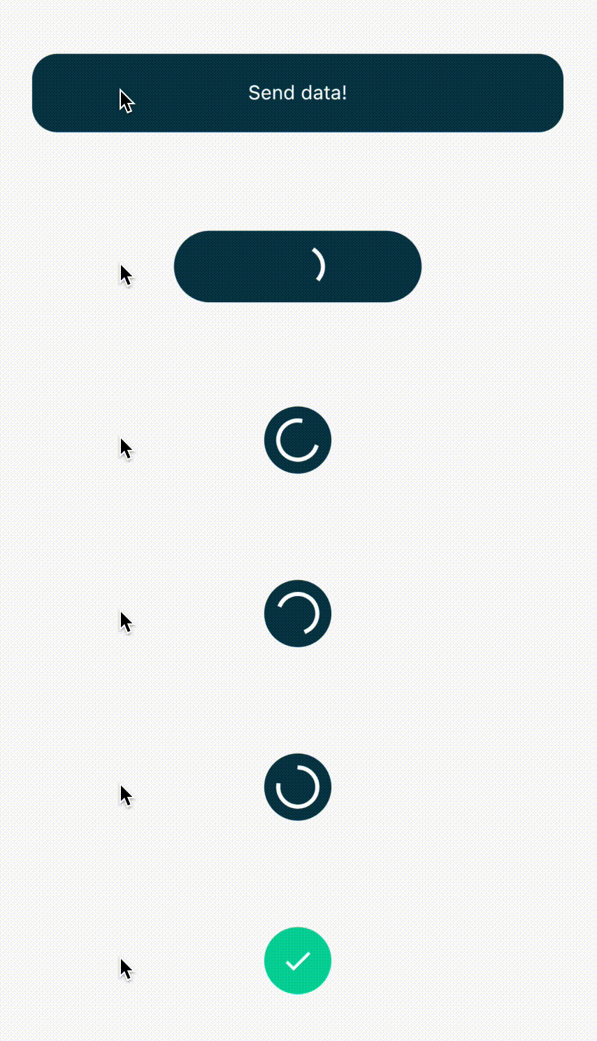
Created by Piotr Białas, appvinio

Categorias

Dependências

Lista de dependências 3 itens

Repositório-fonte

Projetos que usam este pacote

Ainda não há dados.