Buscar pacotes, repositórios e categorias de apps

Capa de auth_buttons
Detalhes do pacotev3.0.3

auth_buttons

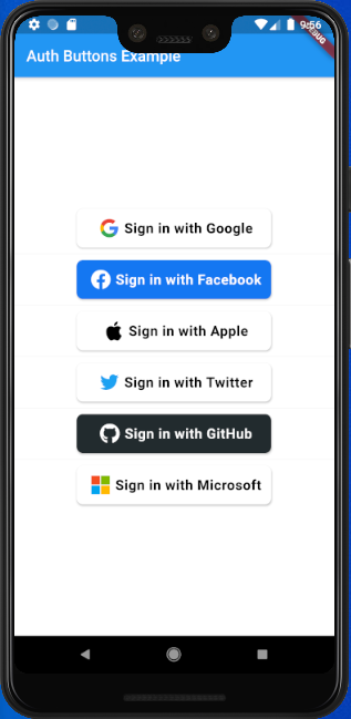
Auth Buttons é uma biblioteca de widgets do Flutter, incluindo botões para autenticação com as redes sociais mais populares, como Google, Facebook, Apple e Twitter.

AndroidiOSWebmacOSWindowsLinux
Downloads em 30 dias
4,2 mil
Curtidas
199
Pontos Pub
140

Instalar pacote

flutter pub add auth_buttons

Visão geral do pacote

Orientação gerada a partir de informações públicas. Apenas para referência.

Auth Buttons é uma biblioteca de widgets do Flutter que fornece botões de autenticação prontos para uso para redes sociais populares, incluindo Google, Facebook, Apple e Twitter. Projetado para simplificar a integração de recursos de login social, oferece botões consistentes e visualmente atraentes em todas as plataformas. O pacote suporta Android, iOS, Web, macOS, Windows e Linux, garantindo compatibilidade entre plataformas. Melhora a experiência do usuário ao reduzir o código boilerplate e agilizar a implementação de fluxos de autenticação de terceiros.

Casos de uso

  • Integração de login social
  • Onboarding de usuário com contas sociais
  • Interface de autenticação multiplataforma
  • Implementação simplificada do botão OAuth
  • Fluxos de autenticação simplificados

Principais recursos

  • Botões de login social pré-construídos
  • Suporte para Google, Facebook, Apple e Twitter
  • Compatibilidade multiplataforma
  • Interface do usuário consistente em dispositivos
  • Integração fácil com configuração mínima
  • Estilos de botão personalizáveis

Indicado para

  • Desenvolvedores criando aplicativos com login social
  • Projetos que exigem componentes de interface de usuário de autenticação rápida
  • Aplicativos direcionados a múltiplas plataformas
  • Equipes priorizando a velocidade de desenvolvimento
  • Implementações de autenticação voltadas para o frontend

Considerações

  • Requer configuração adicional para a configuração do OAuth
  • Depende dos SDKs da plataforma subjacente
  • Pode ser necessário tratamento personalizado para estados de erro
  • Limitado a provedores sociais pré-definidos
  • Não adequado para métodos de autenticação personalizados

README original

Snapshot do README original do repositório-fonte vinculado. Consulte o repositório para o conteúdo mais recente.

auth_buttons

Github stars Pub Version

Auth Buttons is a flutter widget library, include buttons for authenticating with the most popular social networks like: Google, Facebook, Apple and too other.

Installation

  1. Add this to your packages pubspec.yaml file:
dependencies:
  auth_buttons: <^last>
  1. Install it You can install it from the command line:
$ flutter pub get
  1. Import it Now in Dart code, you can use:
import 'package:auth_buttons/auth_buttons.dart';

Recommendation

We recommend you to using show special when you want use some button. show help you importing part of library.

import 'package:auth_buttons/auth_buttons.dart'
    show GoogleAuthButton, AuthButtonStyle, AuthButtonType, AuthIconType;

We also recommend you to using the latest version.

Overview

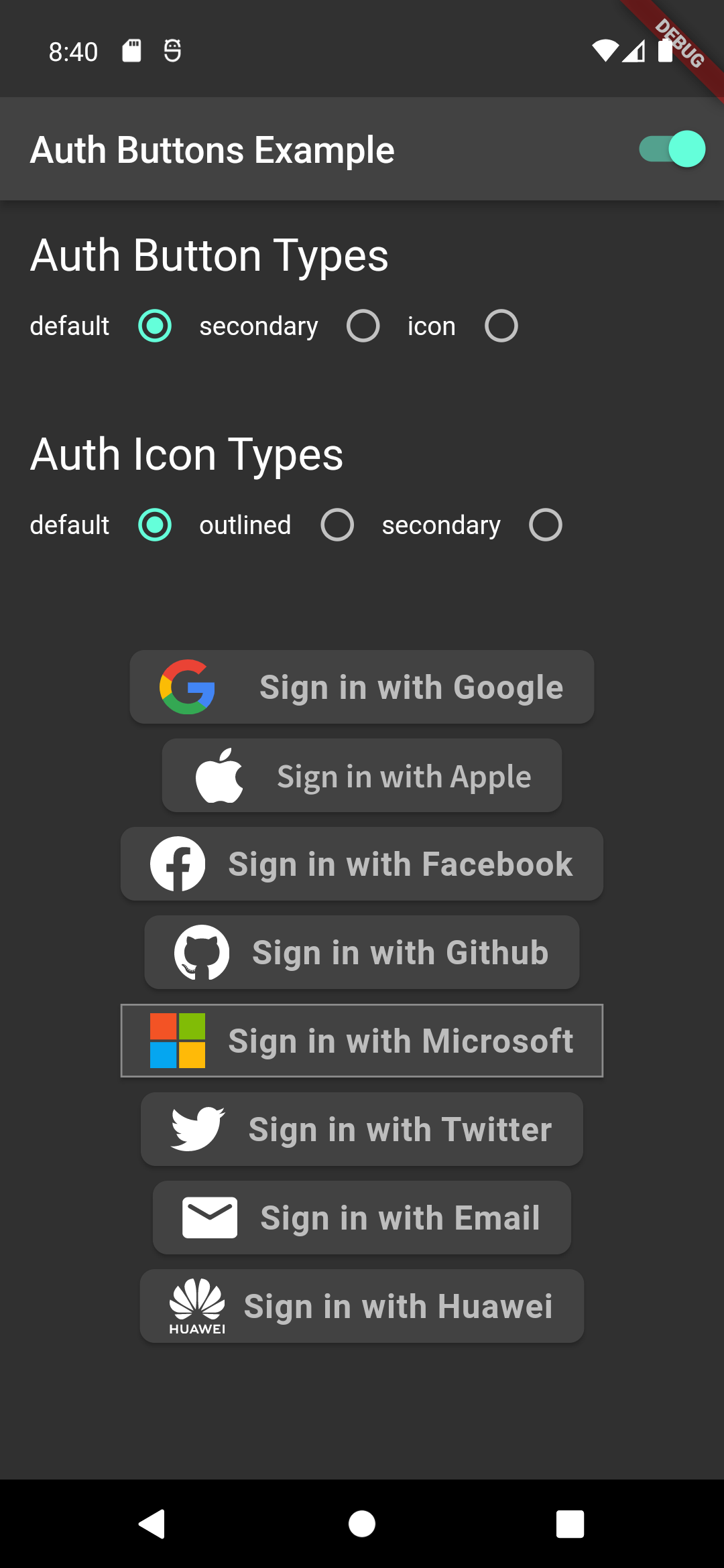
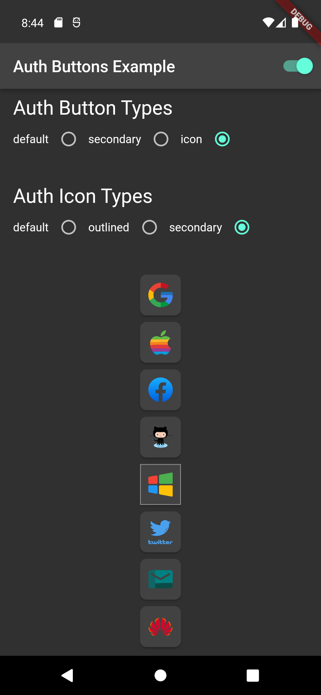
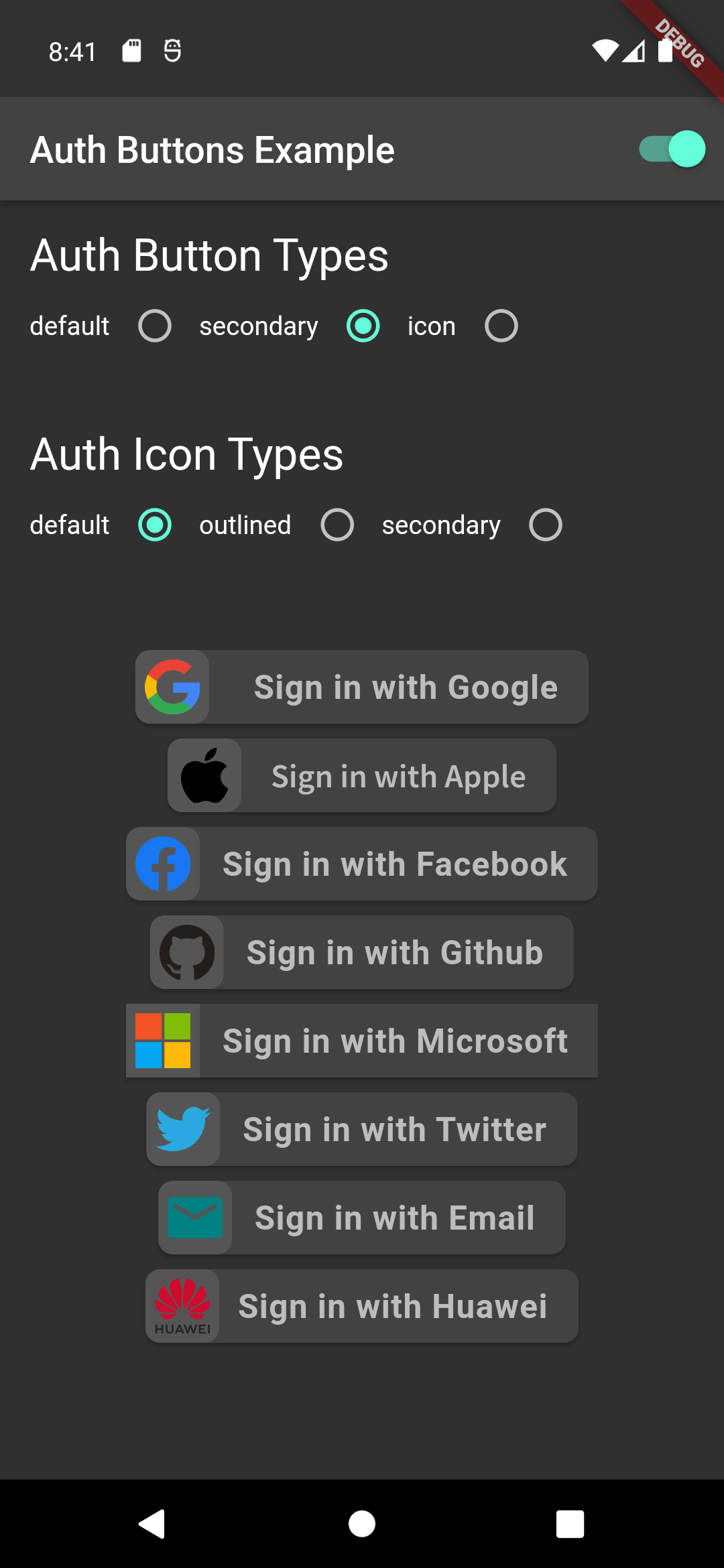
From the version 3.0.0 all AuthButtons are following the system mode. see ThemeMode for more info.

From the version 3.0.0 you're able to regroup AuthButton s for sharing style properties, to do this use the already existing AuthButtonGroup.

From the version 2.0.0 disabled state is supported.

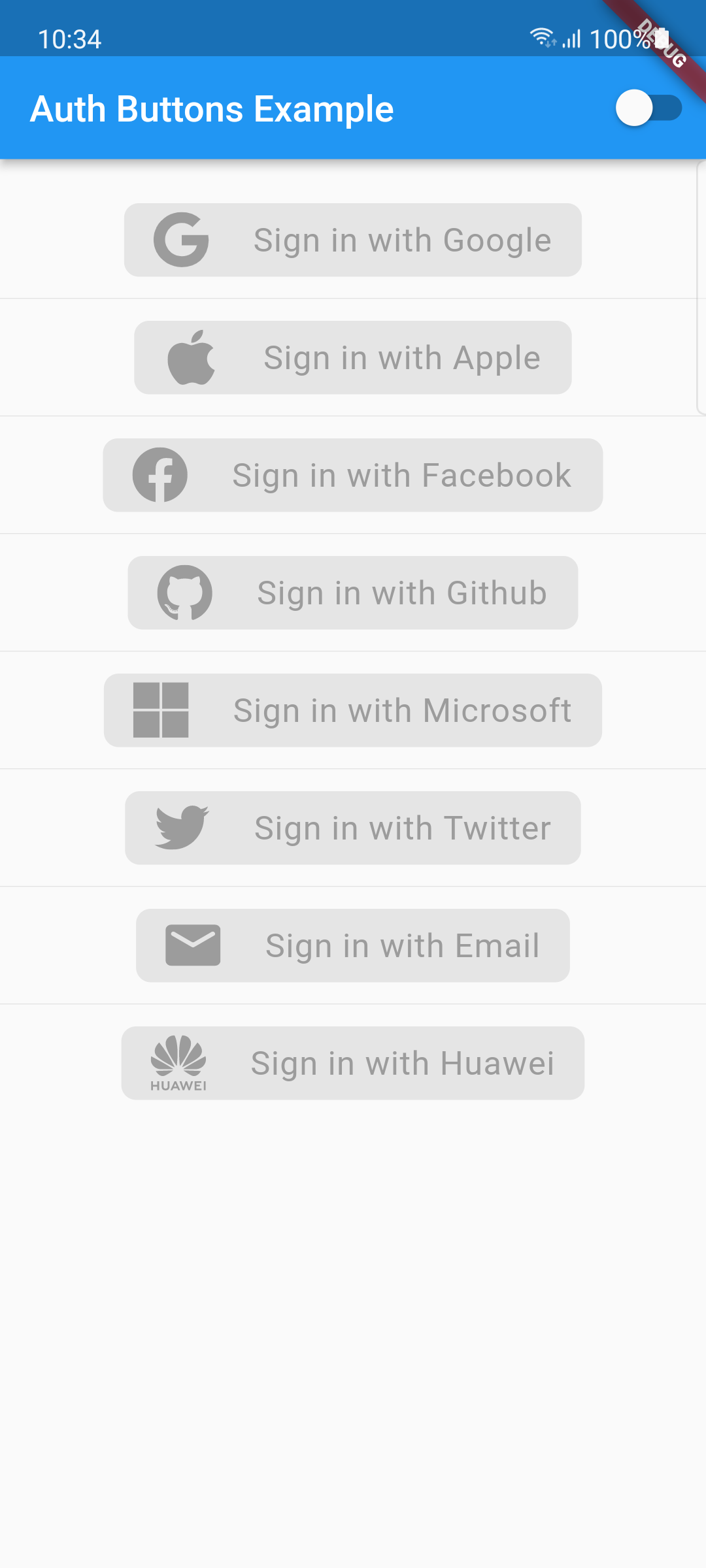
  1. Enabled
  2. Disabled

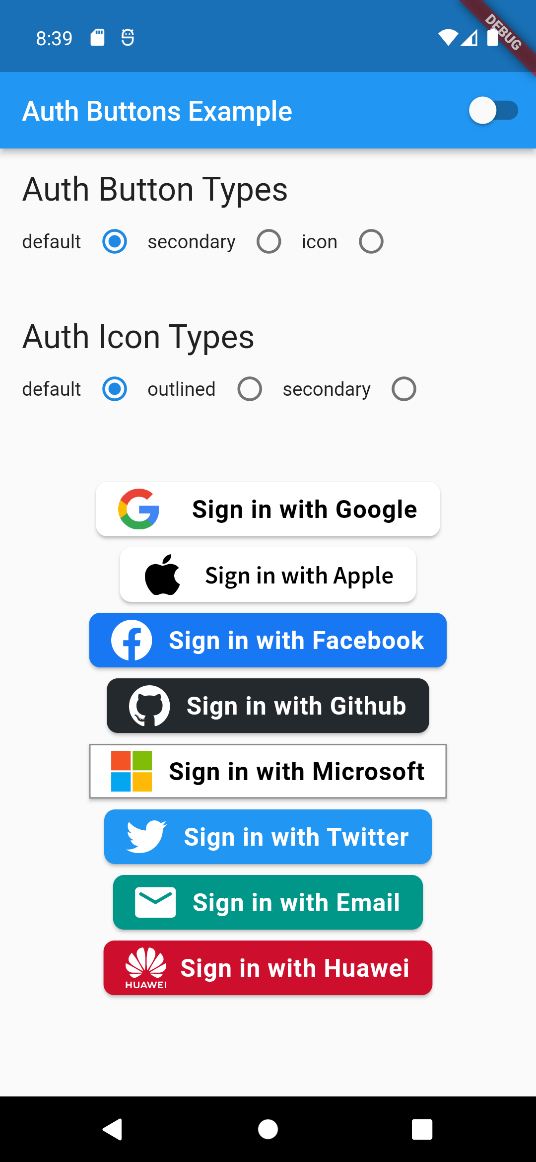
There are three Types you can choose between them:

  1. Default
  2. Icon
  3. Secondary

Suggestion

If you plain to use a non existing AuthButton like: Linkedin or any others along with the existing one, than make your custom one just use CustomAuthButton this provide you with a fast way to do so.

Using

Enabled State.

You need to use just the following code:

Default Type
GoogleAuthButton(
  onPressed: () {},
),
Light Dark
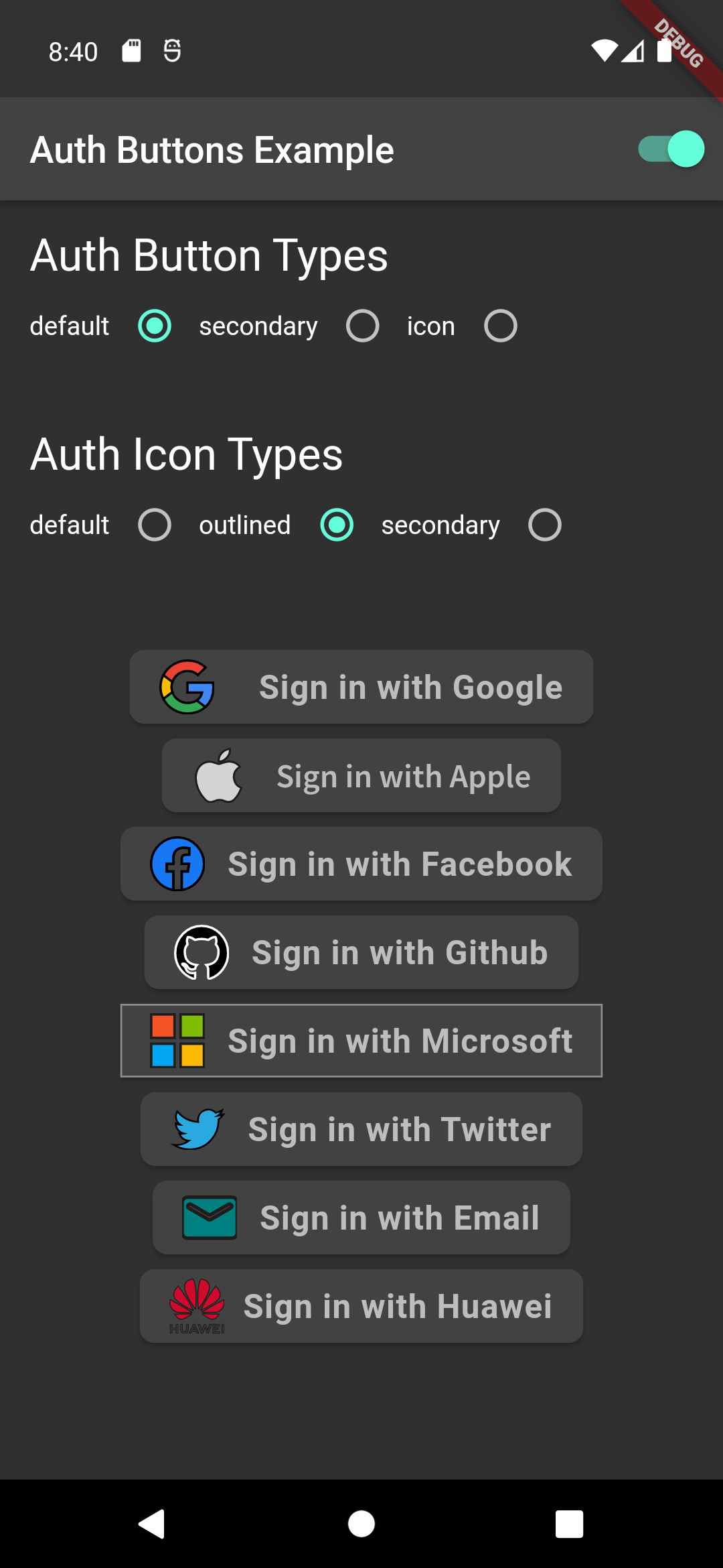
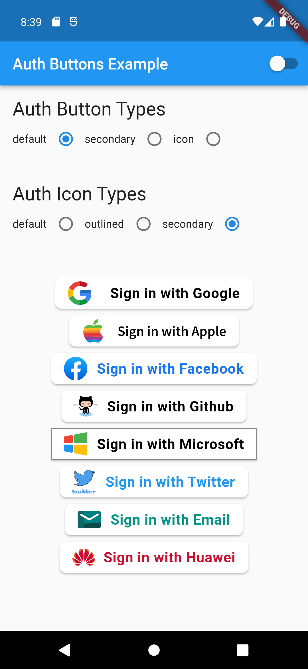
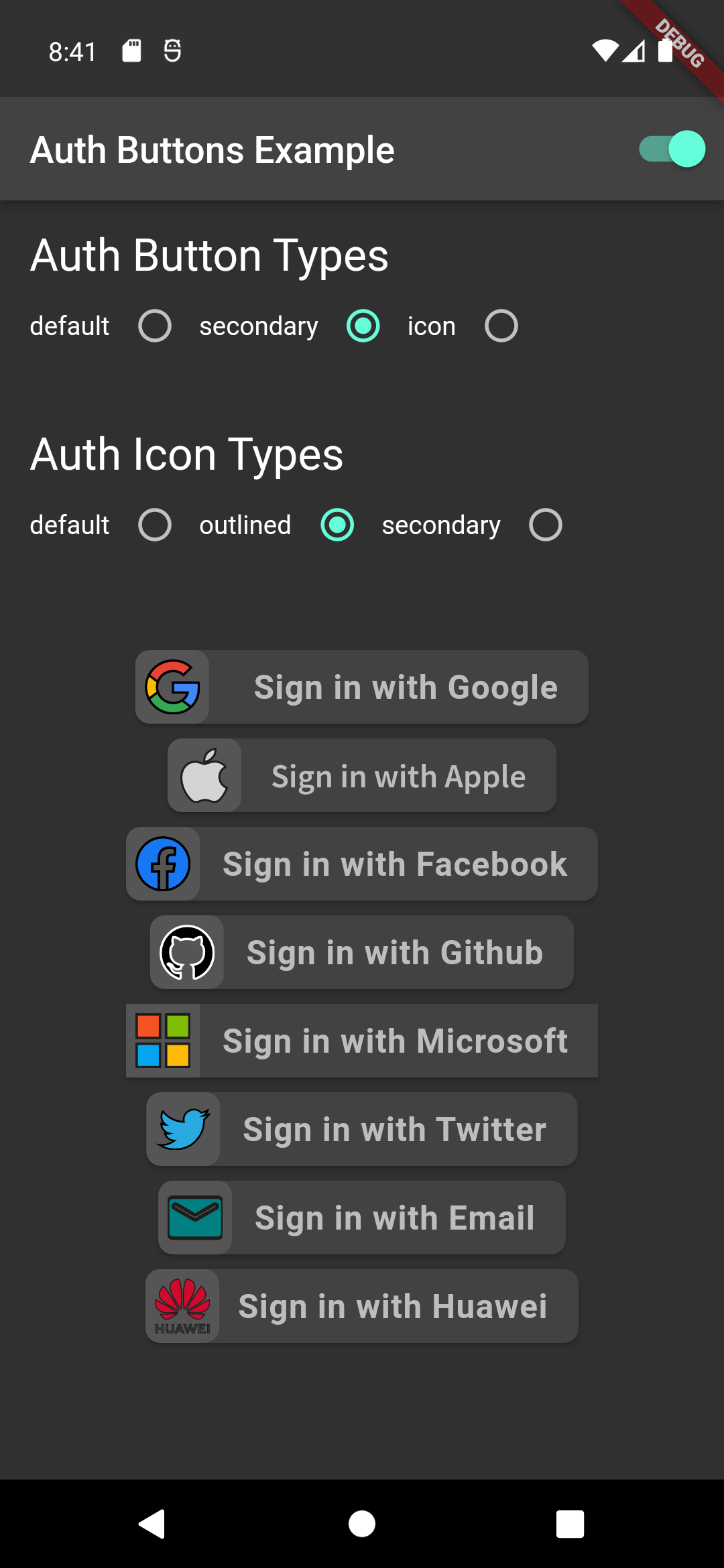
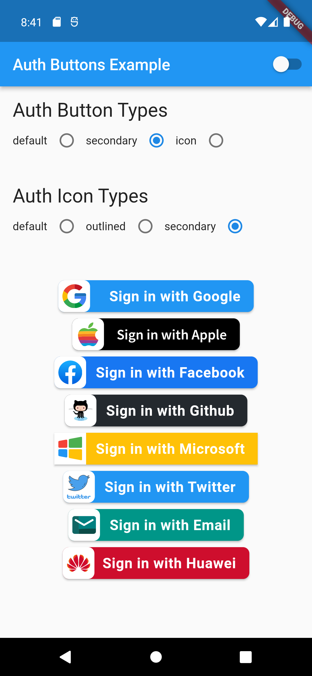
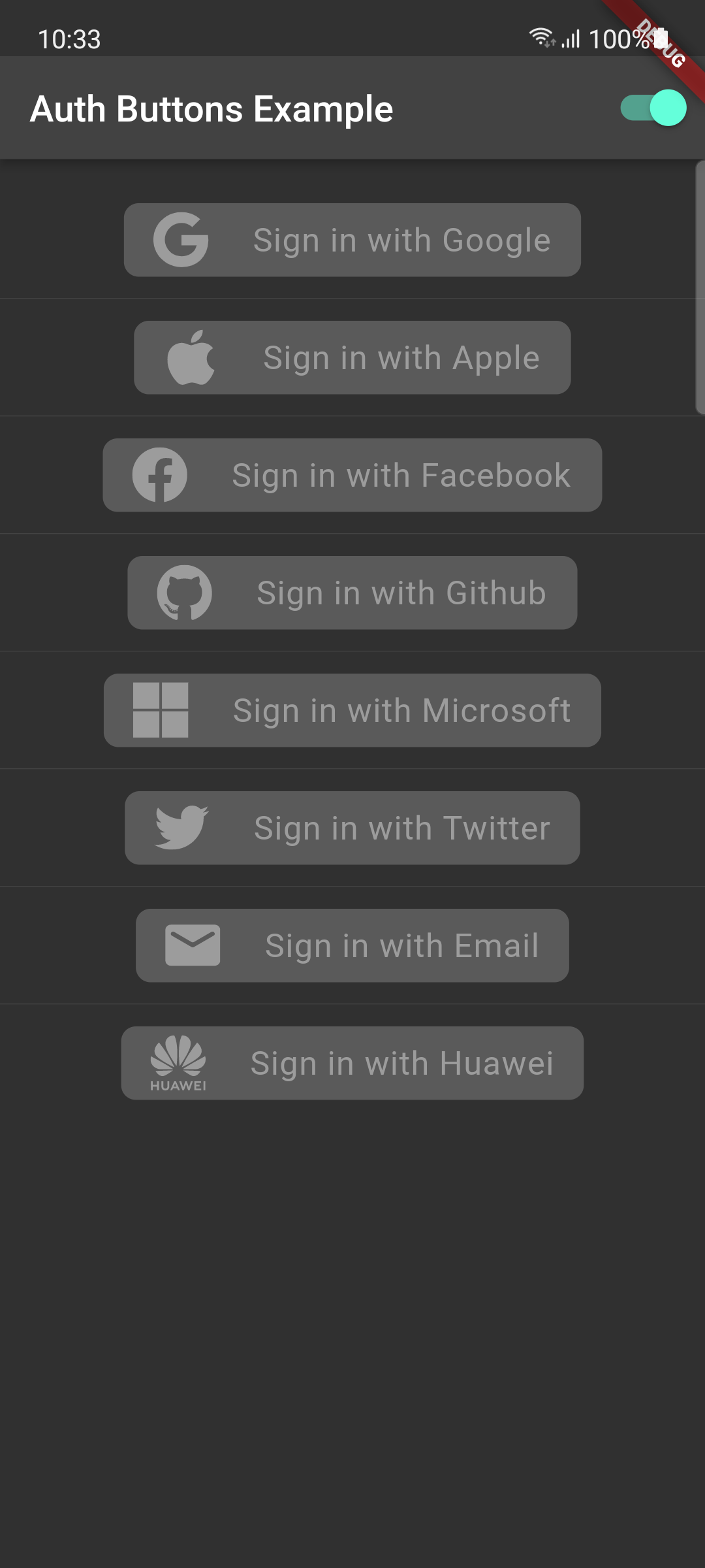
default-button-default-icon dark-default-button-default-icon
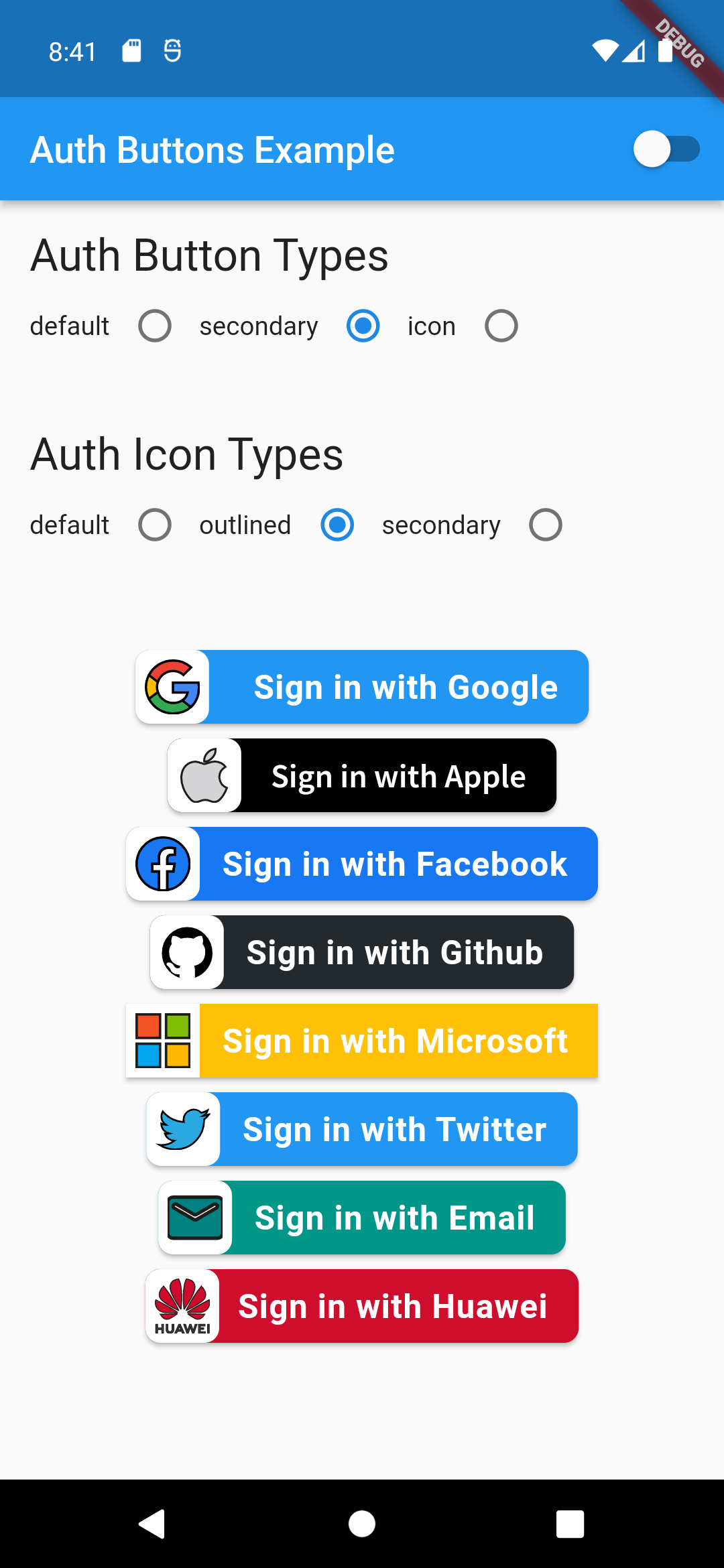
GoogleAuthButton(
  onPressed: () {},
  style: AuthButtonStyle(
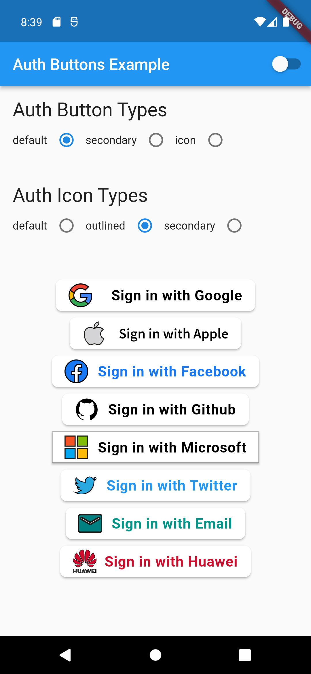
    iconType: AuthIconType.outlined,
  ),
),
Light Dark
default-button-outlined-icon dark-default-button-outlined-icon
GoogleAuthButton(
  onPressed: () {},
  style: AuthButtonStyle(
    iconType: AuthIconType.secondary,
  ),
),
Light Dark
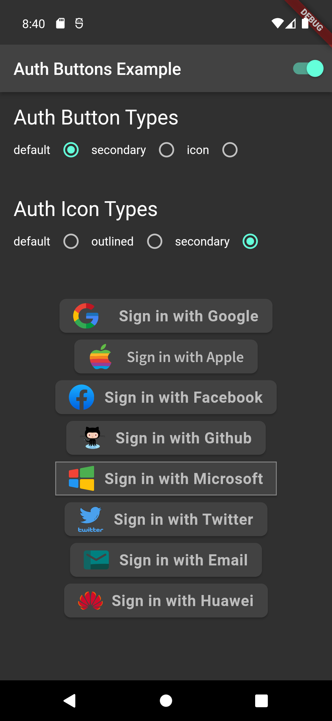
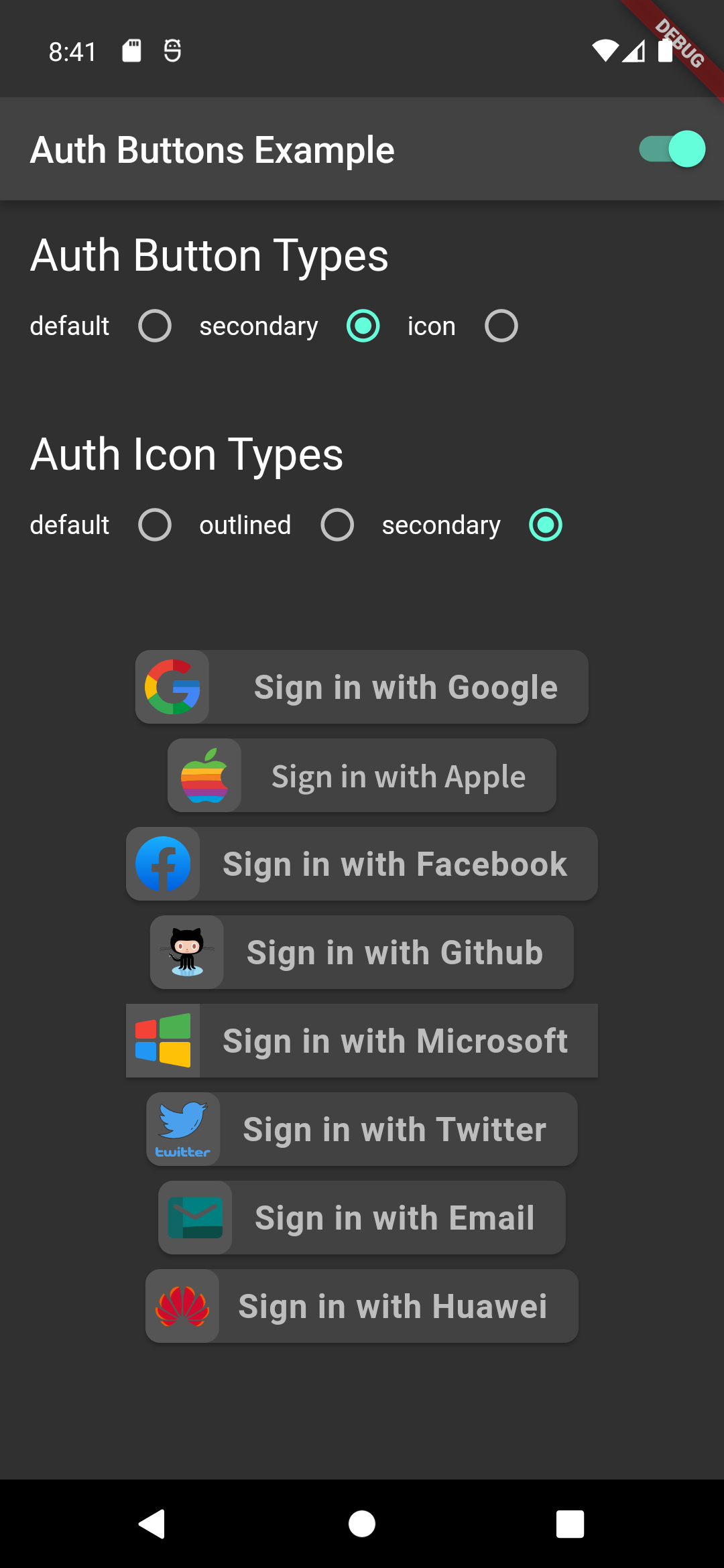
default-button-secondary-icon dark-default-button-secondary-icon
Icon Type
GoogleAuthButton(
  onPressed: () {},
  style: AuthButtonStyle(
    buttonType: AuthButtonType.icon,
  ),
),
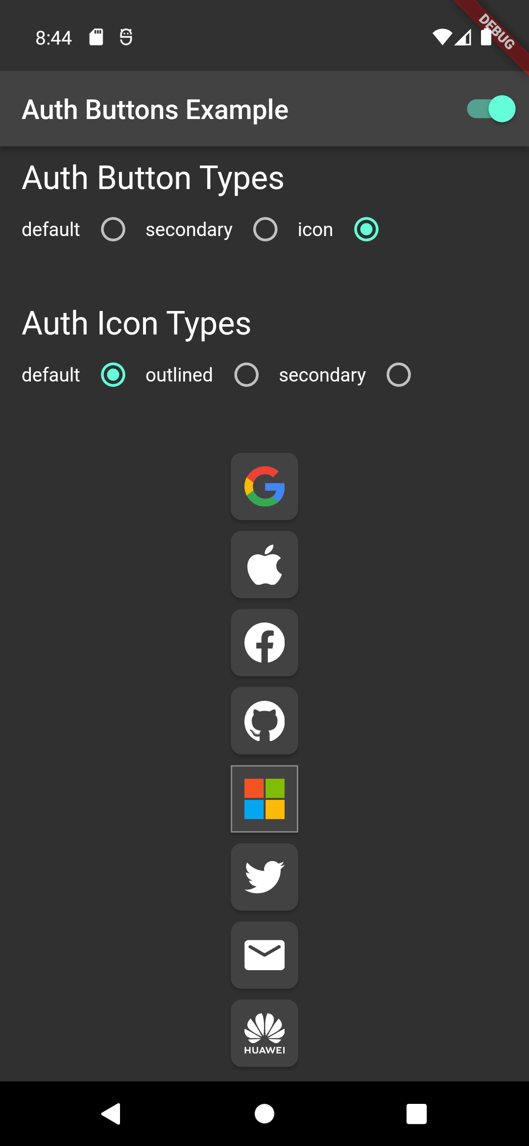
Light Dark
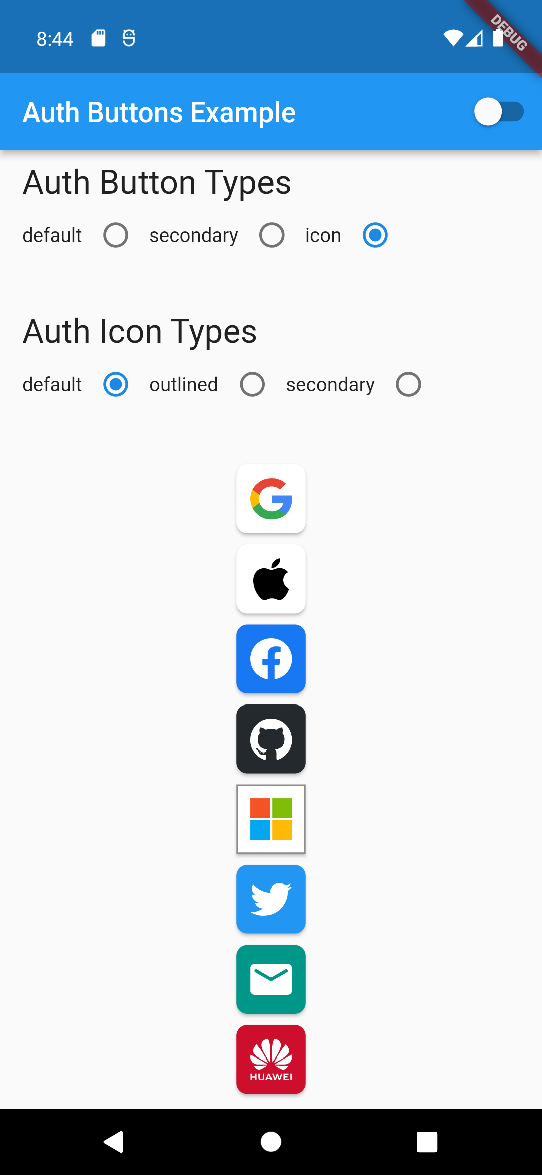
icon-button-default-icon dark-icon-button-default-icon
GoogleAuthButton(
  onPressed: () {},
  style: AuthButtonStyle(
    buttonType: AuthButtonType.icon,
    iconType: AuthIconType.outlined,
  ),
),
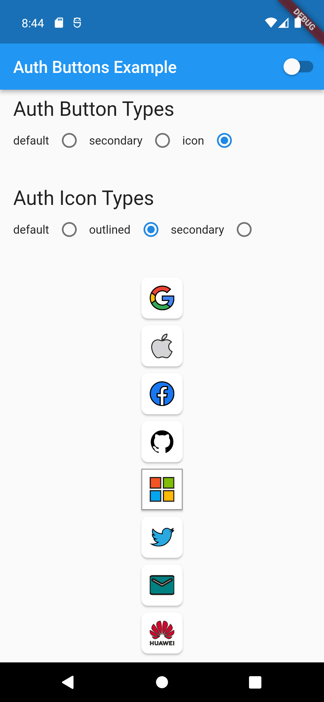
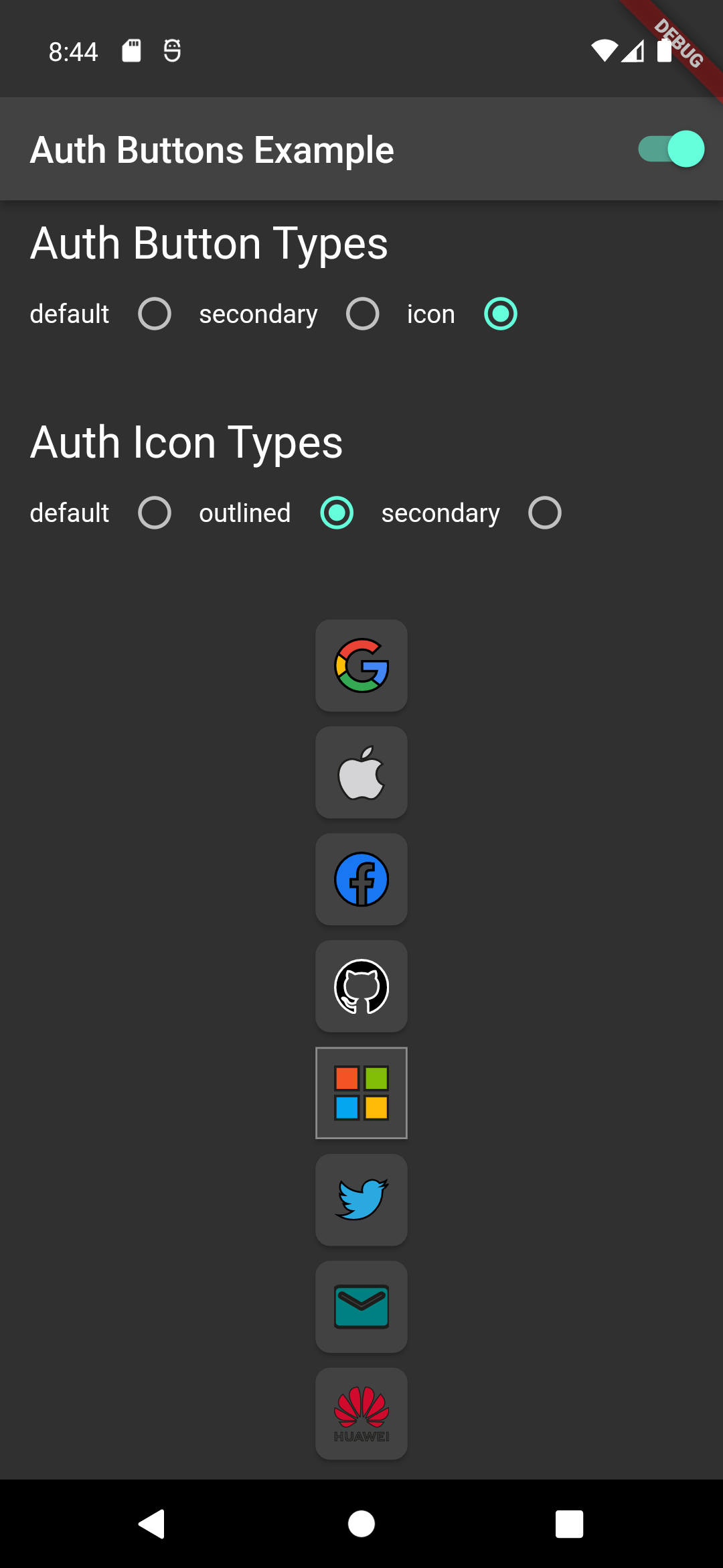
Light Dark
icon-button-outlined-icon dark-icon-button-outlined-icon
GoogleAuthButton(
  onPressed: () {},
  style: AuthButtonStyle(
    buttonType: AuthButtonType.icon,
    iconType: AuthIconType.secondary,
  ),
),
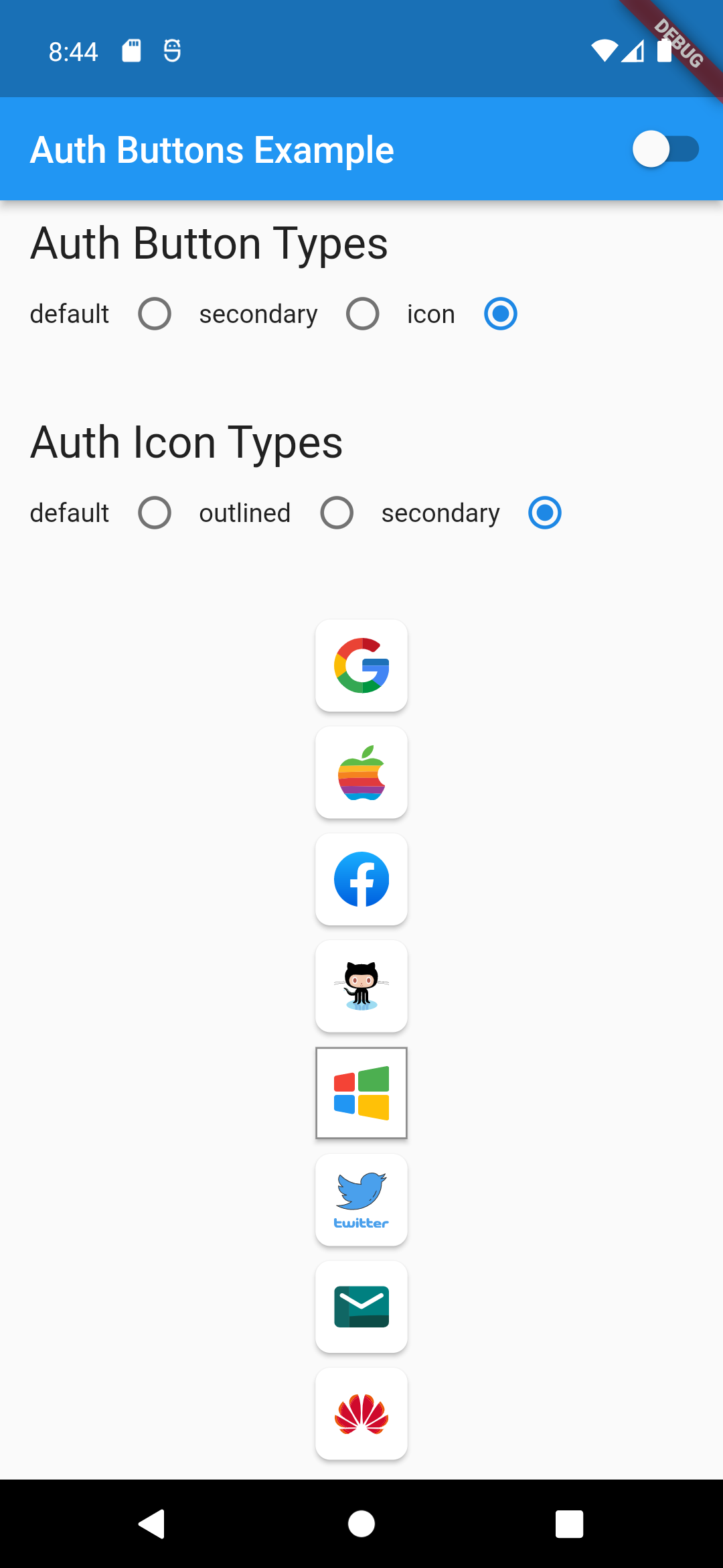
Light Dark
icon-button-secondary-icon dark-icon-button-secondary-icon
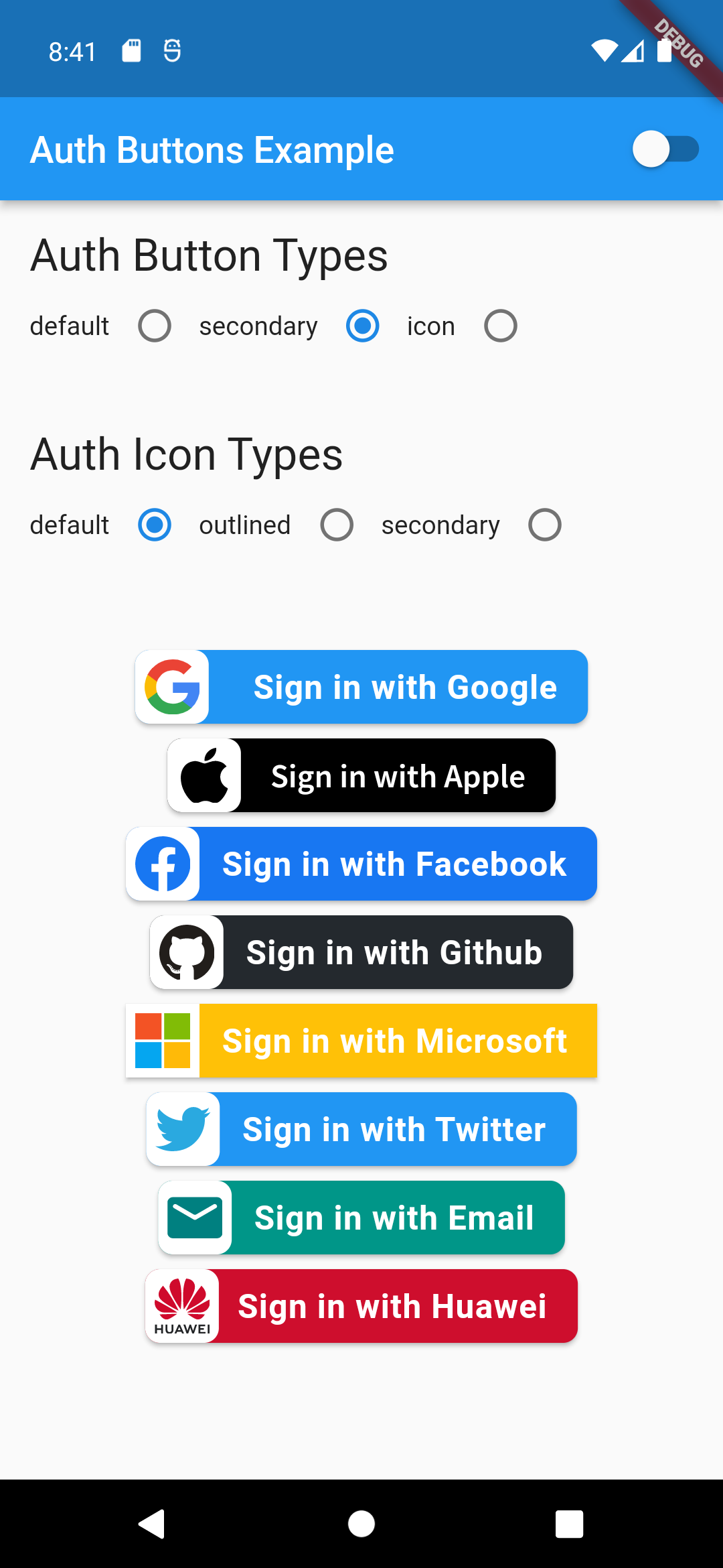
Secondary Type
GoogleAuthButton(
  onPressed: () {},
  style: AuthButtonStyle(
    buttonType: AuthButtonType.secondary,
  ),
),
Light Dark
secondary-button-default-icon dark-secondary-button-default-icon
GoogleAuthButton(
  onPressed: () {},
  style: AuthButtonStyle(
    buttonType: AuthButtonType.secondary,
    iconType: AuthIconType.outlined,
  ),
),
Light Dark
secondary-button-outlined-icon dark-secondary-button-outlined-icon
GoogleAuthButton(
  onPressed: () {},
  style: AuthButtonStyle(
    buttonType: AuthButtonType.secondary,
    iconType: AuthIconType.secondary,
  ),
),
Light Dark
secondary-button-secondary-icon dark-secondary-button-secondary-icon
Disabled State
Light Dark
disabled-buttons dark-disabled-buttons

Do same think with the other buttons, when you want to customize any button you can do it just passing a property which you want.

Grouped buttons

Example

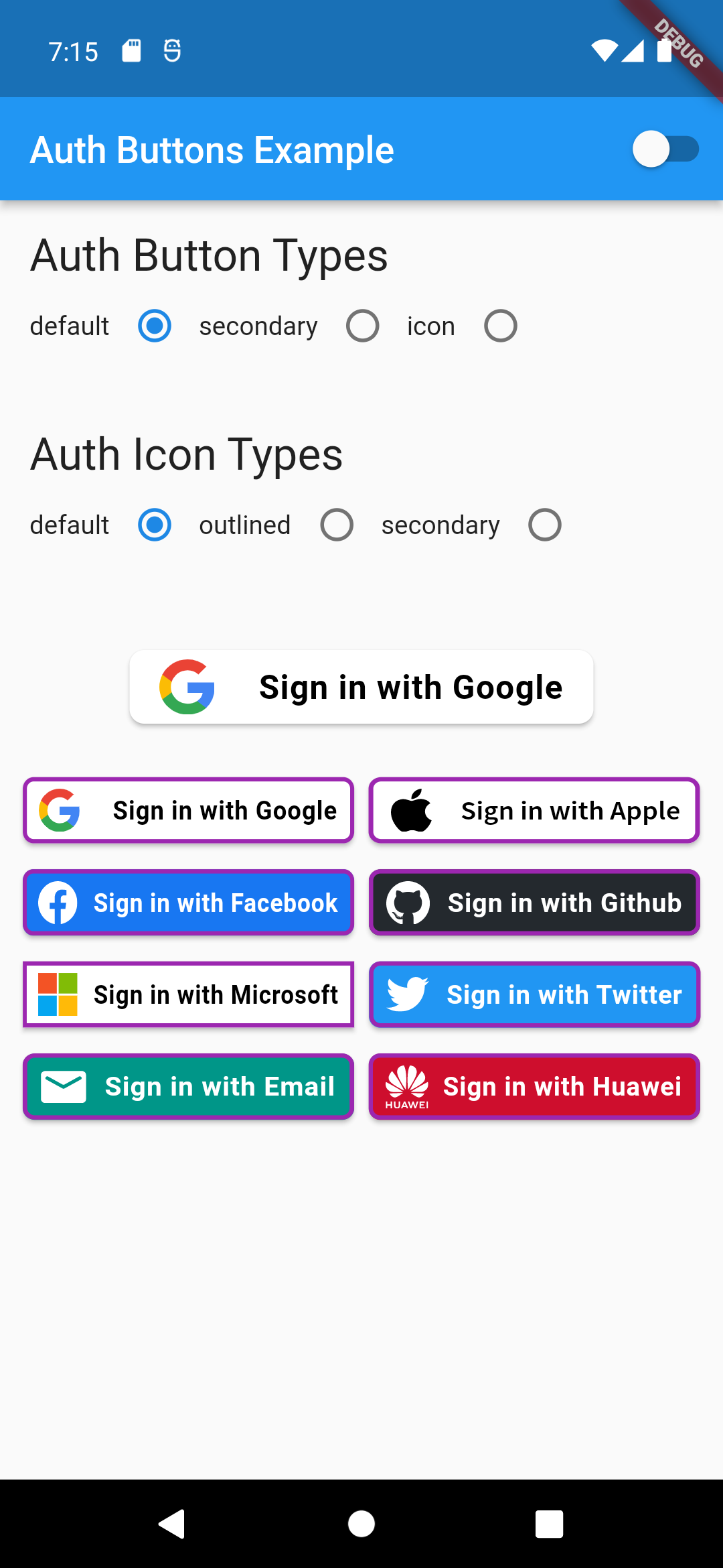
auth button group usecase
AuthButtonGroup(
  style: const AuthButtonStyle(
    width: 180,
    height: 50,
    borderColor: Colors.purple,
    borderWidth: 3.0,
    margin: EdgeInsets.only(bottom: 8.0),
  ),
  buttons: [
    GoogleAuthButton(),
    AppleAuthButton(),
    //....
  ]
),
                                                                                           Secondary                                                                                               |  Icon

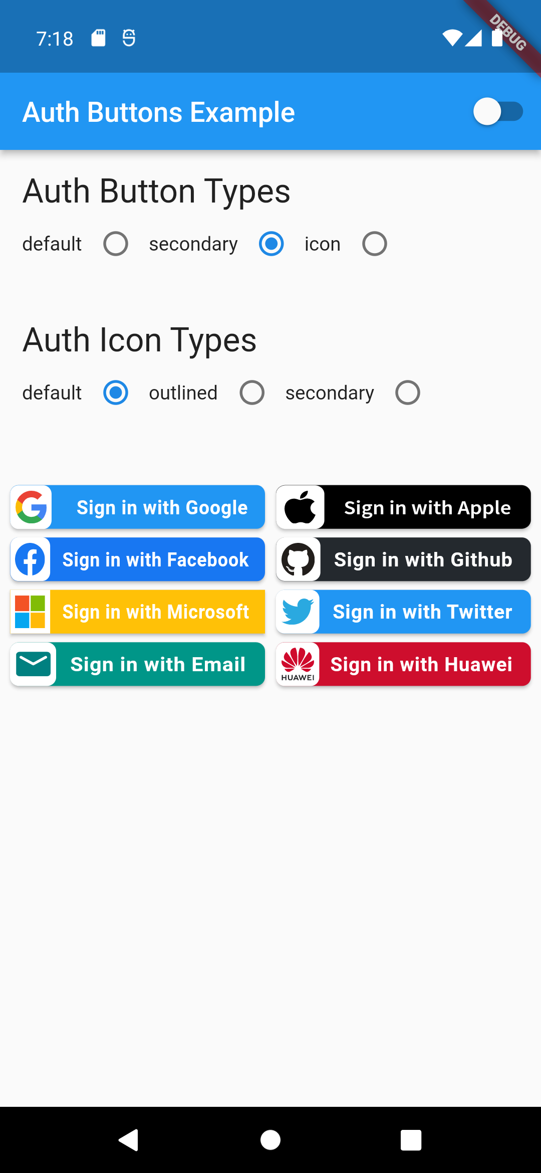
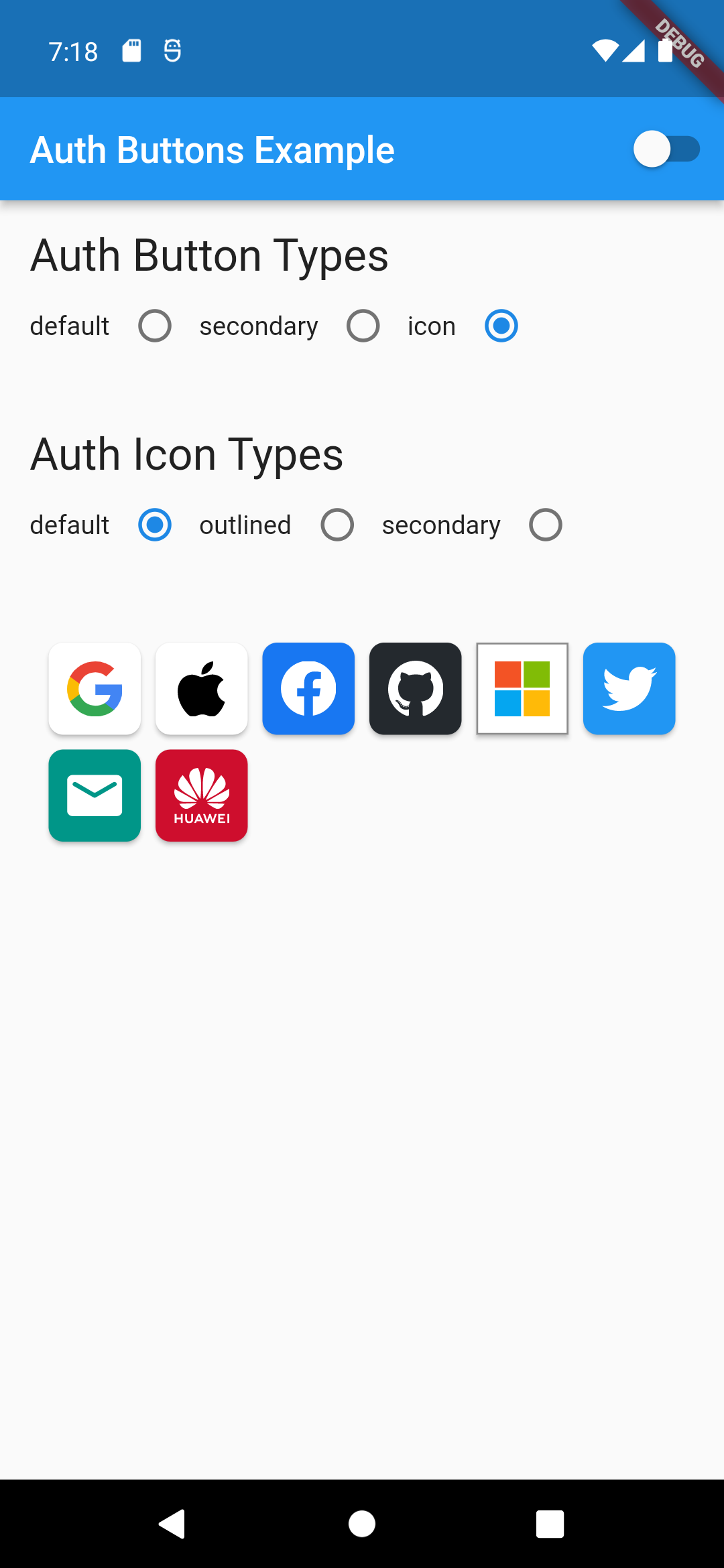
:-----------------------------------------------------------------------------------------------------------------------------------------------------------------------------------------------------:|:-------------------------: auth button group secondary buttons | auth-button-group-icon-buttons

Full property you can pass:

GoogleAuthButton(
  key: const ValueKey<String>(''),
  onPressed: () {},
  onLongPress: () {},
  onHover: (bool value) {},
  onFocusChange: (bool value) {},
  focusNode: FocusNode(),
  autofocus: false,
  text: 'Sign in with Google',
  isLoading: false,
  themeMode: ThemeMode.system,
  textDirection: TextDirection.ltr,
  materialStyle: ButtonStyle(),
  style: AuthButtonStyle(
    buttonColor: Colors.blue,
    splashColor: Colors.red,
    elevation: 2.0,
    borderRadius: 99.0,
    textStyle: TextStyle(),
    padding: const EdgeInsets.all(8.0),
    margin: const EdgeInsets.all(8.0),
    borderColor: Colors.amber,
    borderWidth: 3.0,
    buttonType: AuthButtonType.secondary,
    width: 300.0,
    height: 50.0,
    iconSize: 40.0,
    separator: 20.0,
    iconBackground: Colors.white,
    iconType: AuthIconType.outlined,
    shadowColor: Colors.pink,
    progressIndicatorColor: Colors.blue,
    progressIndicatorValueColor: Colors.grey[300],
    progressIndicatorStrokeWidth: 2.0,
    progressIndicatorValue: 1.0,
    iconColor: Colors.purple,
    progressIndicatorType: AuthIndicatorType.circular,
    visualDensity: VisualDensity.standard,
    tapTargetSize: MaterialTapTargetSize.shrinkWrap,
),

return up

Categorias

Dependências

Lista de dependências 2 itens

Repositório-fonte

Projetos que usam este pacote

Ainda não há dados.