Orientação gerada a partir de informações públicas. Apenas para referência.
Blurry é um pacote Flutter que fornece um widget de diálogo visualmente atraente com efeito de desfoque, inspirado no design glassmorphic. Ele vem com temas embutidos para personalizar facilmente a aparência, tornando-o ideal para interfaces modernas. O diálogo é compatível com múltiplas plataformas, incluindo Android, iOS, Web, macOS, Windows e Linux, garantindo desempenho consistente em dispositivos diferentes. Com configuração mínima via `flutter pub add blurry`, os desenvolvedores podem integrar rapidamente diálogos elegantes e translúcidos aos seus aplicativos. O pacote melhora a experiência do usuário por meio de profundidade visual sutil e elegância.
Casos de uso
Criando diálogos de aplicativos modernos
Implementando elementos de interface em vidro
Adicionando sobreposições translúcidas
Melhorando a estética de aplicativos móveis e de desktop
Projetando interfaces de usuário imersivas
Principais recursos
Efeito de desfoque no conteúdo do diálogo
Temas personalizáveis embutidos
Compatibilidade multiplataforma
Integração fácil com o Flutter
Suporte para múltiplos sistemas operacionais
Indicado para
Designers de interface buscando estéticas modernas
Aplicativos que exigem diálogos sobrepostos elegantes
Projetos direcionados para múltiplas plataformas
Equipes focadas no acabamento visual
Considerações
Impacto no desempenho em dispositivos de baixa gama
Personalização limitada além dos temas fornecidos
Possíveis problemas de legibilidade com intensidade alta de desfoque
Requer planejamento cuidadoso de contraste de cor
Pode não se adequar a todos os estilos de design de aplicativos
README original
Snapshot do README original do repositório-fonte vinculado. Consulte o repositório para o conteúdo mais recente.
Blurry Dialog
Features
Display simple blurry dialog popup
Offer built-in themes
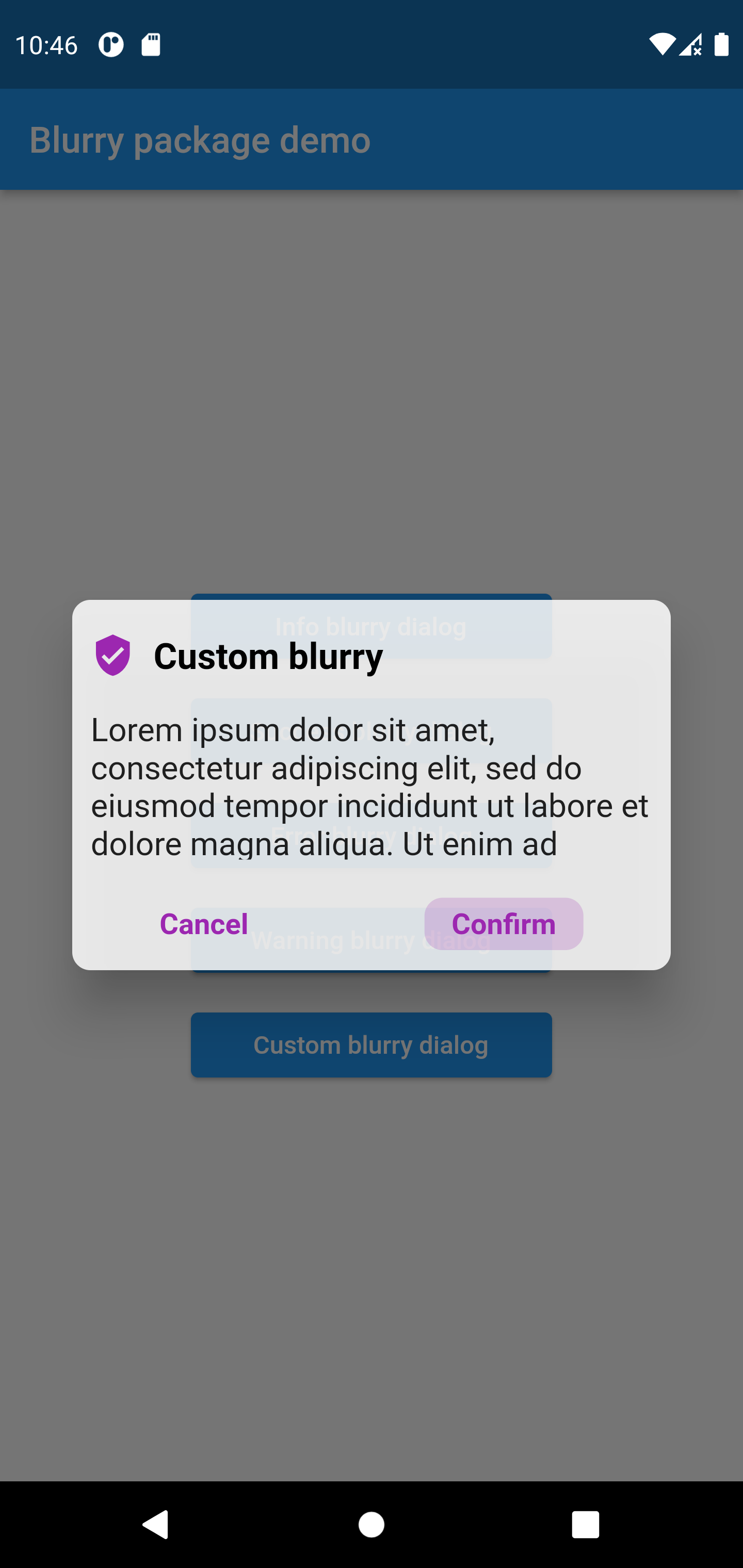
Possibility to create you custom dialog
Button click handler callbacks
Customizable text
Customizable barrier color and behavior
Customize popup size
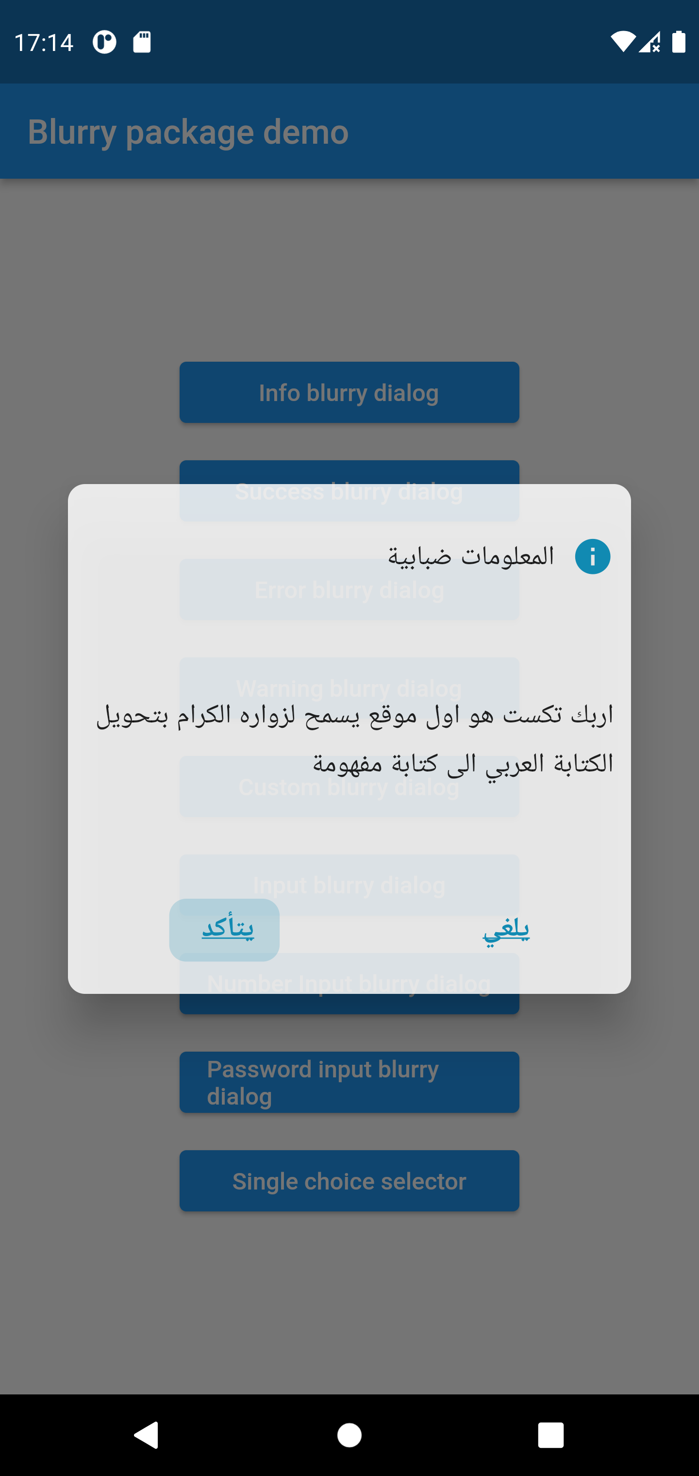
Customizable layout LTR, RTL, Center
Support arabic language
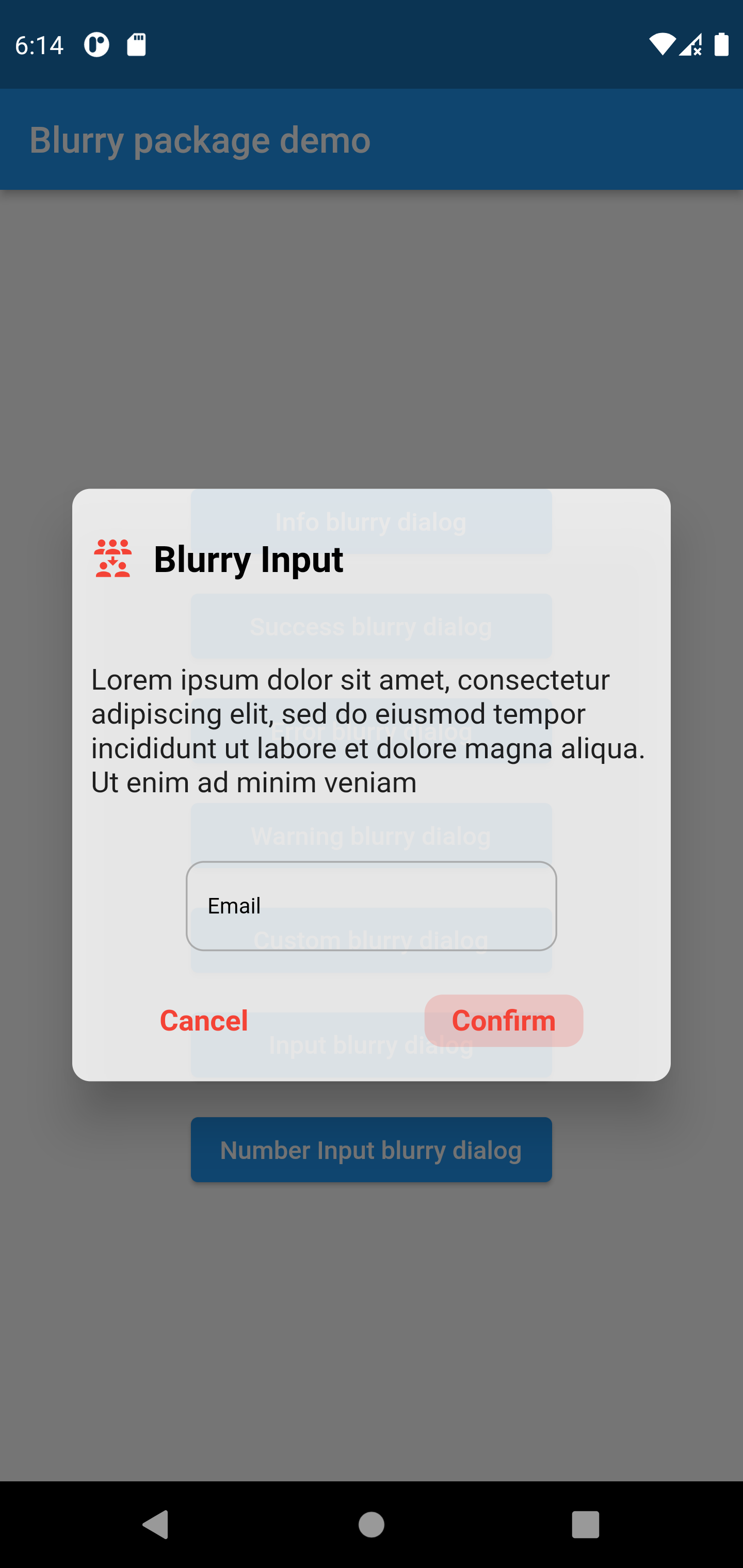
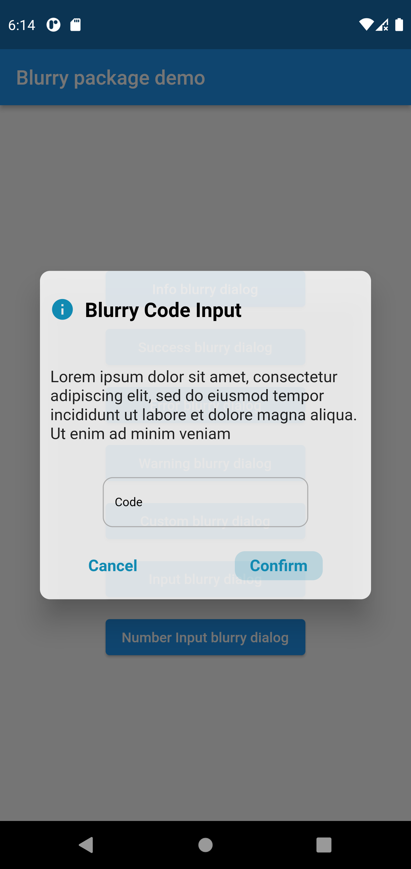
Input popup option with keyboard type
Customizable input style and input text style
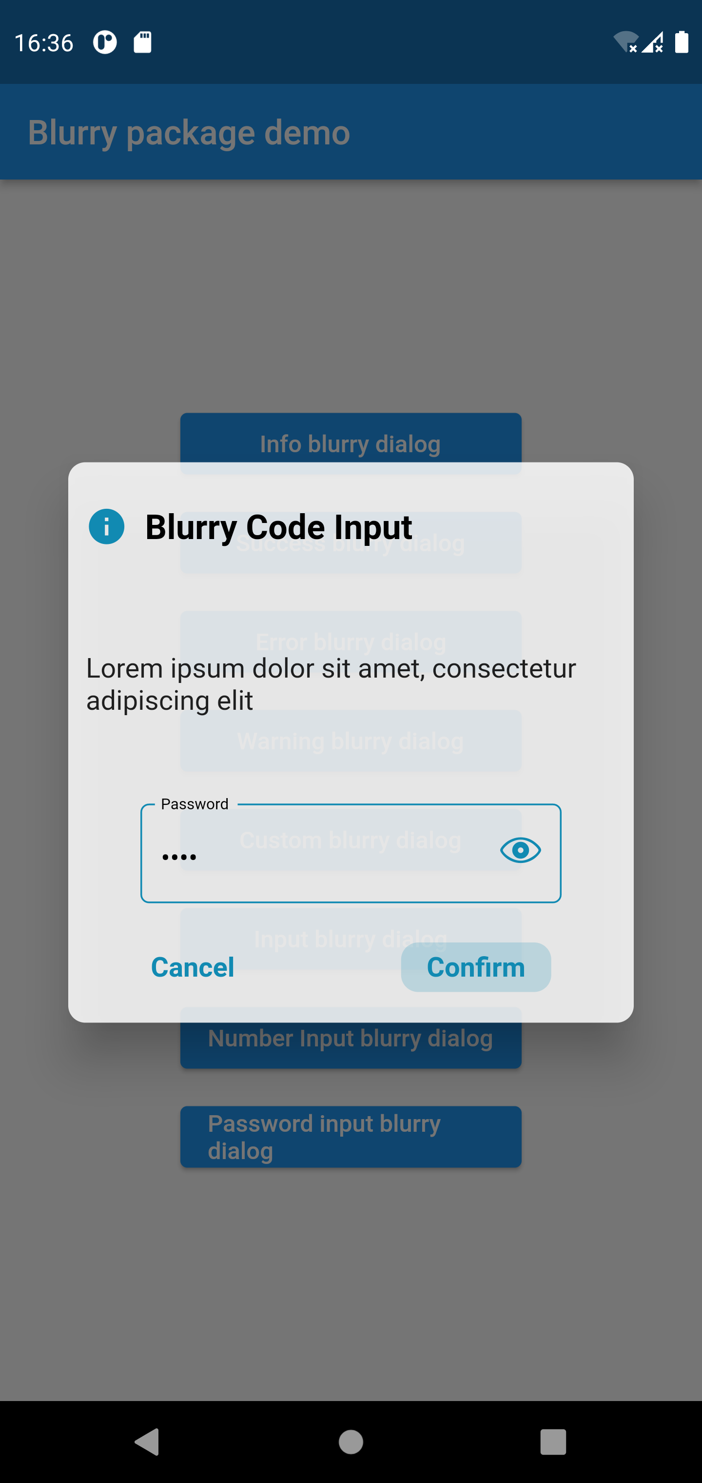
Password popup type with eye icon to view password
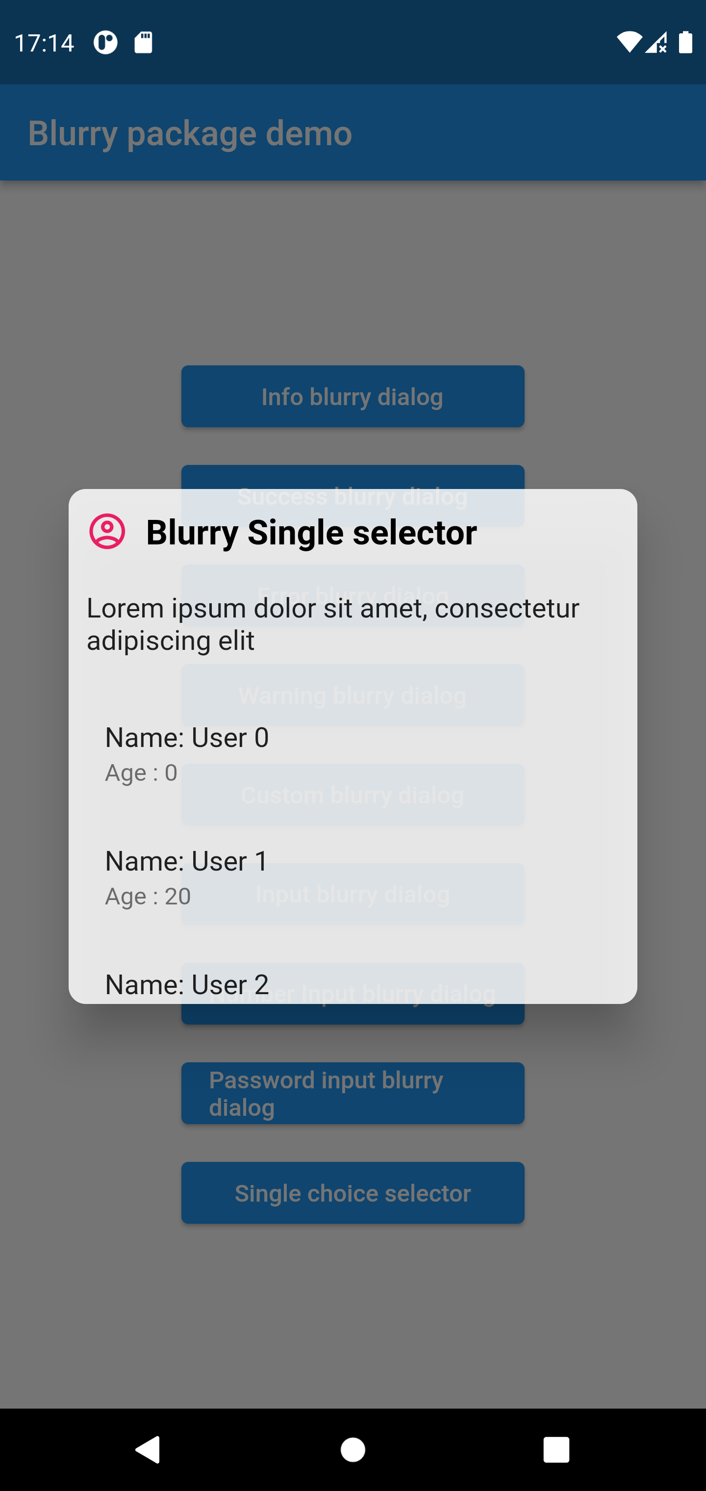
Single item selector type
Getting started
To use the blurry dialog package you need to add it in pubspec.yaml file
dependencies:blurry:^1.4.2
Usage
Parameters
///the dialog popup title, required in all blurry class constructorsfinalString title;
///the dialog description text///required in all blurry class constructorsfinalString description;
///the cancel button text, by default it's 'Cancel'finalString cancelButtonText;
///the confirm button (primary button) text stringfinalString confirmButtonText;
///the dialog theme color///will be applied on buttons and icon///not available in default types constructors (info, error, warning, success)lateColor? themeColor;
///function invoked when the primary button is pressed///required in all constructorsfinalFunction onConfirmButtonPressed;
///the callback that will be invoked when pressing on cancel buttonfinalFunction? onCancelButtonPressed;
///the icon that will be rendered in the dialog///required only when using the default constructorlateIconData? icon;
///title text style, by default it's nullfinalTextStyle? titleTextStyle;
///description text style, by default it's nullfinalTextStyle? descriptionTextStyle;
///button text style, by default it's nullfinalTextStyle? buttonTextStyle;
///the blurry dialog popup heightfinaldouble? popupHeight;
///indicate whether the cancel button will be rendered or not///by default the cancel button is displayedfinalbool displayCancelButton;
///indicates whether the popup dialog is dismissable or not///by default [dismissable = true]finalbool dismissable;
///the color of the barrier of the burry dialog///if it's null the barrier color will be the default color [Colors.black54]finalColor? barrierColor;
///the layout rendering type, LTR, RTL or center///possible values/// - ltr/// - rtl/// - center/// by default is [LAYOUT_TYPE.ltr]final LAYOUT_TYPE layoutType;
/// the input label string, required when using the input constructorlateString? inputLabel;
/// the input text field text controller/// required when using the input constructorlateTextEditingController? inputTextController;
/// the input text style by default it's just black textlateTextStyle inputTextStyle;
/// the input label style by default it's just black textlateTextStyle inputLabelStyle;
/// text input type applied on input field/// available only when using the input constructorlateTextInputType textInputType;
/// the design type of the popup, available when using input constructor/// availabele options/// {/// info,/// success,/// error,/// warning/// }/// ```late BLURRY_TYPE? type;
/// indicate whether display visibility eye icon on password fields/// available only when using `Blurry.password` constructor/// by default it's 'true'bool withVisibilityEye = true;
///list items that will be rendered in the single selector blurry popup type///available only when using `singleChoiceSelector` constructor (should be not null and not empty)lateList<Widget>? items;
///invoked when pressing on item from the list///available only when using `singleChoiceSelector`///by default pressing an element from the list will close the popuplateFunction(int)? onItemSelected;
Examples
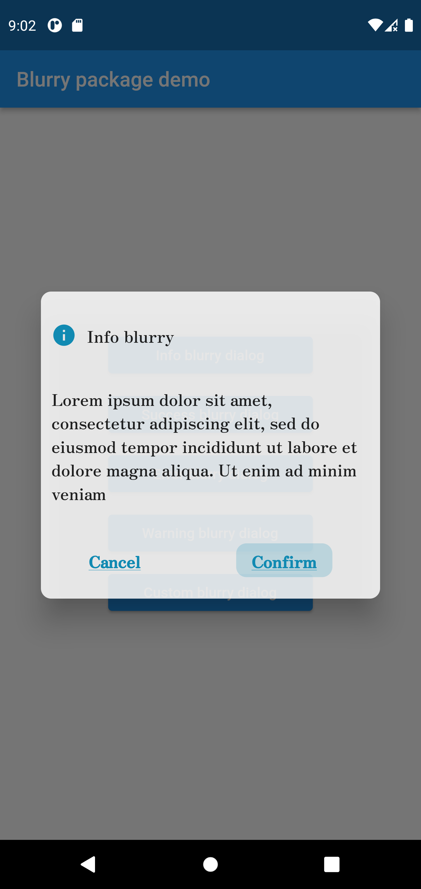
Info style blurry package
Blurry.info(
title: 'Info blurry',
description:'Lorem ipsum dolor sit amet, consectetur adipiscing elit, sed do eiusmod tempor incididuntut labore et dolore magna aliqua. Ut enim ad minim veniam',
confirmButtonText: 'Confirm',
titleTextStyle: constTextStyle(fontFamily: 'Zen'),
popupHeight: 300,
buttonTextStyle: constTextStyle(
decoration: TextDecoration.underline,
fontFamily: 'Zen'
),
descriptionTextStyle: constTextStyle(fontFamily: 'Zen'),
onConfirmButtonPressed: () {})
.show(context);
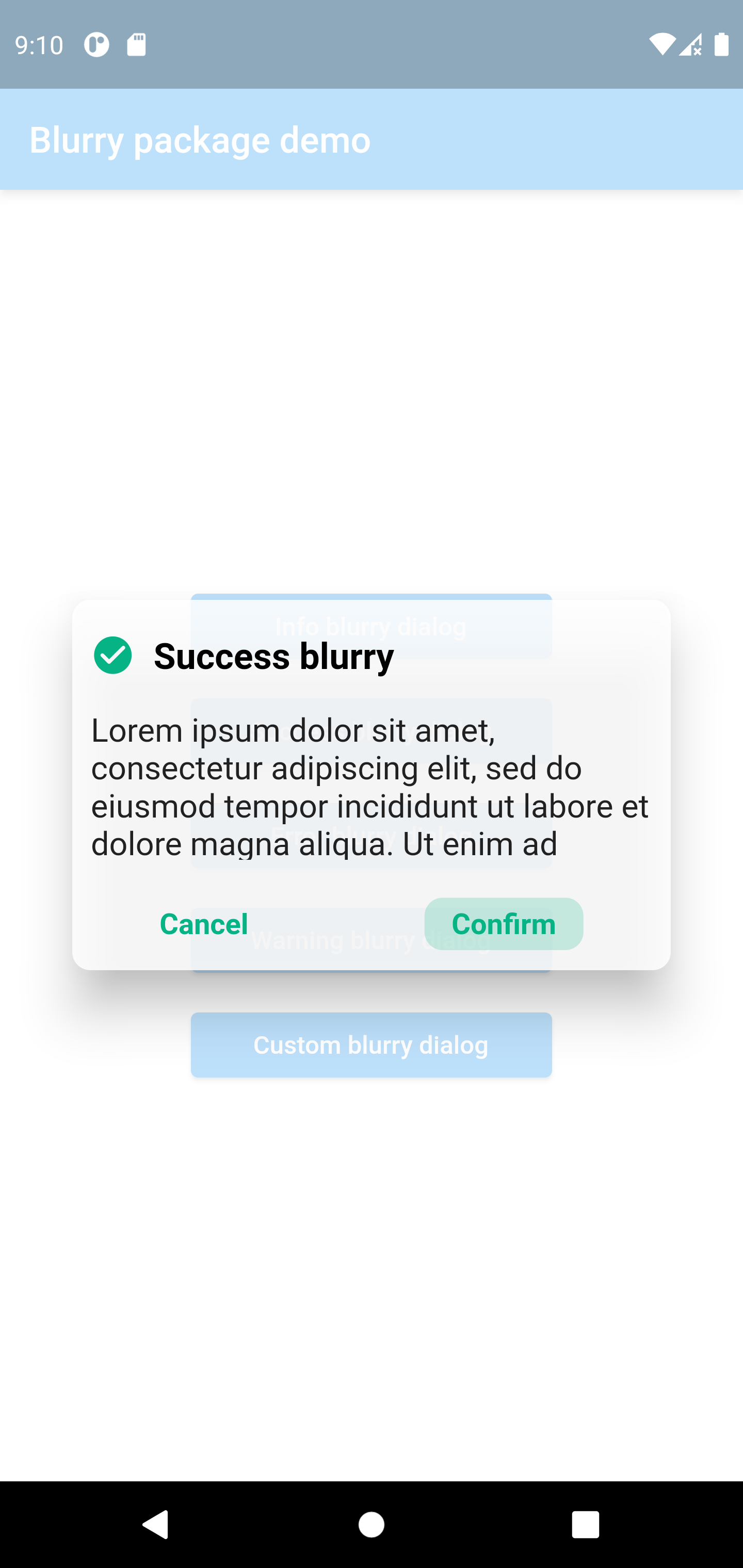
Success style blurry package
Blurry.success(
	title:  'Success blurry',
	description:
	'Lorem ipsum dolor sit amet, consectetur adipiscing elit, sed do eiusmod tempor incididunt ut labore et dolore magna aliqua. Ut enim ad minim veniam',
	confirmButtonText:  'Confirm',
	onConfirmButtonPressed: () {},
	barrierColor: Colors.white.withOpacity(0.7),
	dismissable:  false,
).show(context);
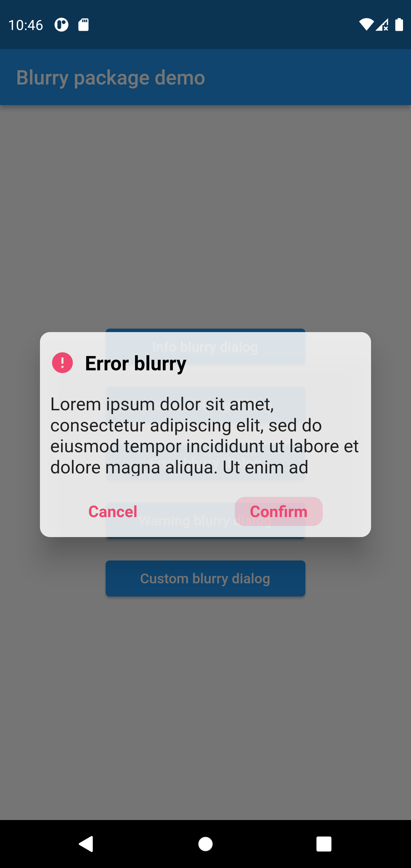
Error style blurry package
Blurry.error(
	title:  'Error blurry',
	description:'Lorem ipsum dolor sit amet, consectetur adipiscing elit, sed do eiusmod tempor incididun',
	confirmButtonText:  'Confirm',
	onConfirmButtonPressed: () {
		print('hello world');
	})
.show(context);
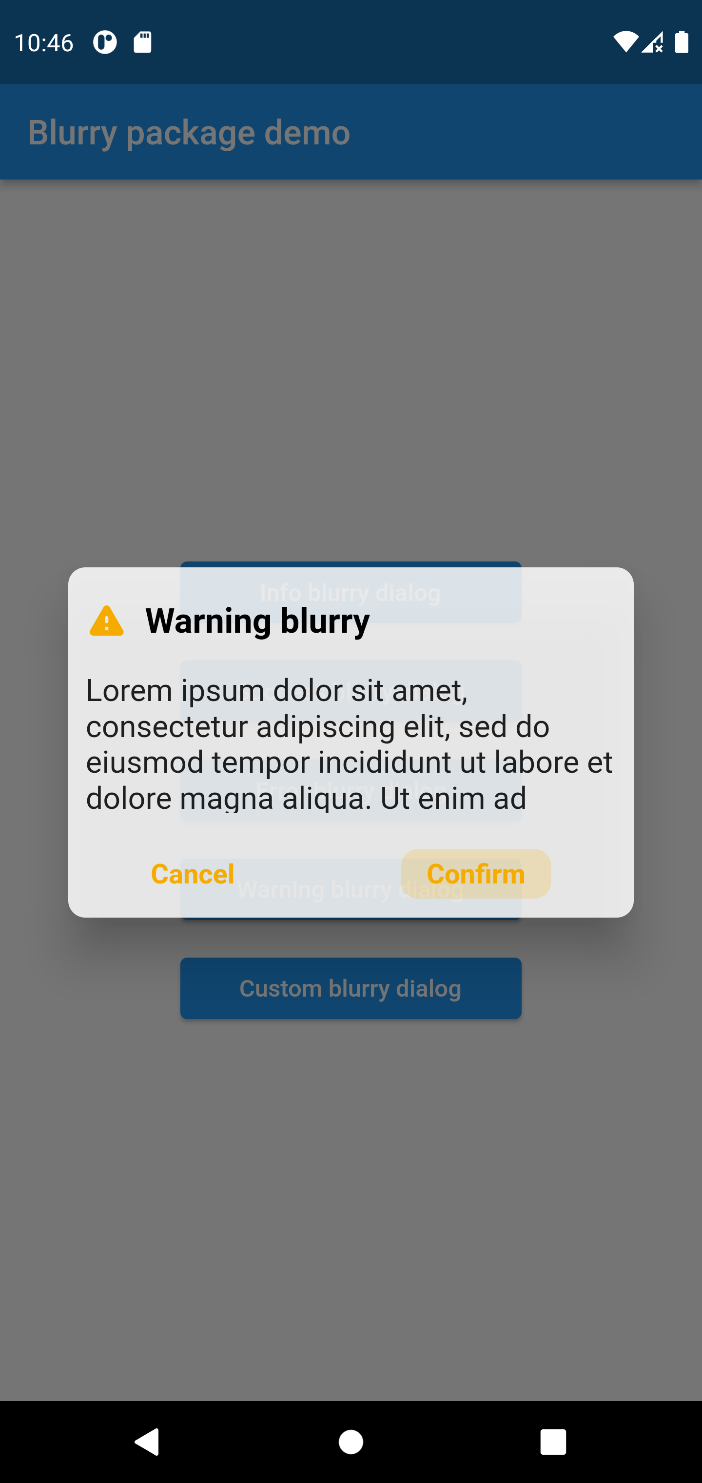
Warning style blurry package
Blurry.warning(
	title:  'Warning blurry',
	description:'Lorem ipsum dolor sit amet, consectetur adipiscing elit, sed do eiusmod tempor incididun',
	confirmButtonText:  'Confirm',
	onConfirmButtonPressed: () {
		print('hello world');
	})
.show(context);