Buscar pacotes, repositórios e categorias de apps

Capa de buttons_tabbar
Detalhes do pacotev2.0.0

buttons_tabbar

Um pacote Flutter que implementa um TabBar onde cada rótulo é um botão de alternância.

AndroidiOSWebmacOSWindowsLinux
Downloads em 30 dias
10,3 mil
Curtidas
448
Pontos Pub
150

Instalar pacote

flutter pub add buttons_tabbar

Visão geral do pacote

Orientação gerada a partir de informações públicas. Apenas para referência.

ButtonsTabBar é um pacote Flutter que fornece um TabBar personalizável onde cada rótulo de aba funciona como um botão de alternância, permitindo que os usuários selecionem e desmarquem opções individualmente. Ele melhora a navegação em aplicativos com múltiplas seções ao oferecer feedback visual para estados selecionados. O pacote suporta todas as principais plataformas, incluindo Android, iOS, Web, macOS, Windows e Linux, tornando-o ideal para aplicações multiplataforma. Desenvolvido com simplicidade e flexibilidade em mente, integra-se perfeitamente em projetos existentes do Flutter.

Casos de uso

  • Navegação de guias personalizadas em aplicativos móveis e web
  • Interfaces de filtragem interativas
  • Layouts de guias de seleção múltipla
  • Mudança dinâmica de conteúdo
  • Configurações de preferência do usuário
  • Navegação do painel

Principais recursos

  • Rótulos de guia alternáveis
  • Compatibilidade multiplataforma
  • Estilo personalizável
  • Integração simples com o Flutter
  • Gerenciamento de estado para guias selecionadas
  • Suporte a design responsivo

Indicado para

  • Desenvolvedores construindo interfaces de usuário interativas
  • Aplicativos que exigem guias de seleção múltipla
  • Designers procurando navegação intuitiva
  • Projetos Flutter multiplataforma
  • Alterações rápidas na interface de protótipo

Considerações

  • Pode exigir lógica personalizada para o manuseio de estado complexo
  • animações embutidas limitadas
  • Não adequado para cenários de seleção única
  • Requer manipulação manual das transições de guia
  • Mais adequado para conjuntos de guias pequenos a médios
  • Depende de estilos externos para visuais avançados

README original

Snapshot do README original do repositório-fonte vinculado. Consulte o repositório para o conteúdo mais recente.

Buttons TabBar

Publish Pub

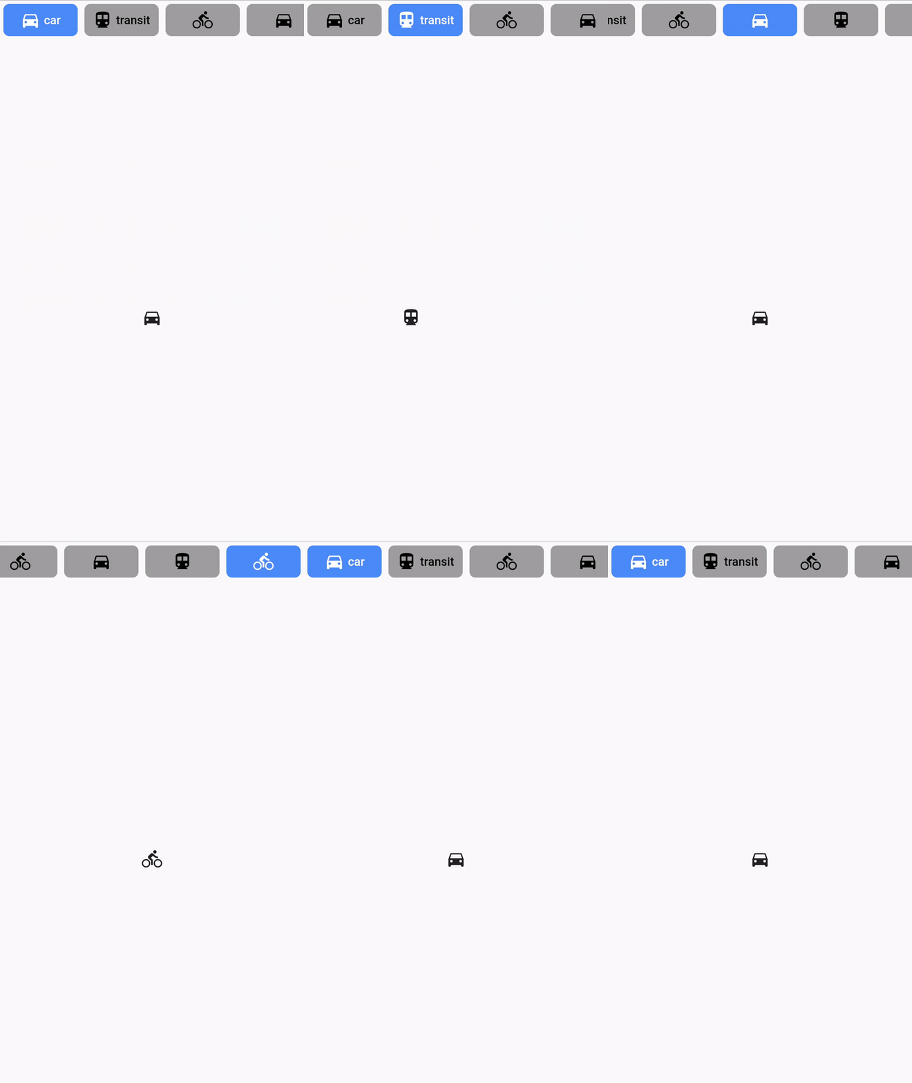
Buttons TabBar is an open-source Flutter package that provides a tabbar where each tab indicator is a toggle button. It allows you to create interactive and customizable tab bars for your Flutter applications.

ButtonsTabBar screen animation

Features

✨ Each tab indicator is a toggle button 🎨 Customizable appearance and behavior 🖌️ Supports various styling options, including background color, border color, label style, icon color, and more 🚀 Smooth transition animations 📱 Works like a native TabBar ⚙️ Simple and easy to use configuration with a wide range of parameters

Installation

To use Buttons TabBar in your Flutter project, follow these steps:

  1. Add the dependency to your pubspec.yaml file:
dependencies:
  flutter:
    sdk: flutter
  buttons_tabbar: ^1.3.14
  1. Run flutter pub get to install the package.

Usage

Import the package in your Dart file and customize the tab bar according to your needs:

import 'package:buttons_tabbar/buttons_tabbar.dart';

DefaultTabController(
  length: ...,
  child: Column(
    children: <Widget>[
      ButtonsTabBar(
        // Customize the appearance and behavior of the tab bar
        backgroundColor: Colors.red,
        borderWidth: 2,
        borderColor: Colors.black,
        labelStyle: TextStyle(
          color: Colors.white,
          fontWeight: FontWeight.bold,
        ),
        unselectedLabelStyle: TextStyle(
          color: Colors.black,
          fontWeight: FontWeight.bold,
        ),
        // Add your tabs here
        tabs: ...,
      ),
      Expanded(
        child: TabBarView(
          children: ...,
        ),
      ),
    ],
  ),
)

Examples

Here are a few examples of how you can use Buttons TabBar:

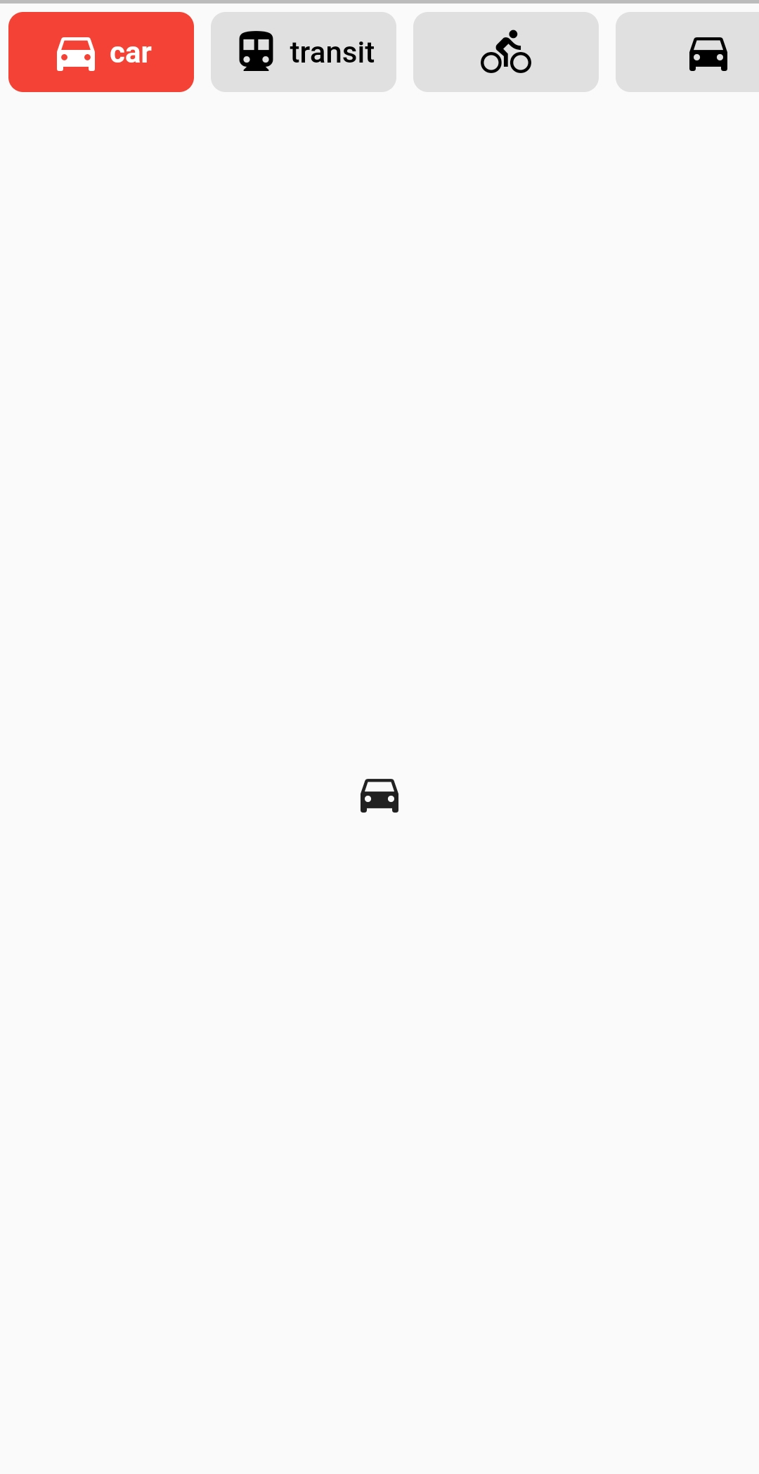
Example #1

ButtonsTabBar - Example #1

DefaultTabController(
  length: ...,
  child: Column(
    children: <Widget>[
      ButtonsTabBar(
        backgroundColor: Colors.red,
        tabs: ...,
      ),
      Expanded(
        child: TabBarView(
          children: ...,
        ),
      ),
    ],
  ),
)
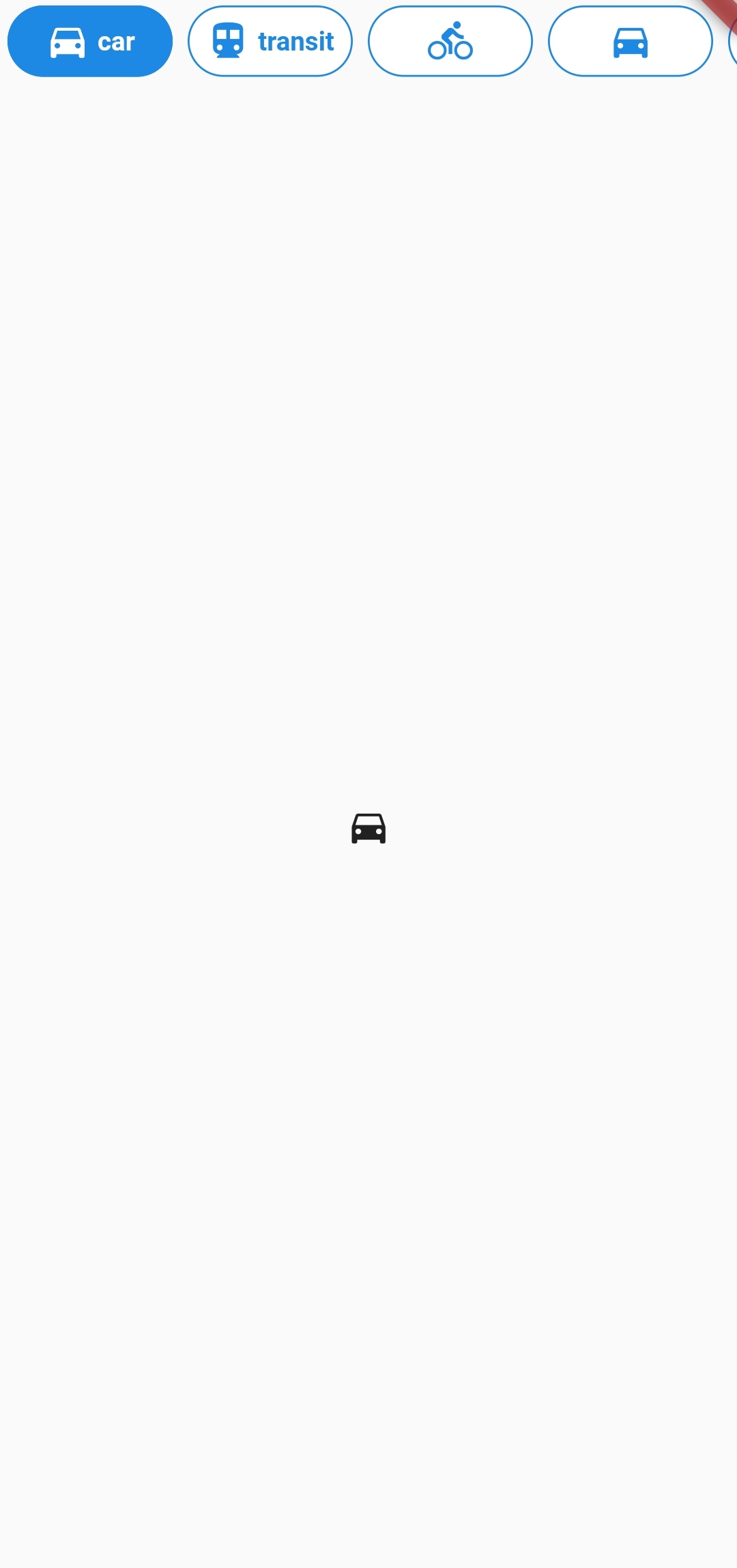
Example #2

ButtonsTabBar - Example #2

DefaultTabController(
  length: ...,
  child: Column(
    children: <Widget>[
      ButtonsTabBar(
        backgroundColor: Colors.blue[600],
        unselectedBackgroundColor: Colors.white,
        labelStyle: TextStyle(
          color: Colors.white,
          fontWeight: FontWeight.bold,
        ),
        unselectedLabelStyle: TextStyle(
          color: Colors.blue[600],
          fontWeight: FontWeight.bold,
        ),
        borderWidth: 1,
        unselectedBorderColor: Colors.blue[600],
        radius: 100,
        tabs: ...,
      ),
      Expanded(
        child: TabBarView(
          children: ...,
        ),
      ),
    ],
  ),
)
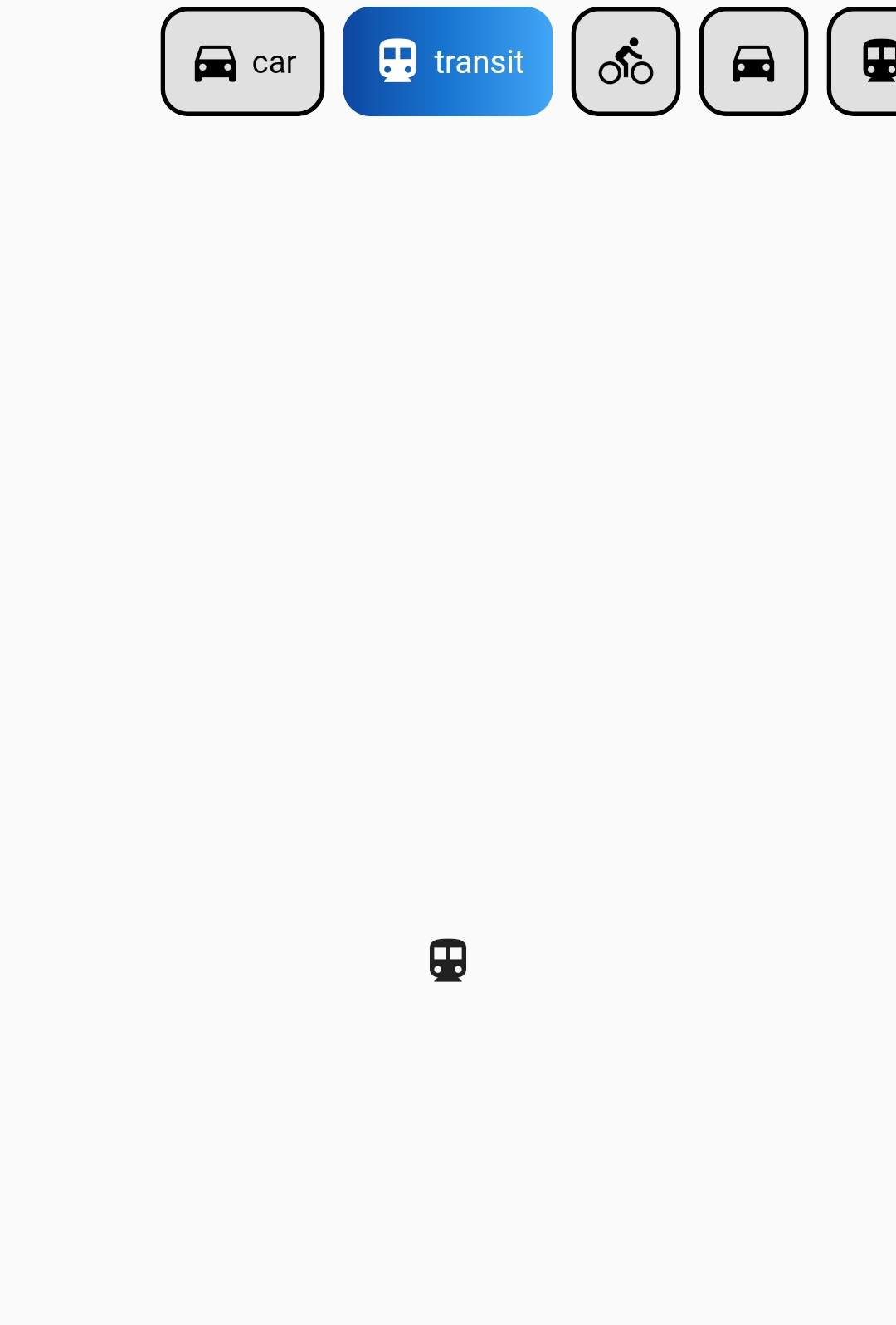
Example #3

ButtonsTabBar - Example #3

DefaultTabController(
  length: 6,
  child: Column(
    children: <Widget>[
      ButtonsTabBar(
        radius: 12,
        contentPadding: EdgeInsets.symmetric(horizontal: 12),
        borderWidth: 2,
        borderColor: Colors.transparent,
        center: true,
        decoration: BoxDecoration(
          gradient: LinearGradient(
            colors: <Color>[
              Color(0xFF0D47A1),
              Color(0xFF1976D2),
              Color(0xFF42A5F5),
            ],
          ),
        ),
        unselectedLabelStyle: TextStyle(color: Colors.black),
        labelStyle: TextStyle(color: Colors.white),
        height: 56,
        tabs: ...,
      ),
      Expanded(
        child: TabBarView(
          children: ...,
        ),
      ),
    ],
  ),
)

For more examples, please refer to the example.dart file.

Properties

Below are the properties available for customizing the ButtonsTabBar. For more detailed information, check the API reference.

Property Type Description Default
backgroundColor Color The background color of the button on its selected state. Theme.of(context).accentColor
borderColor Color The border color of the button on its selected state. Colors.black
borderWidth double The width of the solid border for each button. 0
buttonMargin EdgeInsets The EdgeInsets used for the margin of the buttons. EdgeInsets.all(4.0)
center bool Center the tab buttons. false
contentPadding EdgeInsets The EdgeInsets used for the padding of the buttons' content. EdgeInsets.symmetric(horizontal: 4.0)
controller TabController This widget's selection and animation state. DefaultTabController.of
decoration BoxDecoration The BoxDecoration of the button on its selected state. null
duration int The duration in milliseconds of the transition animation. 250
elevation double The value of elevation applied to each button. 0
height double? Override the default height. 46.0
labelSpacing double The spacing between the icon and the text. If only one of those is provided, no spacing is applied. 4.0
labelStyle TextStyle The TextStyle of the button's text on its selected state. The color provided on the TextStyle will be used for the icon's color. TextStyle(color: Colors.white)
onTap void Function(int)? An optional callback that's called when the TabBar is tapped. null
physics ScrollPhysics The physics used for the ScrollController of the tabs list. BouncingScrollPhysics()
radius double The value of the BorderRadius.circular applied to each button. 7.0
splashColor Color? The splash color of the button. null
tabs List<Widget> The tabs to display. Typically a list of two or more Tab widgets. @required
unselectedBackgroundColor Color The background color of the button on its unselected state. Colors.grey[300]
unselectedBorderColor Color The border color of the button on its unselected state. If it's value is null, the Color of borderColor is used. null
unselectedDecoration BoxDecoration The BoxDecoration of the button on its unselected state. null
unselectedLabelStyle TextStyle The TextStyle of the button's text on its unselected state. The color provided on the TextStyle will be used for the icon's color. TextStyle(color: Colors.black)

Apps Using Buttons TabBar

Here are some apps that are using Buttons TabBar to create engaging and interactive tab bars:

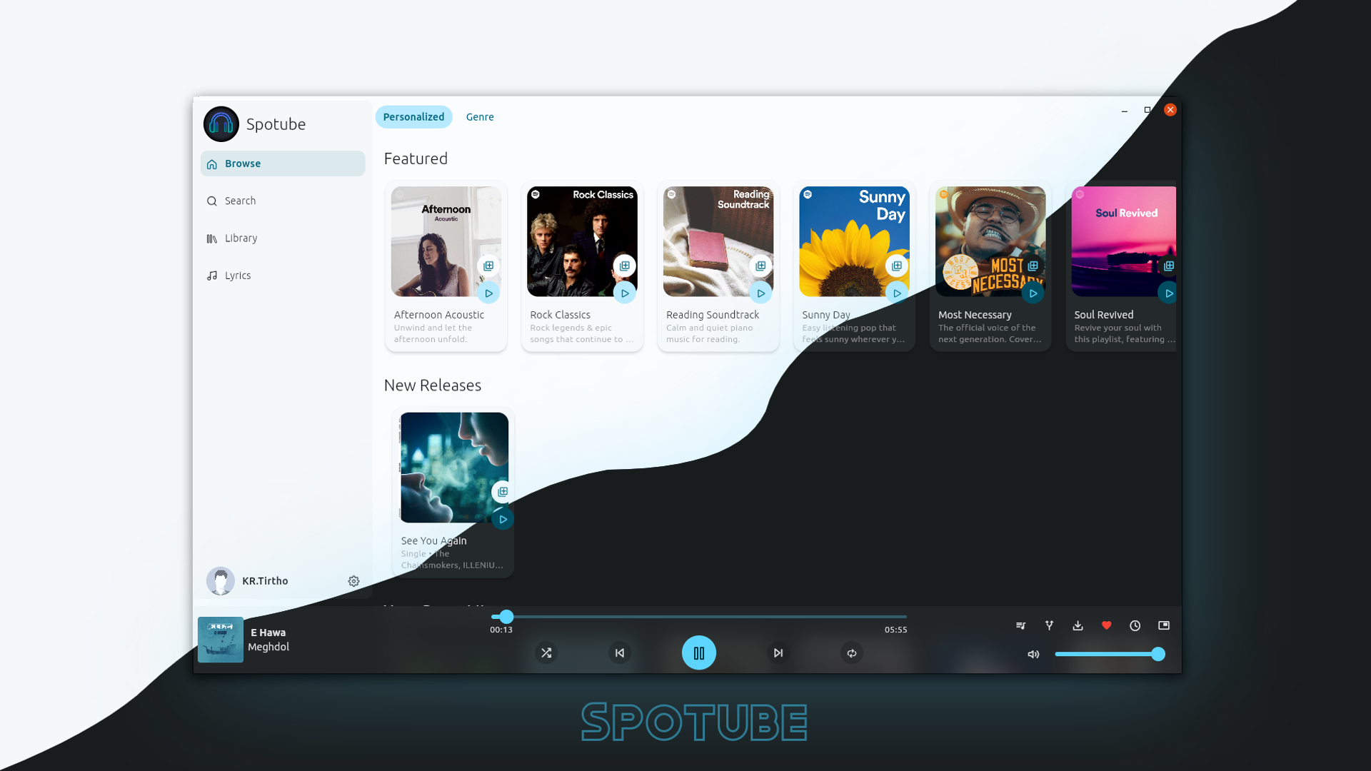
  1. Spotube - Open source Spotify client that doesn't require Premium nor uses Electron! Available for both desktop & mobile! Spotube

If you are using Buttons TabBar in your app and would like to showcase it here, please let us know. We would be happy to feature your app as well.

Please note that the above apps are provided as examples and may not be actively maintained or associated with the Buttons TabBar package.

Future Development

If you have any suggestions or encounter any issues, feel free to let me know. I am committed to improving and maintaining this package.

License

This package is licensed under the MIT License. For more information, see the LICENSE.md file.

More Information

For more information, visit the Buttons TabBar GitHub repository or the author's website.

Categorias

Dependências

Lista de dependências 1 itens

Repositório-fonte

Projetos que usam este pacote