Orientação gerada a partir de informações públicas. Apenas para referência.
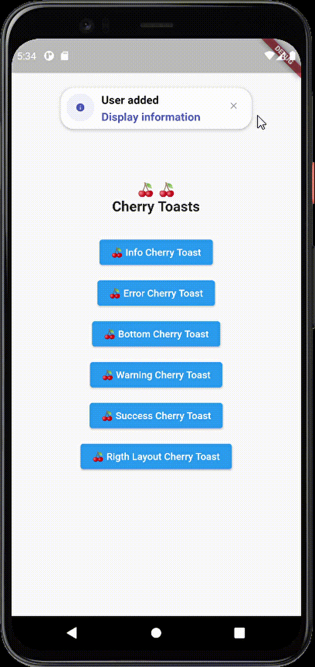
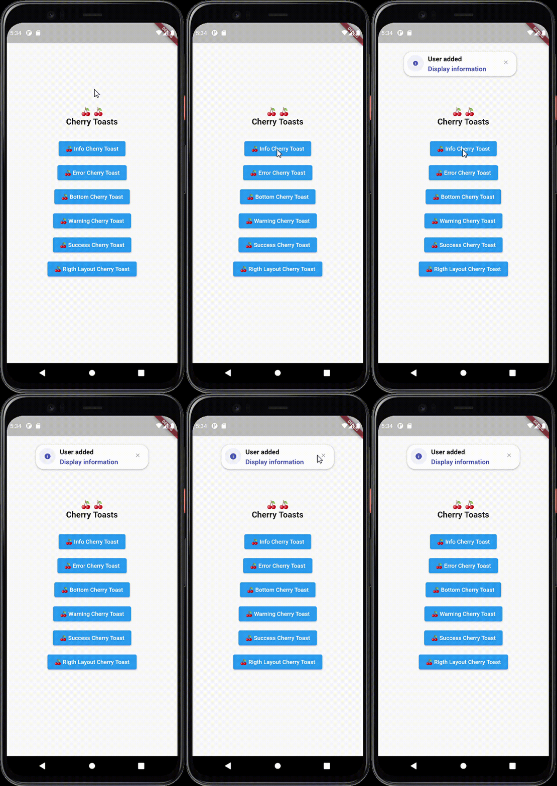
Cherry Toast é um pacote do Flutter que oferece uma maneira moderna e visualmente atraente de exibir toasts com animações suaves e designs personalizáveis. Criado para desenvolvedores que buscam uma alternativa elegante aos toasts padrão do Flutter, ele melhora a experiência do usuário com feedbacks sutis, mas estilizados. O pacote suporta múltiplas plataformas, incluindo Android, iOS, Web, macOS, Windows e Linux, garantindo comportamento consistente entre dispositivos. Com APIs intuitivas e foco na estética, o Cherry Toast simplifica a integração de notificações atrativas em aplicativos Flutter.
Casos de uso
Exibindo feedback do usuário após ações
Mostrando mensagens de sucesso ou erro
Melhorando a interface com notificações animadas
Fornecendo atualizações de status leves
Melhorando o acabamento do aplicativo com estilo visual
Principais recursos
Design elegante e moderno
Animações suaves
Suporte multiplataforma
Aparência personalizável
Integração simples de API
Suporta vários tipos de toast
Indicado para
Desenvolvedores Flutter priorizando estética da interface
Aplicativos que precisam de feedback de usuário aprimorado
Projetos com foco em estilos modernos de notificação
Desenvolvedores que querem soluções de toast fáceis de usar
Equipes focadas na melhoria da experiência do usuário
Considerações
Pode exigir estilos adicionais para o modo escuro
Personalização limitada em comparação com sistemas de notificação completos
Depende de bibliotecas externas de animação
Não ideal para fluxos de trabalho complexos de notificação
Mais adequado para mensagens simples e breves
README original
Snapshot do README original do repositório-fonte vinculado. Consulte o repositório para o conteúdo mais recente.
Cherry Toast
A new way to display toasts in Flutter in an elegant design and animations
Cherry Toast
Support all platforms
Top and Bottom display position
Customizable background color
Support RTL layout rendering (for arabic text)
Multiple built-in themes
Built-in animations
Support null safety
Elegant design
Full customizable
Heartbeat animation on icons
Customizable icon size and color and display
Dismissable notification
Customizable toast constraints, height and width
Installation
To add cherry toast to your project add this line to your pubspec.yaml file
dependencies:cherry_toast:^1.13.0
Parameters
/// Text widget displayed as a title in the toast/// required parameter for all toast typesfinalText? title;
/// Text widget displayed as a description in the toastfinalText? description;
/// The action button displayed below descriptionfinalText? action;
/// The toast icon, it's required when using the default constructorlateIconData icon;
/// The Icon color/// this parameter is only available on the default constructor/// for the built-in themes the color will be set automaticallylateColor iconColor;
/// Background color of containerfinalColor backgroundColor;
/// Box shadow color of containerfinalColor shadowColor;
/// Custom widget displayed at the place of the predefined iconsfinalWidget? iconWidget;
/// The icon size/// this parameter is available in default constructorlatedouble iconSize;
/// The toast display postion, possible values/// ```dart/// {/// top,/// bottom/// }/// ```finalPosition toastPosition;
/// The color that will be applied on the circle behind the icon/// for better rendering the action button must have the same colorlateColor themeColor;
/// The function invoked when clicking on the action buttonfinalFunction? actionHandler;
/// The duration of the animation by default it's 1.5 secondsfinalDuration animationDuration;
/// The animation curve by default it's set to `Curves.ease`.finalCubic animationCurve;
/// The animation type applied on the toast/// ```dart/// {/// fromTop,/// fromLeft,/// fromRight/// }/// ```finalAnimationType animationType;
/// Indicates whether the toast will be hidden automatically or not.finalbool autoDismiss;
/// The duration of the toast if [autoDismiss] is truefinalDuration toastDuration;
/// The layout of the toast/// ```dart/// {/// ltr,/// rtl/// }/// ```finalTextDirection textDirection;
/// Display / Hide the close button iconfinalbool displayCloseButton;
/// Define the border radius applied on the toastfinaldouble borderRadius;
/// Define whether the icon will be rendered or notfinalbool displayIcon;
/// Define wether the animation on the icon will be rendered or notfinalbool enableIconAnimation;
/// The attribute is declaring a final variable named "width" of type double with a nullable value./// width attribute define the toast widthfinaldouble? width;
/// The attribute is declaring a final variable named "height" of type double with a nullable type/// modifier./// height attribute define the toast heightfinaldouble? height;
/// Enable taost constraints customization (by default it's null)finalBoxConstraints? constraints;
/// Indicate whether the toast animation is enabled or not/// by default the toast animation is enabledfinalbool disableToastAnimation;
/// Indicate toast should inherit theme colors sheme, to apply in background/// and shadow color.finalbool inheritThemeColors;
/// Callback invoked when toast get dismissed (closed by button or dismissed automtically)finalFunction()? onToastClosed;
/// Horizontal alignment display of the toast contentfinalCrossAxisAlignment horizontalAlignment;
/// The space rendered between the title and description widgets.finaldouble titleDescriptionMargin;
/// The space rendered between the description and actions widgets.finaldouble descriptionActionMargin;