Buscar pacotes, repositórios e categorias de apps

Capa de contained_tab_bar_view
Detalhes do pacotev0.8.0

contained_tab_bar_view

Encapsula o TabController, o TabBar e o TabBarView em um único widget personalizável.

AndroidiOSWebmacOSWindowsLinux
Downloads em 30 dias
6 mil
Curtidas
189
Pontos Pub
160

Instalar pacote

flutter pub add contained_tab_bar_view

Visão geral do pacote

Orientação gerada a partir de informações públicas. Apenas para referência.

ContainedTabBarView é um widget personalizável do Flutter que combina TabController, TabBar e TabBarView em um único componente coerente. Ele simplifica a implementação de interfaces com abas, gerenciando automaticamente o estado e o layout, permitindo que os desenvolvedores se concentrem no design e no conteúdo. O pacote suporta todas as principais plataformas, incluindo Android, iOS, Web, macOS, Windows e Linux, tornando-o ideal para aplicações multiplataforma. Com APIs limpas e intuitivas, ele melhora a legibilidade do código e reduz o boilerplate. É especialmente útil para criar interfaces de navegação intensiva com múltiplas abas.

Casos de uso

  • Criando navegação com guias em aplicativos móveis e web
  • Simplificando implementações complexas de interface de guia
  • Construindo componentes de guia reutilizáveis entre projetos
  • Implementando layouts dinâmicos de guias
  • Design de painéis com guias responsivos

Principais recursos

  • Encapsulamento de widget único do TabController, TabBar e TabBarView
  • Gerenciamento de estado embutido para guias
  • Aparência e comportamento personalizáveis
  • Suporte multiplataforma
  • Mínimo boilerplate necessário
  • Suporta adição/remoção dinâmica de guias

Indicado para

  • Desenvolvedores procurando interfaces de guia simplificadas
  • Projetos que exigem navegação consistente com tabulação
  • Aplicações Flutter multiplataforma
  • Componentes de interface precisando de lógica de guia reutilizável
  • Equipes priorizando código mantido

Considerações

  • Pode exigir estilos adicionais para personalizações avançadas
  • Limitado a padrões de guia padrão sem personalização profunda
  • Depende dos widgets de guia embutidos do Flutter
  • Não ideal para comportamentos de guia altamente não padrão
  • Mais adequado para fluxos de navegação típicos baseados em guias

README original

Snapshot do README original do repositório-fonte vinculado. Consulte o repositório para o conteúdo mais recente.

ContainedTabBarView

pub package

ContainedTabBarView encapsulates TabController, TabBar and TabBarView into a single, easy to use Widget and lets you customize its appearance without worrying about internal workings of "TabBar ecosystem".


Usage

All of the below examples can be found under example, each written as a simple StatelessWidget.

Basic

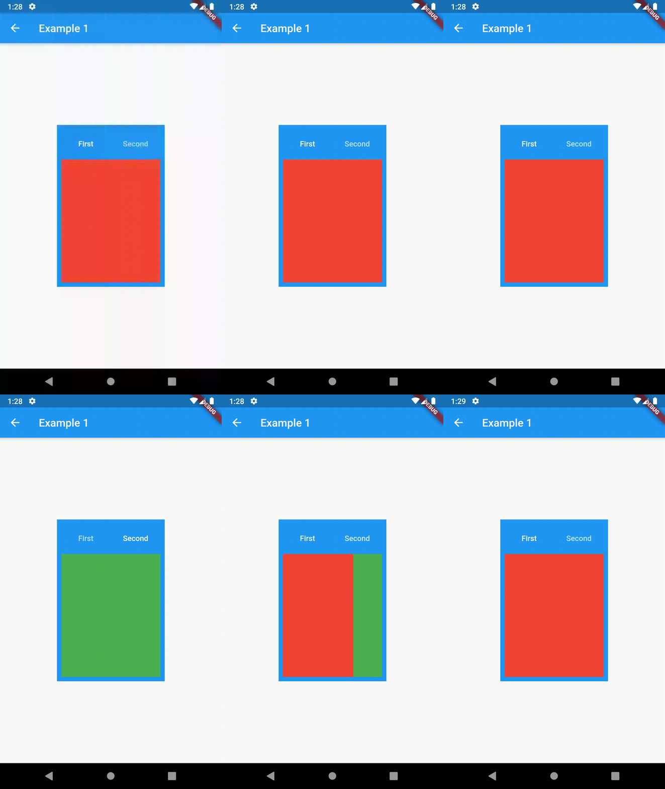
Basic usage includes putting a ContainedTabBarView into a Container whose constraints it will obey. Putting a ContainedTabBarView directly into a body of a Scaffold will, expectedly, draw it full-screen.

// Example 1
import 'package:contained_tab_bar_view/contained_tab_bar_view.dart';

...

Container(
  padding: const EdgeInsets.all(8.0),
  color: Colors.blue,
  width: 200,
  height: 300,
  child: ContainedTabBarView(
    tabs: [
      Text('First'),
      Text('Second'),
    ],
    views: [
      Container(color: Colors.red),
      Container(color: Colors.green)
    ],
    onChange: (index) => print(index),
  ),
),

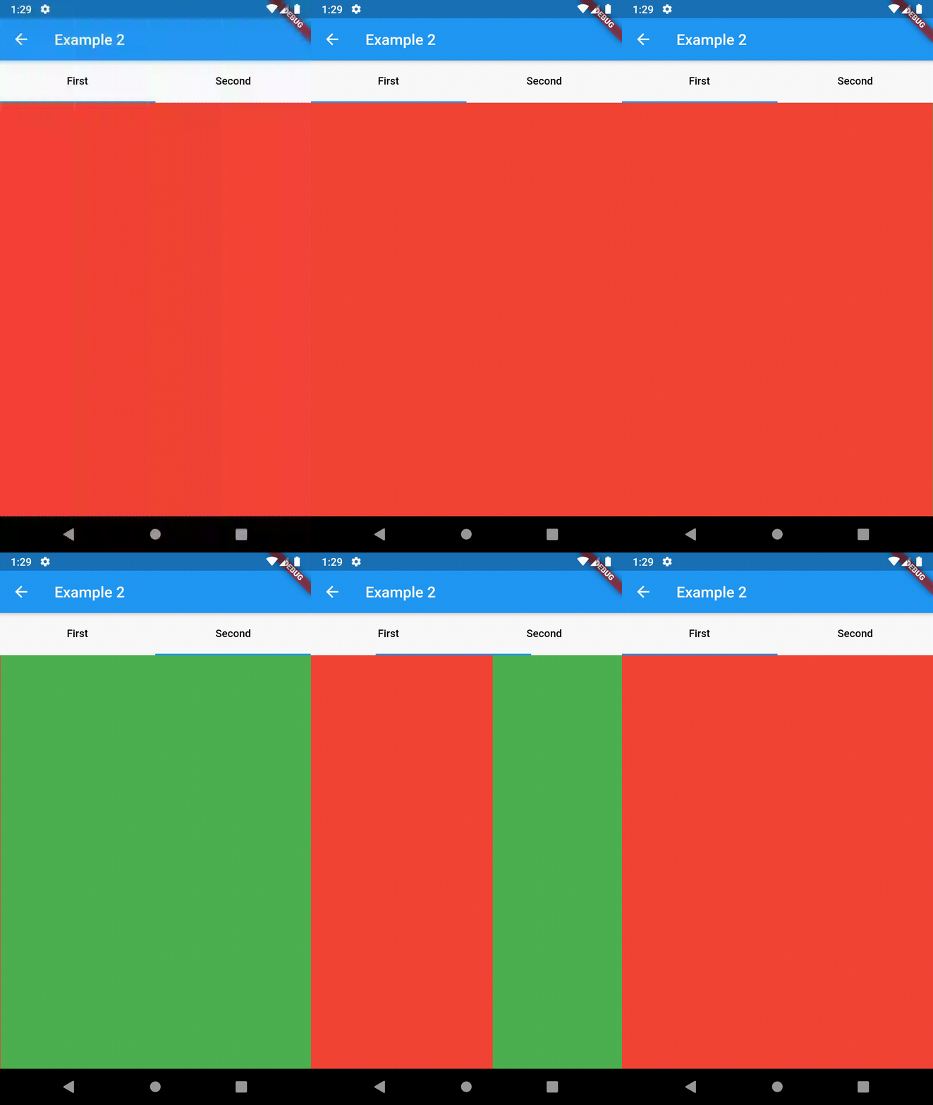
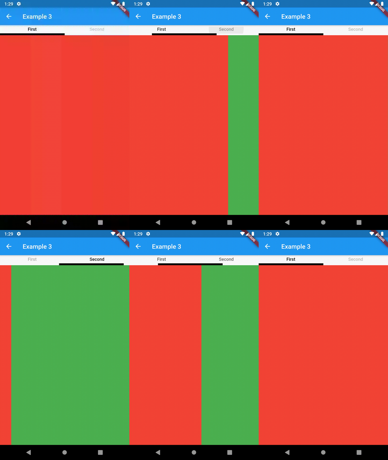
example 1 example 2 example 3

Intermediate

TabBarProperties

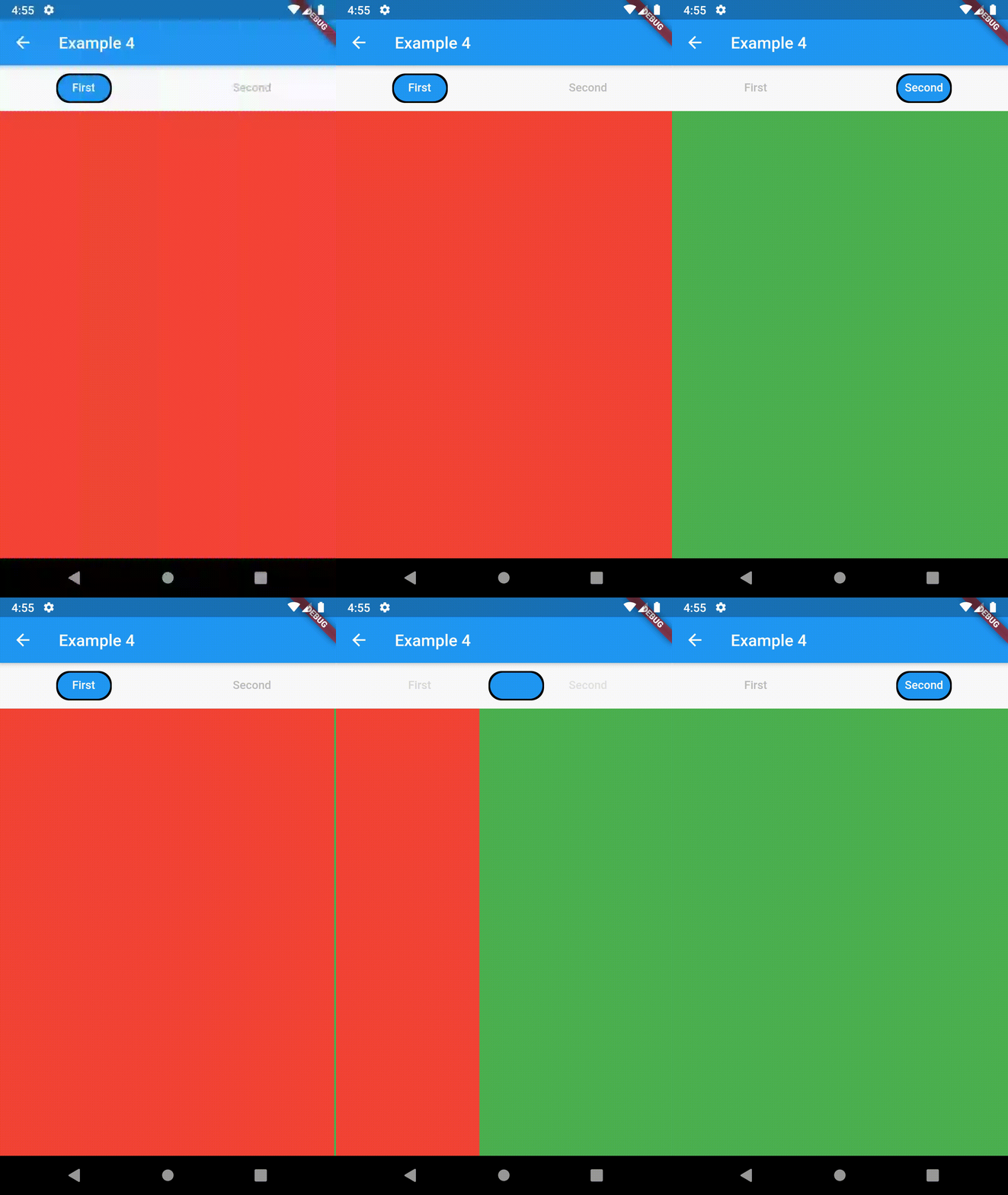
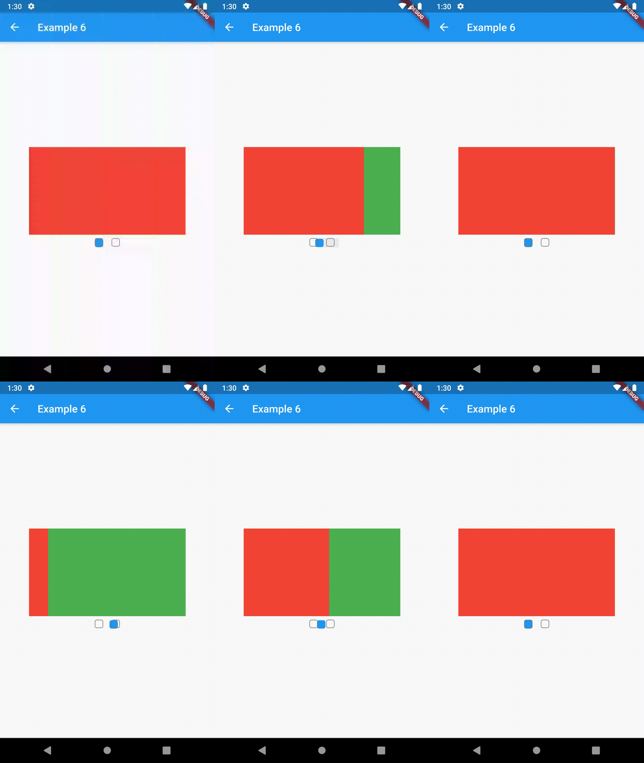
All the properties that can be set for a TabBar are accessible for setting via tabBarProperties. Also, there are many more for the customization of TabBar's appearance. To create your own ("container-based") indicator, you can use ContainerTabIndicator decoration (see examples 4 and 6) which is a part of this package, but also a separate package whose documentation can be found here. Of course, you can use any other tab bar indicator of your liking.

Property Type Default value Description
width double / The width of TabBar. If not set, it's full available width.
height double kToolbarHeight The height of TabBar. The TabBarView takes the available height minus this value.
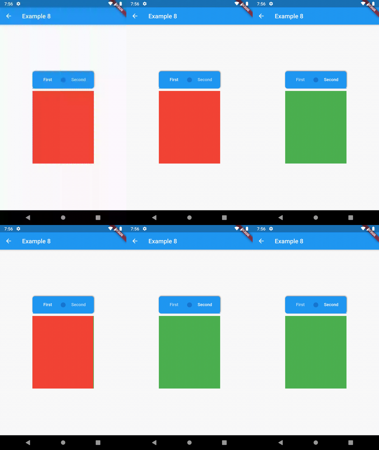
background Container / Container that is behind the tabs. See example 8.
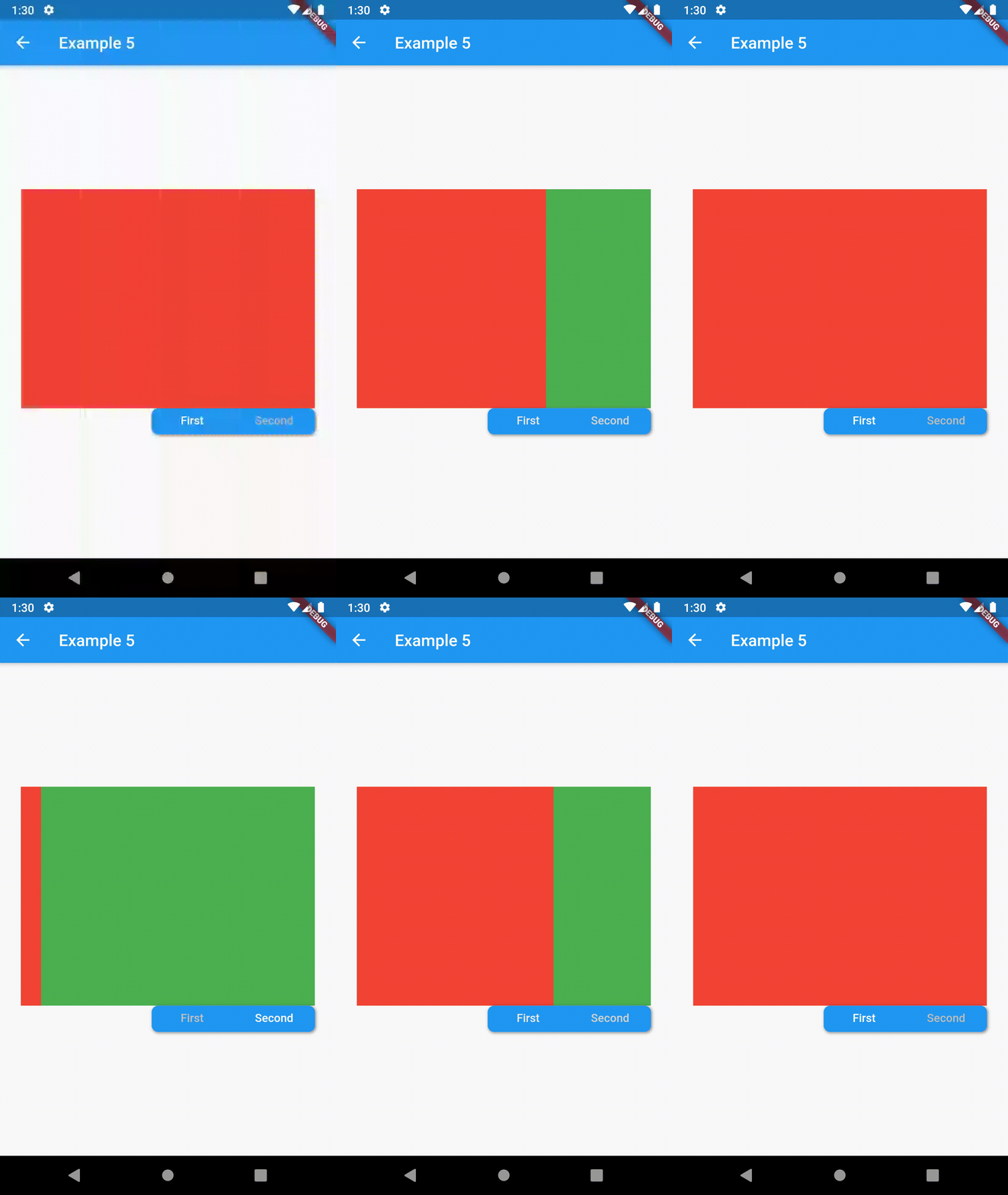
position TabBarPosition TabBarPosition.top Position of TabBar in respect to it's TabBarView. See example 5.
alignment TabBarAlignment TabBarAlignment.center Alignment of TabBar (if it's width is not full available) within TabBar-TabBarView flex. See example 5.
padding EdgeInsets const EdgeInsets.all(0.0) The TabBars padding. See example 4.
margin EdgeInsets const EdgeInsets.all(0.0) The TabBars margin. See example 8.
indicator Decoration / The decoration for the active tab. You can use ContainerTabIndicator for various customization. See example 4. Also, see TabBar documentation
indicatorColor Color / see TabBar documentation
indicatorPadding EdgeInsetsGeometry const EdgeInsets.all(0.0) see TabBar documentation
indicatorSize TabBarIndicatorSize / see TabBar documentation
indicatorWeight double 2.0 see TabBar documentation
isScrollable bool false see TabBar documentation
labelColor Color / see TabBar documentation
labelPadding EdgeInsetsGeometry const EdgeInsets.all(0.0) see TabBar documentation
labelStyle TextStyle / see TabBar documentation
unselectedLabelColor Color / see TabBar documentation
unselectedLabelStyle TextStyle / see TabBar documentation
TabBarViewProperties

All the properties that can be set for a TabBarView are accessible for setting via tabBarViewProperties.

Property Type Default value Description
dragStartBehavior DragStartBehavior DragStartBehavior.start See TabBarView documentation
physics ScrollPhysics (platform specific) See TabBarView documentation

For example, if you want to disable swiping behavior on the TabBarView, set the option like this:

ContainedTabBarView(
  ...
  tabBarViewProperties: TabBarViewProperties(
    physics: NeverScrollableScrollPhysics(),
  ),
)
TabBarPosition
enum TabBarPosition { top, bottom, left, right }
TabBarAlignment
enum TabBarAlignment { start, center, end }
Intermediate Examples
// Example 5
ContainedTabBarView(
  tabs: [
      Text('First'),
      Text('Second'),
  ],
  tabBarProperties: TabBarProperties(
    width: 200,
    height: 32,
    background: Container(
      decoration: BoxDecoration(
        color: Colors.blue,
        borderRadius: BorderRadius.all(Radius.circular(8.0)),
        boxShadow: [
          BoxShadow(
            color: Colors.black.withOpacity(0.4),
            spreadRadius: 0.5,
            blurRadius: 2,
            offset: Offset(1, -1),
          ),
        ],
      ),
    ),
    position: TabBarPosition.bottom,
    alignment: TabBarAlignment.end,
    indicatorColor: Colors.transparent,
    labelColor: Colors.white,
    unselectedLabelColor: Colors.grey[400],
  ),
  views: [
    Container(color: Colors.red),
    Container(color: Colors.green),
  ],
)

example 4 example 5 example 6

Advanced

Change tab from another Widget

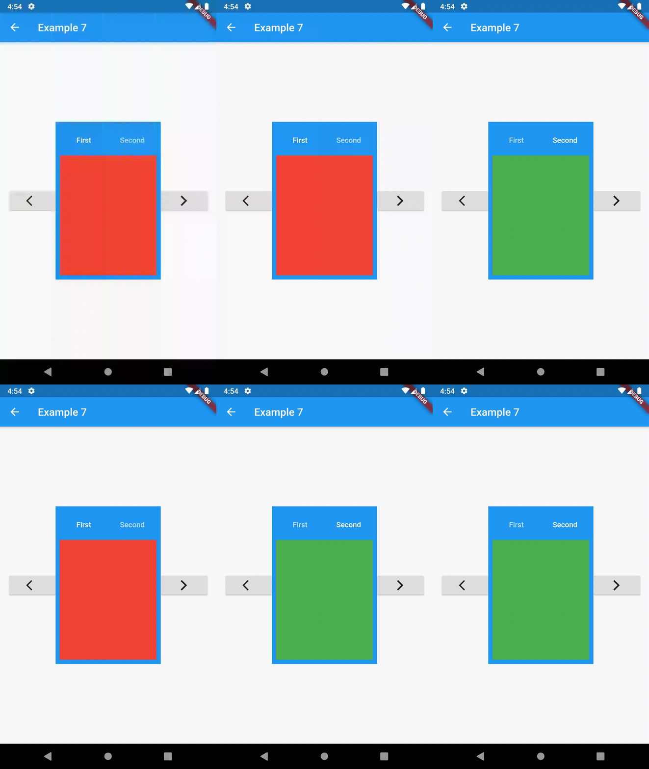
To control the state, i.e. move to another tab, from outside of ContainedTabBarView create it with a GlobalKey and then use methods exposed from state: animateTo(), next() and previous().

// Example 7
class Example7 extends StatelessWidget {
  @override
  Widget build(BuildContext context) {
    GlobalKey<ContainedTabBarViewState> _key = GlobalKey();
    ContainedTabBarView containedTabBarView = ContainedTabBarView(
      key: _key,
      tabs: [
        Text('First'),
        Text('Second'),
      ],
      views: [
        Container(color: Colors.red),
        Container(color: Colors.green),
      ],
    );

    return Scaffold(
      appBar: AppBar(
        title: Text('Example 7'),
      ),
      body: Row(
        mainAxisAlignment: MainAxisAlignment.center,
        children: [
          ElevatedButton(
            onPressed: () => _key.currentState?.previous(),
            child: Icon(Icons.arrow_back_ios),
          ),
          Center(
            child: Container(
              padding: const EdgeInsets.all(8.0),
              color: Colors.blue,
              width: 200,
              height: 300,
              child: containedTabBarView,
            ),
          ),
          ElevatedButton(    
            onPressed: () => _key.currentState?.next(),
            child: Icon(Icons.arrow_forward_ios),
          ),
        ],
      ),
    );
  }
}
Advanced Examples

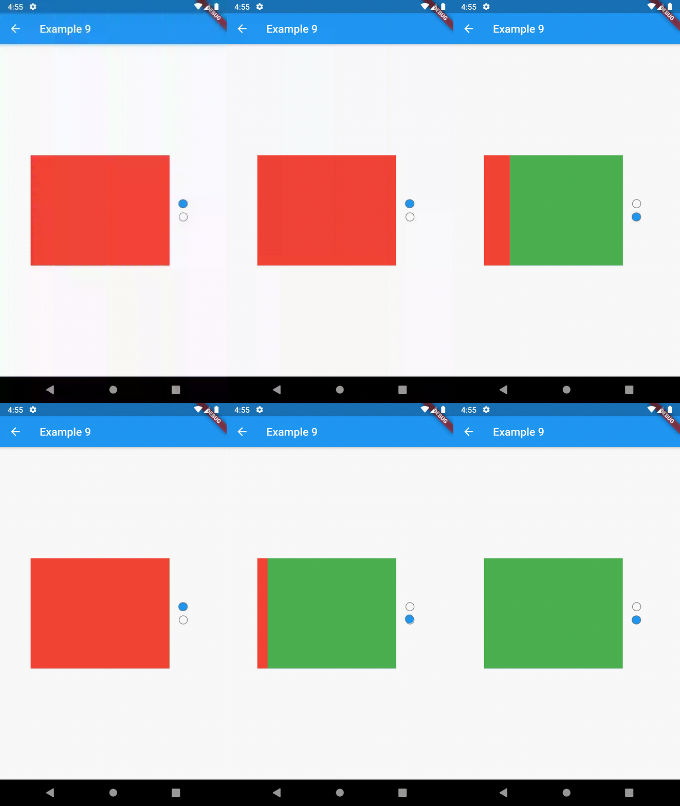
example 7 example 8 example 9

Contributing

This package is still in early stages. If you notice any bugs, please file an issue. If you are willing to fix or enhance things yourself, you are very welcome to make a pull request.

Categorias

Dependências

Lista de dependências 1 itens

Repositório-fonte

Projetos que usam este pacote