Buscar pacotes, repositórios e categorias de apps

Capa de cool_stepper
Detalhes do pacotev1.2.1

cool_stepper

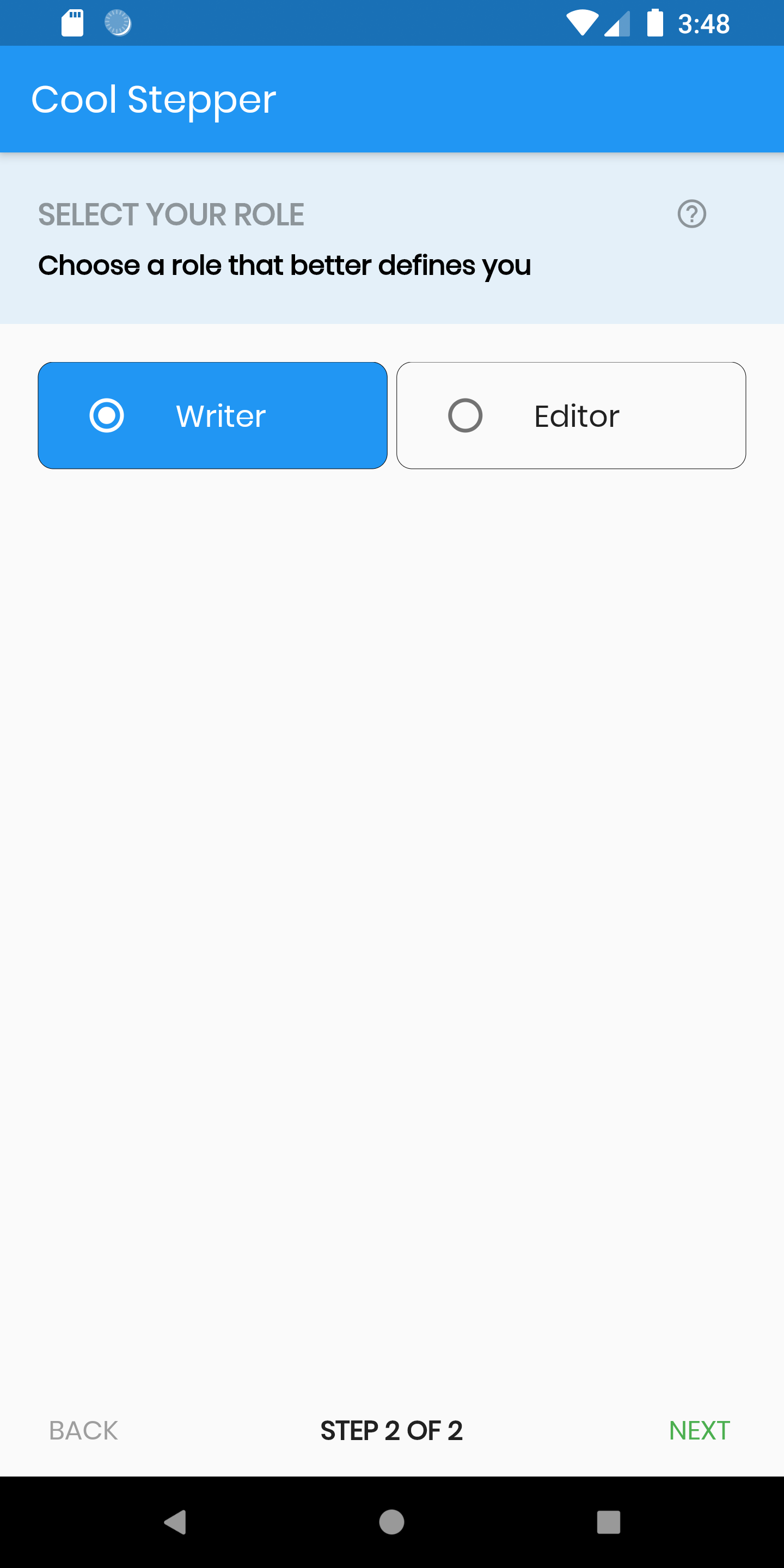
CoolStepper é um widget que exibe uma sequência passo a passo de operações. Pode ser útil para um assistente de formulário ou onboarding.

AndroidiOSWebmacOSWindowsLinux
Downloads em 30 dias
1,3 mil
Curtidas
147
Pontos Pub
130

Instalar pacote

flutter pub add cool_stepper

Visão geral do pacote

Orientação gerada a partir de informações públicas. Apenas para referência.

CoolStepper é um widget personalizável do Flutter projetado para guiar os usuários por processos sequenciais, como assistentes de formulários ou fluxos de boas-vindas. Ele representa visualmente os passos de forma clara e interativa, suportando transições suaves entre etapas. Com suporte em todas as principais plataformas — Android, iOS, Web, macOS, Windows e Linux — garante experiências consistentes para o usuário. O widget é leve e fácil de integrar, sendo ideal para aplicações que exigem navegação passo a passo.

Casos de uso

  • Tutoriais de introdução
  • Formulários de múltiplos passos
  • Processos de checkout
  • Wizards de configuração guiada
  • Fluxos de registro de usuário

Principais recursos

  • indicadores de etapa personalizáveis
  • animações de transição suave
  • Compatibilidade multiplataforma
  • Integração fácil com a interface existente
  • Suporta layouts horizontais e verticais
  • Estados ativos/inativos configuráveis

Indicado para

  • Desenvolvedores criando fluxos de trabalho guiados
  • Aplicativos que precisam de navegação intuitiva
  • Designers procurando componentes modernos de passo
  • Projetos que exigem mínimo boilerplate
  • Equipes direcionadas para múltiplas plataformas

Considerações

  • Lógica de validação interna limitada
  • Requer gerenciamento manual de estado
  • Pode ser necessário estilização personalizada para designs complexos
  • Não otimizado para contagens de passos muito grandes
  • Depende de dependências externas para funcionalidades avançadas
README original

Snapshot do README original do repositório-fonte vinculado. Consulte o repositório para o conteúdo mais recente.

cool_stepper

CoolStepper is a widget that displays a step by step sequence of operations. it could be helpful for a form wizard or onboarding.

Usage

To use this package, add cool_stepper as a dependency in your pubspec.yaml file. And add this import to your file.

import 'package:cool_stepper/cool_stepper.dart';

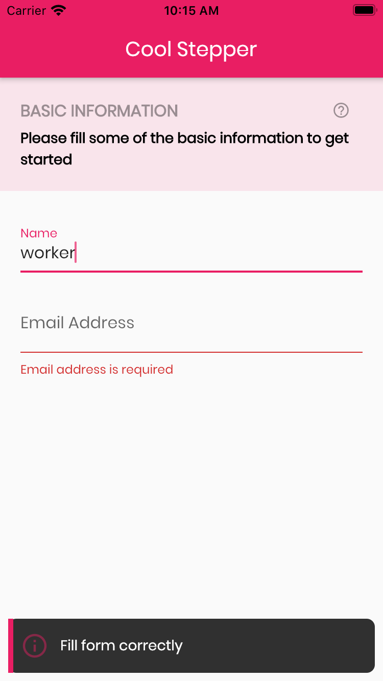
Screenshots

Example
CoolStepper(
   onCompleted: () {},
   steps: List<CoolStep>[
       CoolStep(
        title: "Basic Information",
        subtitle: "Please fill some of the basic information to get started",
        content: Container()
       ),
   ],
);

For each step, return a null, if you want the validation to pass or a String message which would be displayed if you set the showErrorSnackbar attribute to true.

validation: () {
          if (!_formKey.currentState!.validate()) {
            return 'Fill form correctly';
          }
          return null;
        },
CoolStepper Class
Attribute Data type Description Default Value
onCompleted Void Function() @required - A function that is triggers when all steps have been completed Null
steps List @required Null
config CoolStepperConfig Helps to customize your stepper CoolStepperConfig(backText: "BACK", nextText: "NEXT", stepText: "STEP", ofText: "OF")
showErrorSnackbar boolean Shows a snakbar at the bottom of the page when a step validation fails if set to true false
CoolStepperConfig Properties
Attribute Data type Description Default Value
backText String The text that should be displayed for the back button BACK
nextText String The text that should be displayed for the next button NEXT
finalText String The text that should be displayed for the next button on the final step FINISH
stepText String The text that describes the progress STEP
ofText String The text that describes the progress OF
headerColor Color This is the background color of the header Theme.of(context).primaryColor.withOpacity(0.1)
iconColor Color This is the color of the icon Color.black38
icon Icon This icon replaces the default icon Icon(Icons.help_outline,size: 18,Colors.black38)
titleTextStyle TextStyle This is the textStyle for the title text TextStyle(fontSize: 16.0,fontWeight: FontWeight.bold,color: Colors.black38)
subtitleTextStyle TextStyle This is the textStyle for the subtitle text TextStyle(fontSize: 14.0,fontWeight: FontWeight.w600,color: Colors.black)
backTextList List A List of string that when supplied will override 'backText'. Must be one less than the number of steps since for the first step, the backText won't be visible null
nextTextList List A List of string that when supplied will override 'nextText'Must be one less than the number of steps since the 'finalText' attribute is able to set the value for the final step's next button null

Categorias

Dependências

Lista de dependências 1 itens

Repositório-fonte

Projetos que usam este pacote

Ainda não há dados.